Styling & Responsiveness
LocoAI scans through your design files and applies styling & layout to your elements based on media queries so that these elements can adjust to different screen sizes.

What are Media Queries?
Media queries allow you to change the styling of your design based on rules such as screen width.
An example of that would be to change your design from being arranged horizontally to stacking vertically on the <428px Media Query - this means this setting is only applied when the screen width is less than 428px
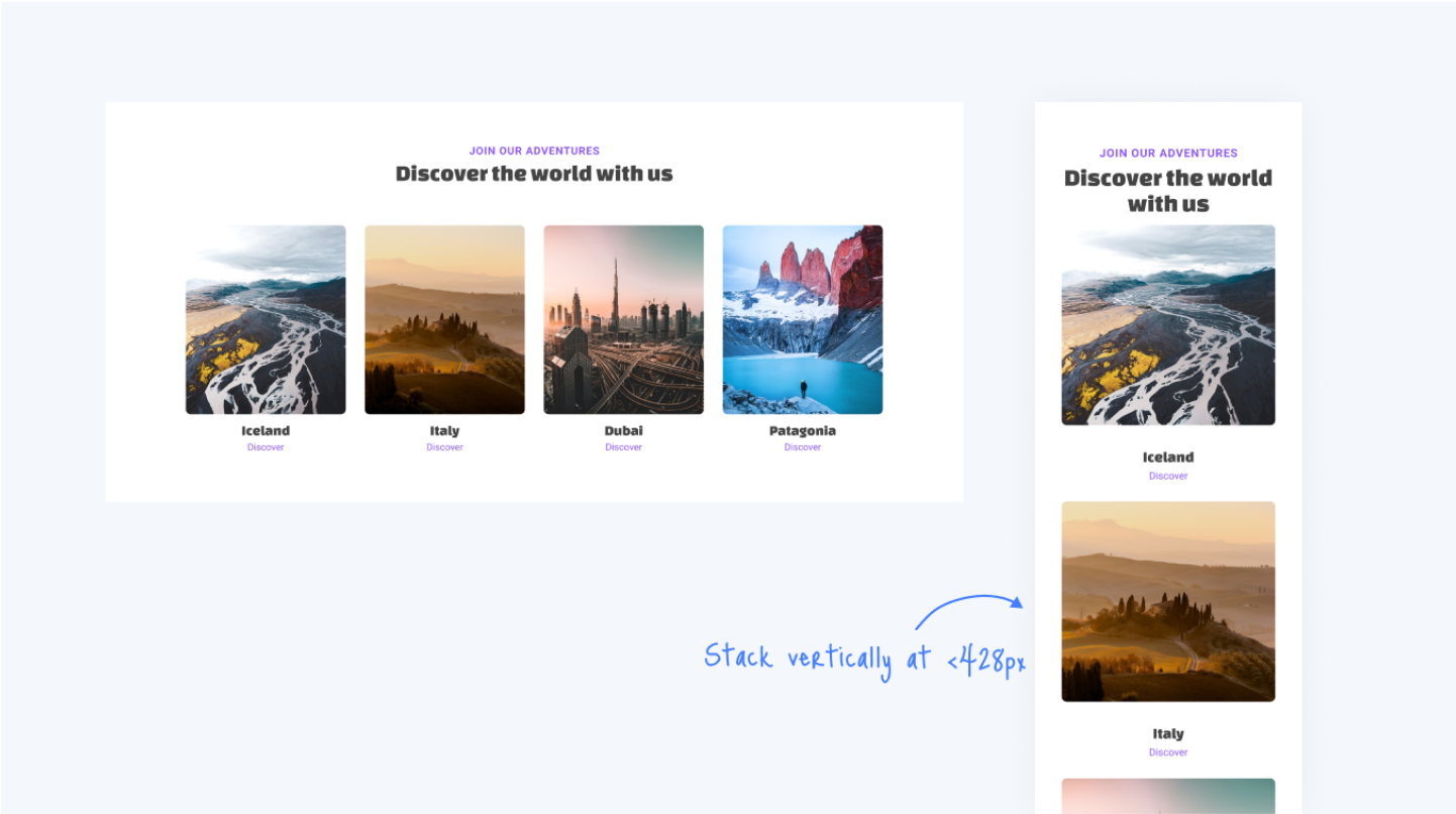
By using Media Queries, you can control your design for various devices such as desktops, tablets, mobile and more.
Switching from Preview Mode to Edit Mode
When you first open your project, it starts in Preview Mode, allowing you to view how your design looks and functions. To begin editing, click the "Edit" button in the top toolbar. This will switch the interface to Edit Mode, where you can access all the features and settings needed to modify your project.
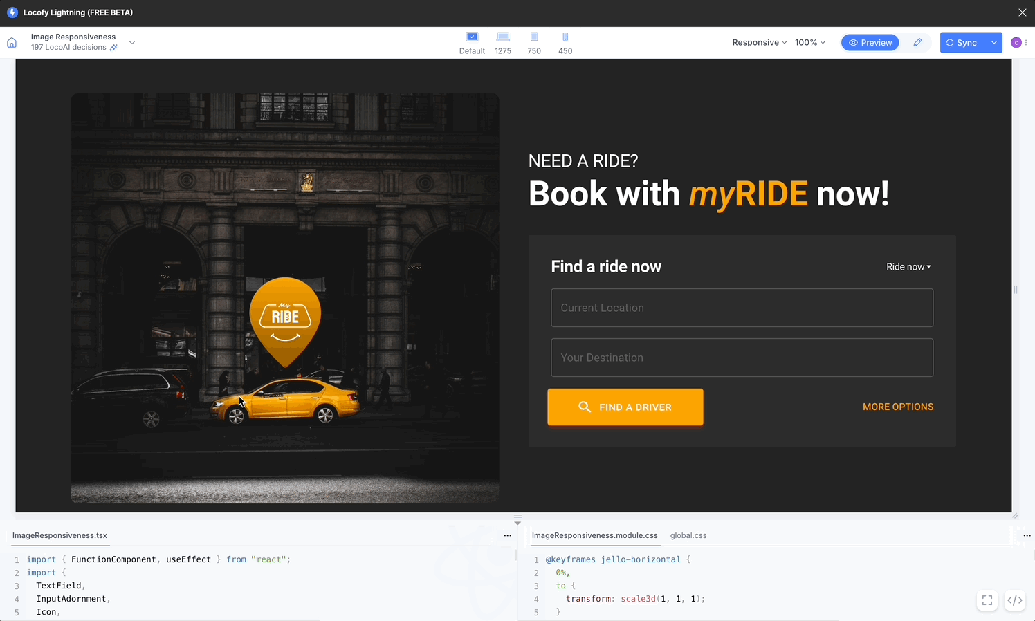
You can return to Preview Mode anytime by clicking the "Preview" button, enabling you to check your changes in real time.
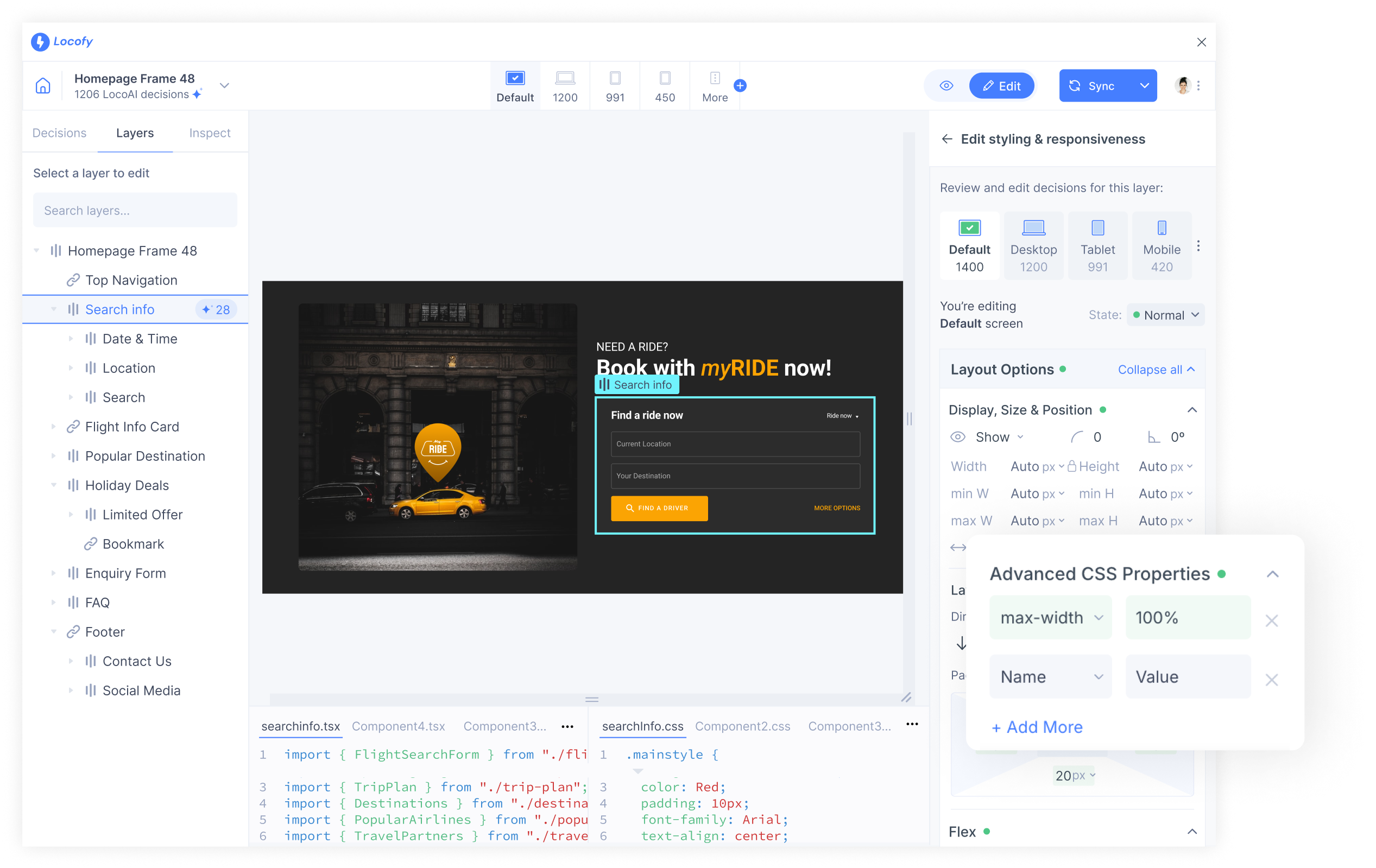
Reviewing responsiveness & styling
After the Locofy.ai wizard has scanned & added styling properties, you can review and edit them.
-
Click on the Edit button under the Decisions tab click on "Styling & Responsiveness".
-
Click on the element for which you want to edit its styling & responsiveness or from the list in the Layers tab, you can select the one that you need to the styling for.
-
Click on the edit button present on the right side to edit the styling properties.

Select and Edit in Preview
You can select the element you wish to edit directly from the preview.
-
Click the 'Edit' tab on top of the preview window and go to the Layers tab.
-
You can now click the element in preview that you wish to edit. You can also hover over the element to see their name.
-
Once the item is selected, you can review & edit the decisions LocoAI made, present on the right panel, with regards to the selected element.

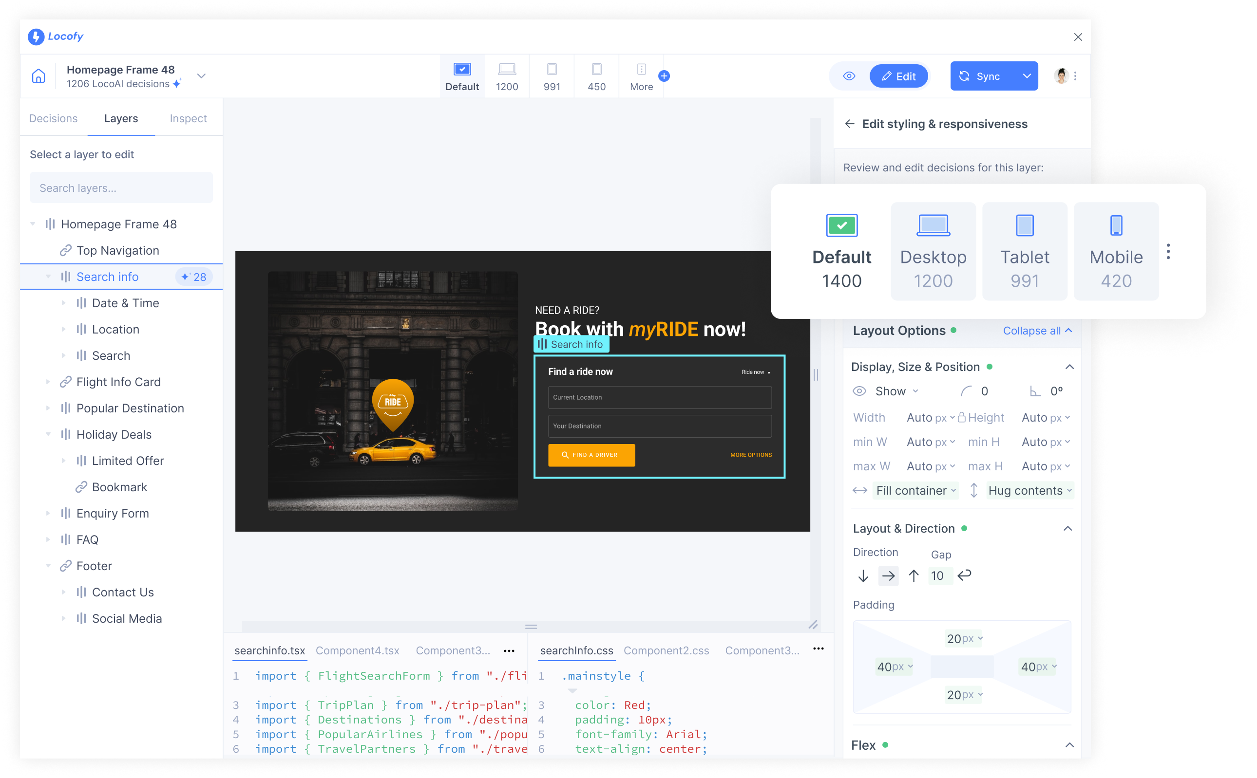
Editing responsiveness & styling on Different Media Queries
Working with media queries in Locofy.ai is easy:
- Click on the desired Media Query tab or select from the dropdown.
- Edit the styling of the layer. All the changes will be applied to the selected media query.
- Preview to see how your element behaves in your selected screen size
Add Custom Media Queries
By following these straightforward steps, you can effortlessly manage and utilize media queries to enhance the responsiveness and adaptability of your design.
How to add new media queries:
-
Navigate to the section for editing styles and responsiveness within the tool.
-
Click on the three dots next to the breakpoint tabs.
-
Within the opened dropdown, locate the "Add media query" button. Click on it.
-
Define your new media query and assign it a name for easy reference
-
Upon saving, your newly created media query will seamlessly integrate into the dropdown menu, alongside any existing media queries.
-
Easily select your desired media query from the dropdown menu by clicking on the corresponding option. The selected media query will then be prominently displayed among the existing tiles, for quick access and reference.
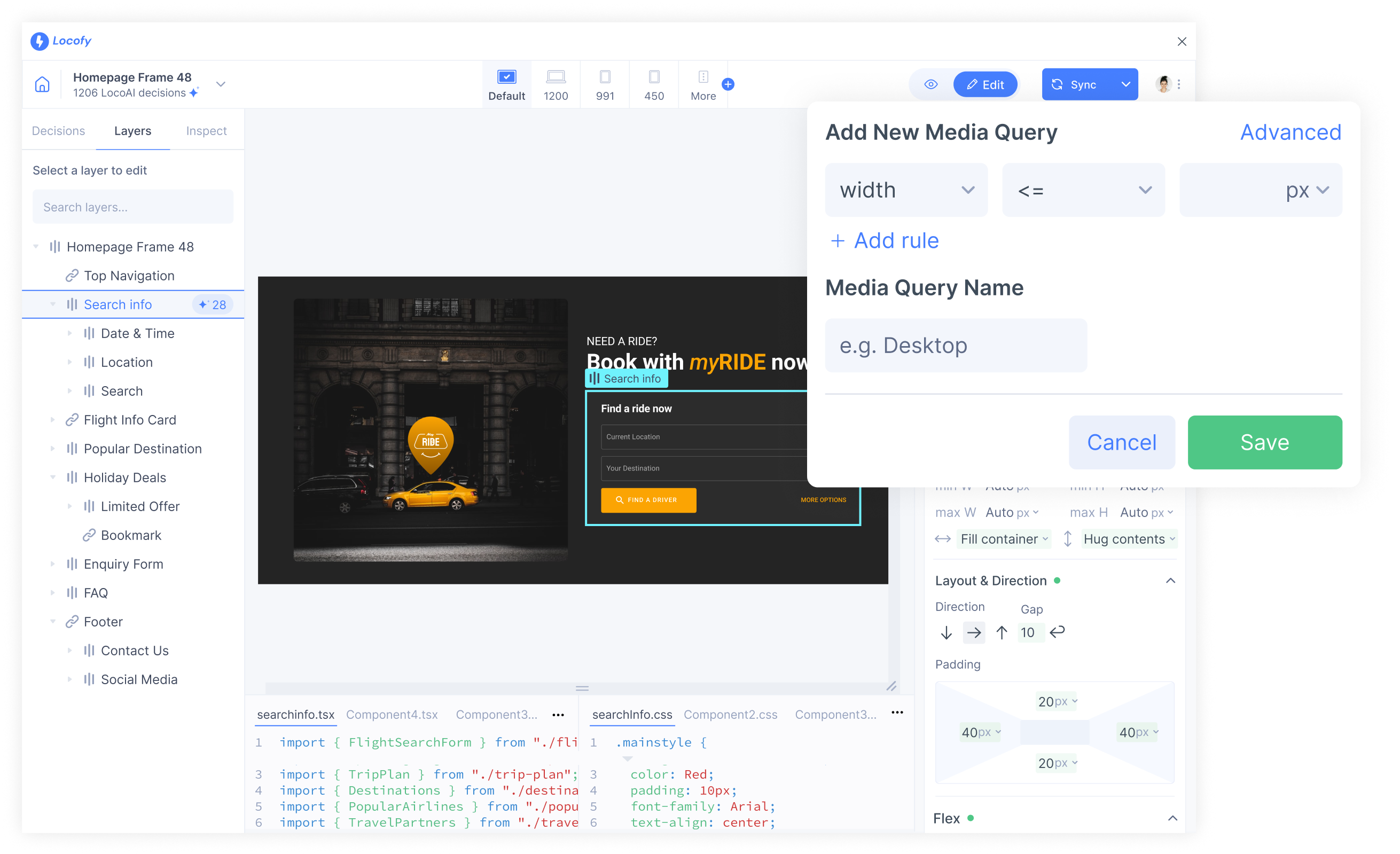
- Also after adding a new media query you can also add more media queries by clicking the plus (+) icon besice the 'More' option located above the live interactive preview.

Creating beautiful interactions with states
Elements on your page are not just static. As users interact with the elements, you may want have a different styling for your element based on its state.
You can do so inside Figma with the Locofy plugin. Commonly used states which are supported by Locofy are:
- Normal
- Hover
- Pressed
- Disabled
- Focused
- Checked
- Empty
Editing element style in its different states
To edit the styling for an element in different states such as hover and disabled:
- Select the state you want to edit for. You can click ont the dropdown next to State.
- Edit the styling of your layer. All changes made will apply only to the selected state.
- Preview to see how your layer looks in the newly styled state by clicking "Done".
Edit styling properties for your layers
Locofy supports styling options for:
- Prebuilt Effects
- Display, Size & Position
- Spacing
- Fill
- Border
- Shadow
- Typography
- Cursor
- Layout
Pre-built Effects
Learn how to create pre-built effects, tag your Lottie files and customise your animation properties.
- Select the frame you want to animate in your design. Navigate to the section for editing styles and responsiveness within the Locogy Lightning plugin and scroll down to the "Pre-built Effects" section.
- Then, you can select the type of animation you want.
- You will then be taken to the "Pre-built Effects" tab. Here, you can further customize other animation properties.
- You have successfully created pre-built effects.
Advanced CSS properties
You can add any CSS property to customise the styling and responsive for your needs.