Building a responsive header navbar
- Ensure that you have applied Autolayout for the header nav bar.
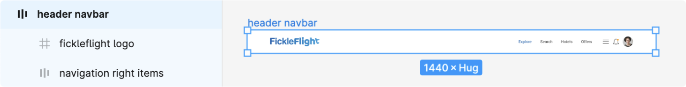
- You should have both the desktop elements (menu links) and the mobile elements (hamburger) in the design.
Hide elements appropriately for different screen sizes
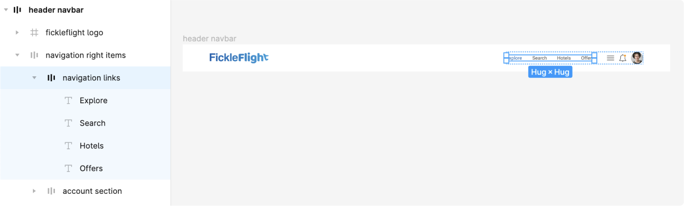
- Select the container which contains the menu links
-
Tag this as a container using the Locofy Plugin
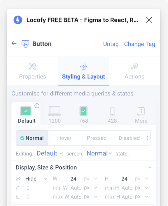
-
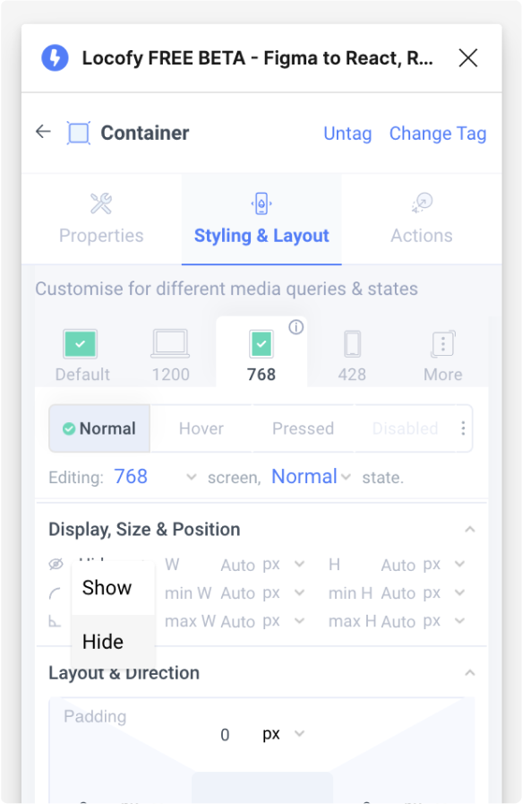
In the Styling & Layouts settings, select on the 768px tab and set the display setting to “hide”
- Next, select the hamburger menu and tag it as a button
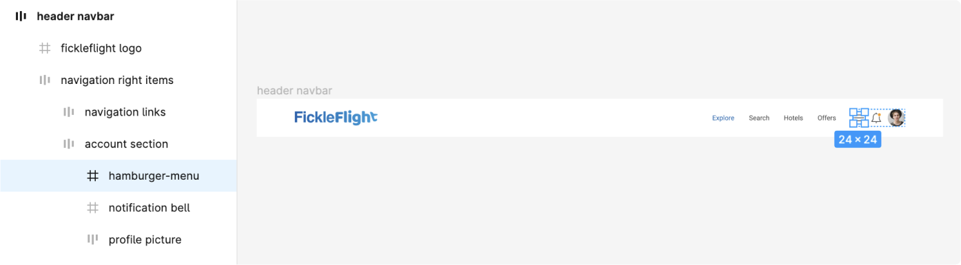
- In the Styling & Layouts settings, set the display to “show” on the 768px tab, and set the display to “hide” on the default tab
- You have successfully created a responsive header navigation bar