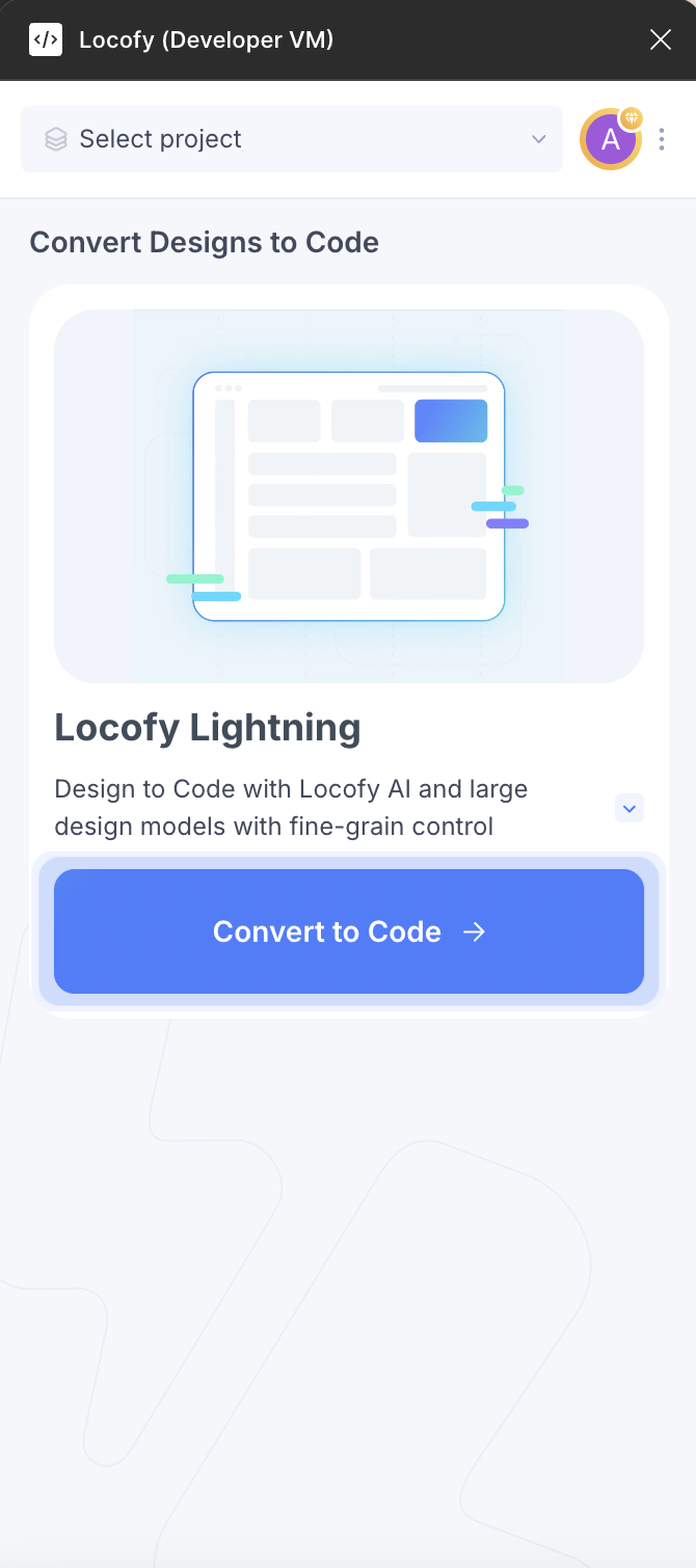
Getting Started
Plugin Overview

Plugin Overview & Step-By-Step Flow

Upon running the plugin, you will find options to choose either the Lightning flow or the Classic flow.

Lightning

The Lightning flow offers you the fastest way to convert your web designs into high-quality code.

It uses a combination of our pre-trained AI models to make your designs responsive, convert design elements into interactive ones, add relevant layer names, & create components.

Here are the steps it performs:

  1. Design Optimiser: This feature optimises your design by removing unnecessary frames, grouping items together & understanding inconsistent gaps and alignments.

  2. Responsiveness: In this step, we make your your designs responsive by applying different CSS properties & also apply media queries so your designs can adapt to different screen sizes.

  3. Tagging: This step turns your static design elements such as buttons and inputs to interactive ones by using the appropriate HTML tags.

  4. Actions / Interactions: In this step, we assign on-click actions for navigation between pages, interacting with popups and more.

  5. Class Names: We generate human-readable class names for you in this step.

  6. Code Components and Props: Finally, we scan the code and split it into reusable code components with props so you can easily extend the code.

Lastly, we push the code generated to Builder where you can make some final adjusments before syncing or deploying it.

You can read more about the Lightning flow by clicking here.

Classic

Locofy.ai's simple step-by-step interface guides you through all of the steps necessary to produce high-quality, production ready frontend code. While we have maintained the basic functionality of the Locofy plugin, you will notice several changes compared to the previous version. Let's get a quick overview over all the changes before we dive deeper into the functionality of each of the steps.

Pre-Built Components & Storybook

Our step-by-step flow allows you to convert your completed design into code. If you're not done designing and prefer to use pre-built components from libraries or your storybook, you can include them at the top under "Drag pre-built components".

The steps from 1 - 5 are present in the plugin.

Step 1: Design Optimiser: In this step, Design optimiser will help you apply the best practises to your Figma design that will lead to high-quality code from Locofy. These best practices include fixing your design structure, applying Figma's auto-layout and making sure your app works across different screen sizes.

Step 2: Tagging: This step is about tagging and converting your static designs elements into functional, interactive ones.

Step 3: Styling and Layout: In this step, you set up styling and layout options for different screen sizes and states.

Step 4: Add Actions: This step allows you to add onClick actions to your elements, such as changing the page or opening a popup.

Step 5: Sync to Locofy Builder: This step allows you to sync your design to the Locofy Builder to view code, set up reusable components, and make final code adjustments.

Note: The steps 6 – 9 are present in the Locofy Builder and they deal with making adjustments to your code and getting it ready for export, deployment or sync with GitHub.

Step 6: Make Components: This allows you to setup reusable components and props for the engineers to use.

Step 7: Bind Data: In this step, you can setup data binding using state variables.

Step 8: Configure Code: In this step, you can change your code configuration & file names.

Step 9: Exporting Code: The last step is to export or syncing your project.

You can read more about the Classic flow by clicking here.