Working with UI Libraries
Learn how to use UI libraries such as Material UI, Ant Design, Bootstrap, Vuetify, or Chakra UI inside your design system.
UI Libraries Supported by Locofy.ai
Locofy currently supports design elements from:


Tagging a UI Library element
To tag a UI Library element:
-
Select the UI library element from your Figma file.
-
Choose the tag from the Locofy plugin by going to Step 2: Tag your layers: Available tags will be highlighted based on your selection.
-
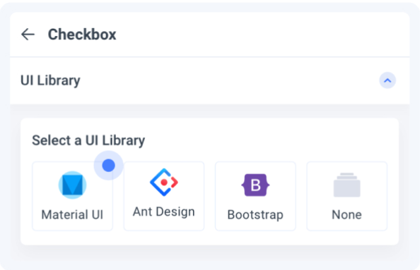
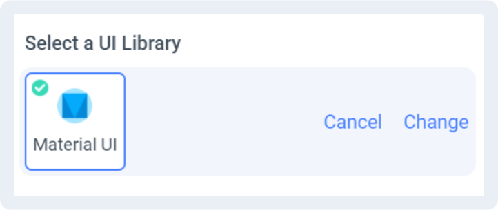
Select a UI Library: Choose the UI Library that you are working with.
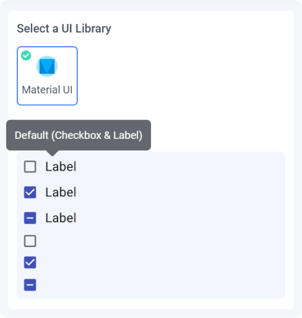
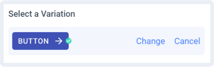
- Select a Variation: Choose the variation of the element you are using
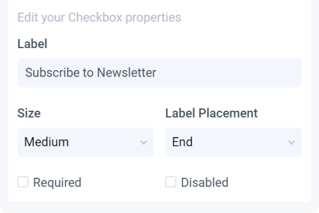
- Edit Properties: You can further define how this element should work.
-
Check the interactive preview: Play with the interactive preview to verify your element is correctly set up
-
Click Done.
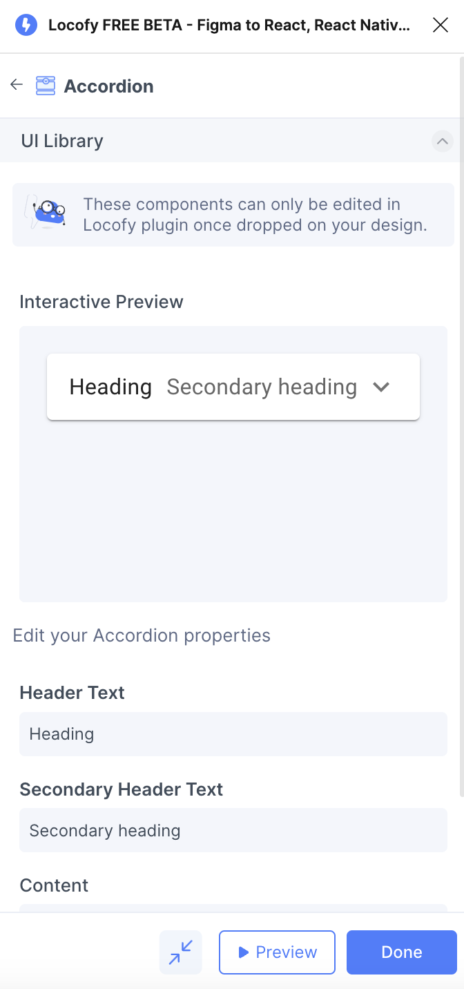
Locofy provides an interactive preview for you to visualize your element while tagging.
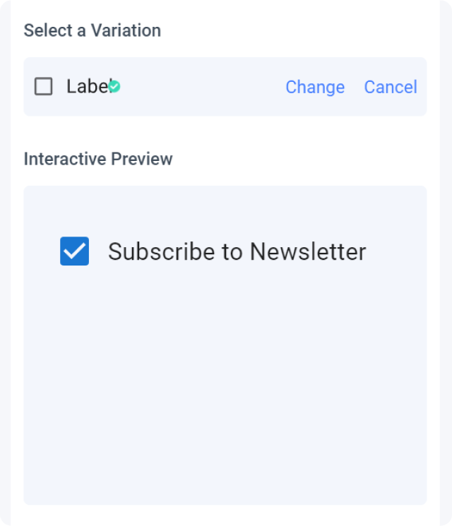
Any changes made to your properties settings will update and refresh the interactive preview.
Tagging your Autocomplete
- Select the autocomplete frame on your design and tag it as an "Auto-complete".
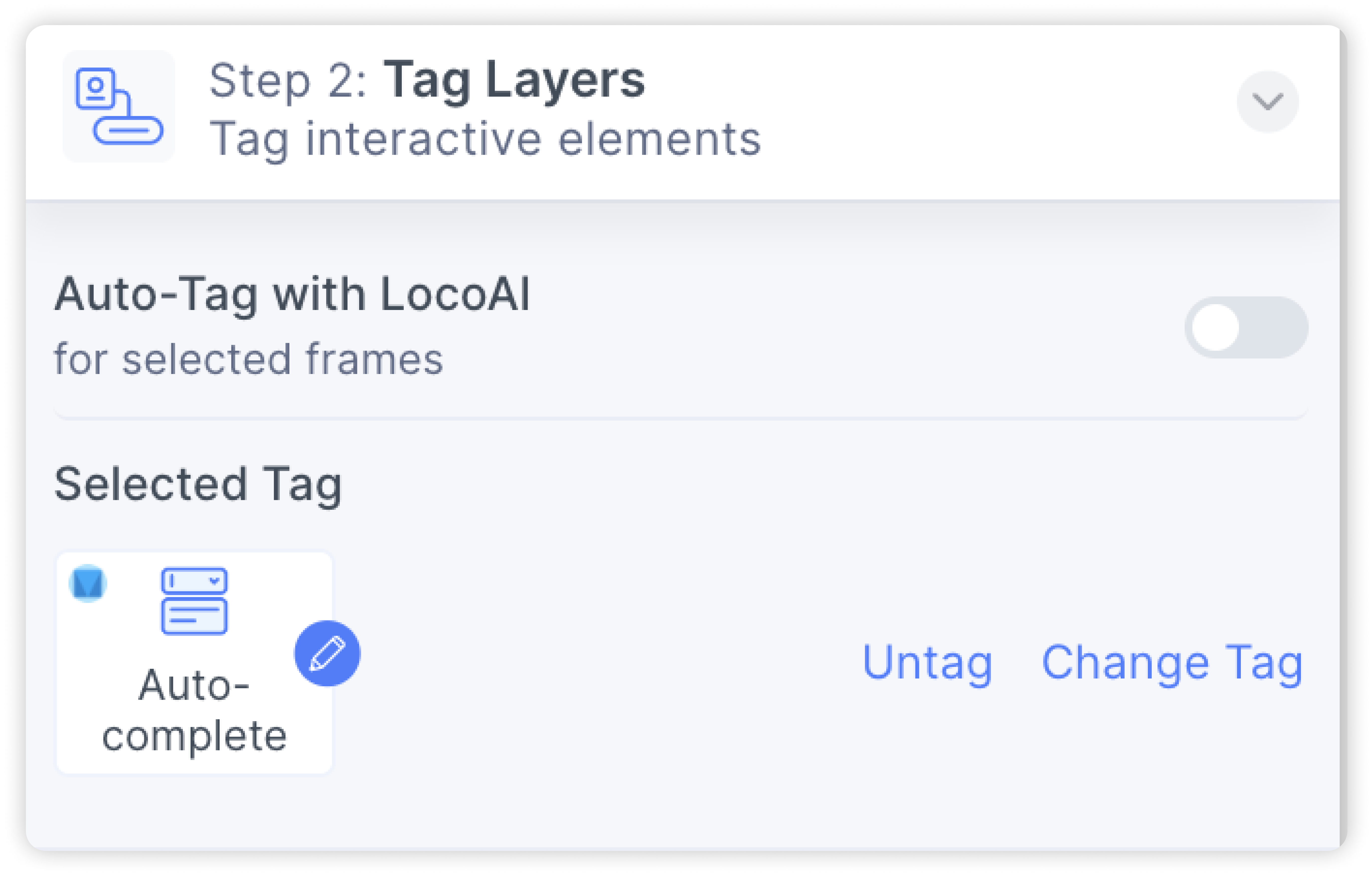
- Follow the steps above to customize the properties.
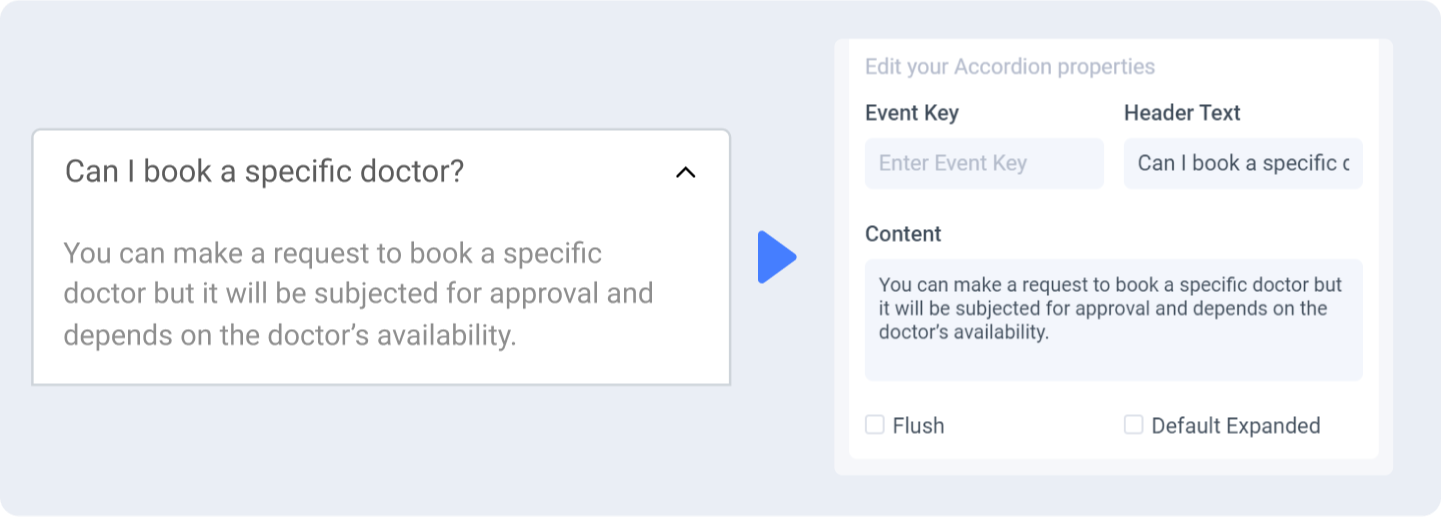
Tagging your Accordion
- Select the accordion frame on your design and tag it as an "Accordion".
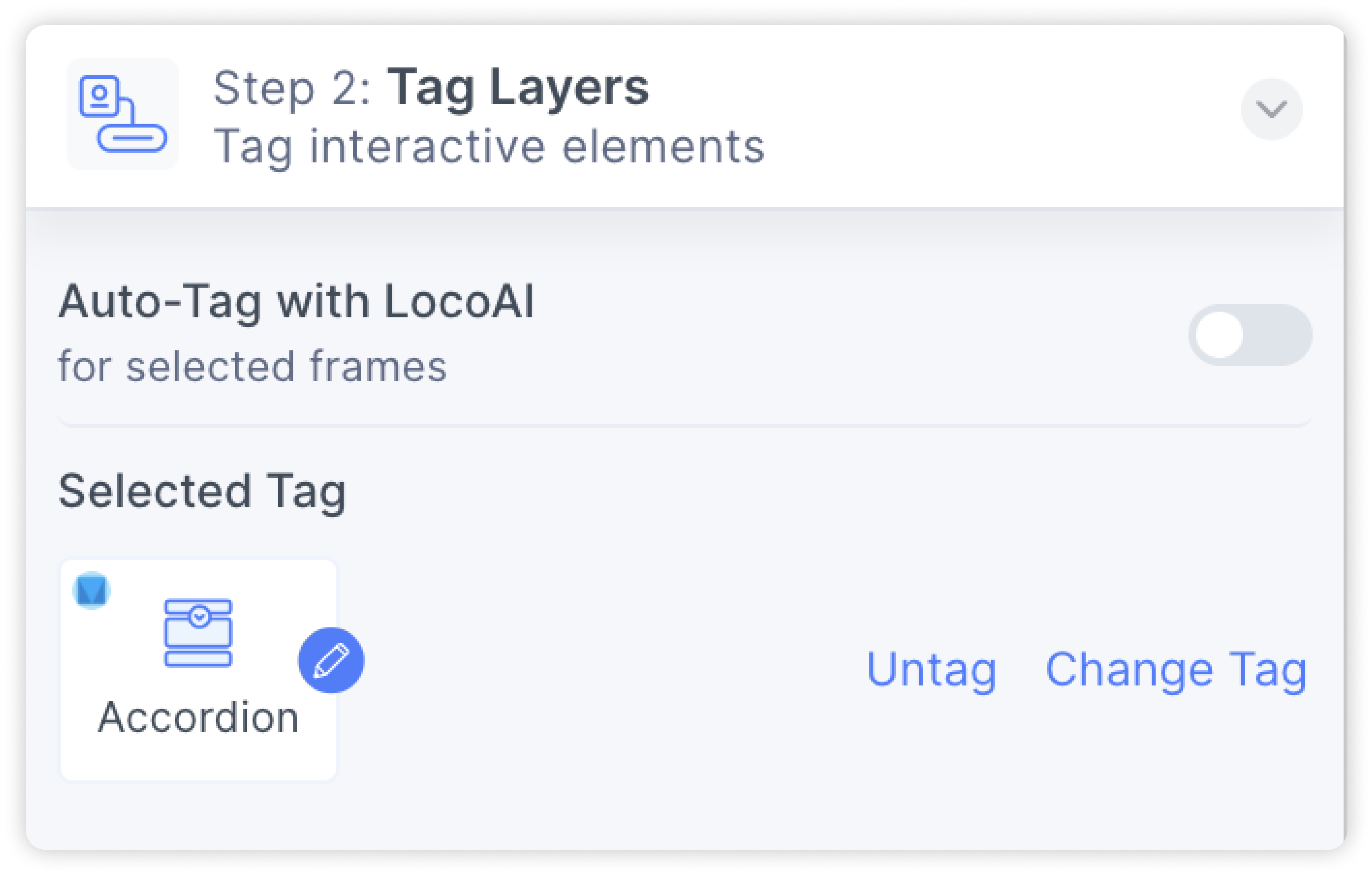
- You can customize properties such as the headers and content.
Tagging your Dropdown
- Select the dropdown frame on your design and tag it as an "Dropdown".
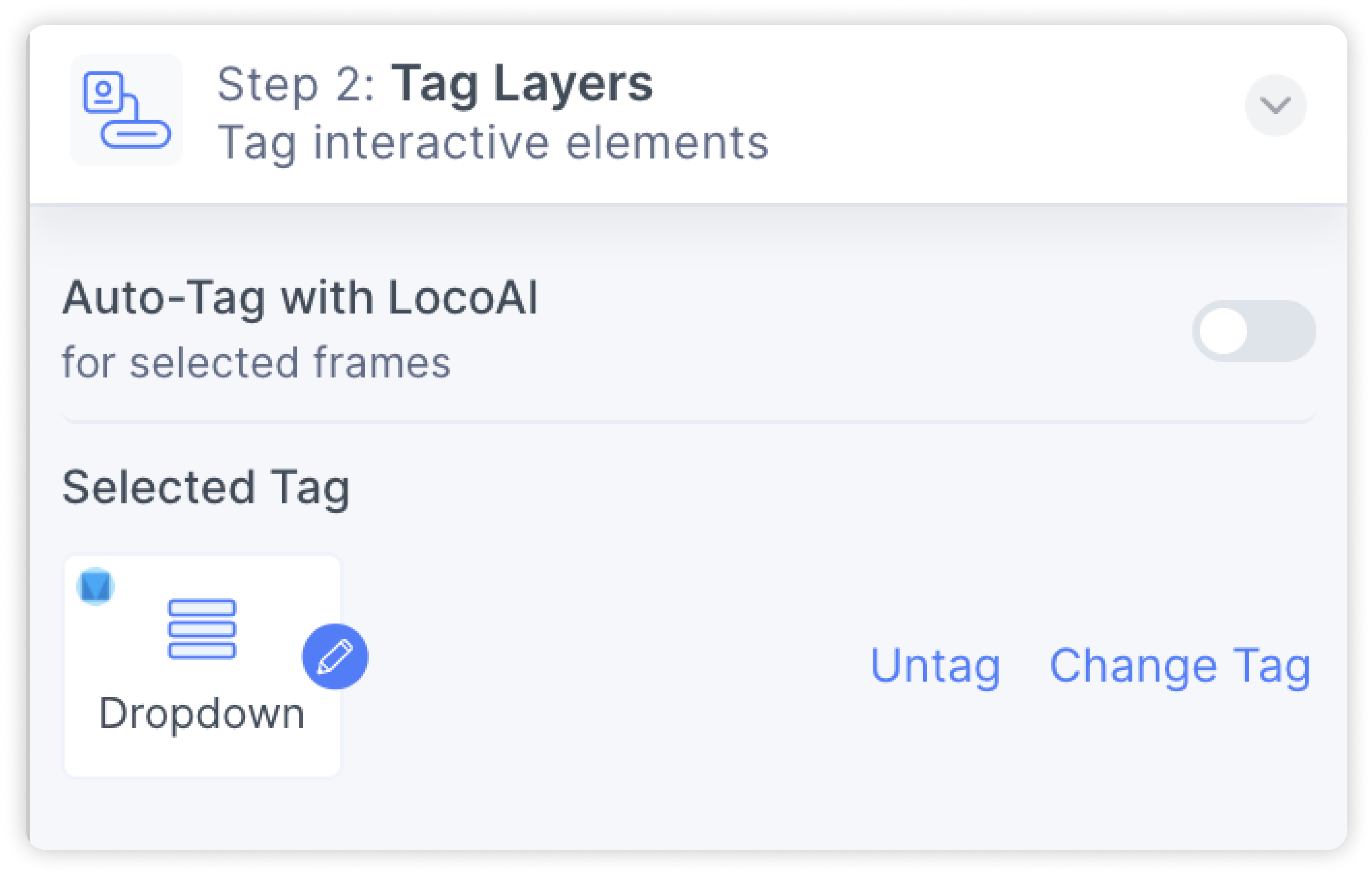
- Follow the steps above to customize the properties.
Properties auto-detection
When tagging your UI library element, Locofy reads your Figma design to automatically populate properties for you.
Change or cancel UI Library
You can switch to a different UI Library or to cancel your selection by clicking the ‘Change’ or ‘Cancel’ button respectively
Change or cancel Variation
You can switch to a different variation or cancel the variation by clicking the ‘Change’ or ‘Cancel’ button respectively.
Theming allows for a customized, consistent look across all your elements from the same UI Library.
Currently we support theming for Material UI and Chakra UI which offer a robust theming system.
Theming for Ant Design and Bootstrap libraries are on the way.