Applying Responsive Constraints
Use our Design Optimiser to apply responsive constraints to frames with auto layout to make them responsive
Introduction to Applying Responsive Constraints with the Design Optimiser
This is the second fix of the second section of the Design Optimiser which assists you to apply responsive constraints to your design.
This is important, because responsive constraints define how elements within your frame are displayed based on different screen widths.
Applying the fix
After applying auto layout to your frames, this helps you to apply responsiveness, so that your frames respond to changes in the screen size.
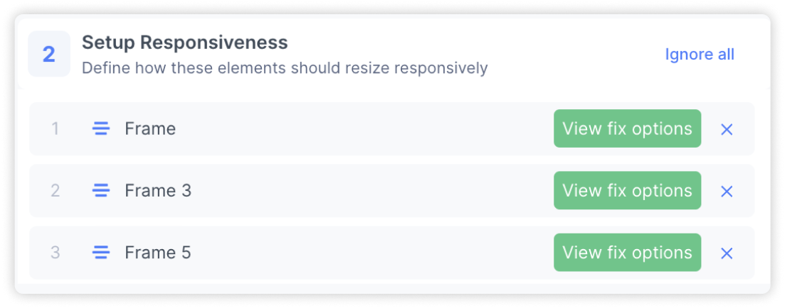
Fix the item: Select “View fix options” to start applying the fix. You’ll be taken to a screen that guides you to apply constraints, and has a live interactive preview to get instant feedback.
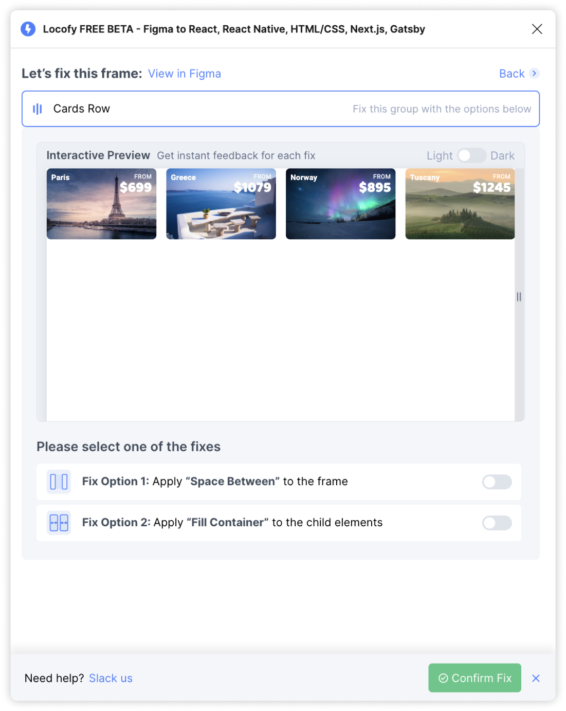
Light/Dark mode
To toggle between a white or black background, click the Light-Dark switch.
Fix options
Based on the structure of your design you will see options that you can select to make your designs responsive. View the preview to see how each option looks.
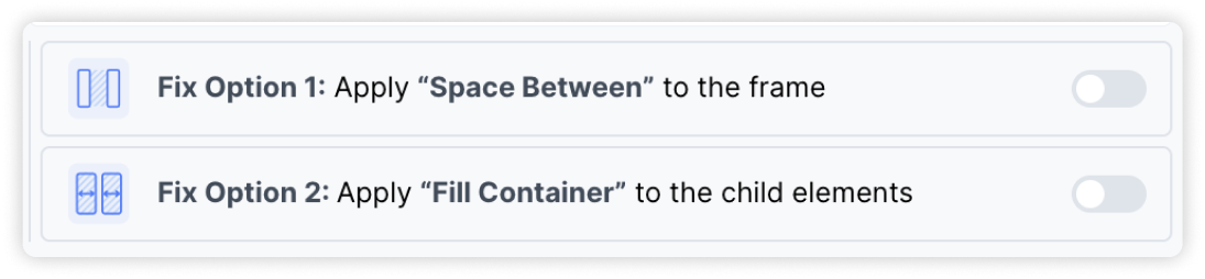
You will note two options:
- Apply “Space Between” which adjusts the gap between elements according to the screen size. The width of each element remain constant.
- Apply “Fill Container” which adjusts the width of the elements according to the screen size. The gaps between elements remain constant.
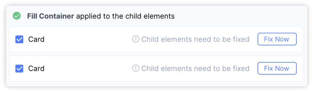
Fixing children layers: In some scenarios, you will also need to further apply responsive fixes to children layers for your whole design to be responsive. The design optimiser will notify you in such cases. You can click on “Fix Now” to expand the selection to get fix options for the child layer.
Reset
To reset your fixes, turn off the switch for the selected fix
Confirm and apply fix: Click on ‘Confirm Fix’ when done with fixes