Building Responsive Content Sections with Locofy.ai: A Step-by-Step Guide
In this guide you will learn how to build a responsive content section and sync it with your github repository containing an existing application.
Below, we have an image of our existing React application.
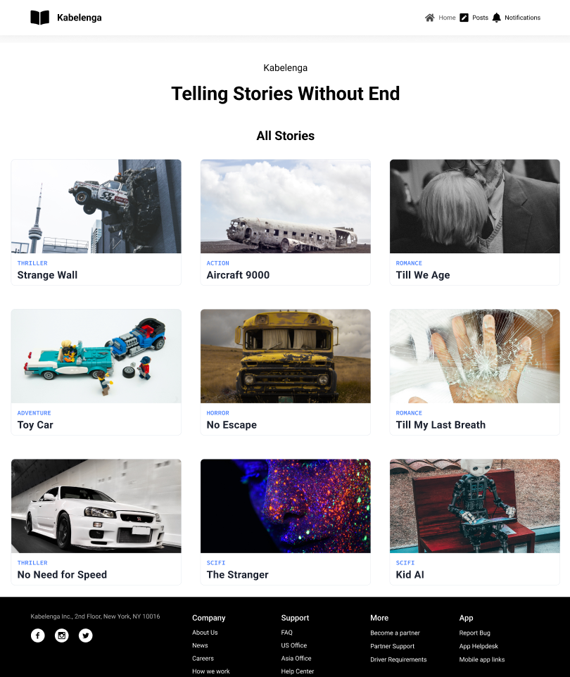
Using the power of Locofy.ai, we will add a new section to this application. The section we add will be responsive and work seamlessly with our entire blog.
Before we commence you will need two things:
- Your figma design
- An already existing application.
- Github account and repository containing your application.
- Locofy.ai account as well it’s plugin up and running on your Figma file.
Turn your design into frontend code with Locofy.ai
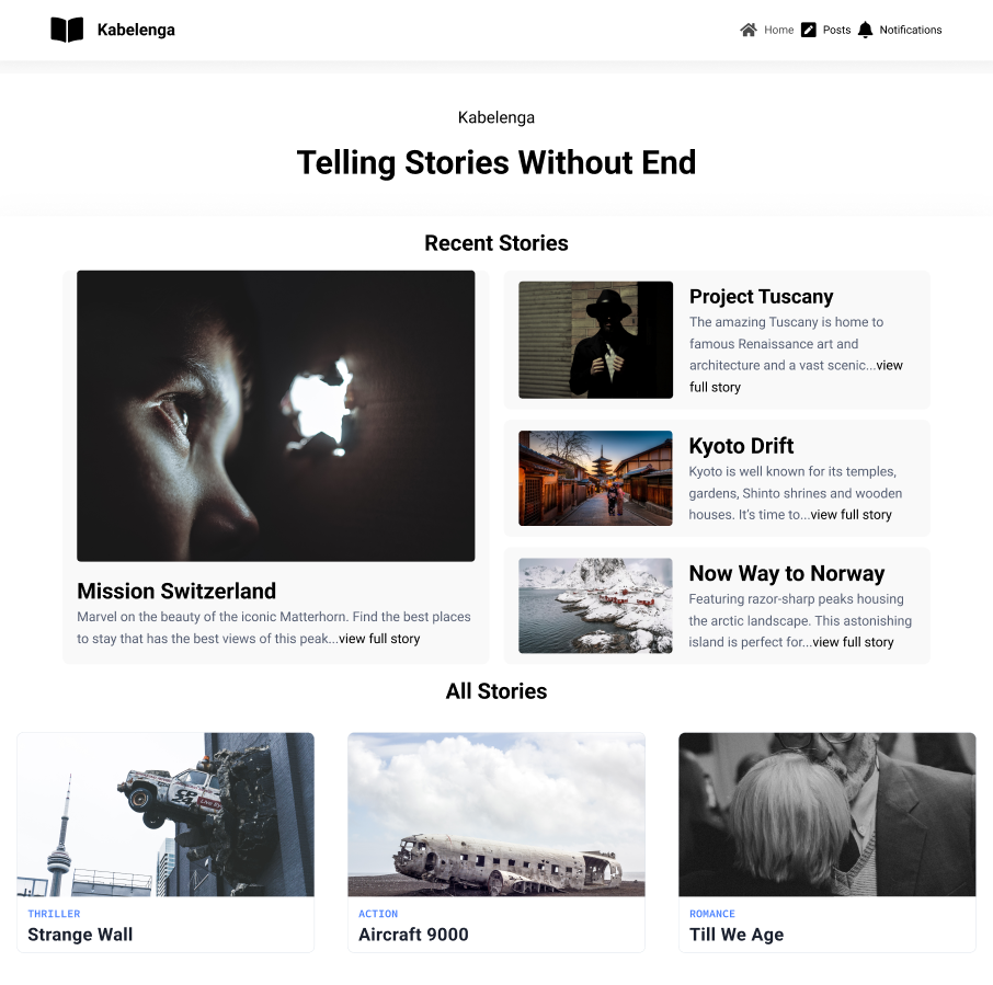
The design below contains the section that we will be adding to our application. It includes the most recent stories that users have been reading a lot..

Before we can add this to our application, we need to ensure that it is responsive. To make it responsive, we will make use of the Locofy.ai plugin.
By the end of this guide, you will learn how the step by step flow of the plugin (opens in a new tab) helps us achieve the following:

Without further ado, let’s get started.
Making the Section Responsive with Locofy
The Locofy.ai.ai plugin simplifies our work by providing steps that we can follow to make all the changes you have seen possible. Going forward, we will follow each step to achieve our goal.
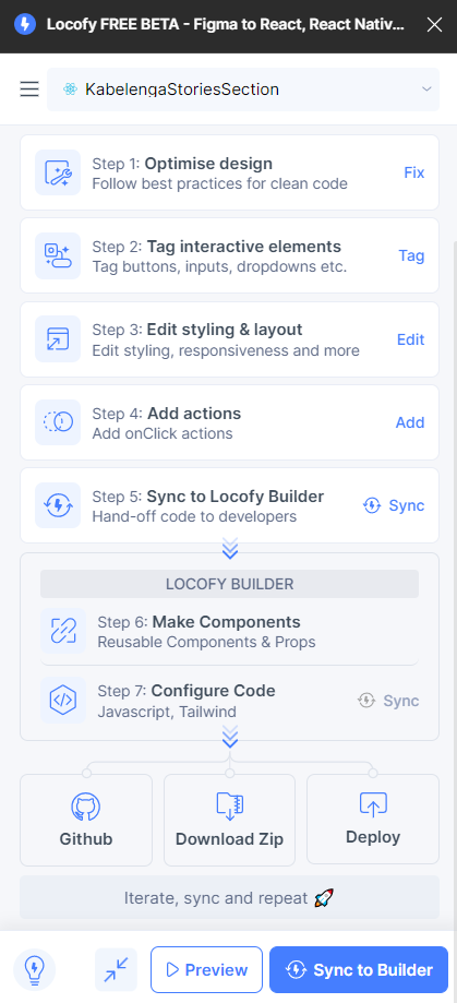
To ensure you end up with clean code and responsiveness, the first step is to click on Step 1: Optimise design (opens in a new tab). Clicking the fix button will reveal fixes suggested by Locofy.ai.
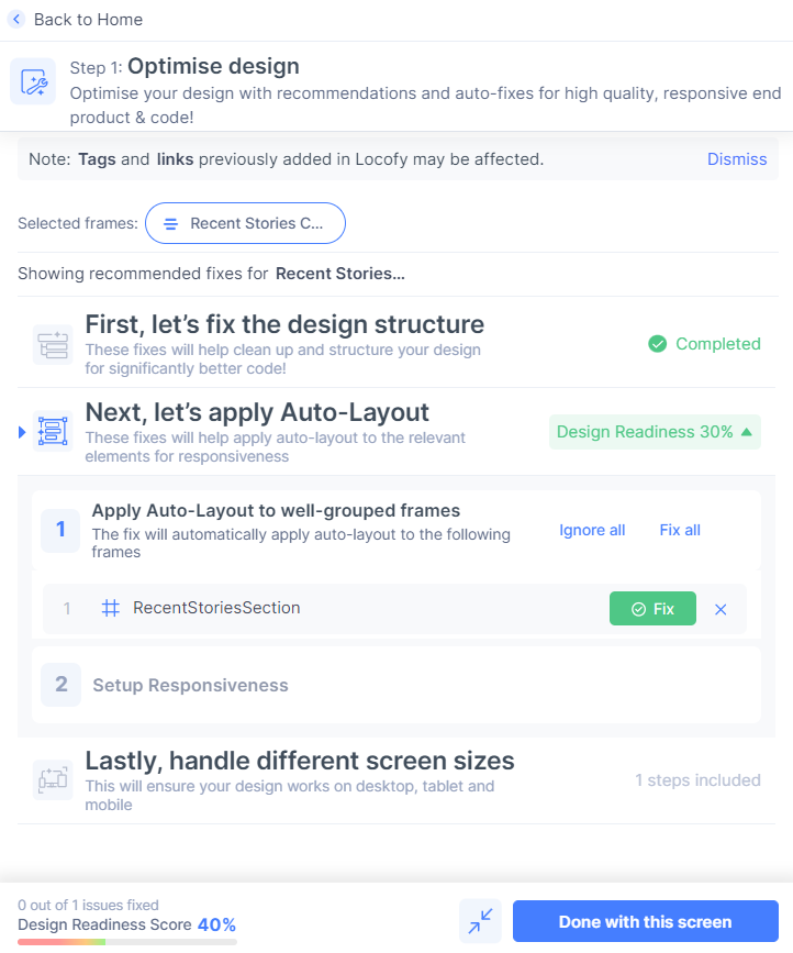
Clicking the fix button will apply autolayout to our RecentStoriesSection, which is the first step in ensuring our design will be responsive. Additionally, the optimizer suggests more fixes for us.
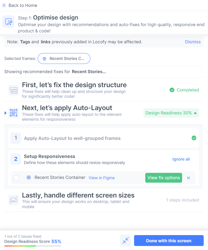
You can click the “view fix options” button to see the suggested fixes the optimizer has made for you to make your design responsive.
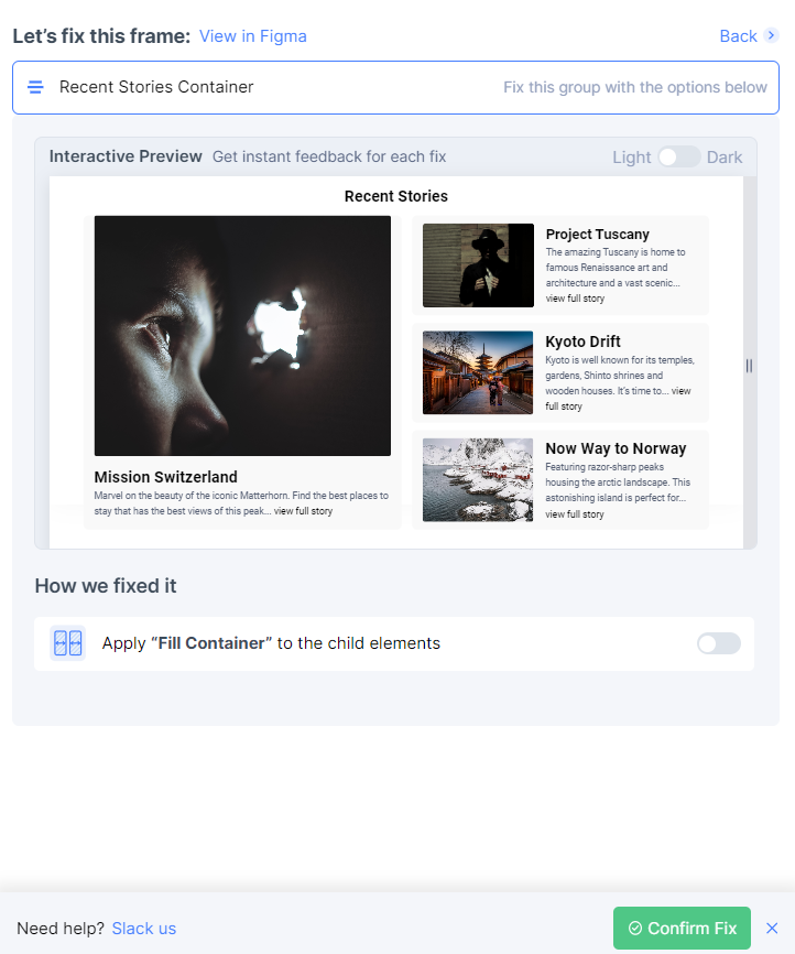
As you can see, the optimizer provides an option to toggle the "Fill Container" option. By clicking it, you will see a live preview of the changes that will be made. Upon toggling, click the "Confirm Fix" button to apply this property. Finally, click the "Done with This Screen" and "Done Fixing Designs" buttons to conclude this step.
Tagging Elements for Interactivity
To make elements in your design interactive, the second step is to click on “Tag” – Step 2: Tag interactive elements (opens in a new tab). Before clicking, choose an element you want to tag, and then click it. This will reveal the possible tags that can be applied to it.
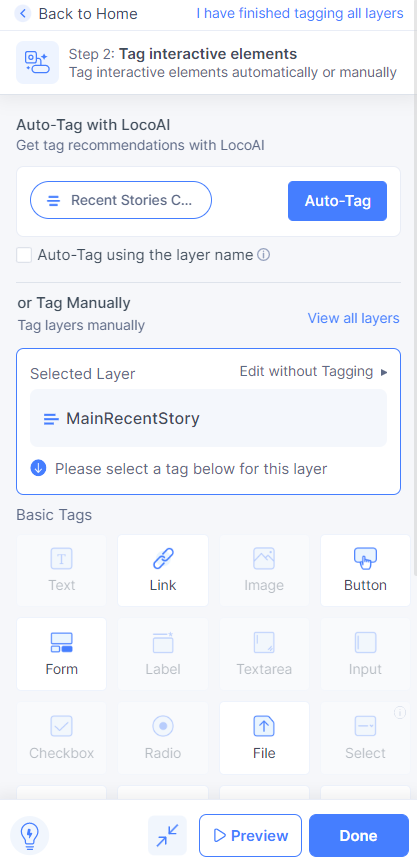
In our case we want to tag the “MainRecentStory” as a link. So, we simply click on the link tag and set the appropriate properties that meet our requirements.
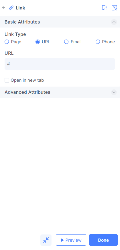
Please note that you can repeat this process to tag additional elements. Once completed, click "Done" to proceed to the next step.
Styling and Layout Editing
To manipulate how your elements behave at different screen sizes, we take advantage of Step 3: Edit styling & layout (opens in a new tab). Clicking "Edit" reveals the available options.
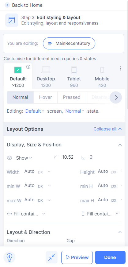
In our case, we don't need to use this step because the preview shows that our design is responsive on both mobile and desktop. However, if your design has issues on certain devices, you can use this step to control it.
Adding onClick Actions
To add onClick events to your elements, simply click on "Add" – Step 4: Add actions (opens in a new tab).
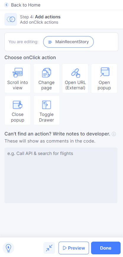
The actions shown above can be added to elements. Choose actions that best suit your requirements. In our case, we won't select any actions as we don't need them at the moment.
Syncing the Design to the Builder
To view the code, create components, and more for the design we have worked on, click on "Sync" – Step 5: Sync to Locofy Builder (opens in a new tab).
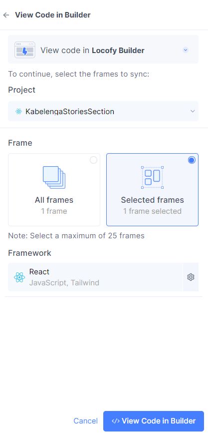
Select the frames you want to view in the builder. In our case, we only have one frame, so we select it and wait to see our code in the builder. The builder will also introduce us to the next step.
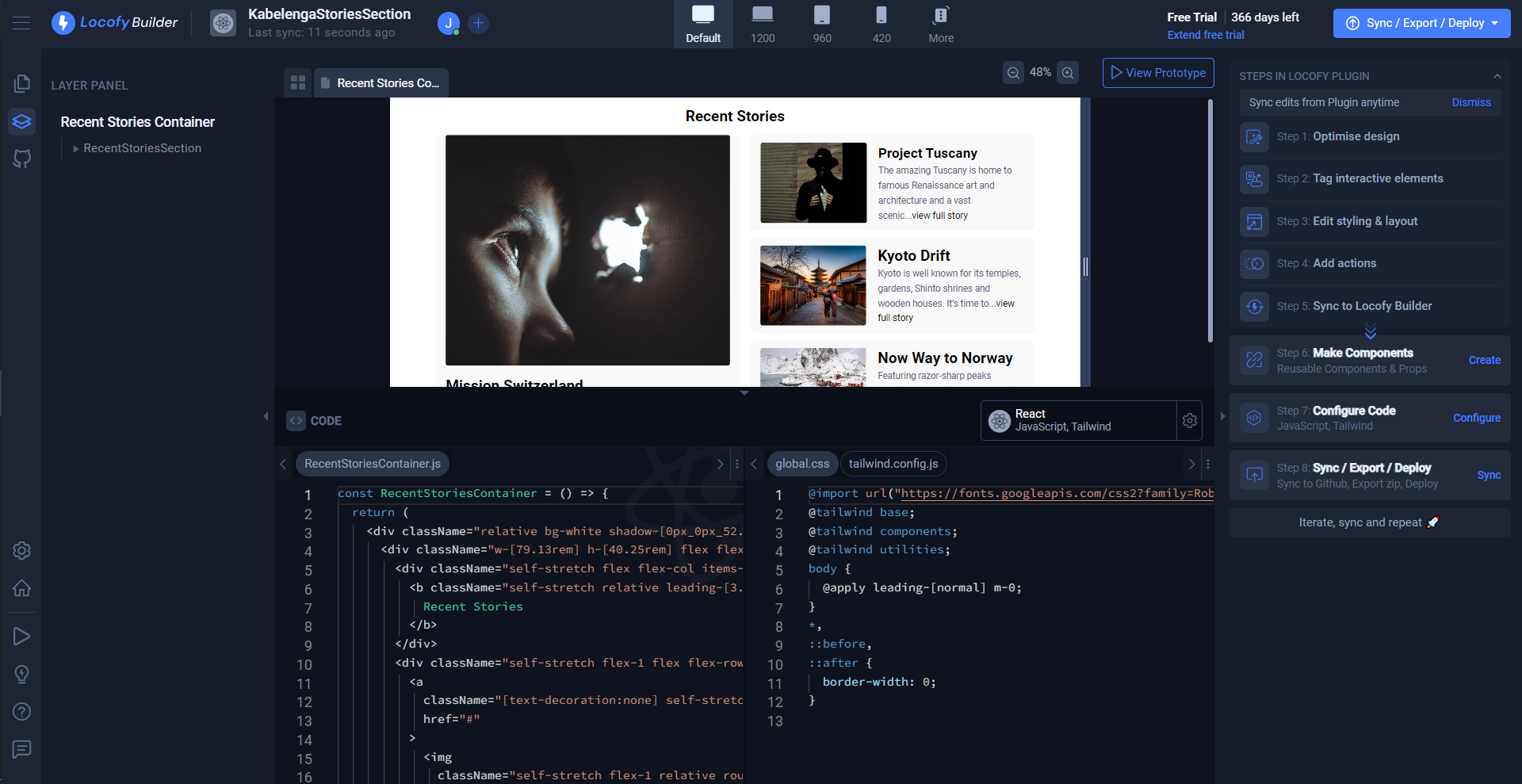
Creating Reusable Components
To create components that you can reuse, click on "Create" – Step 6: Make Components (opens in a new tab).
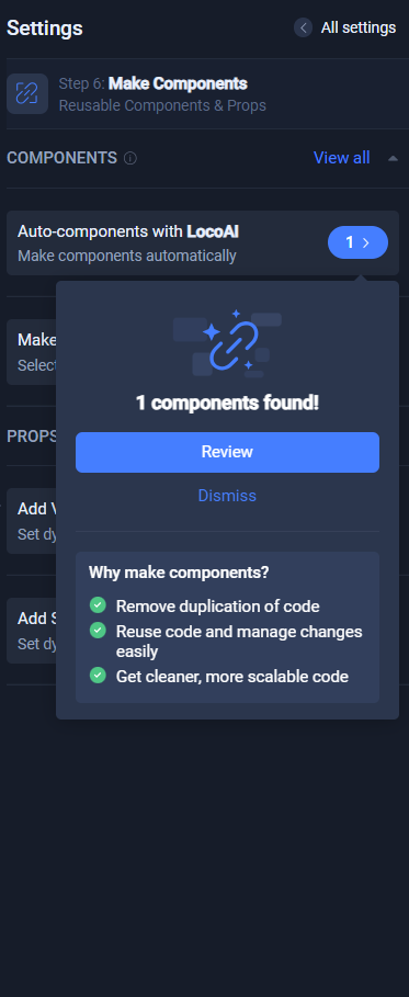
LocoAI automatically identifies certain elements and suggests them as components. You can either dismiss the components it suggests or review and edit them. In our case, we will review them.
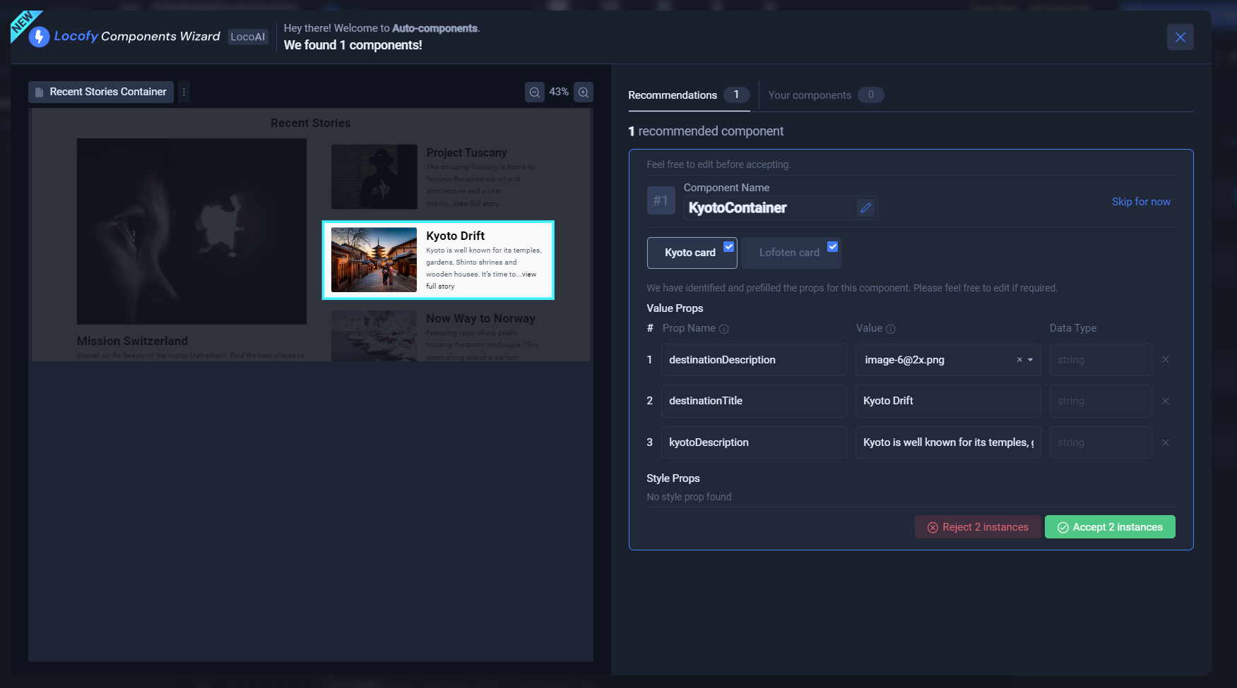
Here, you can change the properties as per your requirements. We simply accept all instances and proceed.
We want to make the RecentStoriesSection an entire component. To do this, select it, and you should see the option "Make Component" on the left side.
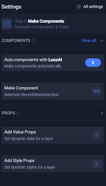
Click the blue button beside it to make it a component. This will reveal a popup that allows you to edit its name. When you are done, click "Create." Furthermore, you can edit your component by clicking the pencil icon that appears when you hover over it.
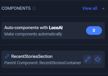
With these few steps, you have created components that you can reuse wherever you choose. Click the "All Settings" button to access all settings.
Configuring the Code
To make adjustments to your project, click "Configure" – Step 7: Configure Code (opens in a new tab).
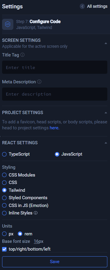
In our case, we leave these properties as they are. Feel free to change them as desired and click the save button.
Syncing/Exporting/Deploying
To download code, make it live, or sync code with your existing app, click on "Sync/Export/Deploy" – Step 8: Sync/Export/Deploy (opens in a new tab). Clicking it will reveal available options.
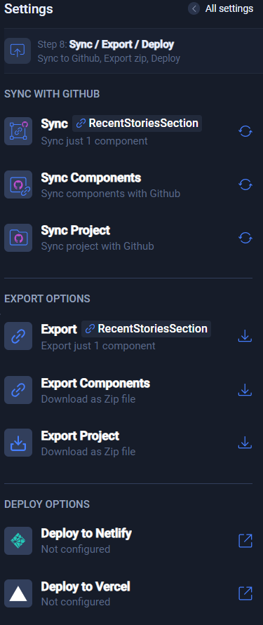
Since we want to sync our component with our GitHub repository, we will choose "Export Components." If you only want to sync one component, you can choose the first option. Clicking the sync button will prompt you to perform a few steps:
- Connect to GitHub
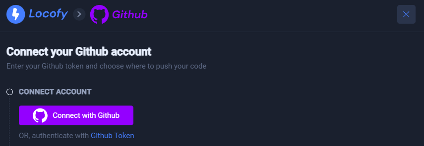
- Choose a repository
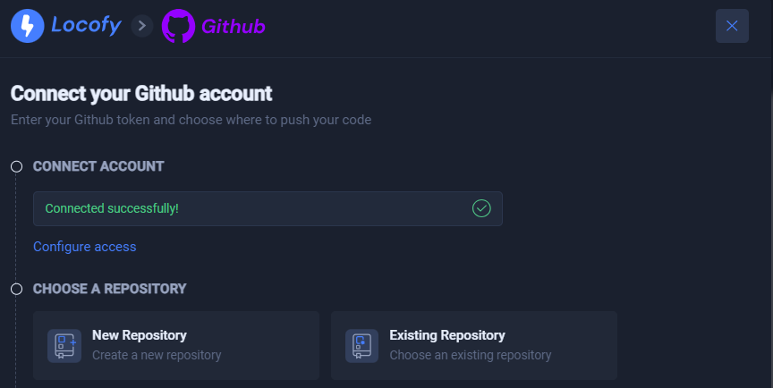
Since we already have one, we select "Existing Repository."
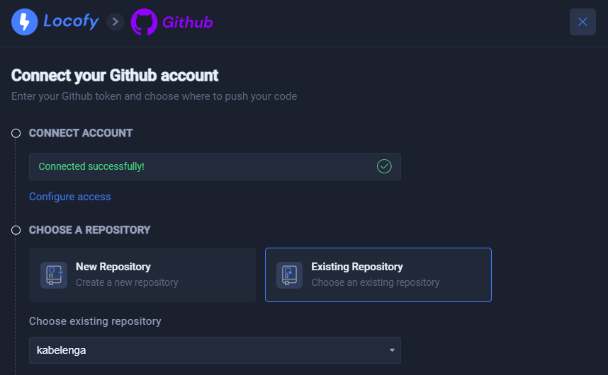
As you can see, we have even selected the repository we want to interact with.
- Choose a branch
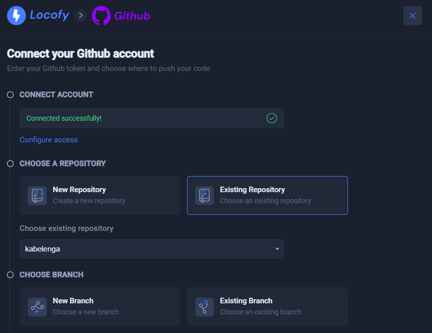
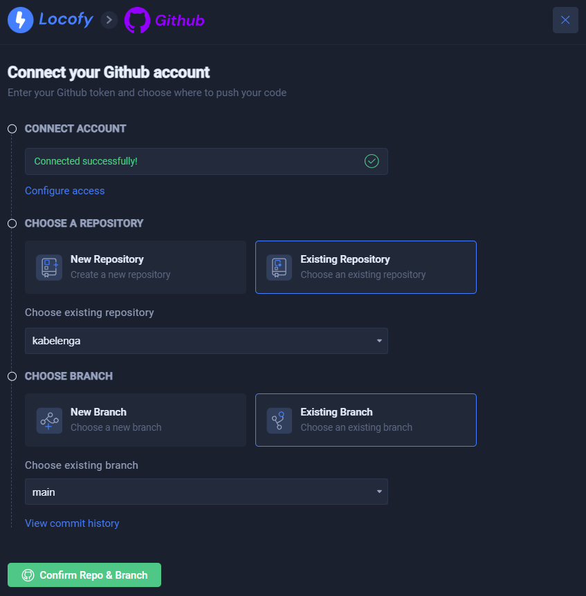
Here, we can specify the branch we want to work with. We will choose the main branch and then click the "Confirm Repo & Branch" button.
Since we exported the components, we can select the components we want and exclude those we don't want.
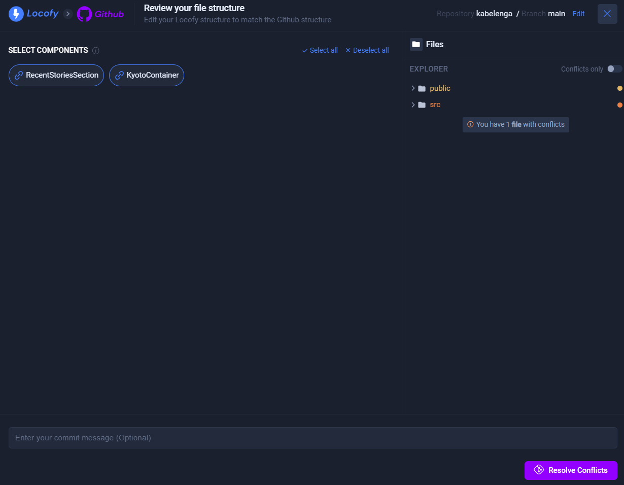
Additionally, we notice that our current code and the code in GitHub have differences. So, we click the "Resolve Conflicts" button to handle the differences.
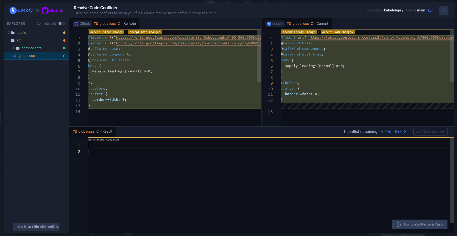
As you can see, there is a difference in the global.css files. To resolve this issue, click "Accept GitHub Change" and mark it as resolved.
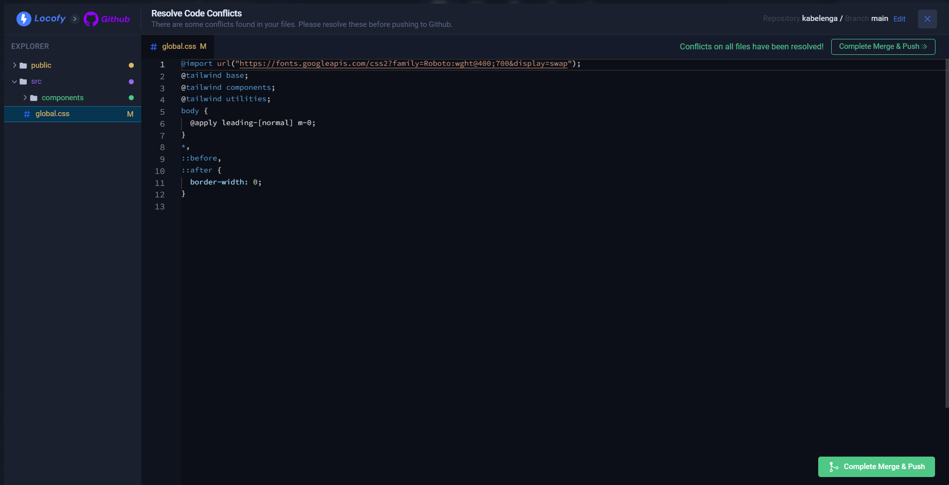
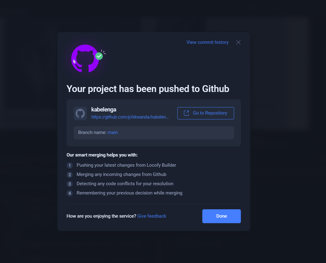
Once we click "Confirm Merge & Push," our repository and the chosen components will be in sync.
Implementing the Components in the Local Application
Now, we want to make use of the components we have added to our GitHub repository. However, before doing this, we need to add the components to our local application.
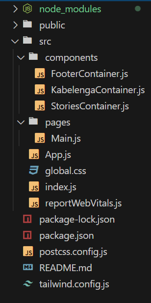
Current Local Application Folder Structure
Below, you can see the folder structure of the local app before pulling the changes from GitHub.
Updating Local Application
To update our application we can perform a “git pull” to ensure that our local files get updated.
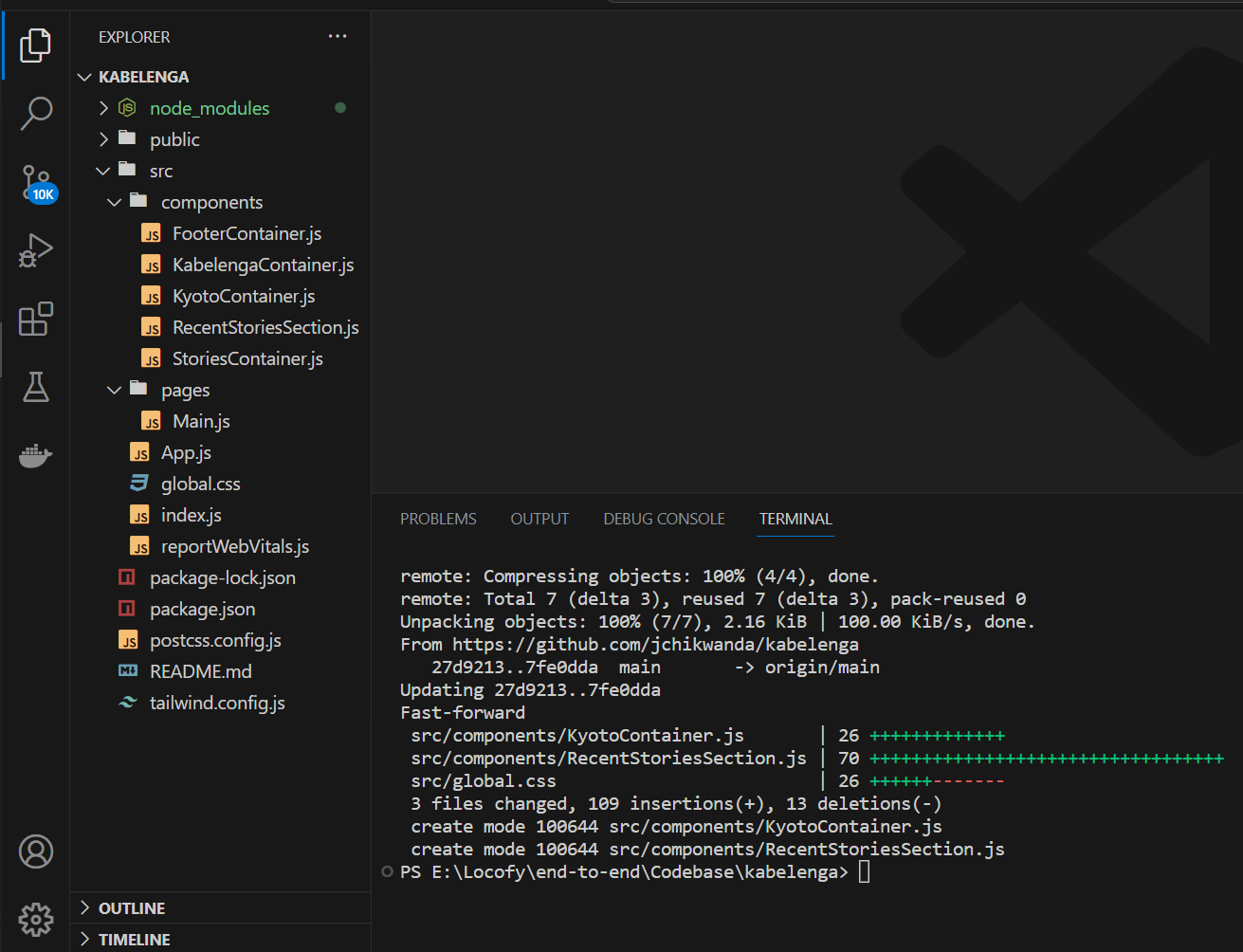
In VSCode, we can see that new components have been added, and our CSS file has been updated. The last step would be to use the component where we want it to be used.
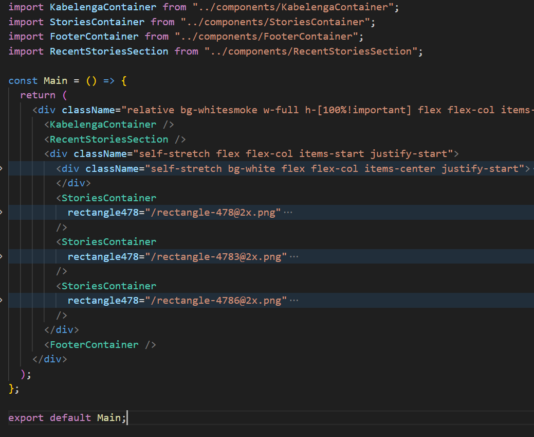
By following the steps above, you will be able to create components and add them to your existing applications easily.
