Design Optimiser for improved code quality
Use our Design Optimiser to apply best practices to your Figma designs for cleaner, more responsive code
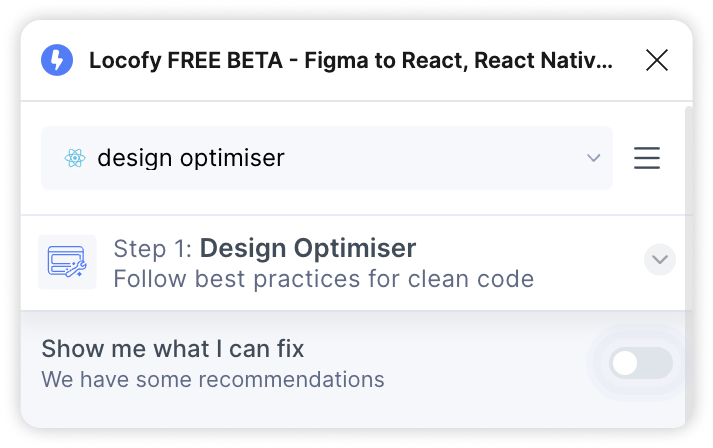
Activate the Design Optimiser
You can activate Design Optimiser by selecting a frame on your Figma file and clicking on the Design Optimiser switch. The Design Optimiser panel will open and show you recommendations after scanning through your selected design.
Design Optimiser Overview
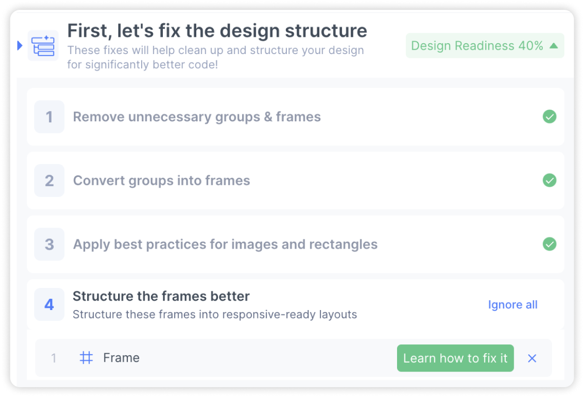
The design optimiser helps you to achieve cleaner, responsive code by applying best practices to your design in 3 steps.
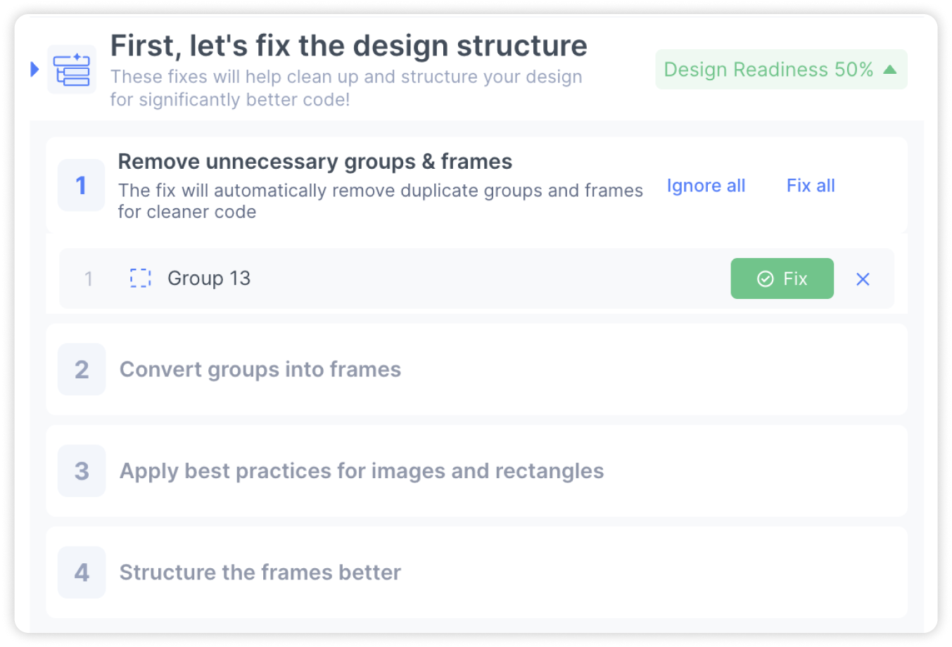
- Design structure fixes: The first step consists of four individual fixes that help you to get better layer structure. These fixes help you to:
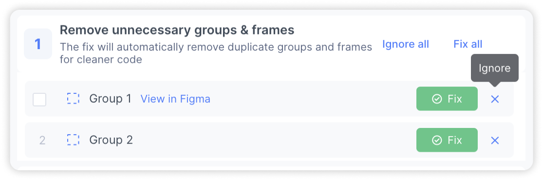
- Remove unnecessary groups & frames
- Converting groups to frames
- Apply best practices for images and rectangles
- Structure your frames better to be autolayout-ready
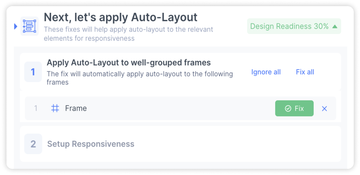
- Autolayout and Responsiveness helper: This step consists of two individual fixes that help you to implement responsiveness into your designs:
- Applying autolayout to well-structured frames
- Setup responsiveness by applying constraints
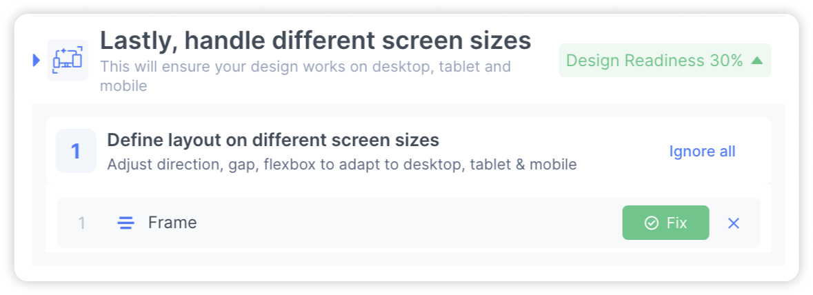
- Adapt design for different screen sizes: The last step consists of one individual fix that helps you to tailor the layout of your designs for different screen sizes such as desktop, tablets and mobile. This step is only available for web frameworks.
Individual Fixes
Here’s how each individual fix works and how you can easily apply them to your design.
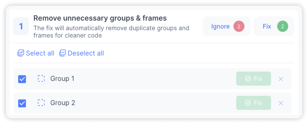
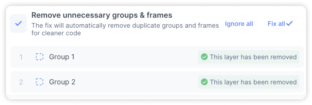
Removing redundant groups & frames
Groups and frames are considered to be “redundant” if they do not contribute to the style and structure of your design. As such, they can removed without any impact on your design. This fix helps you to detect and remove redundant groups which leads to shorter, cleaner code.
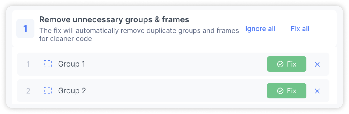
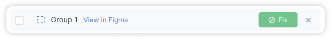
You will receive a list of layers which have been detected as redundant. You can review the suggestions and take the following actions:
-
View in Figma: Hover over an item on the list and click on “View in Figma” to locate the layer on the Figma canvas
-
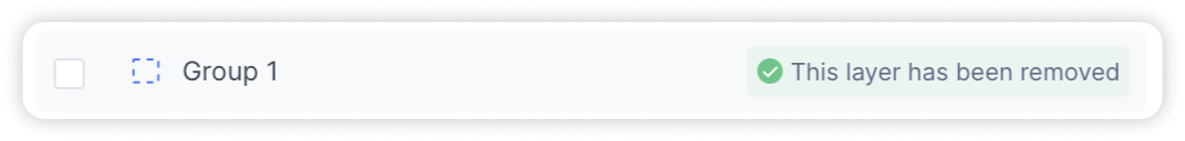
Applying the fix: Select ‘Fix’ to apply the fix for the targeted element.
-
Ignore: Select the ‘x’ icon to ignore the suggestion. The item will be removed from the list permanently.
-
Multi-Select: Hovering over an item will reveals a checkbox that can be selected for bulk actions. You can then ignore or fix them in one go.
-
Fix all/ Ignore all: Select ‘Fix all’ to apply fix on all issue items or ‘Ignore all’ to ignore all issue items and move on to the next step
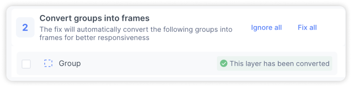
Convert groups into frames
This fix helps you to convert groups to into frames. This is necessary as frames contain additional properties that are useful when applying responsiveness.
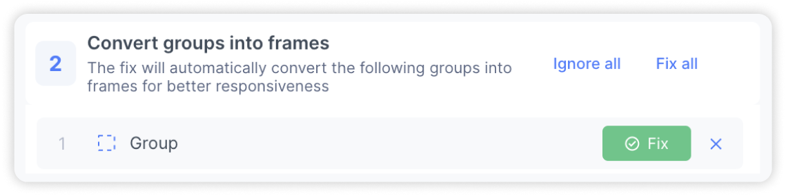
You will receive a list of groups which can be converted into frames. You can review the suggestions and take the following actions:
-
Applying the fix: Select ‘Fix’ to apply the fix for the targeted element.
You can also hover over the items to locate them in your Figma file, apply bulk actions, as well as ignore the suggestion.
Apply best practices for images and rectangles
When creating elements like buttons, cards, and more, it is common to use rectangles or images to act as the background for actual content. This is convenient during the design process, however it can lead to additional layers and additional lines of code.
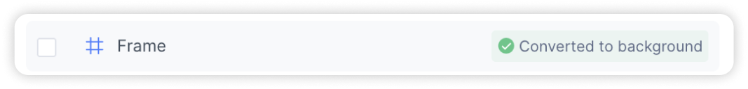
This fix helps to convert the rectangle or image into the background fill of the parent frame.
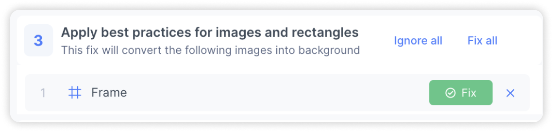
You will receive a list of frames which contain images/rectangles that should be removed. You can review the suggestions and take the following actions:
-
Fix to apply: Select ‘fix’ to convert the rectangle/image layer into the background fill for the frame
You can also hover over the items to locate them in your Figma file, apply bulk actions, as well as ignore the suggestion.
Structure your frames better
For responsive design that looks great on every possible screen size, it is important to apply auto layout. This is because auto layout defines the the position, alignment and size of each element relative to its parent, children or adjacent elements - which helps your content to reflow on different screen sizes.
When you apply auto layout to unstructured frames, it can affect the look of your design. As such, this fix helps you to better structure your frames so that auto layout can be applied safely while maintaining the integrity of the original design.
Select ‘Learn how to fix it’ to open up the panel to view the diagnosis and follow the instructions displayed on plugin to fix it.
There are 3 possible diagnosis that you will encounter:
-
Inconsistent alignment. This occurs when the elements in the frame do not share a common top, centre or bottom alignment.
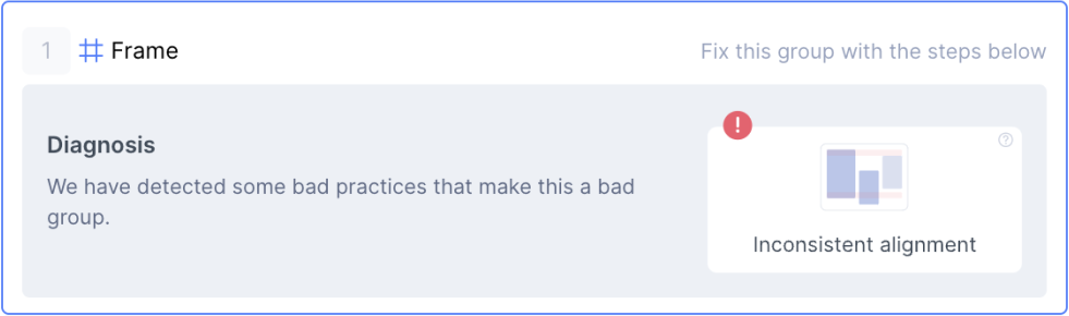
Follow instructions in the plugin to ensure that elements are aligned. You may have to split the elements into further groups.
-
Inconsistent gap. This occurs when the gap between the elements in the frame are not constant
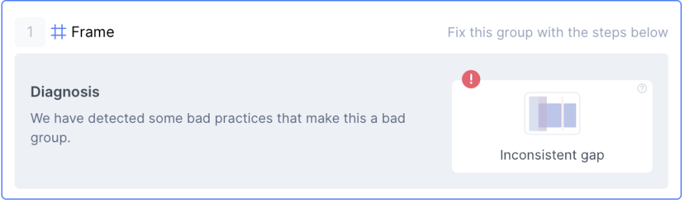
Follow instructions in the plugin to ensure that gap between all the elements are constant. You may have to split the elements into further groups.
-
Three possible issues. In this scenario, the design optimiser detected three possible issues:
-
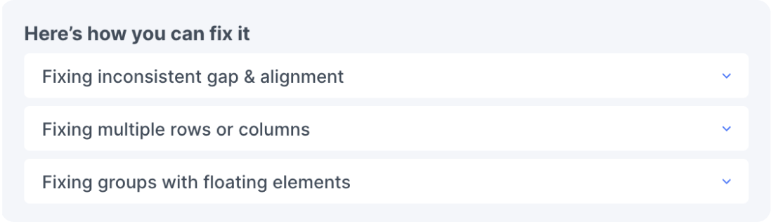
Inconsistent gap and alignment
-
Multiple rows or columns
-
With floating elements
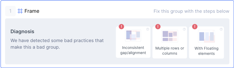
You will need to assess which of this issue applies to your frame and open the respective accordion to find the steps to fix it.
-
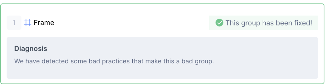
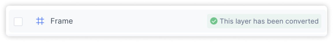
Recheck: Once you have followed the instructions to apply the fix, click the ‘Recheck’ button to check if any issues remain. You will be shown the new diagnosis if some issues remain, otherwise, you will see the green status screen.
-
Done: Click on ‘I’ve Fixed it! Proceed’ when done with the fixes or click the ‘x’ to ignore this item

Convert well-grouped frames to Auto layout
When applying Figma auto layout, it can result in some movement in your design and may not preserve some properties. This fix helps you to apply auto layout to well-structured frames while preserving properties so that it looks the same as your original design.
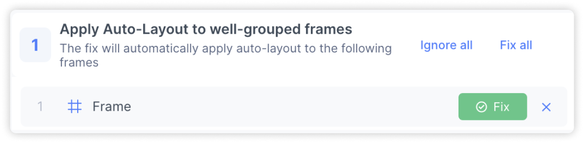
You will receive a list of frames which contain images/rectangles that should be removed. You can review the suggestions and take the following actions:
-
Applying the fix: Select ‘Fix’ to apply the fix for the targeted element.
You can also hover over the items to locate them in your Figma file, apply bulk actions, as well as ignore the suggestion.
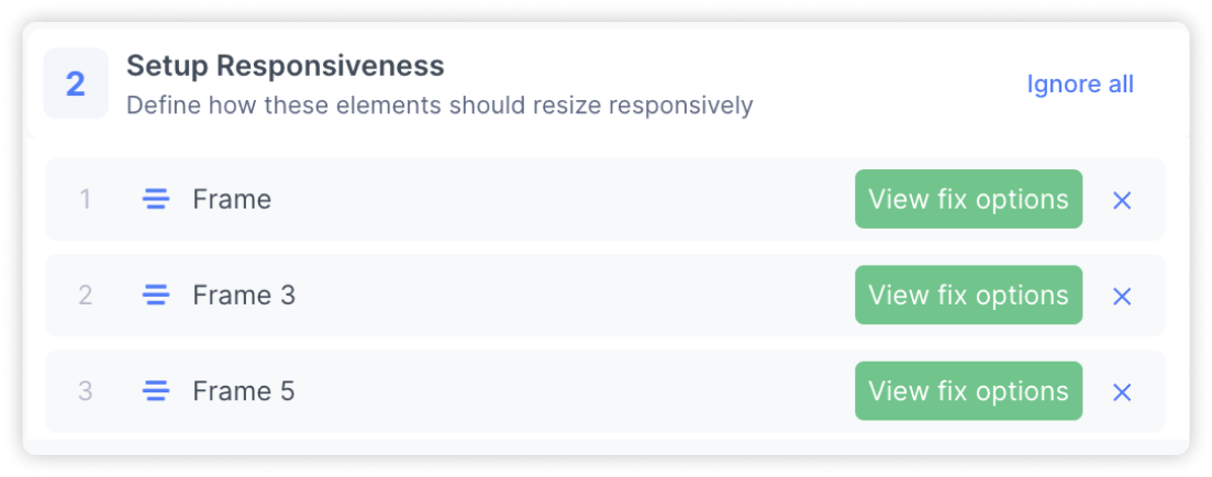
Setup Responsiveness Settings
After applying auto layout to your frames, this helps you to apply responsiveness, so that your frames respond to changes in the screen size.
-
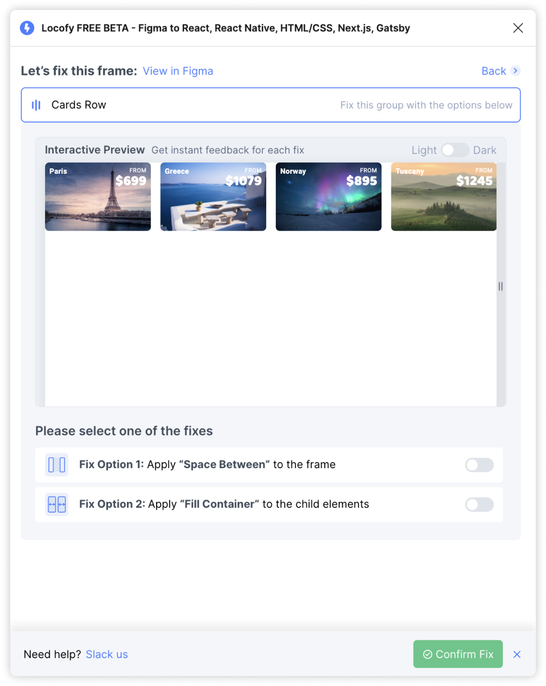
Fix the item: Select “View fix options” to start applying the fix. You’ll be taken to a screen that guides you to apply constraints, and has a live interactive preview to get instant feedback.
-
Light/Dark mode: To toggle between a white or black background, click the Light-Dark switch.
-
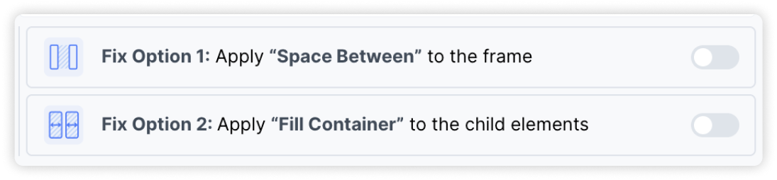
Fix options: Based on the structure of your design you will see options that you can select to make your designs responsive. View the preview to see how each option looks.
-
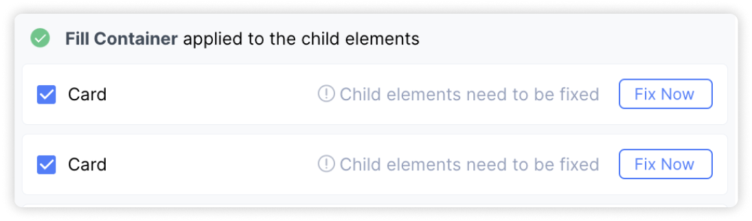
Fixing children layers: In some scenarios, you will also need to further apply responsive fixes to children layers for your whole design to be responsive. The design optimiser will notify you in such cases. You can click on “Fix Now” to expand the selection to get fix options for the child layer.
-
Reset: To reset your fixes, turn off the switch for the selected fix
-
Confirm and apply fix: Click on ‘Confirm Fix’ when done with fixes
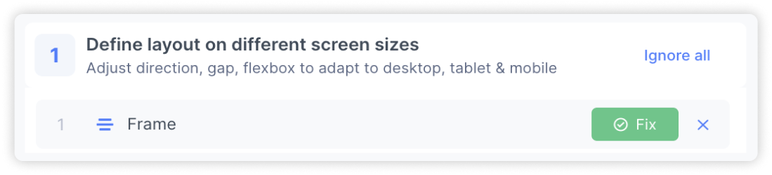
Define layout on different screen sizes
After completing the previous steps, your screen is now responsive. However, there may be cases where your design still breaks down and you need to change the layout on smaller devices. This fix detects and assists you to handle such cases.
-
Applying the fix: Click the ‘Fix’ button to open up the fixing panel
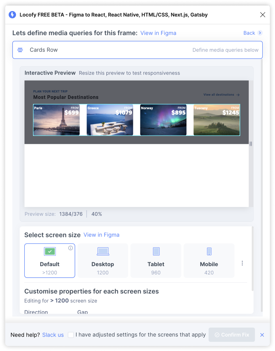
-
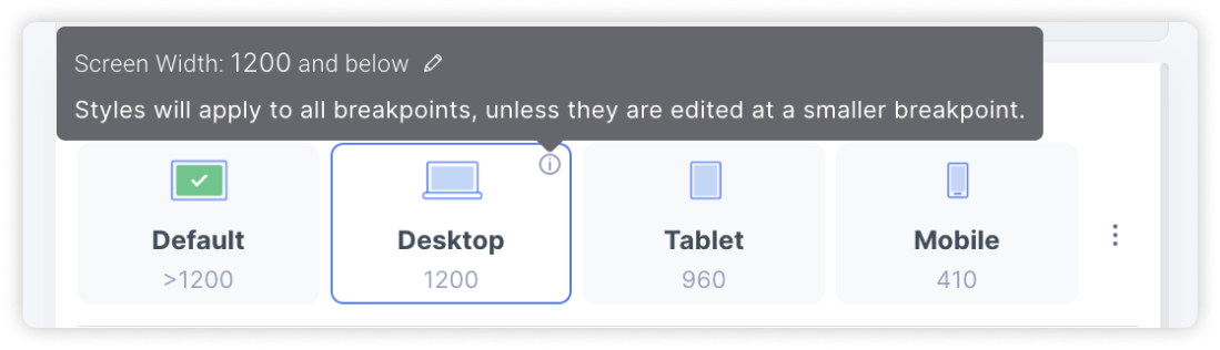
Screen size tabs: Click on the tabs to preview your design at the different screen widths. To change the screen width, hover over the tooltip and click on the pencil edit icon to modify the media query screen size
-
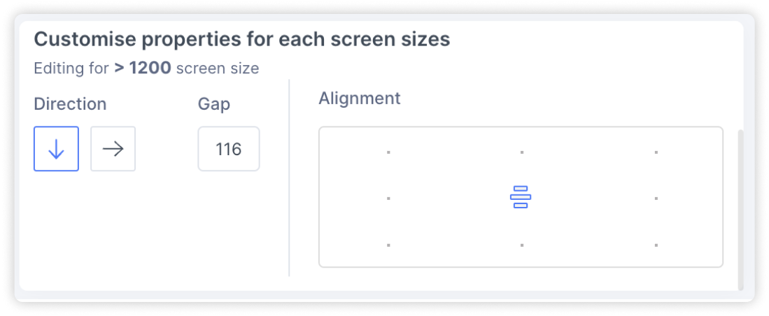
Customising properties: At each screen size, you can change the stacking direction for the elements, the gap spacing between elements and the alignment. This let’s you adjust the layout of your design for different screen widths.
-
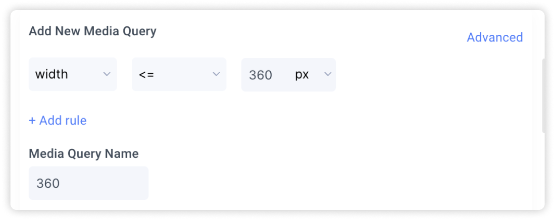
Adding new custom screen sizes: To add new custom screen sizes, select the icon with the 3 dots. Then, define your new media query and assign it a name for easy reference.
-
Confirm fix: Once you have checked the preview and are happy with the settings applied, select the checkbox to indicate that you’ve adjusted your design for all the different screen sizes. Then, click on ‘Confirm Fix’