Drag and Drop basics
Drag and drop pre-built components into your Figma canvas. Working with UI Libraries and custom components is now easier than ever.
Locofy now supports Drag and Drop for the following UI Libraries:
- Material UI
- Ant Design
- Boostrap
- Chakra UI

Introduction to Drag and Drop
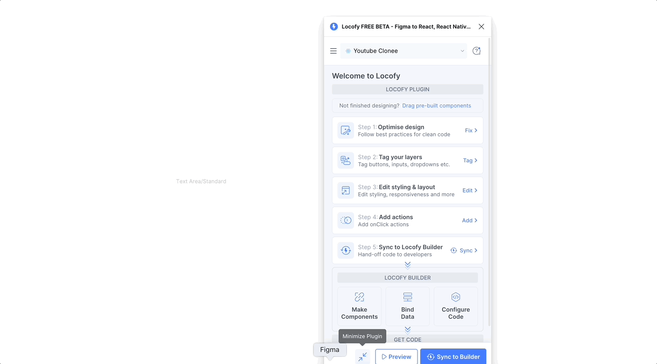
Locofy reads your design to generate fully functional code with working inputs, checkboxes, dropdowns etc. There are two ways in which Locofy is able to understand your design to accomplish this.
Drag and Drop
Simply drag a component from Locofy plugin into your Figma canvas.
Every component in the Drag and drop widget has actual code associated with it. Hence when you add it out into your Figma canvas, Locofy is able to understand and generate functional code for your design.
With Drag and drop, You no longer need to create the layers manually in Figma and style them - you can simply drag it into the file.
You can also ensure that the design in your Figma file matches the code for the components
Tagging
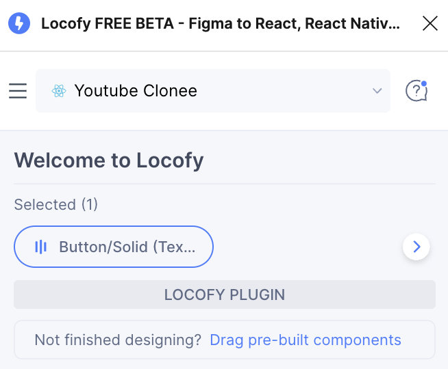
You can select an existing layer on your canvas and select the appropriate tag from Locofy plugin.
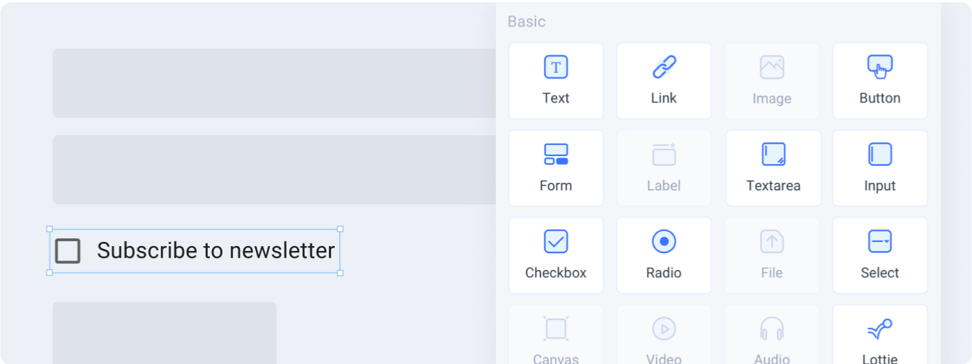
Click on the Drag and drop widget to expand it and view the components which you can add to your design.
Currently we support popular UI Libraries such as Material UI, Ant design, Vuetify, Bootstrap and Chakra UI. Soon, you will also be able add your own UI code components to the gallery to drag and drop into your design.
Categories Sidebar
Components are organised into categories, you can view all the categories on the sidebar of the Drag & drop widget. You can click the arrow at the top of the sidebar to expand it and view the category titles.
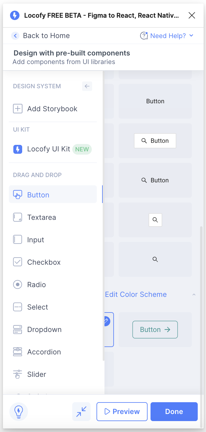
From the sidebar, select the category to view all the components available for it.
Dragging and Dropping a component
To add a component to your Figma design using Drag and Drop:
-
Navigate to the category of your desired component and find the variation you want to use. Click and drag it from the Locofy plugin into your Figma file
-
You can then further customize the component as shown in the section below.
-
Once you have completed the customization, click ‘Done’ to complete the process.
-
You have successfully dragged and dropped a component into your Figma design and customized it according to your requirements.
Editing drag and dropped components
To edit a component that has been dropped on your canvas, you can simply select it. You will be taken to the settings page to continue customizing it.
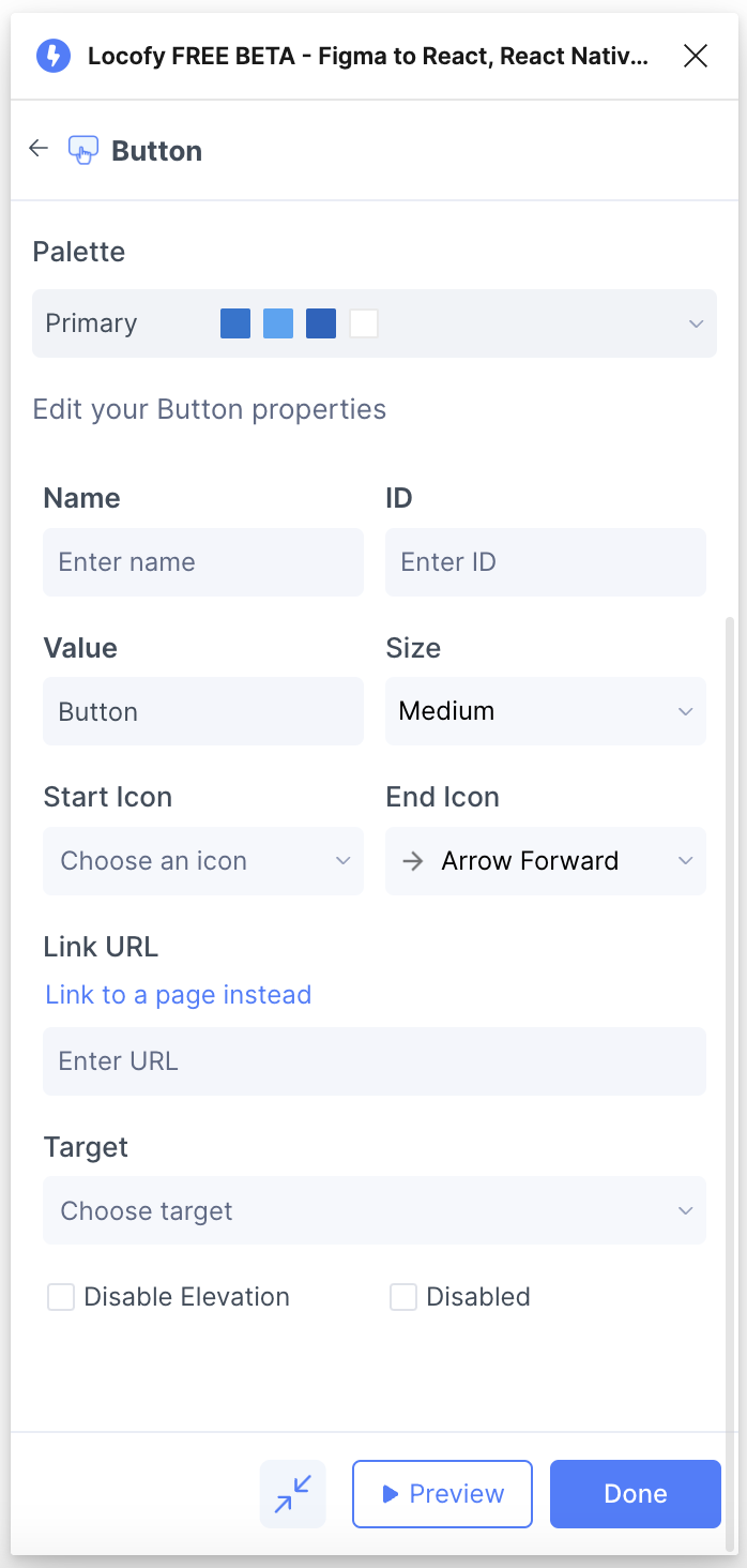
Theming allows for a customized, consistent look across all your elements from the same UI Library.
Currently we support theming for Material UI which offers a robust theming system. You can edit the theme for your components by selecting the edit icon.
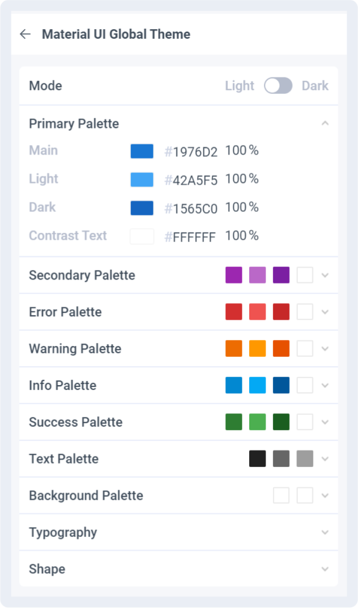
The theming menu will open for you to customize your theme.
UI Library theming is consistent across your entire project. Changes made will reflect in drag and dropped components, as well as manually tagged components.