Manual Prop Mapping
When Locofy turns Figma into code, it needs to know which values from the design should flow into which props on your real components. Manual prop mapping is how you teach Locofy that connection—through the Figma plugin, through locofy.config.json in your repo, or both.
Quick overview: push your components to Locofy
Most teams keep components in Git and sync them with the Locofy CLI:
- Install the CLI globally (
npm install @locofy/cli -g). - From your repo root, run
locofy initto createlocofy.config.json(see What islocofy.config.json? below). - Run
locofy pushto upload your component library to Locofy. - In the Locofy Figma plugin, open your project and use I have completed all the steps so the pushed components appear for mapping.
For the full CLI walkthrough, see Import components using the Locofy CLI. If you prefer videos or third-party walkthroughs, search the web for Locofy push—many results follow this same init → push → plugin flow.
Why manual prop mapping exists
Design and engineering often describe the same UI with different surfaces:
- Your Figma team uses component properties in the right sidebar (variants, booleans, text, instance swap) and layers inside the component.
- Your code team defines props on React, Angular, or other components.
Locofy has to bridge the two. When a value is exposed as a Figma component property, mapping is usually straightforward: you point a code prop at that property by name. When a value only lives as nested layers, repeated frames, or patterns Figma cannot express as a single property (for example, lists), you teach Locofy with config.layer, layer naming conventions, or—for custom logic—mapFn.
Map props in five steps
- Import or push your code components (CLI or GitHub).
- Match each code component to a Figma component (Locate Mode in the plugin, or
figmaComponentNamein config). - For props backed by Figma’s Properties panel, set
figmaPropName(andvalueMappingwhen labels differ from code). - For props that come from the layer tree, align Figma layers with your props (layer naming), use
config.layer, ormapFnfor derived or array data. - Sync and generate screens; adjust in Builder or the plugin until previews match your design system.
On this page: What is locofy.config.json? · AI mapping (plugin export) · Vocabulary · Code & Figma setup · Plugin UI · Config reference · How detection works · Full ProductCard example · Complex mapFn →
What is locofy.config.json?
locofy.config.json is a JSON file at the root of your repository that tells Locofy which files are components and what each prop looks like (name, type, and how to read values from Figma).
Typical structure:
- Top level: optional
framework,projectId,projectName, optionalwrapper,webpack,publicPath, and acomponentsarray. - Each component entry:
path(source file),name(exported component), optionalfigmaComponentName,figmaPageName, and apropsarray. - Each prop:
name,type(string,number,boolean,enum,object,array,node,function, …), optionalrequired, optionalpreviewValue(sample value so Locofy can preview the component in the plugin Props mapping screen—skip it if you do not need that preview), plus mapping fields such asfigmaPropName,valueMapping,config.layer, orconfig.mapFn.
How the file gets there
locofy init(Locofy CLI) creates the file and starter entries when you wire a repo to Locofy.locofy pushsends that config and your components to Locofy—keep the file in version control so design and engineering share one source of truth.- AI-assisted mapping uses an export from the Locofy plugin plus an AI assistant in your repo to draft or update prop entries (below).
Paths in the JSON must be relative to the project root. A concise table of top-level keys is in Locofy config file.
AI-assisted mapping (export from plugin)
Locofy can package Figma metadata (JSON) and a Markdown prompt so an AI in your local repo can generate or refine locofy.config.json mappings for you. You do not need Locofy MCP for this flow.
Prerequisites
locofy inithas been run in your local repository solocofy.config.jsonexists at the project root.- The Locofy Figma plugin is open and the correct Locofy project is selected.
- An AI coding assistant that can read the exported prompt and edit files in your repo—for example Cursor (Agent), Claude Code, GitHub Copilot / Codex, or another tool you use with your codebase.
- A way to unzip the bundle the plugin downloads.
How it works
- Run
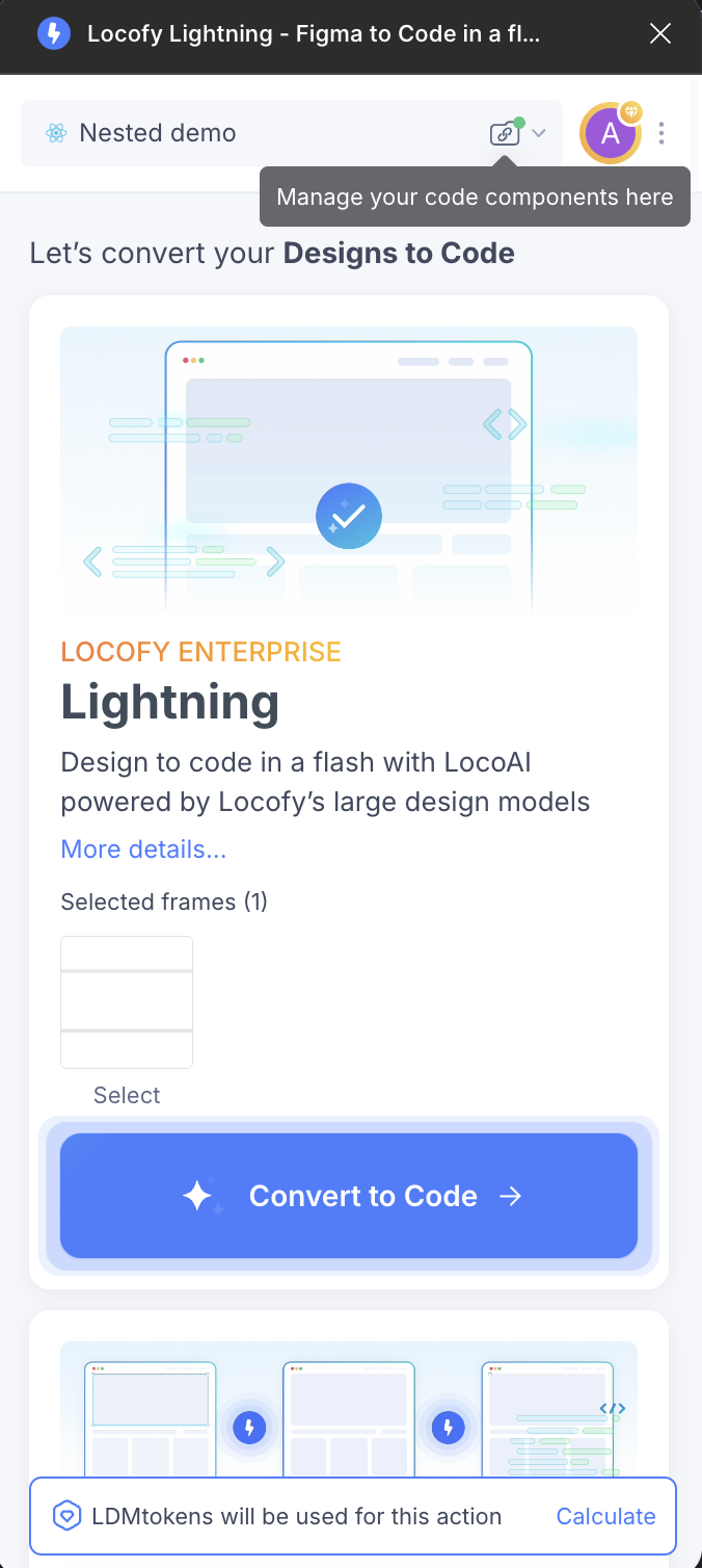
locofy initin your repo if you have not already, and keeplocofy.config.jsonunder version control. - In the Locofy Figma plugin, select your Locofy project.
- Click the folder icon next to the project name. You will see two options:
- Custom component library — import/sync components and map props inside the plugin (see Mapping via UI in Plugin).
- Export data for mapping — download a ZIP used for AI-assisted mapping (this section).
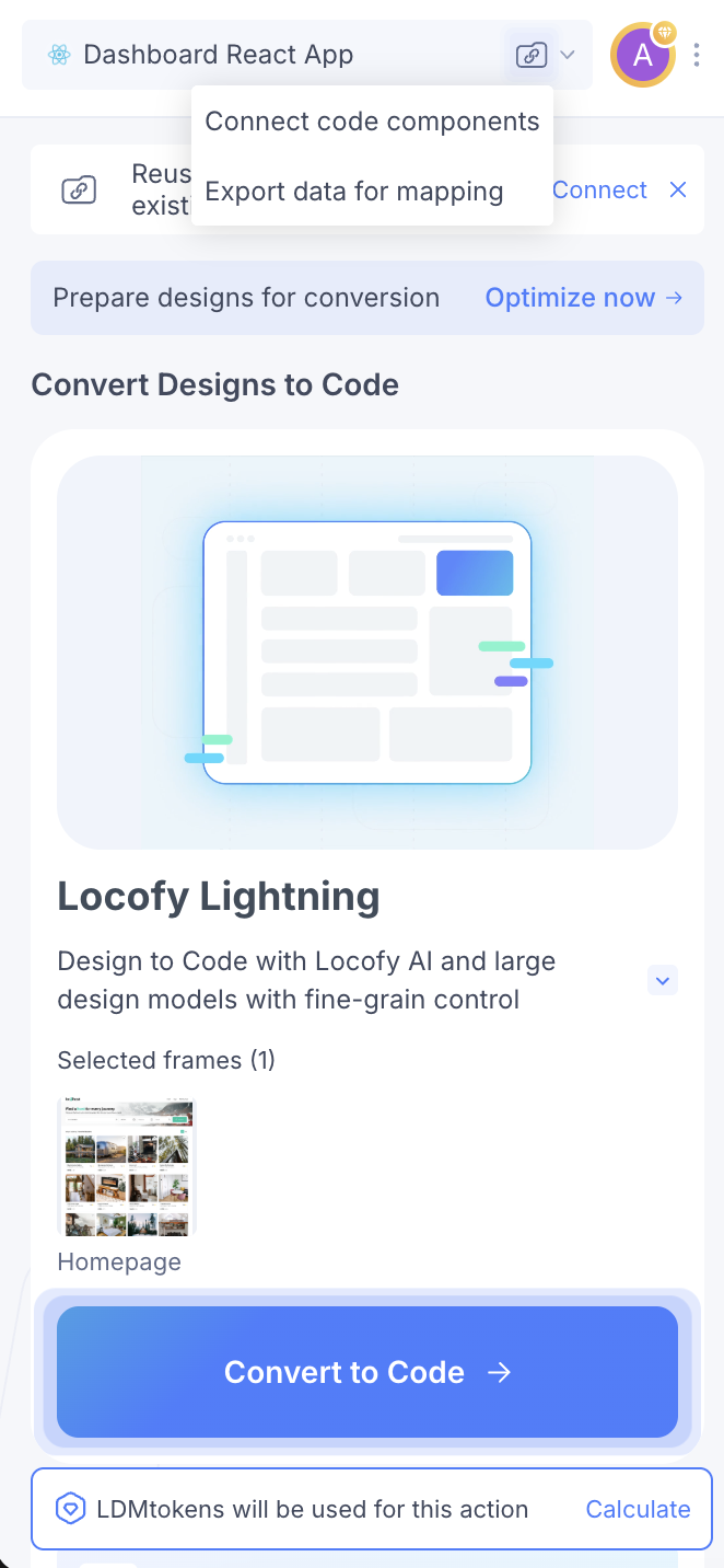
- Choose Export data for mapping.
- In the export screen, choose the scope of what to send—for example one or more components, the entire current page, or the whole Figma file—then click Export.
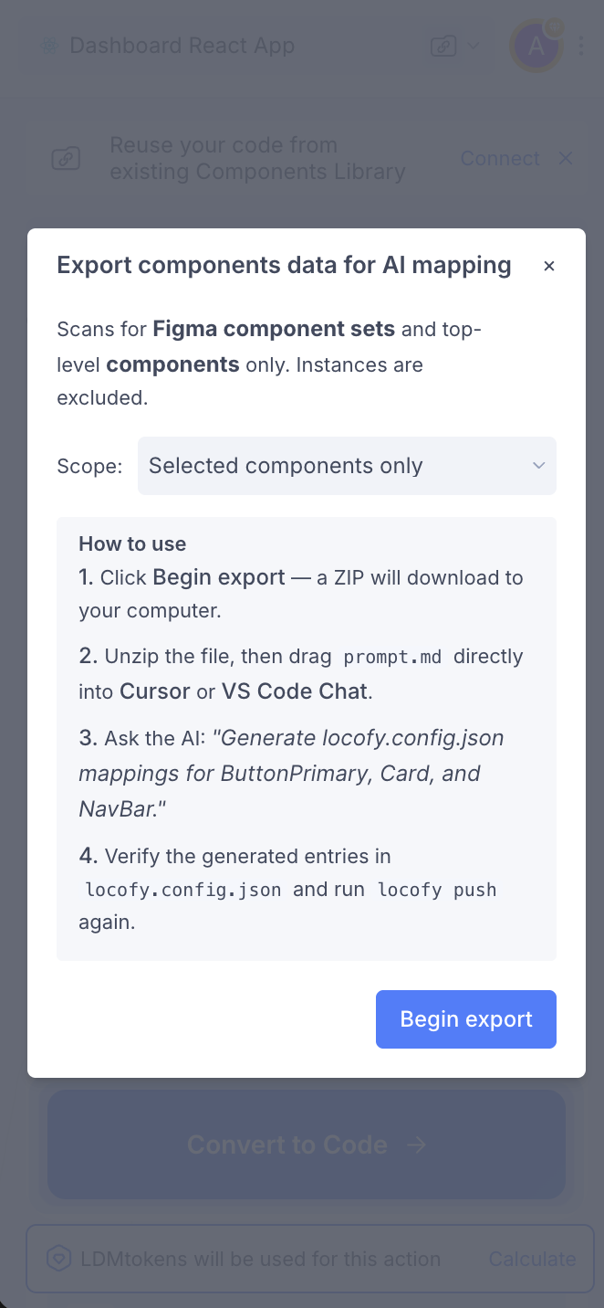
- Unzip the download. Inside you will find Figma metadata as JSON plus a Markdown prompt file with instructions for generating mapping in
locofy.config.json. - Open your local repository in your AI tool, attach or @-mention that Markdown prompt (and any JSON the prompt tells you to include).
- Follow the prompt’s steps, then ask in plain language—for example: Map my
Buttoncomponent or Update mapping forProductCard—so the assistant can read your code and Figma export and editlocofy.config.json. - Review the diff, adjust if needed, commit, and run
locofy pushwhen you want Locofy to pick up the updated config.
The mapping vocabulary (how Figma meets code)
| Concept | Plain language | Where it lives |
|---|---|---|
Code prop name | The prop on your component (title, variant, item). | props[].name |
type (for example string) | What kind of value Locofy should read or write (text, number, array, object, …). | props[].type |
figmaComponentName | The exact name of the Figma component or component set this code component should attach to. | Component entry |
figmaPropName | One row from Figma’s Properties sidebar (spelling, spaces, and capitalization must match). | Prop entry |
valueMapping | When Figma’s labels differ from code (Primary vs primary), maps code values to the Figma labels Locofy should expect. | Prop entry (common for enum / boolean) |
config.layer | Binds a prop to named layers inside the instance—especially when there is no Figma component property, or to disambiguate duplicate layer names. | props[].config.layer |
config.mapFn | A small expression that walks the Figma tree—for example building an array from child TEXT layers. | props[].config — see Complex prop mapping (mapFn) |
String props usually come from Figma text properties, text layers, or images (use attr: "src" on the prop when binding image fills). Enum / variant props typically use figmaPropName plus valueMapping. Objects and arrays often combine config.layer, layer naming, or mapFn when Figma has no single “array property.”
The sections below are the full reference: field tables, React and Angular samples, detection order, and end-to-end examples.
Code component
import { FunctionComponent } from "react";
import styles from "./Card.module.css";

export type CardProp = {
  badge: string;
  item: {
    name: string;
    image: string;
    rating: number;
    locations: {
      name: string;
    }[];
  };
};

const Card: FunctionComponent<CardProp> = ({ badge, item }) => {
  return (
    <div className={styles.card}>
      <span className={styles.badge}>{badge}</span>
      <h3>{item.name}</h3>
      {/* ... */}
    </div>
  );
};

export default Card;
In these examples, the component and its properties are already defined. Next, create matching layers in your Figma component.
Figma component
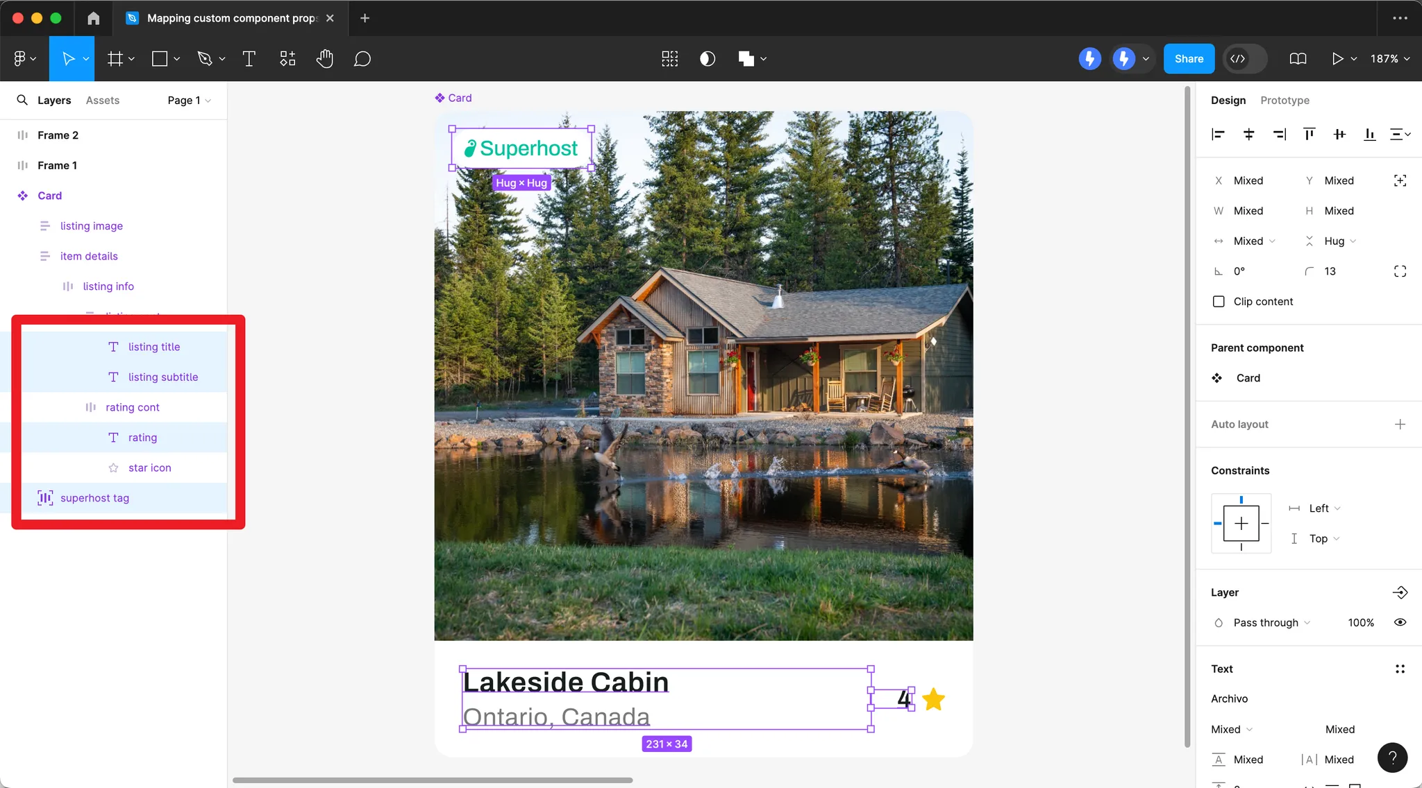
Create Figma layers that correspond to your component props (e.g. badge, item name, rating, locations).
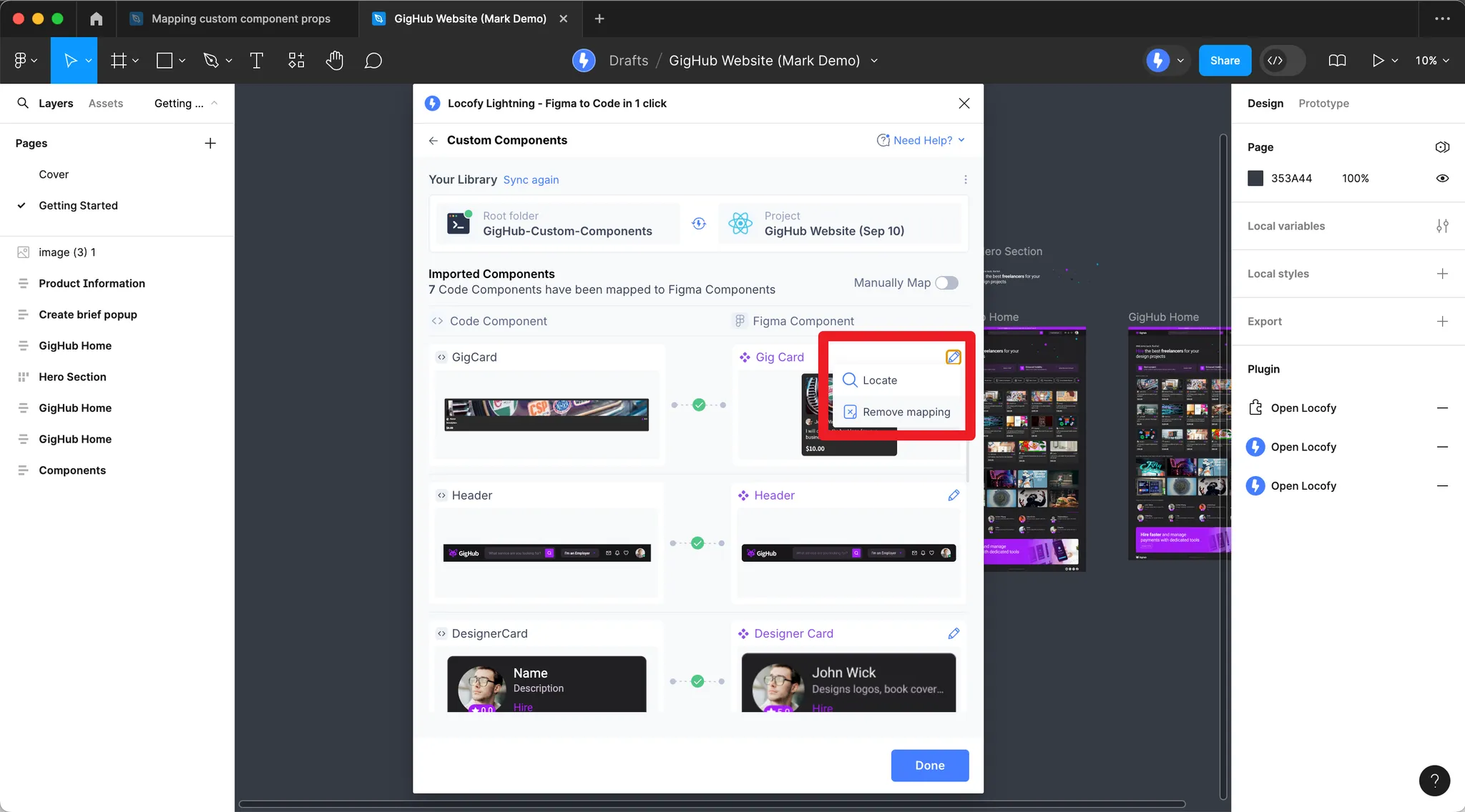
Mapping via UI in Plugin
-
After pushing your components, click the folder icon next to the project name. Choose Custom component library to map props in the plugin (for Export data for mapping and AI, see AI-assisted mapping).
-
Click the pencil icon, then Props mapping.
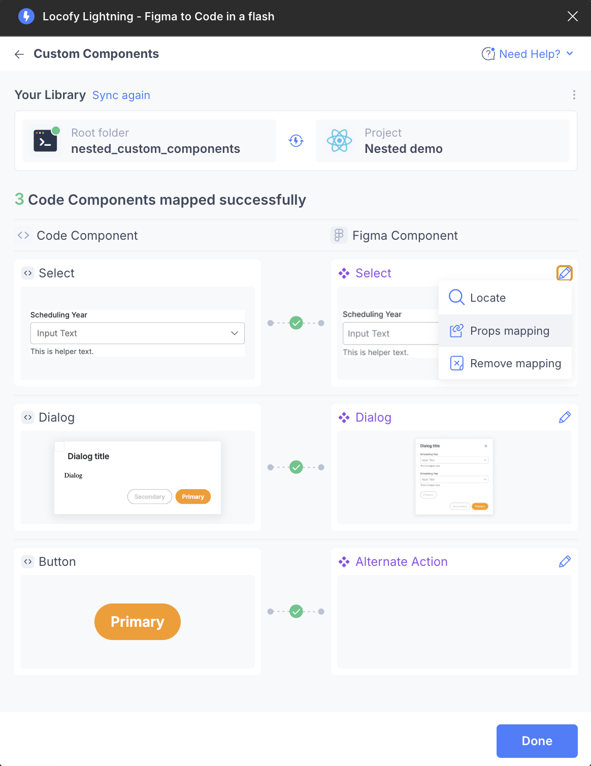
-
Map your code component props to Figma component values.
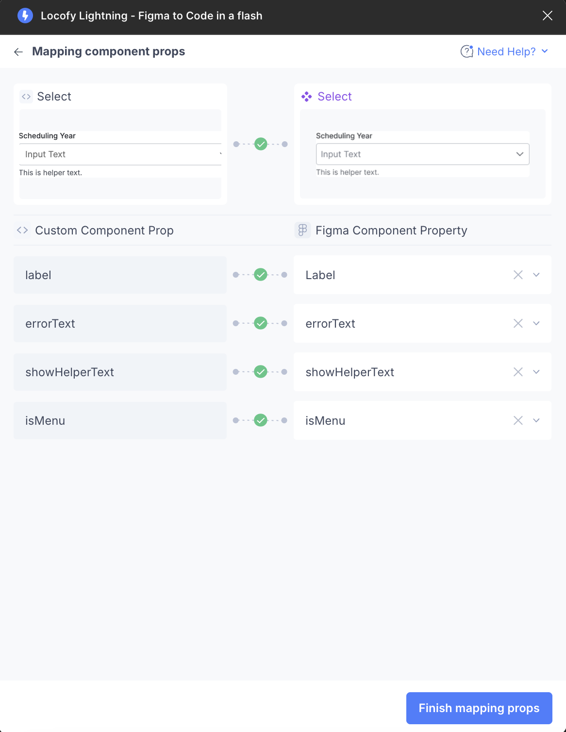
Once all properties are mapped, you will see a green tick between each custom component prop and Figma component property. You do not need to map all props—optional ones can be left unmapped.

Mapping via locofy.config.json
Detailed locofy.config.json reference below—the overview and vocabulary sections above summarize the same ideas.
Each component has path, name, optional figmaComponentName / figmaPageName, and props. Optional top-level keys include framework, projectId, and projectName. Each prop sets type and any of figmaPropName, valueMapping, config.layer (with parent / grandParent when needed), attr, skip, config.nodeKind (Angular slots), optional previewValue (for Props mapping previews in the plugin only), or config.mapFn (mapFn guide). Use the plugin for quick mapping; use the file to keep mappings in Git.
{
  "components": [
    {
      "path": "./src/components/Card.tsx",
      "name": "Card",
      "props": [
        {
          "name": "className",
          "type": "string",
          "required": false
        },
        {
          "name": "badge",
          "type": "string",
          "required": false,
          "previewValue": "Superhost"
        },
        {
          "name": "item",
          "type": "object",
          "required": true,
          "previewValue": {
            "name": "Cozy Studio",
            "image": "https://images.unsplash.com/photo-1502672260266-1c1ef2d93688?w=800&q=80",
            "rating": 4.9,
            "locations": [{ "name": "Downtown" }]
          }
        }
      ]
    }
  ],
  "framework": "react",
  "projectId": "2mYKttmuPiV11gUqXAU7Krha1Pn",
  "projectName": "Website project"
}
Component- and prop-level fields
| Field | Scope | Purpose |
|---|---|---|
figmaComponentName | Component | Match this code component to a Figma component (or component set) by exact name. |
figmaPageName | Component | Optional. Figma page name (e.g. a design-system page). Locofy can look up a component such as Icon on that page when resolving the mapping. |
figmaPropName | Prop | Match a Figma component property (text, boolean, variant, etc.). |
valueMapping | Prop (often enum / boolean) | Map code values to Figma labels (e.g. "primary" → ["Primary"]). |
config.layer | Prop | Declarative binding: array of layer specs { "name": "LayerName", "parent": "DirectParentFrame", "grandParent": "OptionalAncestorFrame" }. See config.layer: parent and grandparent below. |
config.mapFn | Prop | Expression-based mapping — see Complex prop mapping (mapFn). |
config.nodeKind | Prop | Angular only: for type: "node", "slot" marks the layer as an ng-content-style slot. Not used for React / Vue. |
attr | Prop | For image-like values, e.g. "src" on a layer bound as an image. |
skip | Prop | true skips automatic mapping for that prop (e.g. className). |
previewValue | Prop | Optional sample value Locofy uses only to render component previews in the plugin Props mapping screen. |
For Angular node + attr: "slot" + mapFn (pick which child maps to a slot), see Angular: named slot on the mapFn guide.
config.layer parent and grandparent
Each entry in config.layer can use:
| Key | When to use |
|---|---|
name | Required. Layer name to bind (exact match). |
parent | Optional. Name of a direct or containing frame/group so Locofy picks the right layer when the same name appears in multiple places (e.g. Label under Header vs under Footer). |
grandParent | Optional. Another ancestor name to narrow further when parent alone is not enough (e.g. Icon under Toolbar inside Sidebar). |
name only — layer is unique in the instance:
"config": { "layer": [{ "name": "Label" }] }With parent — disambiguate nested layers:
"config": { "layer": [{ "name": "Label", "parent": "Header" }] }With parent and grandParent — deeper path (e.g. design system structure Sidebar → Toolbar → Icon):
"config": {
  "layer": [{ "name": "Icon", "parent": "Toolbar", "grandParent": "Sidebar" }]
}
Figma component properties and locofy.config.json
In Figma, open your component or component set and use the right sidebar Properties list. Each row (variant, text, boolean, instance swap, etc.) has a name Locofy can match. In config, set figmaComponentName to the Figma component or component set name, and set figmaPropName on each prop to the exact property label from that panel (spacing and capitalization matter). Use figmaPageName when the component name is not unique across the file—for example, to look for Icon on your Design System page only. Use valueMapping when Figma’s option labels differ from your code (Primary vs primary, True vs true, etc.).
Example 1 — Button: variants, boolean, and text property
Figma (component set Button)
| Property in Figma panel | Type | What the designer sees |
|---|---|---|
Variant | Variant | Primary, Ghost |
Show icon | Boolean | True / False |
Label | Text | Editable string (drives the text layer wired to that property) |
Same component in locofy.config.json
The code prop names (variant, showIcon, children) are yours; figmaPropName is what ties them to Figma. valueMapping maps code values to Figma’s variant/boolean labels.
{
  "path": "./src/components/Button.tsx",
  "name": "Button",
  "figmaComponentName": "Button",
  "props": [
    {
      "name": "variant",
      "figmaPropName": "Variant",
      "type": "enum",
      "enum": ["primary", "ghost"],
      "valueMapping": { "primary": ["Primary"], "ghost": ["Ghost"] }
    },
    {
      "name": "showIcon",
      "figmaPropName": "Show icon",
      "type": "boolean",
      "valueMapping": { "true": ["True"], "false": ["False"] }
    },
    {
      "name": "children",
      "figmaPropName": "Label",
      "type": "string",
      "config": { "layer": [{ "name": "Label" }] }
    },
    { "name": "onClick", "type": "function" }
  ]
}
children here is bound to the Label text property and the layer named Label via config.layer, so generated code picks up text from the instance correctly.
Example 2 — Listing card: mix of Figma properties and layers
Figma (component Listing-item)
| Source | Name | Type | Role |
|---|---|---|---|
| Component property | Show superhost | Boolean | Maps with figmaPropName + valueMapping |
| Component property | Title | Text | String prop |
| Component property | Address | Text | String prop |
| Component property | Liked | Boolean | Boolean prop |
| Component property | State | Variant | String prop (variant value) |
| Layer in the instance | listingName, rating, price, … | — | Bound with config.layer when not exposed as a top-level property |
| Image fill / layer | listing01ImageIcon | — | Image prop with "attr": "src" |
Matching locofy.config.json (excerpt)
{
  "path": "./src/components/ListingItem.tsx",
  "name": "ListingItem",
  "figmaComponentName": "Listing-item",
  "props": [
    { "name": "className", "type": "string", "skip": true },
    {
      "name": "showSuperhostTag",
      "figmaPropName": "Show superhost",
      "type": "boolean",
      "valueMapping": { "true": ["True"], "false": ["False"] }
    },
    {
      "name": "listingName",
      "figmaPropName": "Title",
      "type": "string",
      "config": { "layer": [{ "name": "listingName" }] }
    },
    {
      "name": "listingAddress",
      "figmaPropName": "Address",
      "type": "string",
      "config": { "layer": [{ "name": "listingAddress" }] }
    },
    {
      "name": "rating",
      "type": "string",
      "config": { "layer": [{ "name": "rating" }] }
    },
    {
      "name": "price",
      "type": "string",
      "config": { "layer": [{ "name": "price" }] }
    },
    {
      "name": "listingImage",
      "type": "string",
      "attr": "src",
      "previewValue": "https://randomuser.me/api/portraits/men/32.jpg",
      "config": { "layer": [{ "name": "listing01ImageIcon" }] }
    },
    {
      "name": "liked",
      "figmaPropName": "Liked",
      "type": "boolean",
      "valueMapping": { "true": ["True"], "false": ["False"] }
    },
    {
      "name": "state",
      "figmaPropName": "State",
      "type": "string"
    }
  ]
}
Props that only exist as named layers inside the component still use config.layer (and optional figmaPropName when you also sync with a property).
Example 3 — Header links: no Figma “array” property
Figma has no array component property. You define nav items as layers (e.g. a frame nav links containing TEXT children) and derive the array in config with mapFn:
Figma (structure)
- Instance of component
Header - Layer path:
nav links→ child TEXT nodes = “Home”, “Listings”, …
Config
{
  "name": "links",
  "type": "array",
  "required": true,
  "previewValue": [{ "name": "Home", "href": "/" }],
  "config": {
    "mapFn": "query('nav links').children.filter(t => t.type === 'TEXT' && t.visible).map(t => ({ name: t.text, href: '/' + t.text.replaceAll(' ', '-').toLowerCase() }))"
  }
}
See Complex prop mapping (mapFn) for the helpers available inside mapFn.
Locofy can automatically detect properties you have not manually mapped. For example, the image property may be inferred from layer content.
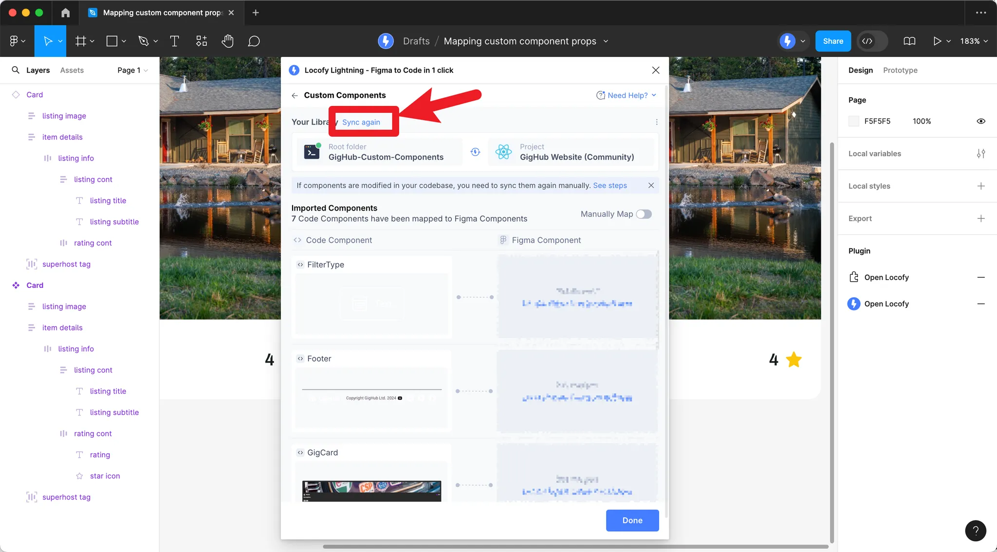
Previously imported your component library?
If you have previously imported your component library, remove all existing mappings by clicking the pencil icon and Remove mapping, then click Sync again.
How Prop Detection Works
Once you have a mapping config in place, Locofy detects prop values from your designs. This section explains what you need to do in Figma and in your config so props are detected correctly.
Detection order (per prop)
| Priority | Strategy |
|---|---|
| 0 | prop.config.mapFn — if set, only this runs for that prop (no fallback). See Complex prop mapping (mapFn). |
| 1 | Layer-based binding (meaningful layer names, optional […] naming hints, predefined pairs) |
| 2 | User config (config.layer, figmaPropName, Figma component properties) |
| 3 | Node-id structural mapping |
Strategies 1–3 apply when mapFn is not set for that prop. For the mapFn helpers and patterns, see Complex prop mapping (mapFn).
Component Matching
Figma components and instances: When your custom component is mapped to a Figma component (or component set), all instances of that Figma component map to your custom component. Locofy uses the shared tree structure to match layers across instances.
Normal layers (frames and groups): You can map custom components to non-component layers using a naming convention:
| Layer name | Maps to |
|---|---|
<Button> | Custom component named Button |
<Card> | Custom component named Card |
<card> | Custom component named Card (case-insensitive) |
Limitation: Normal layer matching only works for components with simple props (children, className).
Mapping Props from Figma Component Properties
The most direct way to pass props is through Figma component properties:
| Figma property type | Custom prop type | How it works |
|---|---|---|
| Text | string | Text value from the Figma property |
| Variant | string / enum | Selected variant value |
| Boolean | boolean | True/false state |
| Instance Swap | ReactNode / ng-content | Swapped instance content maps to a slot |
Worked examples that list Figma property panel names next to the matching figmaPropName / valueMapping / config.layer entries are in Figma component properties and locofy.config.json (earlier on this page).
See Structuring Components for aligning Figma properties with your code props.
Layer naming conventions
Layer naming is about the Figma layer in your component tree—the layer name (and how that layer is wired in Locofy) tells the tool which layer to read from. Locofy then picks up whatever data lives on that layer, not only values listed as Figma component properties in the right sidebar.
Typical layer-backed data includes:
- Text — characters on a TEXT layer (for example a button label that is not exposed as its own component property, but exists as a child text layer).
- Layout and size — width, height, and related layout from the layer’s geometry when detection maps them to your schema.
- Visual state — fills, visibility, and other attributes Locofy’s detection rules can map to props (alongside explicit component properties when those exist).
Example: A Button in Figma might not give label as a dedicated Text component property, yet there is still a Label text layer inside the instance. By binding that layer to your code’s label prop—through a clear layer name, an optional [label]-style hint on the layer, or config.layer pointing at Label—Locofy can read the text from that layer (and other layer-level details detection supports), without requiring every string to be a top-level Figma property.
Optional bracket patterns (when you want an explicit hint in the layer name):
| Pattern | Role |
|---|---|
[name] | Tie this layer’s content (text, image fill, etc.) to the prop called name. |
[name >] | Tie this layer’s children to the prop name (for example children or list-like props). |
Predefined values in the layer name (fixed literals for previews or static mapping):
[firstName=John][lastName=Doe]Each [key=value] segment sets the matching nested key to that literal when you use this pattern.
Value Mapping
When Figma uses different labels than your code (e.g. Sky vs sky, or Severity - Low vs green), define value mapping. Keys are values in your code; values are Figma variant/property names that map to them.
// src/components/Badge.tsx
import { FunctionComponent } from "react";

export type BadgeProps = {
  label: string;
  color?: "sky" | "purple" | "green";
};

export const LocofyConfig = {
  props: [
    {
      name: "color",
      type: "enum",
      enum: ["sky", "purple", "green"],
      previewValue: "green",
      valueMapping: {
        sky: ["Sky"],
        purple: ["Purple"],
        green: ["Green", "Severity - Low"]
      }
    }
  ]
};

const Badge: FunctionComponent<BadgeProps> = ({ label, color = "sky" }) => (
  <span className={`badge badge-${color}`}>{label}</span>
);

export default Badge;
Figma might use Severity - Low as a variant; with valueMapping, it maps to color="green" in code.
Expected Values
For enum-like props, restrict detected values with expectValues:
{
  expectValues: ["small", "medium", "large"];
}
If the detected value is not in this list, the first expected value is used instead.
Object Props
Object props are detected by treating each key as a separate prop. Map nested keys in your config, bind the right Figma layers to each key, or encode fixed samples in layer names such as [user.firstName=John][user.lastName=Doe].
// src/components/ListingCard.tsx
import { FunctionComponent } from "react";

export type Listing = {
  name: string;
  image: string;
  rating: number;
  locations: { name: string }[];
};

export type ListingCardProps = {
  badge: string;
  item: Listing;
};

const ListingCard: FunctionComponent<ListingCardProps> = ({ badge, item }) => (
  <div className="card">
    <span className="badge">{badge}</span>
    <h3>{item.name}</h3>
    <img src={item.image} alt="" />
    <span>{item.rating}★</span>
    {item.locations.map((loc) => (
      <span key={loc.name}>{loc.name}</span>
    ))}
  </div>
);

export default ListingCard;
locofy.config.json – declare the item prop as type object; map nested keys (item.name, item.rating, item.locations[].name) to Figma layers via the plugin UI:
{
  "components": [
    {
      "path": "./src/components/ListingCard.tsx",
      "name": "ListingCard",
      "props": [
        {
          "name": "badge",
          "type": "string",
          "required": false,
          "previewValue": "Superhost"
        },
        {
          "name": "item",
          "type": "object",
          "required": true,
          "previewValue": {
            "name": "Cozy Downtown Apartment",
            "image": "https://images.unsplash.com/photo-1502672260266-1c1ef2d93688?w=800&q=80",
            "rating": 4.8,
            "locations": [{ "name": "Downtown, Seattle" }]
          }
        }
      ]
    }
  ]
}
In Figma, point nested keys at the right layers—for example name layers [item.name], [item.rating], [item.locations >], or use predefined literals: [item.name=My Listing][item.rating=4.5].
Array Props
Array props use type: "array" in locofy.config.json. Define how the first item is detected unless you derive the whole array with config.mapFn. Locofy finds additional items via indexed layer names ([items.0.title], [items.1.title], …) or structure-based discovery (sibling nodes with the same structure).
// src/components/ProductList.tsx
import { FunctionComponent } from "react";

export type ProductItem = {
  title: string;
  price: number;
};

export type ProductListProps = {
  items: ProductItem[];
};

const ProductList: FunctionComponent<ProductListProps> = ({ items }) => (
  <div className="product-list">
    {items.map((item, i) => (
      <div key={i} className="product-card">
        <h4>{item.title}</h4>
        <p>${item.price}</p>
      </div>
    ))}
  </div>
);

export default ProductList;
Figma structure (structure-based discovery):
Frame: "Product List"
├── Card (title: "iPhone", price: "$999")   ← items[0]
├── Card (title: "MacBook", price: "$1299") ← items[1]
└── Card (title: "iPad", price: "$799")     ← items[2]
Or use indexed layer names so each list slot lines up with a layer: [items.0.title], [items.1.title], [items.0.price], etc.
locofy.config.json:
{
  "components": [
    {
      "path": "./src/components/ProductList.tsx",
      "name": "ProductList",
      "props": [
        {
          "name": "items",
          "type": "array",
          "required": true,
          "previewValue": [
            { "title": "iPhone", "price": 999 },
            { "title": "MacBook", "price": 1299 },
            { "title": "iPad", "price": 799 }
          ]
        }
      ]
    }
  ]
}
Result when detected from the product list:
[
  { title: "iPhone", price: 999 },
  { title: "MacBook", price: 1299 },
  { title: "iPad", price: 799 }
];
How Values Are Extracted
| Prop type | Source |
|---|---|
| String | Text layer content, layer name (normalized), or image src |
| Number | Parsed from text content or Figma prop values |
| Boolean | Layer visibility, Figma boolean property, or variant (truthy/falsy) |
| Style | Derived from Figma: flexDirection, color, fontSize, fontWeight, and layout such as width / height when detection maps them |
| Node/slot | Figma layer(s) rendered as React nodes or Angular ng-content |
Best Practices
- Keep structure consistent – All instances of a Figma component should share the same tree structure.
- Use Figma component properties when possible – Text, Variant, Boolean, and Instance Swap map cleanly to props.
- Bind layers to props – When something is not a Figma component property, name or target the layer that holds the text, size, or other data Locofy should read; add
[…]hints orconfig.layerif auto-detection needs help. - Define value mapping – When designers use different names than developers (e.g.
Svssmall), addvalueMapping. - For arrays – Define the first item clearly; use naming or structure-based discovery for the rest.
Complete Example: Full Component and Config
Below is a complete ProductCard component with multiple prop types, and the corresponding locofy.config.json for each framework.
React
// src/components/ProductCard.tsx
import { FunctionComponent } from "react";
import styles from "./ProductCard.module.css";

export type ProductCardProps = {
  title: string;
  price: number;
  badge?: string;
  onSale?: boolean;
  rating?: number;
  tags?: { label: string }[];
};

const ProductCard: FunctionComponent<ProductCardProps> = ({
  title,
  price,
  badge = "",
  onSale = false,
  rating = 0,
  tags = []
}) => {
  return (
    <div className={styles.card}>
      {badge && <span className={styles.badge}>{badge}</span>}
      {onSale && <span className={styles.saleTag}>Sale</span>}
      <h3 className={styles.title}>{title}</h3>
      <p className={styles.price}>${price}</p>
      {rating > 0 && <span className={styles.rating}>{rating}★</span>}
      {tags.length > 0 && (
        <div className={styles.tags}>
          {tags.map((t) => (
            <span key={t.label} className={styles.tag}>
              {t.label}
            </span>
          ))}
        </div>
      )}
    </div>
  );
};

export default ProductCard;
locofy.config.json
{
  "components": [
    {
      "path": "./src/components/ProductCard.tsx",
      "name": "ProductCard",
      "props": [
        {
          "name": "className",
          "type": "string",
          "required": false
        },
        {
          "name": "title",
          "type": "string",
          "required": true,
          "previewValue": "Wireless Headphones"
        },
        {
          "name": "price",
          "type": "number",
          "required": true,
          "previewValue": 99
        },
        {
          "name": "badge",
          "type": "string",
          "required": false,
          "previewValue": "Best Seller"
        },
        {
          "name": "onSale",
          "type": "boolean",
          "required": false,
          "previewValue": true
        },
        {
          "name": "rating",
          "type": "number",
          "required": false,
          "previewValue": 4.5
        },
        {
          "name": "tags",
          "type": "array",
          "required": false,
          "previewValue": [{ "label": "New" }]
        }
      ]
    }
  ],
  "projectId": "your-project-id",
  "projectName": "Your Project"
}
Angular
// src/app/components/product-card/product-card.component.ts
import { Component, Input } from "@angular/core";

export interface ProductTag {
  label: string;
}

@Component({
  selector: "app-product-card",
  standalone: true,
  templateUrl: "./product-card.component.html",
  styleUrls: ["./product-card.component.css"]
})
export class ProductCardComponent {
  @Input() title!: string;
  @Input() price!: number;
  @Input() badge?: string;
  @Input() onSale?: boolean;
  @Input() rating?: number;
  @Input() tags?: ProductTag[];
}
<!-- product-card.component.html -->
<div class="card">
@if (badge) {
<span class="badge">{{ badge }}</span>
} @if (onSale) {
<span class="sale-tag">Sale</span>
}
<h3 class="title">{{ title }}</h3>
<p class="price">${{ price }}</p>
@if (rating && rating > 0) {
<span class="rating">{{ rating }}★</span>
} @if (tags && tags.length > 0) {
<div class="tags">
@for (t of tags; track t.label) {
<span class="tag">{{ t.label }}</span>
}
</div>
}
</div>locofy.config.json
{
  "components": [
    {
      "path": "./src/app/components/product-card/product-card.component.ts",
      "name": "ProductCardComponent",
      "props": [
        {
          "name": "title",
          "type": "string",
          "required": true,
          "previewValue": "Wireless Headphones"
        },
        {
          "name": "price",
          "type": "number",
          "required": true,
          "previewValue": 99
        },
        {
          "name": "badge",
          "type": "string",
          "required": false,
          "previewValue": "Best Seller"
        },
        {
          "name": "onSale",
          "type": "boolean",
          "required": false,
          "previewValue": true
        },
        {
          "name": "rating",
          "type": "number",
          "required": false,
          "previewValue": 4.5
        },
        {
          "name": "tags",
          "type": "array",
          "required": false,
          "previewValue": [{ "label": "New" }]
        }
      ]
    }
  ],
  "projectId": "your-project-id",
  "projectName": "Your Project"
}
Each prop in the config has a name, type (string, number, boolean, enum, object, array, node, function), optional required, optional previewValue (only for Props mapping previews in the plugin), and the mapping fields above. Map these props to your Figma layers via the plugin UI, or encode mapping in config.layer, figmaPropName, and valueMapping as described above; use mapFn when you need custom logic.