Generating Responsive Code
Learn how to convert your designs into responsive code using Figma and Locofy.ai.
This guide will take you step-by-step through the steps required to make your design responsive and generate code for it using the Locofy.ai plugin.
You never know what device your users will open the app on, hence your code has to be configured to handle all the different breakpoints so every user has a smooth experience regardless of their screen size.
Reviewing a Non-Responsive Design
Before we dive into how to make designs responsive, let’s take a look at a design component that does not have responsiveness applied.
- Below is a frame with auto layout consisting of an image, on the left, and text, on the right side.
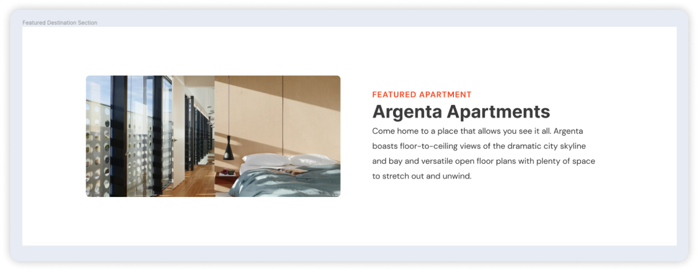
- You can resize the frame on Figma to simulate a smaller screen size & see how the elements inside will react.
As you can see, the text is overflowing and the image is not getting resized relative to the new size of the frame.
Locofy accurately reflects the behaviour in Figma, and generates the code accordingly. As such, we will need to make these designs responsive in Figma as well, and it will translate to responsive code.
Creating Responsive Designs using Auto Layout
Using Figma’s auto layout feature, you can add responsive capabilities to your design and also build new designs in a much more coherent way.
- The most basic measure to adjust an element’s height and width is to change the horizontal resizing from fixed to fill. The fill property will stretch the element to the width and/or height of their parent frame. We will be making the image responsive first by changing the width from fixed to fill.
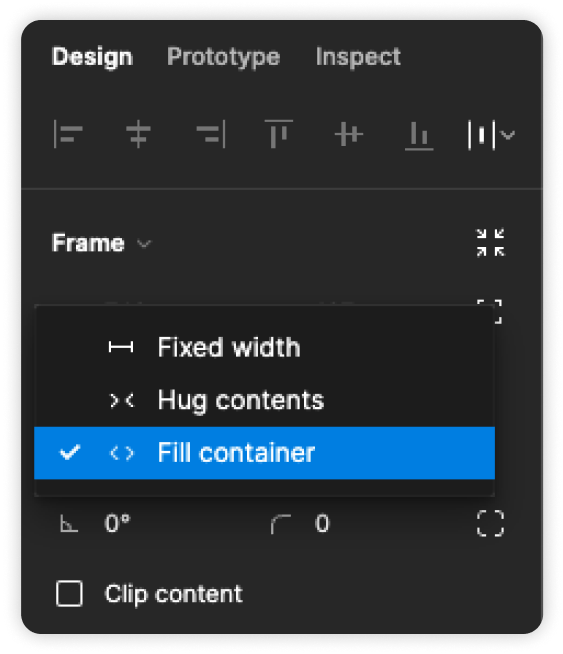
Do note that the fill container property is only available on frames that have auto layout.
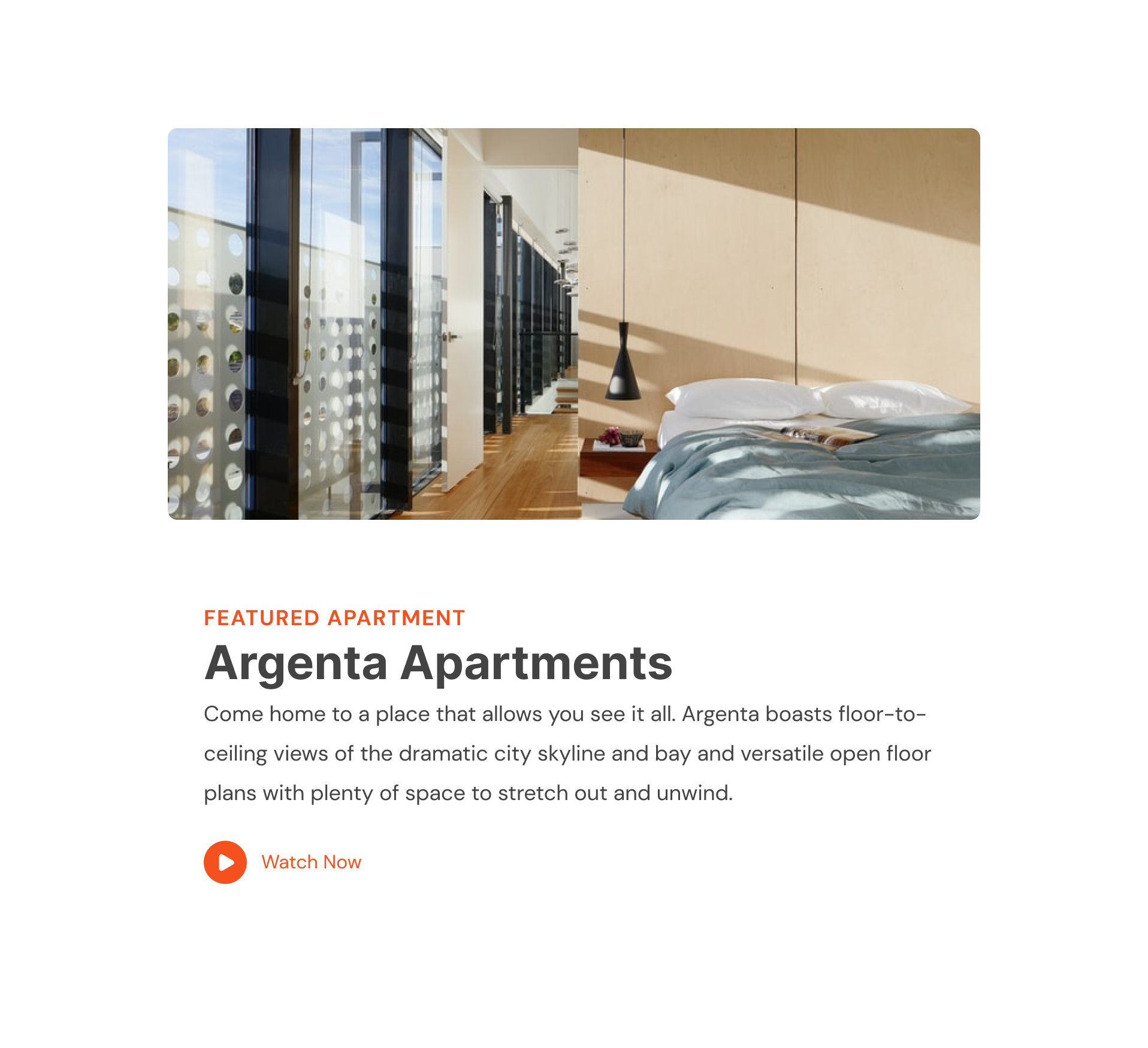
- Now our image should respond to the changes in width. To make the text resize as per the parent frame, we can make the group of text to fill container as well similar to what we did for the image.
Configuring Your Designs for Different Breakpoints using Locofy.ai
The Locofy.ai plugin builds upon the Figma properties such as auto layouts to generate responsive code.
It helps overcome the core limitation of the generating responsive designs with Figma by allowing users to set different layout & style configurations based on certain breakpoints.
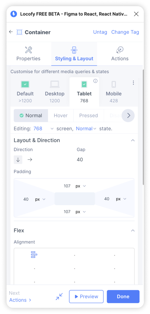
- If we shrink our design to an even smaller size, we want the layout to switch to a vertical direction i.e the text should go below the image as shown below, so users on small devices can have better readability. To do so, open the Locofy.ai plugin and select the frame that comprises of the text & image.
- Head over to the Styling & Layout tab and switch to a breakpoint that you want you to have specific styles for. In our example, we’ll go over the 768px breakpoint and change the direction to vertical i.e the downward facing arrow. In other words, at the 768px width or below, our image and text are stacked vertically.
-
We can also apply all the standard design properties such as padding as well as custom CSS properties using the Locofy.ai plugin. For instance, we want the padding to be on the lesser side for smaller devices. To do that, we again head over to the 768px breakpoint tab in the plugin and under Layout & Direction, we reduce the padding.
-
Once the changes are done, you can hit the Preview button inside the plugin and view your changes reflected without even leaving Figma.