Auto-Tagging By Layer Name
With our new "Auto-Tagging by Layer Name" feature, the Locofy plugin further minimises any manual tagging work you need to perform – accelerating your design to code workflow further.
With this feature, you can follow simple naming rules for your Figma layers, and Locofy will automatically tag those layers – without any manual intervention from your side.

Layer Naming Syntax
Simply follow this naming syntax to have your elements automatically tagged (added spaces for readability):
[tag name] / [OPTIONAL: tag subtype OR UI library OR "none"] / [OPTIONAL: UI library element variation]
Example:
checkbox/bootstrap/default-checkbox-label
Once you have named all your layers correctly, in Step 2 – Tag interactive elements in the Locofy plugin, you can just toggle the checkbox called "Auto-tag using the layer name" and click "Auto-Tag".
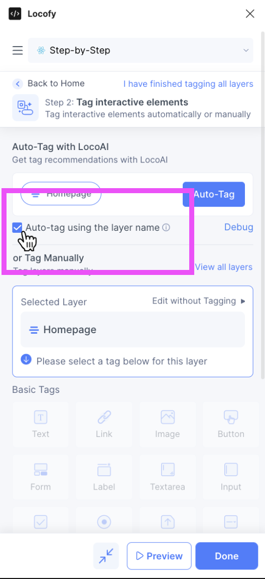
All your correctly named layers will automatically be tagged, and appear under the Tagged tab. You won't need to first accept the recommendation for tagging – Locofy already took care of that.
Examples
Below are some examples on how to automatically tag your elements using Figma layers names.
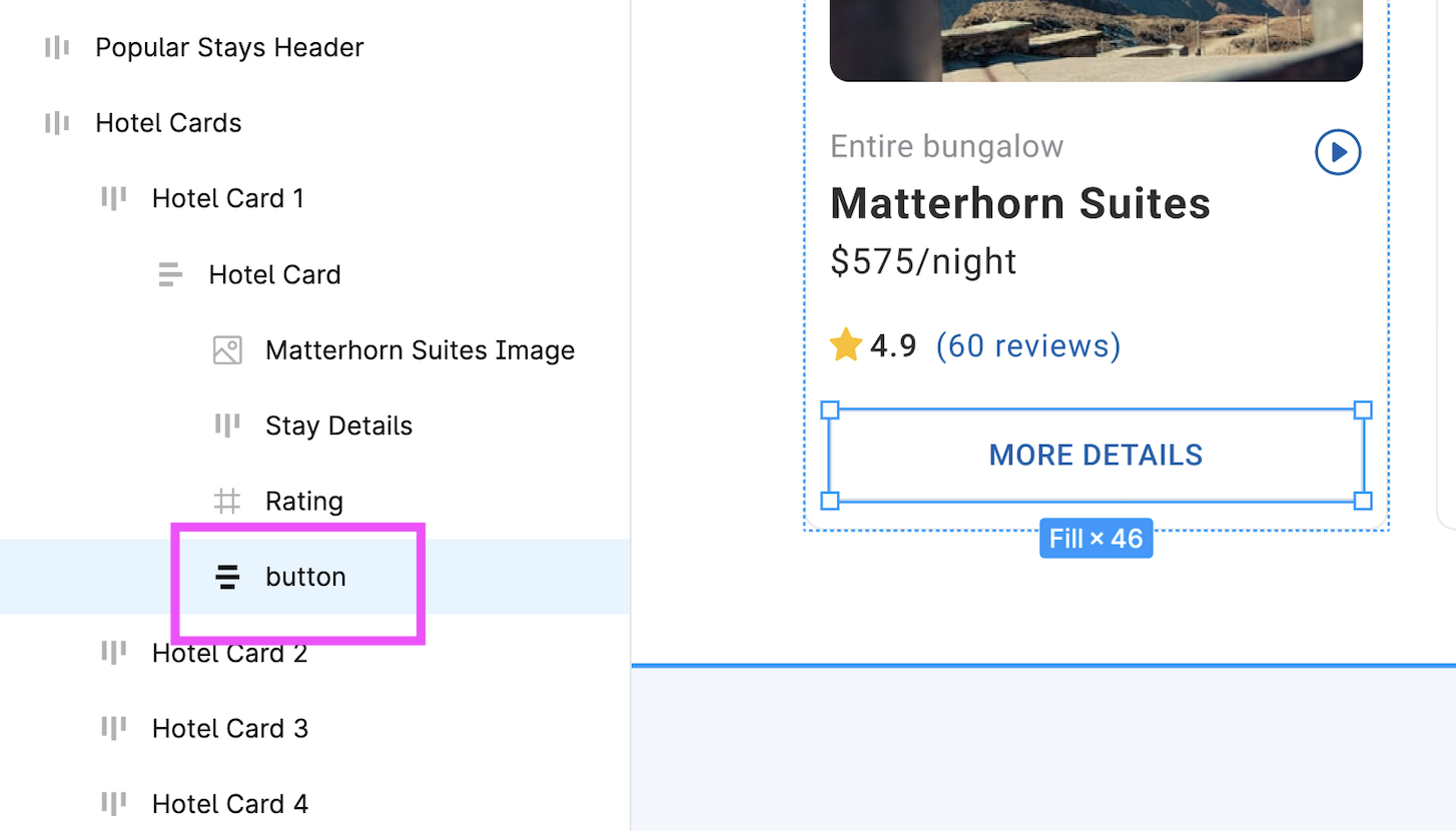
Example 1 – Button
Tagging a button. Simply name the respective Figma layer as such:
button
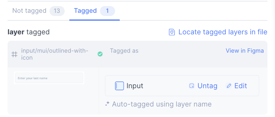
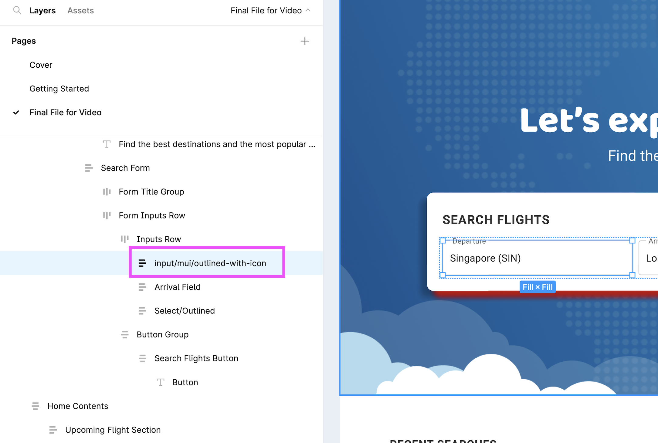
Example 2 – Input with Library
Tagging an input, using Material UI's outlined input with an icon. Simply name the respective Figma layer as such:
input/mui/outlined-with-icon
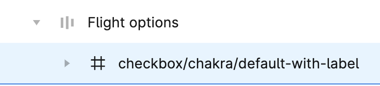
Similarly, tagging an Chakra UI checkbox with a label would work as such:
checkbox/chakra/default-with-label
Appendix – Currently Supported Tags
The following tags are supported in HTML, React, Angular, Vue, Next.js, and Gatsby.
| Type | Library | Layer Name |
|---|---|---|
| Text | - | text/a |
| Text | - | text/b |
| Text | - | text/div |
| Text | - | text/h1 |
| Text | - | text/h2 |
| Text | - | text/h3 |
| Text | - | text/h4 |
| Text | - | text/h5 |
| Text | - | text/h6 |
| Text | - | text/i |
| Text | - | text/label |
| Text | - | text/p |
| Text | - | text/span |
| Text | - | text/strong |
| Text | - | text/blockquote |
| Text | - | text/code |
| Text | - | text/code |
| Text | - | text/legend |
| Text | - | text/pre |
| Text | - | text/q |
| Text | - | text/s |
| Text | - | text/small |
| Text | - | text/sub |
| Link | - | link |
| Image | - | image |
| Button | - | button |
| Button | - | button/none |
| Button | Material UI | button/mui/contained-text-icon |
| Button | Material UI | button/mui/outlined-text-icon |
| Button | Material UI | button/mui/text-icon |
| Button | Material UI | button/mui/contained-text |
| Button | Material UI | button/mui/outlined-text |
| Button | Material UI | button/mui/text |
| Button | Material UI | button/mui/icon-only |
| Button | Ant Design | button/antd/primary-text-icon |
| Button | Ant Design | button/antd/default-text-icon |
| Button | Ant Design | button/antd/dashed-text-icon |
| Button | Ant Design | button/antd/text-icon |
| Button | Ant Design | button/antd/primary-text |
| Button | Ant Design | button/antd/default-text |
| Button | Ant Design | button/antd/dashed-text |
| Button | Ant Design | button/antd/text |
| Button | Ant Design | button/antd/primary-icon-only |
| Button | Ant Design | button/antd/default-icon-only |
| Button | Ant Design | button/antd/dashed-icon-only |
| Button | Ant Design | button/antd/text-icon-only |
| Button | Bootstrap | button/bootstrap/default |
| Button | Bootstrap | button/bootstrap/outline |
| Button | Chakra UI | button/chakra/solid |
| Button | Chakra UI | button/chakra/outline |
| Button | Chakra UI | button/chakra/ghost |
| Form | - | form |
| Label | - | label |
| Textarea | – | textarea |
| Textarea | – | textarea/none |
| Textarea | Material UI | textarea/mui/standard |
| Textarea | Material UI | textarea/mui/filled |
| Textarea | Material UI | textarea/mui/outlined |
| Textarea | Ant Design | textarea/antd/bordered |
| Textarea | Ant Design | textarea/antd/no-border |
| Textarea | Bootstrap | textarea/bootstrap/standard |
| Textarea | Chakra UI | textarea/chakra/outline |
| Textarea | Chakra UI | textarea/chakra/filled |
| Textarea | Chakra UI | textarea/chakra/flushed |
| Input | - | input |
| Input | - | input/none |
| Input | Material UI | input/mui/standard |
| Input | Material UI | input/mui/filled |
| Input | Material UI | input/mui/outlined |
| Input | Material UI | input/mui/standard-with-icon |
| Input | Material UI | input/mui/filled-with-icon |
| Input | Material UI | input/mui/outlined-with-icon |
| Input | Ant Design | input/antd/default |
| Input | Ant Design | input/antd/one-icon |
| Input | Ant Design | input/antd/two-icons |
| Input | Bootstrap | input/bootstrap/standard |
| Input | Chakra UI | input/chakra/outline |
| Input | Chakra UI | input/chakra/filled |
| Input | Chakra UI | input/chakra/flushed |
| Checkbox | - | checkbox |
| Checkbox | - | checkbox/none |
| Checkbox | Material UI | checkbox/mui/default-checkbox-label |
| Checkbox | Material UI | checkbox/mui/checked-checkbox-label |
| Checkbox | Material UI | checkbox/mui/indeterminate-checkbox-label |
| Checkbox | Material UI | checkbox/mui/default-checkbox-only |
| Checkbox | Material UI | checkbox/mui/checked-checkbox-only |
| Checkbox | Material UI | checkbox/mui/indeterminate-checkbox- |
| Checkbox | Ant Design | checkbox/antd/default-checkbox-label |
| Checkbox | Ant Design | checkbox/antd/checked-checkbox-label |
| Checkbox | Ant Design | checkbox/antd/indeterminate-checkbox-label |
| Checkbox | Ant Design | checkbox/antd/default-checkbox-only |
| Checkbox | Ant Design | checkbox/antd/checked-checkbox-only |
| Checkbox | Ant Design | checkbox/antd/indeterminate-checkbox-only |
| Checkbox | Bootstrap | checkbox/bootstrap/default-checkbox |
| Checkbox | Bootstrap | checkbox/bootstrap/default-checkbox-label |
| Checkbox | Chakra UI | checkbox/chakra/default-with-label |
| Checkbox | Chakra UI | checkbox/chakra/checked-with-label |
| Checkbox | Chakra UI | checkbox/chakra/default |
| Checkbox | Chakra UI | checkbox/chakra/checked |
| Radio | - | radio |
| Radio | - | radio/default |
| Radio | Material UI | radio/mui/default-radio-label |
| Radio | Material UI | radio/mui/checked-radio-label |
| Radio | Material UI | radio/mui/checked-radio-only |
| Radio | Material UI | radio/mui/checked-radio-only |
| Radio | Ant Design | radio/antd/default-radio-label |
| Radio | Ant Design | radio/antd/checked-radio-label |
| Radio | Ant Design | radio/antd/checked-radio-only |
| Radio | Ant Design | radio/antd/checked-radio-only |
| Radio | Bootstrap | radio/bootstrap/default-radio-label |
| Radio | Bootstrap | radio/bootstrap/checked-radio-only |
| Radio | Chakra UI | radio/chakra/default-with-label |
| Radio | Chakra UI | radio/chakra/checked-with-label |
| Radio | Chakra UI | radio/chakra/default |
| Radio | Chakra UI | radio/chakra/checked |
| File | - | file |
| Select | - | select |
| Select | - | select/none |
| Select | Material UI | select/mui/standard |
| Select | Material UI | select/mui/filled |
| Select | Material UI | select/mui/outlined |
| Select | Ant Design | select/antd/basic |
| Select | Ant Design | select/antd/search |
| Select | Bootstrap | select/bootstrap/default |
| Select | Chakra UI | select/chakra/outline |
| Select | Chakra UI | select/chakra/filled |
| Select | Chakra UI | select/chakra/flushed |
| Container | - | container |
| Container | - | container/div |
| Container | - | container/article |
| Container | - | container/footer |
| Container | - | container/header |
| Container | - | container/main |
| Container | - | container/section |
| Container | - | container/nav |
| Container | - | container/address |
| Container | - | container/aside |
| Container | - | container/canvas |
| Container | - | container/fieldset |
| Video | - | video |
| Audio | - | audio |
| Lottie | - | lottie |
| Youtube | - | youtube |
| iFrame | - | iframe |
| Google Maps | - | google-maps |