Intro to Live Responsive Prototypes
Say goodbye to high-fidelity. Locofy generates live, responsive Real-fidelity Prototypes running on code that look and feel just like your actual product.
Live Responsive Prototypes - the next generation prototype
Live responsive prototypes do a better job at meeting all the goals of the traditional high-fidelity prototypes, which is to get as close as possible to a true representation of the user interface in order to:
- Conduct usability testing with users
- Accurately communicate product vision and behaviour to development team
- Present to stakeholders and getting buy-in
Locofy.ai’s live responsive prototypes not only do a better job of meeting these objectives, you can do so with less effort and time.
Live Responsive Prototypes vs Traditional Ones
Natural Interactions
Traditional prototypes run on static images, and try to emulate interactions by using hotspots. Locofy prototypes run on code. This means components that actually work. Input fields, dropdowns, videos, embeds, animations that users can interact with naturally.
Responsive - 1 prototype for all screen sizes
With traditional prototypes, you have to design and create several prototypes for multiple screen sizes. This can be especially time consuming for projects with many screens and states.
With Locofy, you can design screens just once, and create a single live responsive prototype that fits on all screen widths.
Handover code, not mockups
Unlike traditional prototypes which act as a reference for developers to start coding from scratch. With Locofy, you can directly export developer-friendly frontend code to save development time. You also cut down on back and forth, since what you see in the prototype is exactly what you get.
Share and view from anywhere
In order to view traditional prototypes, you will need to install their app on your mobile and tablet devices.
With Locofy prototypes, you can share easily with a link. The prototype runs on the web, so collaborators can view it on any browser. No downloads or log-in required.
How to create your own Live Responsive Prototype
Step 1: Tag, Define UX and Add Actions on Plugin
Bring designs to life - Tag your static layers and turn them into interactive buttons, input fields, videos and more. View Guide
Define the user experience - Add responsiveness to your design and create beautiful interactions. View Guide
Add actions - Link up your designs to create clickable user flows. View Guide
Step 2: Sync to Builder
Preview your design and sync to Locofy Builder.
Step 3: View code and make components
View the code for your design in builder, and turn elements into components and reuse them throughout your project. Add props to receive and display dynamic content in your website or app.
Share and view your prototype
To share your Live Responsive Prototype with your team:
- Enter preview mode
- Click ‘Share Prototype’
- Share via a link, or send an email to collaborators
To view the prototype, simply visit the link. As it is running on code, the prototype can be viewed on any browser.
To reveal clickable areas, simply click anywhere on the prototype. This includes anything that is interactive, such as links to other pages. Or interactive elements such as inputs, dropdowns, embeds and more.
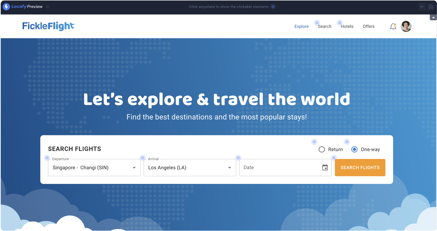
You can also use the back button to return to the previous page, and home button to restart from the homepage.
Export Code for handover
Export code in your preferred framework settings to meet your team’s coding styles and conventions.
View the Code Export guide to learn how to export code for screens or components.