Working with Chakra UI
Learn how to use Chakra UI inside your design system.

Tagging a Chakra UI element
To tag a Chakra UI element.
-
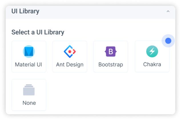
Select the Chakra UI element from your Figma file.
-
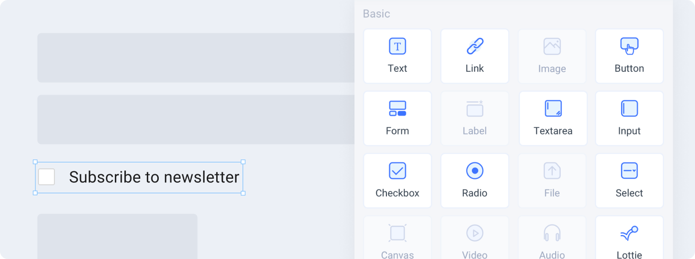
Choose the tag from the Locofy plugin. Available tags will be highlighted based on your selection.
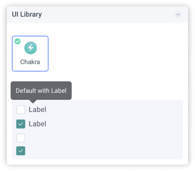
 A Chakra UI “Checkbox with Label”
- Select a Variation: Choose the variation of the element you are using
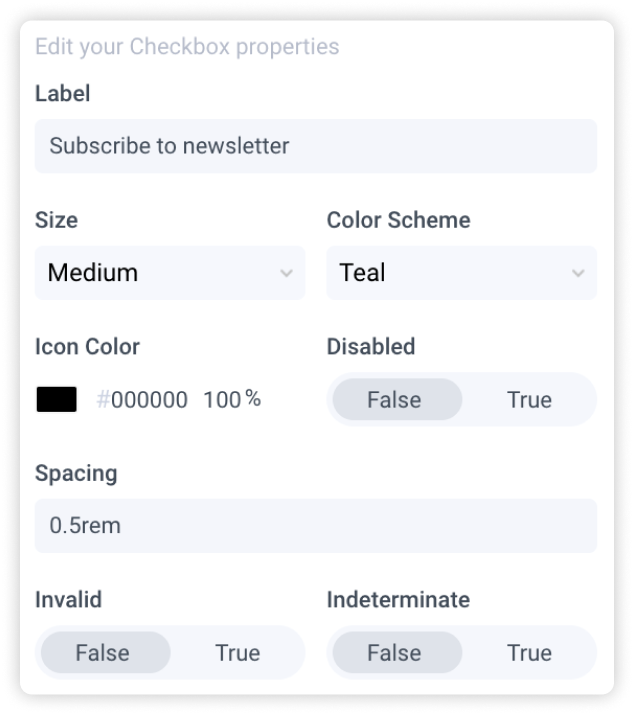
- Edit Properties: You can further define how this element should work.
-
Check the interactive preview: Play with the interactive preview to verify your element is correctly set up
-
Click Done.
Locofy provides an interactive preview for you to visualize your element while tagging.
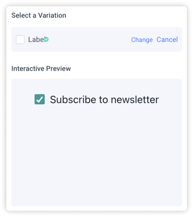
Any changes made to your properties settings will update and refresh the interactive preview.
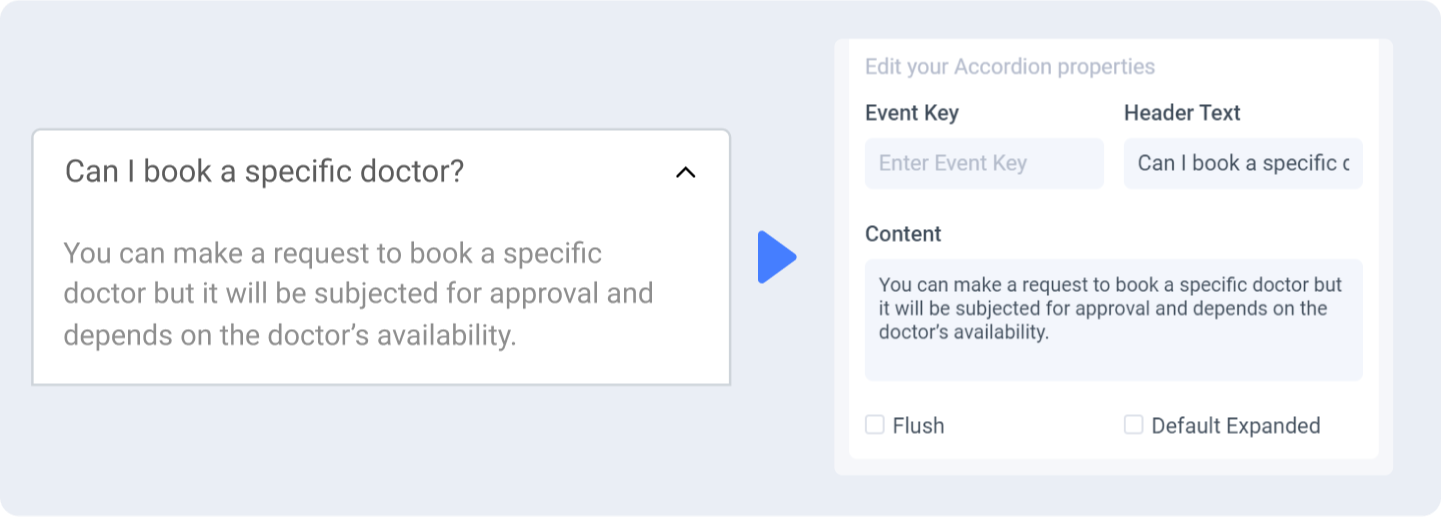
Properties auto-detection
When tagging your Chakra UI element, Locofy reads your Figma design to automatically populate properties for you.
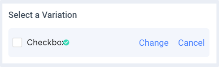
Change or cancel Variation
You can switch to a different variation or cancel the variation by clicking the ‘Change’ or ‘Cancel’ button respectively.
Theming
Theming allows for a customized, consistent look across all your Chakra UI elements.
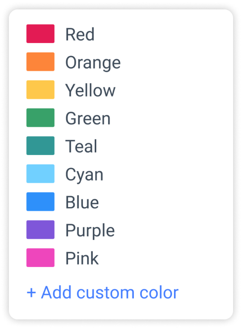
Customizing your theme
When tagging your Chakra UI element or using drag & drop, you are required to choose the palette to use for the tagged element.
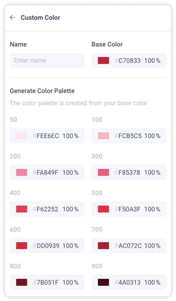
Click on “+ Add Custom Color” to create a new theme
Theme settings
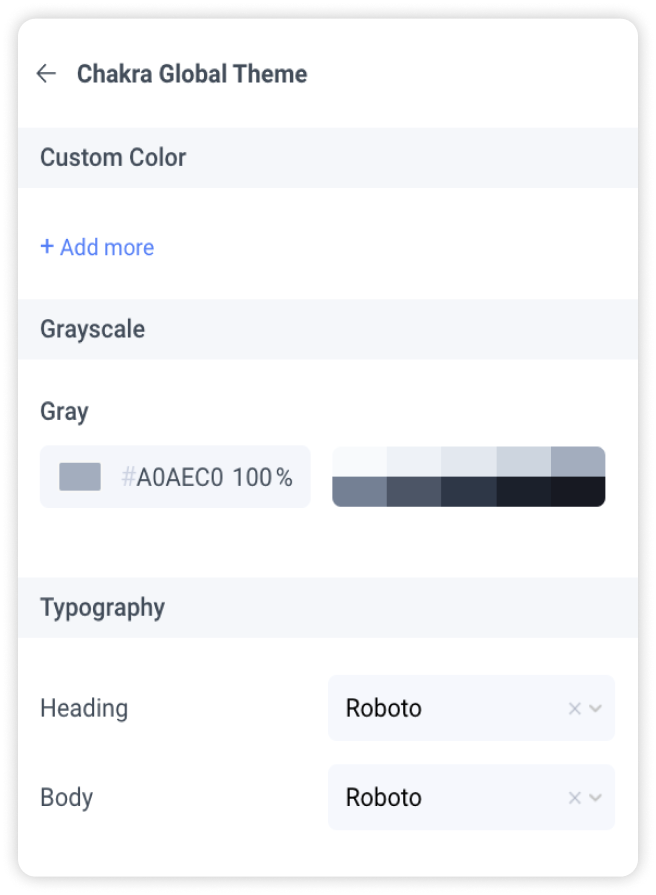
Create a custom color theme by clicking “Add more”
You will need to enter a name for your theme and choose a base color. Locofy will then generate the color palette for you. You can further customize the individual tones for each shade of color.
Greyscale
You can customize your grayscale palette to ensure accessibility
Typography
Define typography settings that will be used across your Chakra UI elements
Chakra UI Version
Chakra UI package will be imported as a dependency for the generated code base.
- @chakra-ui/react: v2.2.6