Figma Components
Learn how you can create and structure figma components for optimal code conversion. This guide will walk you through the steps to create Figma components with props and also showcase how to structure Figma Variants

Note: View figma component properties playground file here.
Overview
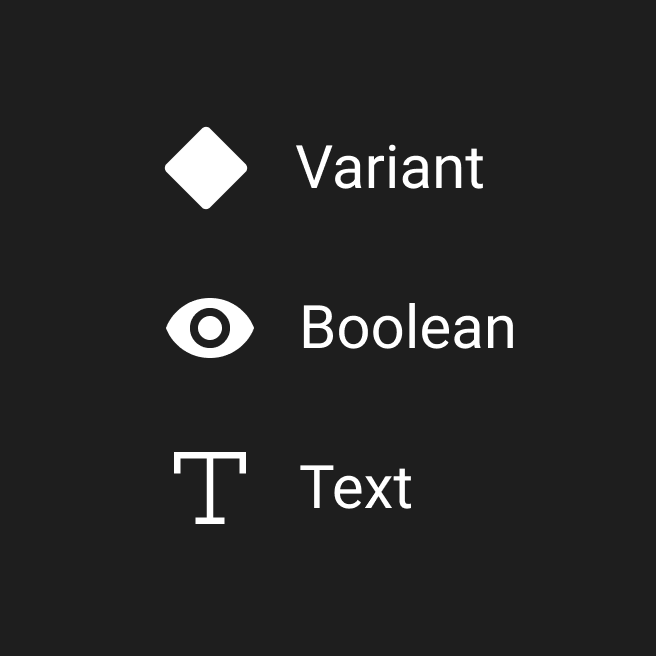
Locofy supports the following types of Figma Component Properties:
- Text Property
- Boolean Property
- Variant Property
We will be adding wider support for Variant & Instance Swap properties soon.
Note: View Figma documentation on how to create Figma Components with properties.
Structuring Figma Components
Creation of Figma Components
Adhere to the following steps for optimal code:
- Create all Figma components outside the screens
- Ensure you name all the layers inside the figma component with the appropriate layernames for optimal css. The names of the Figma Component Properties should be in Camel Case [a-zA-z]
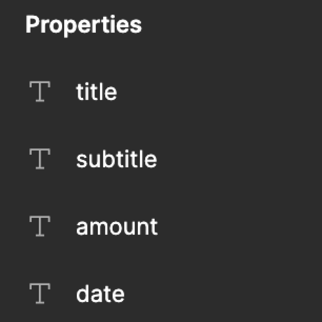
- Create Text properties for the dynamic content. Ensure that the layername is the same as the property name.
- Create Boolean properties in case you need to show and hide certain parts of the design. For optimal naming make use the naming like
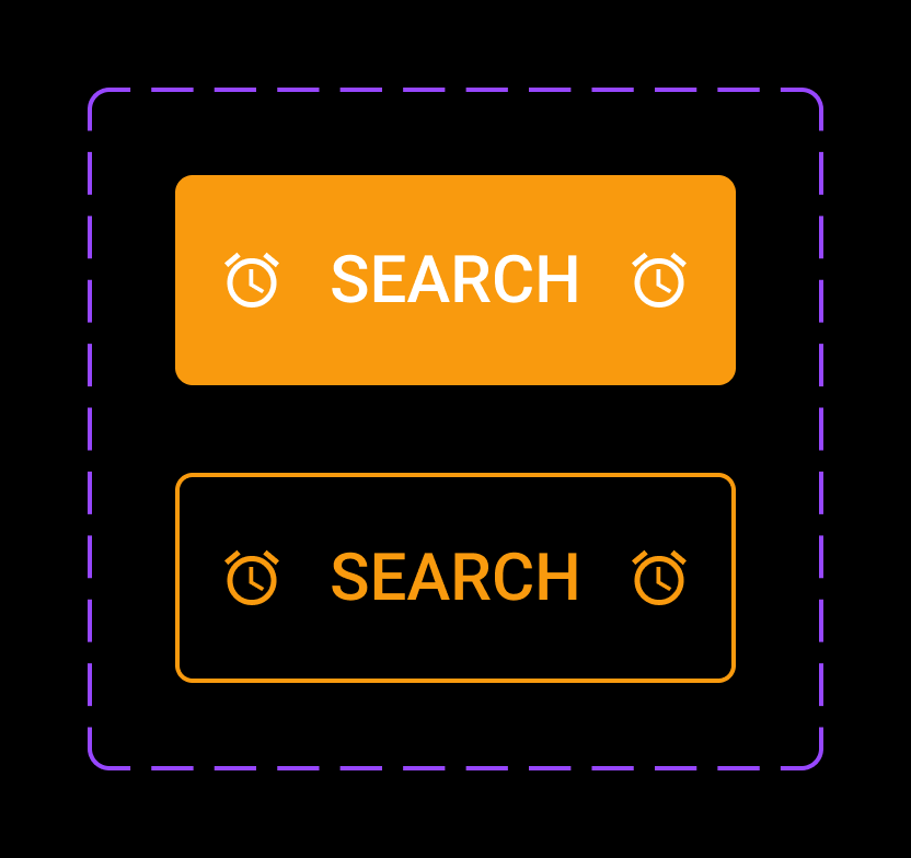
is{PropertyName}orshow{PropertyName} - Create Variant properties for different states or types of the same component. Ensure that the internal layer structure is the same for all the variants
Do's & Don'ts for creating Figma Components:
- Simplify the internal layer structure for optimal HTML & CSS
- Avoid Changing the styles of the Instances to avoid creation of extra style props
- Add autolayout to ensure generation of responsive flexbox based code.
- You can create instance swap properties for dynamic icons. In case of dynamic Background Images you do not need to create any figma component property.
Handling Corner Cases for structuring Figma Components
1) Using Truncate text property for longer text layer:
- Ensure that every text layers has
widthashug contentorfill container. - Ensure that every text layers has
heightas hug content. - If you need the text layer to truncate after a maximum number of lines use the properties in Figma else by default the text layers will wrap.
2) Handling Nested Components :
- Expose the properties of the Child component if they need to be passed from the Parent Components.
- Avoid creation of slots while creating Figma components.
Note: You can create instance swap properties for icons. In case of Background Images you do not need to create a property.
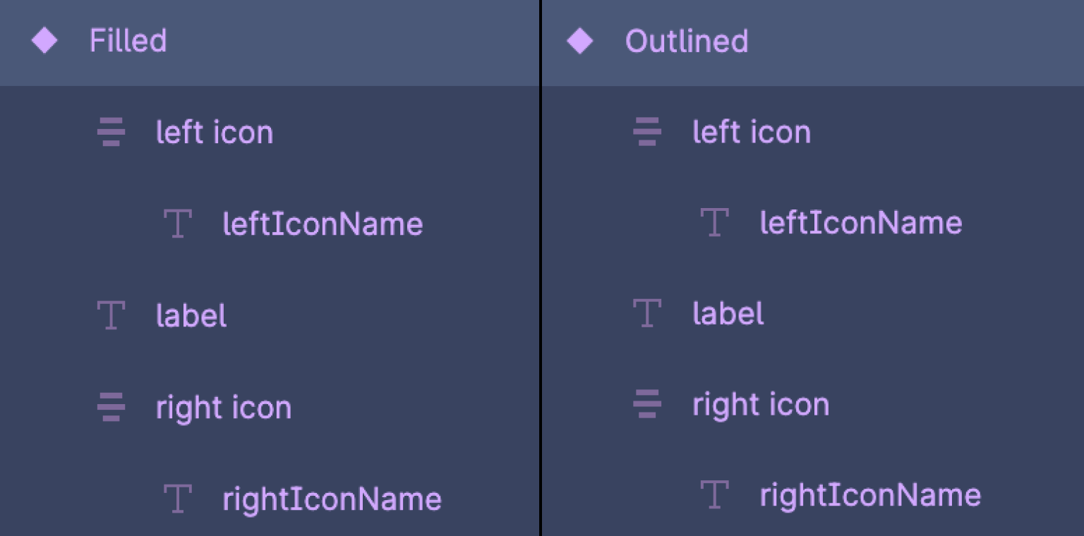
3) Creation of Figma Variant Set:
- When creating Figma Variants ensure that each variant has the same internal structure.
- Create all combinations of the properties to maximum reusability.
- Create Variants sets when you need components instances to have different styling properties. An example if width as
hug contentorfill container.
Figma Variants
Locofying Figma Variants
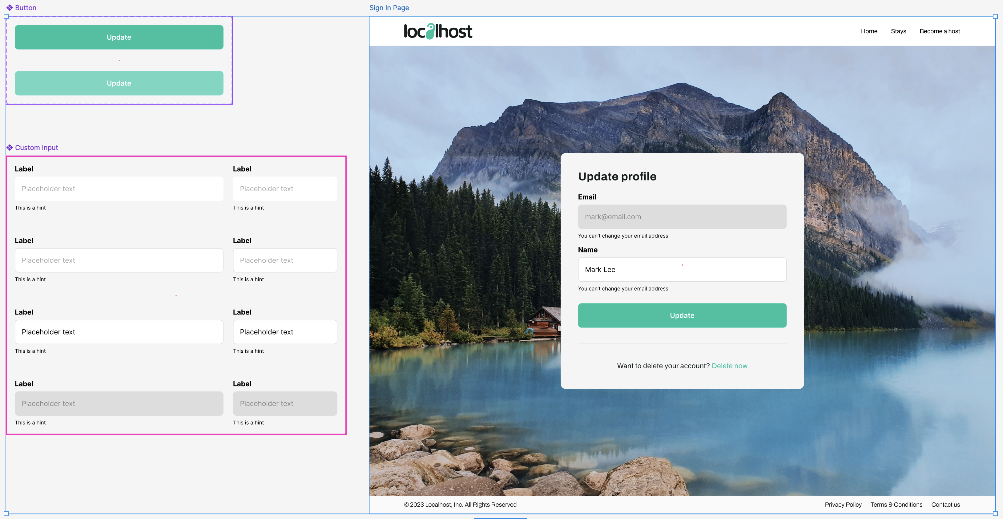
Locofy fully supports Figma variants, respecting all the variant, text, and boolean properties you’ve already defined. Follow these steps to ensure Locofy seamlessly recognizes and works with your variants.
Ensuring Accurate Variant Recognition
To make sure Locofy correctly recognizes your Figma variants, ensure the following:
-
Select both the design frame and master component frames in Figma.
-
Ensure all variant permutations are fully designed in Figma.
-
Maintain a consistent layer structure for each variant.
Locofy Lightning
- Select the design frames and master component frames that you want to convert into code.
- Run Locofy Lightning to process the frames.
- In Preview Mode, you can test the interactivity of your components.
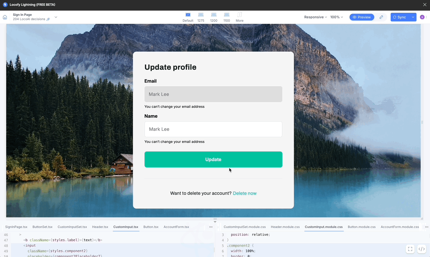
- Switch to Edit Mode in Locofy to view and modify your component properties.
Figma Variables
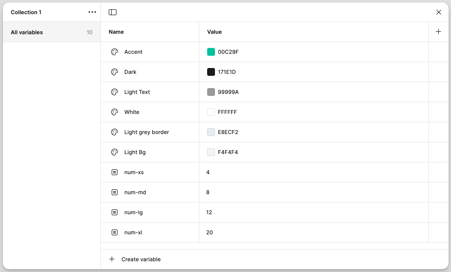
Figma Variables help designers and developers maintain consistency, scalability, and efficiency in their designs.
They allow you to define reusable values—such as colors, spacing, typography, and even dynamic values like themes or mode-based adjustments—so that changes can be made globally with minimal effort.
Locofy's Support For Figma Variables
Locofy supports Figma Variables to ensure a smooth and efficient design-to-code workflow. By automatically detecting and applying supported variables, Locofy helps maintain design consistency while reducing manual effort during development.
Locofy supports the following types of Figma Variables:
- Color Variables
- Number Variables
Color Variables
Supported color properties:
- Fill
- Stroke
- Shadow
- Gradient
Number Variables
Supported number properties:
- Padding
- Gap
- Border Radius
- Width
- Default
- Min width
- Max width
- Height
- Default
- Min height
- Max height
- Stroke Width
- Opacity
Drop Shadow:
- x & y
- Blur
- Spread
Inner Shadow:
- x & y
- Blur
- Spread
Typography
- Font Size
- Line Height
- Letter Spacing
- Font Weight
How to Configure Locofy to Pick Up Figma Variables
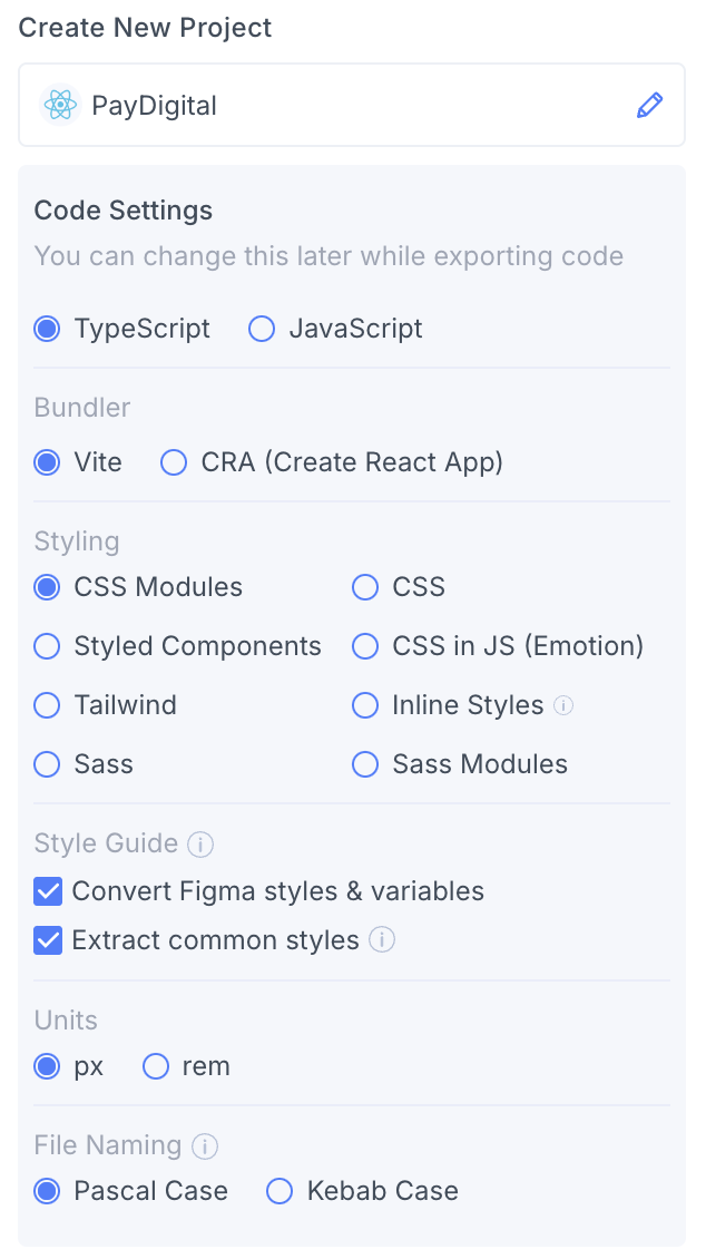
During project creation in Locofy, you are provided with two checkboxes to configure the tokens:
- Convert Figma Styles and Variables – This picks up and applies your Figma variables directly into the generated code.
- Extract Common Styles – This automatically converts repeated values into style variables, ensuring consistency across your code.
You can also toggle them later on in the Locofy Builder code config panel. Your global stylesheet or config file will update accordingly to reflect the changes.
Locofy follows a structured naming convention when generating CSS variables, ensuring clarity and consistency in your styles. It organizes variables based on categories like colors, font sizes, gaps, paddings, and border radii, making it easier to maintain and scale your code.
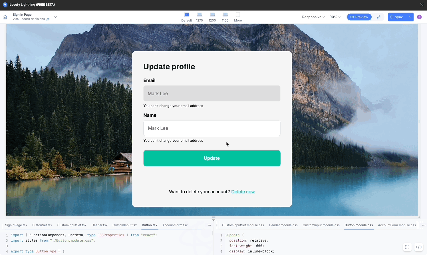
Your global.css file will contain your variables after you enable these settings under the Style guide. Below is a sample global.css file:
body {
  margin: 0;
  line-height: normal;
}
:root {
  /* Fonts */
  --font-archivo: Archivo;
  --font-roboto: Roboto;

  /* font sizes */
  --font-size-sm: 14px;
  --font-size-base: 16px;
  --font-size-md: 18px;
  --font-size-lg: 20px;

  /* Colors */
  --color-black: #000;
  --color-gray-100: #fafafa;
  --color-gray-200: #7a7a7a;
  --color-gray-300: rgba(0, 0, 0, 0.85);
  --color-lightcyan: #defff9;
  --color-saddlebrown: #975b00;
  --color-whitesmoke: #f4f4f4;

  /* Gaps */
  --gap-0: 0px;
  --gap-xs: 4px;
  --gap-md: 8px;
  --gap-base: 16px;
  --gap-xl: 20px;

  /* Paddings */
  --padding-0: 2px;
  --padding-md: 8px;
  --padding-base: 16px;
  --padding-xl: 20px;

  /* Border radiuses */
  --br-half: 0.5px;

  /* Figma Variables */

  /* Color Variables */
  --accent: #00c29f;
  --dark: #171e1d;
  --light-grey-border: #e8ecf2;
  --light-text: #787878;
  --white: #fff;

  /* Number Variables */
  --n-0: 1px;
  --n-1: 2px;
  --n-2: 4px;
  --n-4: 6px;
  --n-5: 8px;
  --n-6: 10px;
  --n-7: 12px;
  --n-8: 14px;
  --n-9: 16px;
  --n-10: 18px;
  --n-11: 20px;
  --n-13: 24px;
  --n-15: 28px;
  --n-16: 30px;
  --n-17: 32px;
  --n-18: 36px;
  --n-19: 40px;
  --n-20: 48px;
}