Custom Components
You can now import your custom components to your React, Next.js, Angular, React Native, Swift, Jetpack Compose & Gatsby Locofy projects and map them to the respective Figma Components.
Locofy replaces your Figma components with your actual custom component code and wires the correct props automatically when generating screens.

Import Custom Components
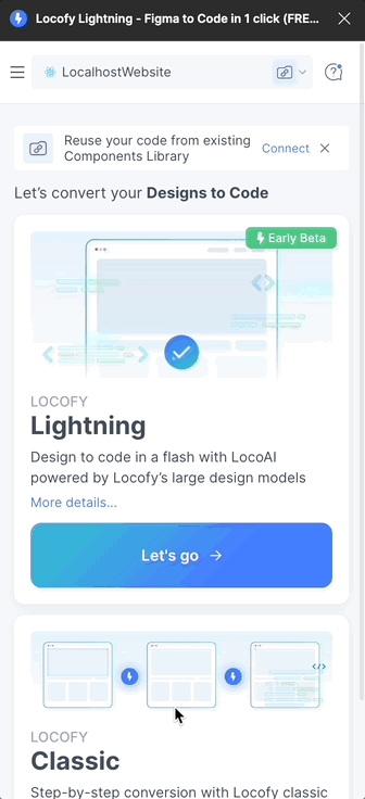
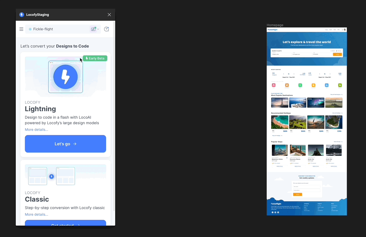
New Locofy Project
- Run the Locofy Figma Plugin. You may view our documentation on installing the Locofy plugin from here.
- Create a new Locofy project for React, Next.js, Angular, React Native, Swift, Jetpack Compose & Gatsby.
- Import your custom components during project setup.
Existing Locofy Project
- Run the Locofy Figma Plugin.
- Select an existing Locofy project.
- Click on the badge or Custom Components icon next to the project dropdown.
- Import your custom components.
Importing Methods
You can import your custom components using any of the following:
- Import using the Locofy CLI from your codebase
- Import from a GitHub repository
Refer to our component structure guide, manual prop mapping, Custom mapping (mapFn), and Figma’s component best practices.
Mapping your Custom Components to the Figma Components
- LocoAI automatically maps your custom components to their corresponding Figma components.
- If a component is not auto-mapped or needs to be changed, use Locate Mode to map it manually.
- You can edit or delete mappings at any time.
- You can detach the entire custom component library if required.
Note:
If your component exposes a className prop, you can edit styling and responsiveness in the review section.
If it exposes an onClick prop, you can configure it under Actions & Interactions.
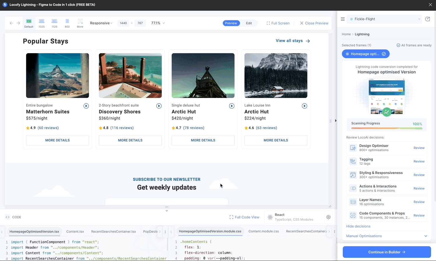
Generating Code for Screens
Select the frames you want to convert and run Locofy Lightning.
Locofy detects mapped custom components, pre-fills the correct props, and generates clean, responsive, modular code for the remaining UI.
Editing Props of Custom Components
After mapping, you can dynamically edit component props.
Steps
- Go to Code Components & Props Review
- Select the custom component
- Select the instance
- Edit style, value, or conditional props and preview changes