Manual Prop Mapping
Want more control over how Locofy maps the props of your custom components when importing your component library? This guide covers mapping via the plugin UI, config files, and how prop detection works—with examples for both React and Angular.
Code component
import { FunctionComponent } from "react";
import styles from "./Card.module.css";

export type CardProp = {
  badge: string;
  item: {
    name: string;
    image: string;
    rating: number;
    locations: {
      name: string;
    }[];
  };
};

const Card: FunctionComponent<CardProp> = ({ badge, item }) => {
  return (
    <div className={styles.card}>
      <span className={styles.badge}>{badge}</span>
      <h3>{item.name}</h3>
      {/* ... */}
    </div>
  );
};

export default Card;
In these examples, the component and its properties are already defined. Next, create matching layers in your Figma component.
Figma component
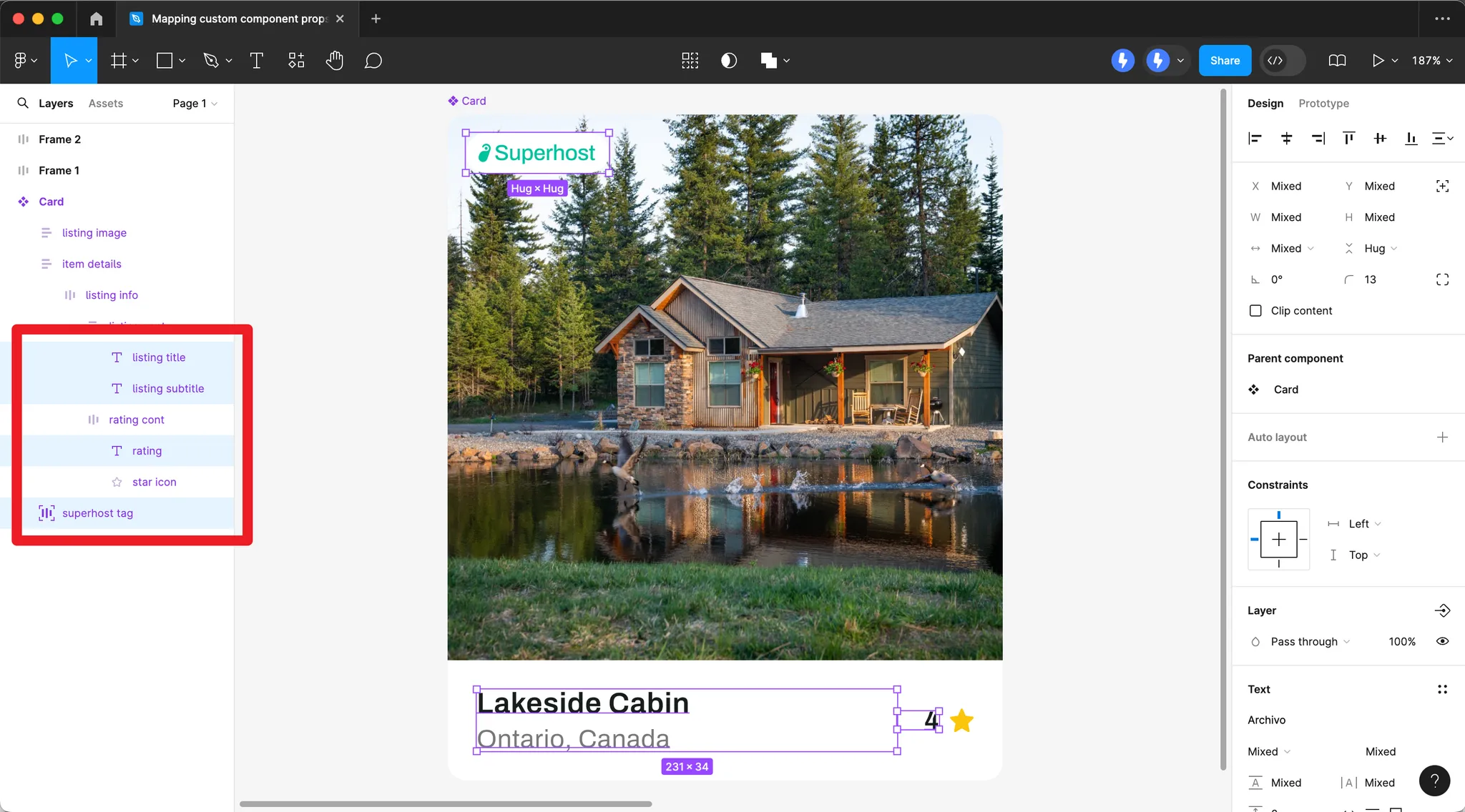
Create Figma layers that correspond to your component props (e.g. badge, item name, rating, locations).
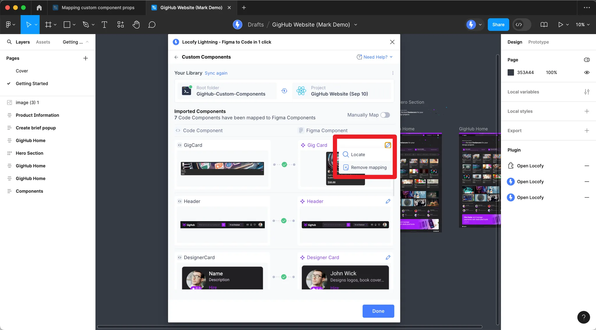
Mapping via UI in Plugin
-
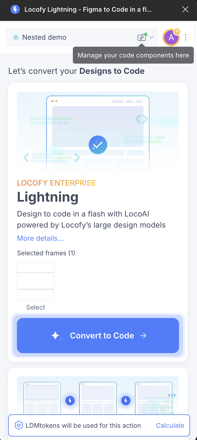
After pushing your components, click the folder icon next to the project name.
-
Click the pencil icon, then Props mapping.
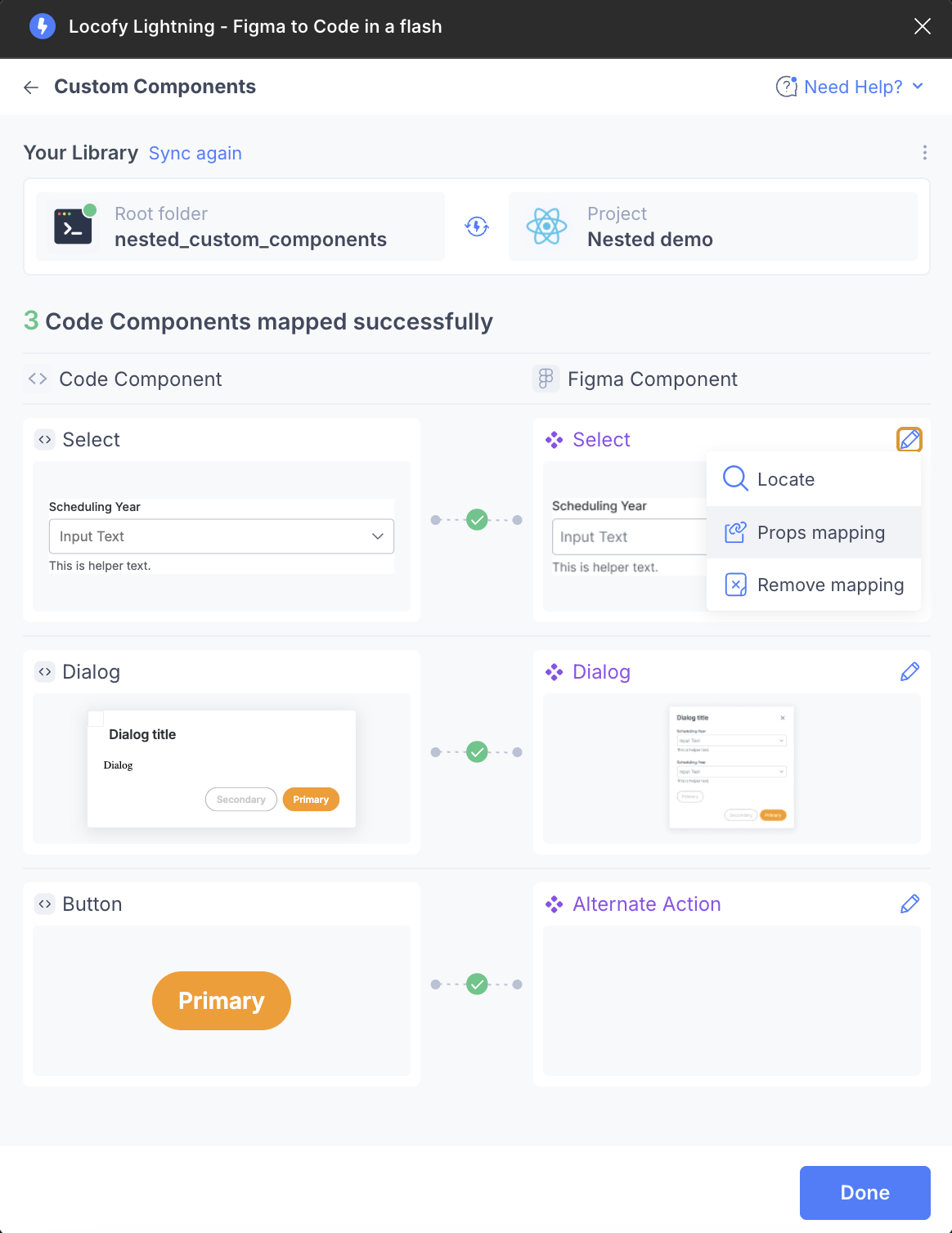
-
Map your code component props to Figma component values.
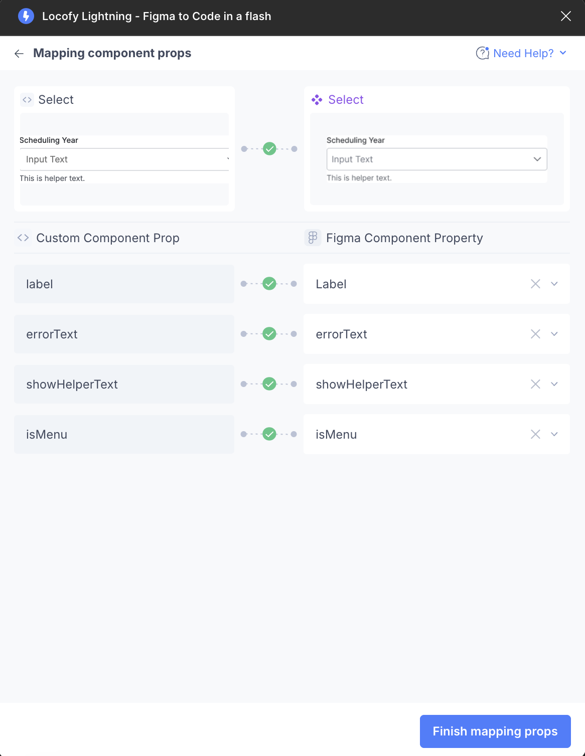
Once all properties are mapped, you will see a green tick between each custom component prop and Figma component property. You do not need to map all props—optional ones can be left unmapped.

Mapping via locofy.config.json
The locofy.config.json file defines your components and their prop schemas. Each component entry includes a path, name, and props array. Each prop has a type, optional required, defaultValue, and previewValue (shown in Locofy Builder). For enums, include an enum array. Use the plugin UI to map these props to Figma layers.
{
  "components": [
    {
      "path": "./src/components/Card.tsx",
      "name": "Card",
      "props": [
        {
          "name": "className",
          "type": "string",
          "required": false,
          "defaultValue": ""
        },
        {
          "name": "badge",
          "type": "string",
          "required": false,
          "defaultValue": "",
          "previewValue": "Superhost"
        },
        {
          "name": "item",
          "type": "object",
          "required": true,
          "defaultValue": { "name": "", "image": "", "rating": 0, "locations": [] },
          "previewValue": {
            "name": "Cozy Studio",
            "image": "/listing.jpg",
            "rating": 4.9,
            "locations": [{ "name": "Downtown" }]
          }
        }
      ]
    }
  ],
  "projectId": "2mYKttmuPiV11gUqXAU7Krha1Pn",
  "projectName": "Website project"
}
Locofy can automatically detect properties you have not manually mapped. For example, the image property may be inferred from layer content.
Using the Locofy MCP to Auto-Generate Config
Locofy MCP can generate the config file for you. Set it up using this guide (opens in a new tab), then:
-
Open your project in your IDE and enter Agent mode.
-
In Cursor, press Command + I.
-
In the Agent chat, reference the component files you want MCP to scan using @ mentions:
@src/components/Card.tsx @src/components/Badge.tsx generate config schema for all components in the given filesOr use globs:
@src/components/**/*.tsx generate config schema for all components in the given filesFor Angular:
@src/app/components/**/*.component.ts generate config schema for all components in the given files -
MCP analyzes the files, detects components and props, and writes output to
locofy.config.jsonat your project root. -
Review the generated entries. Example:
{ "components": [ { "path": "./src/components/Badge.tsx", "name": "Badge", "props": [ { "name": "className", "type": "string", "required": false, "defaultValue": "" }, { "name": "color", "type": "enum", "required": true, "enum": ["sky", "purple", "green"], "defaultValue": "sky", "previewValue": "green" } ] } ], "projectId": "your-project-id", "projectName": "Your Project" } -
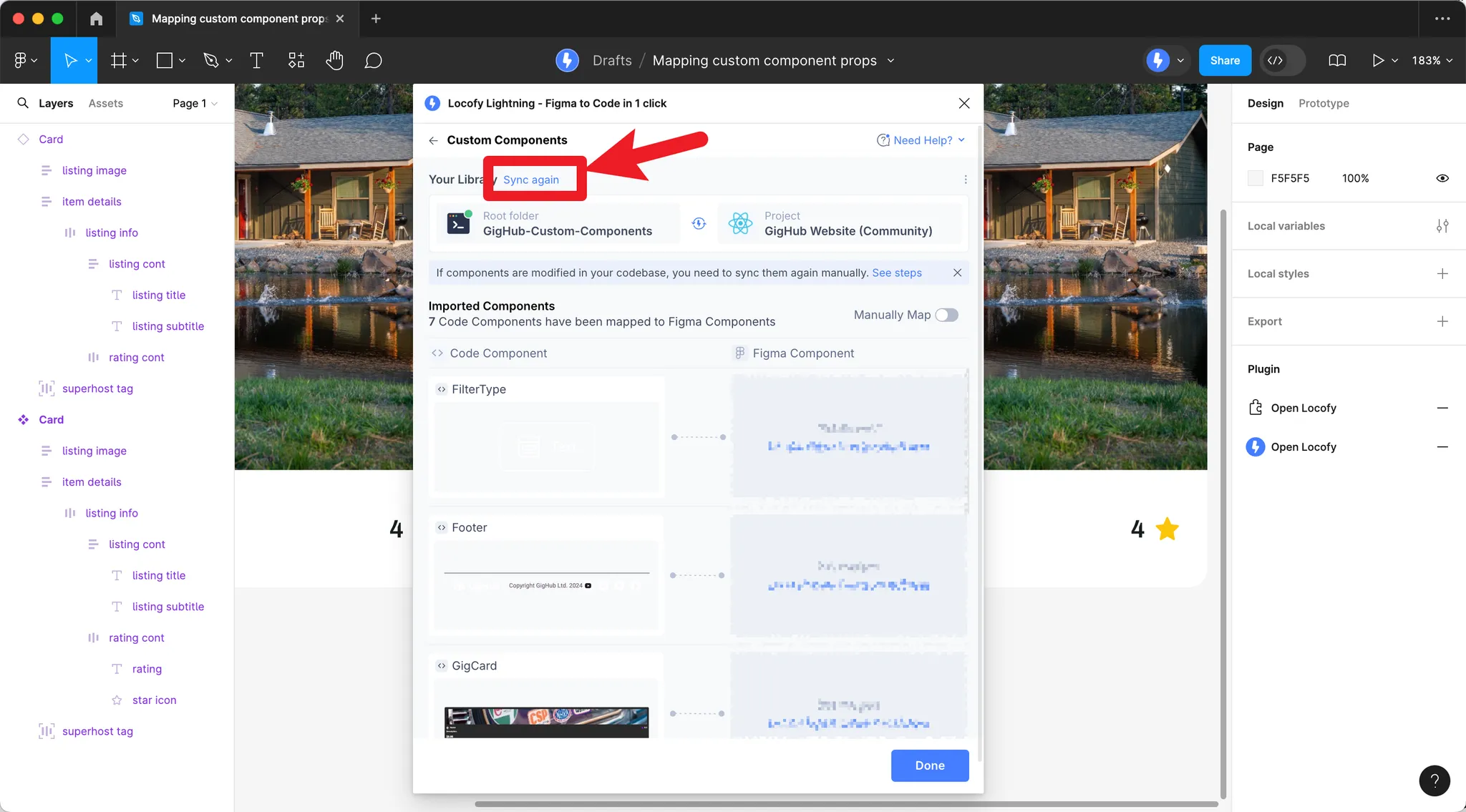
Save and commit. If you previously mapped props via the plugin UI, remove those mappings and Sync again to avoid conflicts.
Previously imported your component library?
If you have previously imported your component library, remove all existing mappings by clicking the pencil icon and Remove mapping, then click Sync again.
How Prop Detection Works
Once you have a mapping config in place, Locofy detects prop values from your designs. This section explains what you need to do in Figma and in your config so props are detected correctly.
Component Matching
Figma components and instances: When your custom component is mapped to a Figma component (or component set), all instances of that Figma component map to your custom component. Locofy uses the shared tree structure to match layers across instances.
Normal layers (frames and groups): You can map custom components to non-component layers using a naming convention:
| Layer name | Maps to |
|---|---|
<Button> | Custom component named Button |
<Card> | Custom component named Card |
<card> | Custom component named Card (case-insensitive) |
Limitation: Normal layer matching only works for components with simple props (children, className).
Mapping Props from Figma Component Properties
The most direct way to pass props is through Figma component properties:
| Figma property type | Custom prop type | How it works |
|---|---|---|
| Text | string | Text value from the Figma property |
| Variant | string / enum | Selected variant value |
| Boolean | boolean | True/false state |
| Instance Swap | ReactNode / ng-content | Swapped instance content maps to a slot |
See Structuring Components for aligning Figma properties with your code props.
Layer Naming Conventions
Map Figma layers to props using naming patterns:
| Pattern | Description |
|---|---|
[propName] | Maps the layer's content (text, image, etc.) to the prop |
[propName >] | Maps the layer's children to the prop (e.g. children or array props) |
Examples:
- Layer named
[title]→titleprop gets the layer's text content - Layer named
[items >]→itemsprop gets the layer's child nodes
Predefined values:
[firstName=John][lastName=Doe]Each [propName=value] pair sets that prop to a fixed value.
Value Mapping
When Figma uses different labels than your code (e.g. Sky vs sky, or Severity - Low vs green), define value mapping. Keys are values in your code; values are Figma variant/property names that map to them.
// src/components/Badge.tsx
import { FunctionComponent } from "react";

export type BadgeProps = {
  label: string;
  color?: "sky" | "purple" | "green";
};

export const LocofyConfig = {
  props: [
    {
      name: "color",
      type: "enum",
      enum: ["sky", "purple", "green"],
      defaultValue: "sky",
      previewValue: "green",
      valueMapping: {
        sky: ["Sky"],
        purple: ["Purple"],
        green: ["Green", "Severity - Low"],
      },
    },
  ],
};

const Badge: FunctionComponent<BadgeProps> = ({ label, color = "sky" }) => (
  <span className={`badge badge-${color}`}>{label}</span>
);

export default Badge;
Figma might use Severity - Low as a variant; with valueMapping, it maps to color="green" in code.
Expected Values
For enum-like props, restrict detected values with expectValues:
{
  expectValues: ["small", "medium", "large"];
}
If the detected value is not in this list, the first expected value is used instead.
Object Props
Object props are detected by treating each key as a separate prop. Map nested keys in your config or use layer naming [user.firstName=John][user.lastName=Doe] for predefined values.
// src/components/ListingCard.tsx
import { FunctionComponent } from "react";

export type Listing = {
  name: string;
  image: string;
  rating: number;
  locations: { name: string }[];
};

export type ListingCardProps = {
  badge: string;
  item: Listing;
};

const ListingCard: FunctionComponent<ListingCardProps> = ({ badge, item }) => (
  <div className="card">
    <span className="badge">{badge}</span>
    <h3>{item.name}</h3>
    <img src={item.image} alt="" />
    <span>{item.rating}★</span>
    {item.locations.map((loc) => (
      <span key={loc.name}>{loc.name}</span>
    ))}
  </div>
);

export default ListingCard;
locofy.config.json – declare the item prop as type object; map nested keys (item.name, item.rating, item.locations[].name) to Figma layers via the plugin UI:
{
  "components": [
    {
      "path": "./src/components/ListingCard.tsx",
      "name": "ListingCard",
      "props": [
        {
          "name": "badge",
          "type": "string",
          "required": false,
          "defaultValue": "",
          "previewValue": "Superhost"
        },
        {
          "name": "item",
          "type": "object",
          "required": true,
          "defaultValue": {
            "name": "Listing Name",
            "image": "",
            "rating": 0,
            "locations": []
          },
          "previewValue": {
            "name": "Cozy Downtown Apartment",
            "image": "/listing.jpg",
            "rating": 4.8,
            "locations": [{ "name": "Downtown, Seattle" }]
          }
        }
      ]
    }
  ]
}
In Figma, name layers [item.name], [item.rating], [item.locations >], or use predefined values: [item.name=My Listing][item.rating=4.5].
Array Props
Array props require defining how the first item is detected. Locofy finds additional items via name-based indexing ([items.1.title], [items.2.title]) or structure-based discovery (sibling nodes with the same structure).
// src/components/ProductList.tsx
import { FunctionComponent } from "react";

export type ProductItem = {
  title: string;
  price: number;
};

export type ProductListProps = {
  items: ProductItem[];
};

const ProductList: FunctionComponent<ProductListProps> = ({ items }) => (
  <div className="product-list">
    {items.map((item, i) => (
      <div key={i} className="product-card">
        <h4>{item.title}</h4>
        <p>${item.price}</p>
      </div>
    ))}
  </div>
);

export default ProductList;
Figma structure (structure-based discovery):
Frame: "Product List"
├── Card (title: "iPhone", price: "$999")   ← items[0]
├── Card (title: "MacBook", price: "$1299") ← items[1]
└── Card (title: "iPad", price: "$799")     ← items[2]
Or use name-based layer naming: [items.0.title], [items.1.title], [items.2.title], [items.0.price], etc.
locofy.config.json:
{
  "components": [
    {
      "path": "./src/components/ProductList.tsx",
      "name": "ProductList",
      "props": [
        {
          "name": "items",
          "type": "object",
          "required": true,
          "defaultValue": [],
          "previewValue": [
            { "title": "iPhone", "price": 999 },
            { "title": "MacBook", "price": 1299 },
            { "title": "iPad", "price": 799 }
          ]
        }
      ]
    }
  ]
}
Result when detected from the product list:
[
  { title: "iPhone", price: 999 },
  { title: "MacBook", price: 1299 },
  { title: "iPad", price: 799 },
];
How Values Are Extracted
| Prop type | Source |
|---|---|
| String | Text layer content, layer name (normalized), or image src |
| Number | Parsed from text content or Figma prop values |
| Boolean | Layer visibility, Figma boolean property, or variant (truthy/falsy) |
| Style | Derived from Figma: flexDirection, color, fontSize, fontWeight |
| Node/slot | Figma layer(s) rendered as React nodes or Angular ng-content |
Best Practices
- Keep structure consistent – All instances of a Figma component should share the same tree structure.
- Use Figma component properties when possible – Text, Variant, Boolean, and Instance Swap map cleanly to props.
- Name important layers – Use
[propName]or[propName >]when you can't use Figma properties. - Define value mapping – When designers use different names than developers (e.g.
Svssmall), addvalueMapping. - For arrays – Define the first item clearly; use naming or structure-based discovery for the rest.
Complete Example: Full Component and Config
Below is a complete ProductCard component with multiple prop types, and the corresponding locofy.config.json for each framework.
React
// src/components/ProductCard.tsx
import { FunctionComponent } from "react";
import styles from "./ProductCard.module.css";

export type ProductCardProps = {
  title: string;
  price: number;
  badge?: string;
  onSale?: boolean;
  rating?: number;
  tags?: { label: string }[];
};

const ProductCard: FunctionComponent<ProductCardProps> = ({
  title,
  price,
  badge = "",
  onSale = false,
  rating = 0,
  tags = [],
}) => {
  return (
    <div className={styles.card}>
      {badge && <span className={styles.badge}>{badge}</span>}
      {onSale && <span className={styles.saleTag}>Sale</span>}
      <h3 className={styles.title}>{title}</h3>
      <p className={styles.price}>${price}</p>
      {rating > 0 && <span className={styles.rating}>{rating}★</span>}
      {tags.length > 0 && (
        <div className={styles.tags}>
          {tags.map((t) => (
            <span key={t.label} className={styles.tag}>
              {t.label}
            </span>
          ))}
        </div>
      )}
    </div>
  );
};

export default ProductCard;
locofy.config.json
{
  "components": [
    {
      "path": "./src/components/ProductCard.tsx",
      "name": "ProductCard",
      "props": [
        {
          "name": "className",
          "type": "string",
          "required": false,
          "defaultValue": ""
        },
        {
          "name": "title",
          "type": "string",
          "required": true,
          "defaultValue": "Product Name",
          "previewValue": "Wireless Headphones"
        },
        {
          "name": "price",
          "type": "number",
          "required": true,
          "defaultValue": 0,
          "previewValue": 99
        },
        {
          "name": "badge",
          "type": "string",
          "required": false,
          "defaultValue": "",
          "previewValue": "Best Seller"
        },
        {
          "name": "onSale",
          "type": "boolean",
          "required": false,
          "defaultValue": false,
          "previewValue": true
        },
        {
          "name": "rating",
          "type": "number",
          "required": false,
          "defaultValue": 0,
          "previewValue": 4.5
        },
        {
          "name": "tags",
          "type": "object",
          "required": false,
          "defaultValue": [{ "label": "New" }]
        }
      ]
    }
  ],
  "projectId": "your-project-id",
  "projectName": "Your Project"
}
Angular
// src/app/components/product-card/product-card.component.ts
import { Component, Input } from "@angular/core";

export interface ProductTag {
  label: string;
}

@Component({
  selector: "app-product-card",
  standalone: true,
  templateUrl: "./product-card.component.html",
  styleUrls: ["./product-card.component.css"],
})
export class ProductCardComponent {
  @Input() title!: string;
  @Input() price!: number;
  @Input() badge?: string;
  @Input() onSale?: boolean;
  @Input() rating?: number;
  @Input() tags?: ProductTag[];
}
<!-- product-card.component.html -->
<div class="card">
@if (badge) {
<span class="badge">{{ badge }}</span>
} @if (onSale) {
<span class="sale-tag">Sale</span>
}
<h3 class="title">{{ title }}</h3>
<p class="price">${{ price }}</p>
@if (rating && rating > 0) {
<span class="rating">{{ rating }}★</span>
} @if (tags && tags.length > 0) {
<div class="tags">
@for (t of tags; track t.label) {
<span class="tag">{{ t.label }}</span>
}
</div>
}
</div>locofy.config.json
{
  "components": [
    {
      "path": "./src/app/components/product-card/product-card.component.ts",
      "name": "ProductCardComponent",
      "props": [
        {
          "name": "title",
          "type": "string",
          "required": true,
          "defaultValue": "Product Name",
          "previewValue": "Wireless Headphones"
        },
        {
          "name": "price",
          "type": "number",
          "required": true,
          "defaultValue": 0,
          "previewValue": 99
        },
        {
          "name": "badge",
          "type": "string",
          "required": false,
          "defaultValue": "",
          "previewValue": "Best Seller"
        },
        {
          "name": "onSale",
          "type": "boolean",
          "required": false,
          "defaultValue": false,
          "previewValue": true
        },
        {
          "name": "rating",
          "type": "number",
          "required": false,
          "defaultValue": 0,
          "previewValue": 4.5
        },
        {
          "name": "tags",
          "type": "object",
          "required": false
        }
      ]
    }
  ],
  "projectId": "your-project-id",
  "projectName": "Your Project"
}
Each prop in the config has a name, type (string, number, boolean, enum, object), optional required, defaultValue, and previewValue. The previewValue is shown in Locofy Builder when editing. Map these props to your Figma layers via the plugin UI.