Theming
Theming lets your users switch between visual modes — most commonly dark and light — without duplicating components or hardcoding colour values. In Agent Mode, you can add a complete theming system to your generated UI using a single prompt or the built-in shortcut.
What Agent Mode Does
When you apply the theming prompt, Agent Mode will:
- Replace hardcoded colour values in your components with CSS variables or theme tokens
- Set up a theme configuration with named colour slots (e.g.
background,surface,text-primary,border) - Generate both a light and dark theme definition mapped to those tokens
- Add a theme toggle mechanism (a React context, a CSS class on the root element, or a framework-native approach) so the switch works at runtime
- Apply changes consistently across all components in scope so colours are driven by the theme rather than fixed values
The output integrates with common patterns — CSS custom properties, Tailwind's dark: variant, or a styled-components ThemeProvider — depending on your project framework.
How to Apply
Using the Shortcut
- Switch to Agent Mode in the plugin or in Locofy Builder.
- In the new chat, you will see a list of prebuilt prompts. You can also click on the light bulb icon to open the shortcuts panel.
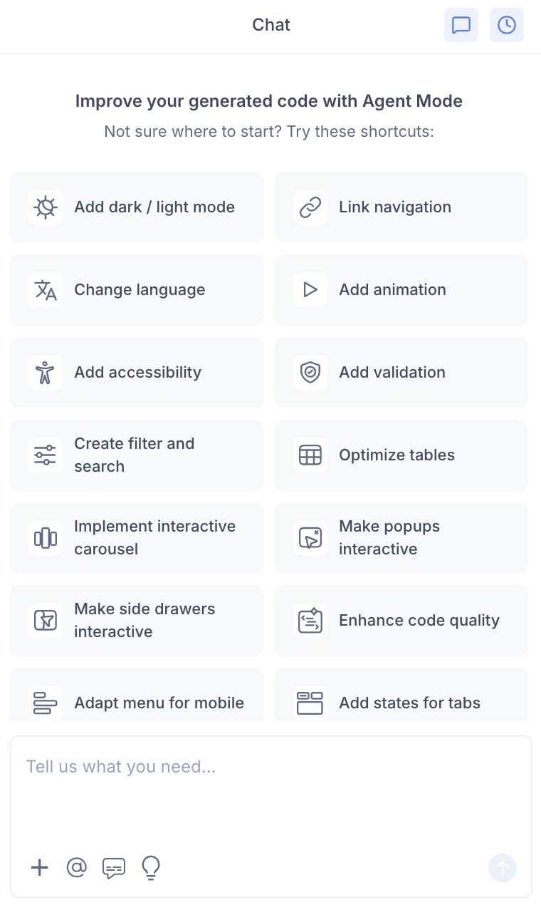
- Select "Enable dark / light theme" from the list.
- Agent Mode will scaffold theming across the current screen or component.

Using a Custom Prompt
You can type a prompt directly into the chat box for more control over the approach. For example:
"Add dark and light mode support using CSS variables. Define both themes on the
:rootand[data-theme='dark']selectors."
"Set up a Tailwind dark mode theme using the
dark:class variant. Apply it consistently across all components."
"Create a React theme context with a toggle button. Switch between a light and dark colour palette using a
ThemeProvider."
"Replace all hardcoded hex colours with design tokens and generate a light and dark token set."
Targeting a Specific Section
To apply theming to a single component or panel:
- Use the selection tool in Agent Mode to highlight the area.
- Type your prompt or select the shortcut.
Agent Mode will scope the token replacements and theme logic to just the selected section.
Example Output
For a card component with hardcoded colours, Agent Mode transforms:
.card {
  background-color: #ffffff;
  color: #111111;
  border: 1px solid #e0e0e0;
}
into a CSS-variable-based approach:
:root {
  --color-background: #ffffff;
  --color-text-primary: #111111;
  --color-border: #e0e0e0;
}

[data-theme="dark"] {
  --color-background: #1a1a1a;
  --color-text-primary: #f5f5f5;
  --color-border: #333333;
}

.card {
  background-color: var(--color-background);
  color: var(--color-text-primary);
  border: 1px solid var(--color-border);
}
A toggle button is also added to switch the data-theme attribute at the document root:
<button onClick={() => {
  const current = document.documentElement.getAttribute('data-theme');
  document.documentElement.setAttribute('data-theme', current === 'dark' ? 'light' : 'dark');
}}>
  Toggle theme
</button>
Customising the Theme
Once the theme scaffolding is in place, you can use Agent Mode to refine it:
"Change the dark mode background to a dark navy colour instead of pure black."
"Add a high-contrast mode as a third theme option."
"Replace the toggle button with a sun and moon icon."
Agent Mode will update the relevant token values and components without rebuilding the entire theme structure.
Tips
- Apply theming early — before adding validation, animations, or other enhancements — so that all subsequent components automatically use theme tokens instead of hardcoded values.
- If your Figma design uses a design system with colour styles, Locofy's generated code may already have named colour references; theming builds cleanly on top of that structure.
- Use the selection tool to theme individual components (e.g. a navigation bar or a sidebar) without affecting the rest of the screen.
- After applying a theme, switch between dark and light modes in the preview to verify contrast and readability before syncing to Builder.