Table Responsiveness
Data tables are one of the most challenging UI patterns to make responsive. On small screens, wide tables overflow or become unreadable. In Agent Mode, you can make any table in your generated UI fully responsive using a prompt — without manually rewriting the table structure.
What Agent Mode Does
When you apply the table responsiveness prompt, Agent Mode will:
- Detect all table components on the screen
- Choose the most appropriate responsive strategy based on the table's content and column count:
- Horizontal scroll — wraps the table in a scrollable container for simple cases
- Card layout — transforms each row into a stacked card on mobile, with column labels shown inline
- Priority columns — hides lower-priority columns on small screens and reveals them on expand
- Collapsible rows — adds an expand/collapse toggle to show additional columns per row
- Apply the changes using CSS media queries or framework-specific responsive utilities
- Ensure the table remains fully functional (sortable, filterable, selectable) after the layout change
How to Apply
Using the Shortcut
- Switch to Agent Mode in the plugin or in Locofy Builder.
- In the new chat, you will see a list of prebuilt prompts. You can also click on the light bulb icon to open the shortcuts panel.
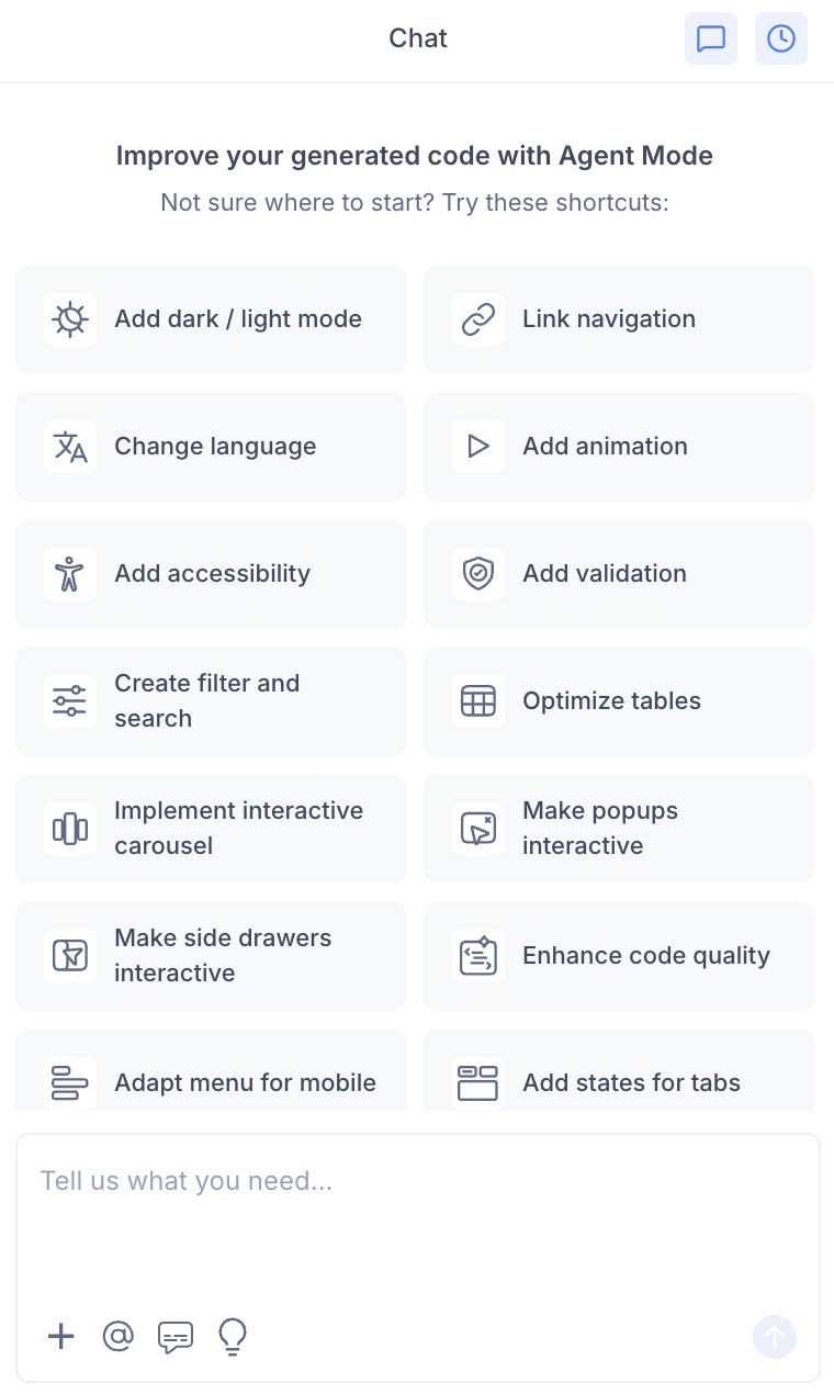
- Select "Make table responsive" from the list.
- Agent Mode will apply a responsive layout to tables on the current screen.
Using a Custom Prompt
Type a prompt to specify the responsive strategy:
"Make the orders table responsive. On mobile, convert each row into a stacked card with the column name shown as a label."
"Wrap the data table in a horizontal scroll container on screens smaller than 768px."
"On mobile, hide the 'Last updated' and 'ID' columns and show only the most important columns."
"Add a row expand toggle on mobile so users can tap a row to see all its details."
Targeting a Specific Table
To apply responsiveness to one table on a page with multiple tables:
- Use the selection tool in Agent Mode to highlight the table.
- Type your prompt.
Agent Mode will scope the changes to just the selected table.
Example Output
For a table converted to a card layout on mobile:
@media (max-width: 640px) {
  table, thead, tbody, th, td, tr {
    display: block;
  }

  thead tr {
    display: none;
  }

  tr {
    border: 1px solid var(--color-border);
    border-radius: 8px;
    margin-bottom: 12px;
    padding: 12px;
  }

  td {
    display: flex;
    justify-content: space-between;
    padding: 6px 0;
    border: none;
  }

  td::before {
    content: attr(data-label);
    font-weight: 600;
    color: var(--color-text-secondary);
  }
}
Each <td> is given a data-label attribute matching its column header:
<td data-label="Order ID">{order.id}</td>
<td data-label="Status">{order.status}</td>
<td data-label="Total">{order.total}</td>
Customising Table Responsiveness
Once the base layout is applied, you can refine it:
"On the card layout, make the status badge appear at the top right of each card."
"Add a sticky first column so the row identifier stays visible when scrolling horizontally."
"Show a summary row at the bottom of the mobile card view with the total."
"Add a 'View details' link at the bottom of each mobile card that opens a detail panel."
Tips
- Combine table responsiveness with filter and search for a complete data management experience across all screen sizes.
- If your table has more than 6 columns, the card layout or collapsible row strategy usually works better than horizontal scroll.
- Use the selection tool if the page has multiple tables and you want different responsive strategies for each.
- After applying, resize the preview window to verify the layout switches correctly at your target breakpoint.