Interactive Side Drawers
Side drawers (also called sidebars or slide-out panels) are navigation or detail panels that slide in from the edge of the screen. Locofy generates the visual layout of your drawer from Figma, but Agent Mode wires up the open/close behaviour, overlay, and accessibility handling automatically.
What Agent Mode Does
When you apply the interactive side drawers prompt, Agent Mode will:
- Add open/close state management to the drawer component
- Wire up trigger elements (hamburger buttons, filter icons, or action buttons) to open the drawer
- Add a backdrop/overlay that closes the drawer on click
- Add a close button inside the drawer
- Apply a slide-in/slide-out transition from the correct edge (left or right)
- Trap keyboard focus inside the drawer while it is open
- Close the drawer when the Escape key is pressed
- Prevent body scroll while the drawer is open on mobile
- Handle z-index layering so the drawer appears above other content
How to Apply
Using the Shortcut
- Switch to Agent Mode in the plugin or in Locofy Builder.
- In the new chat, you will see a list of prebuilt prompts. You can also click on the light bulb icon to open the shortcuts panel.
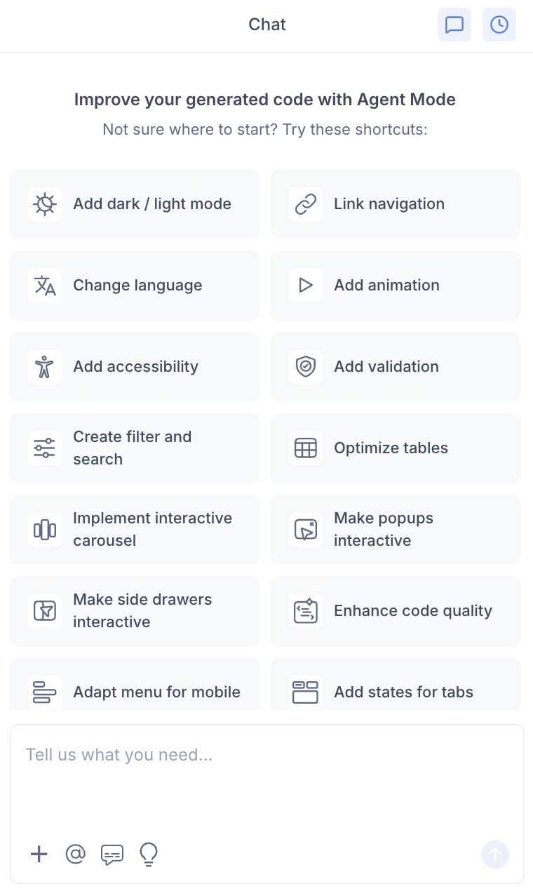
- Select "Make side drawers interactive" from the list.
- Agent Mode will wire up the drawer components on the current screen.
Using a Custom Prompt
Type a prompt to describe the drawer behaviour:
"Make the navigation side drawer interactive. Open it when the hamburger button is clicked and close it on overlay click or Escape key."
"Wire up the filter panel so it slides in from the right when the filter button is clicked."
"Make the cart side drawer slide in from the right with a smooth 0.3s transition."
"Add a side drawer for user profile settings that opens from the right side of the screen."
Targeting a Specific Drawer
To wire up one drawer on a page with multiple panels:
- Use the selection tool in Agent Mode to highlight the drawer component and its trigger.
- Type your prompt.
Agent Mode will scope the interactivity to just the selected drawer.
Example Output
For a left-side navigation drawer:
const [isOpen, setIsOpen] = useState(false);

return (
  <>
    <button
      onClick={() => setIsOpen(true)}
      aria-label="Open navigation menu"
      aria-expanded={isOpen}
      aria-controls="side-drawer"
    >
      ☰
    </button>

    {isOpen && (
      <div
        className="drawer-overlay"
        onClick={() => setIsOpen(false)}
        aria-hidden="true"
      />
    )}

    <nav
      id="side-drawer"
      className={`drawer drawer-left ${isOpen ? 'drawer-open' : ''}`}
      aria-label="Navigation menu"
    >
      <button
        className="drawer-close"
        onClick={() => setIsOpen(false)}
        aria-label="Close navigation menu"
      >
        ✕
      </button>
      {/* drawer content */}
    </nav>
  </>
);
With CSS transitions:
.drawer {
  position: fixed;
  top: 0;
  left: 0;
  height: 100%;
  width: 280px;
  transform: translateX(-100%);
  transition: transform 0.3s ease;
  z-index: 200;
}

.drawer.drawer-open {
  transform: translateX(0);
}

.drawer-overlay {
  position: fixed;
  inset: 0;
  background: rgba(0, 0, 0, 0.4);
  z-index: 199;
}
Customising Drawer Behaviour
Once the base interactivity is applied, you can extend it:
"Make the drawer push the main content to the right instead of overlaying it."
"Add a mini collapsed version of the sidebar that expands on hover on desktop."
"Add a bottom drawer for mobile that slides up from the bottom of the screen."
"Keep the drawer open by default on desktop and make it a toggle only on mobile."
Tips
- Use the selection tool to target a specific drawer if the page has multiple slide-out panels.
- Combine side drawers with adapt menu for mobile — the mobile hamburger menu typically opens a side drawer.
- Always include focus trapping and Escape key handling in your prompt to ensure the drawer meets accessibility standards.
- For persistent sidebars on desktop, mention in your prompt that the drawer should only be a toggle on mobile and always visible on larger screens.