Interactive Popups
Popups — including modals, dialogs, confirmation prompts, and lightboxes — are common UI patterns that require open/close state, overlay management, and accessibility handling. Locofy generates the visual design of your popup from Figma, but Agent Mode wires up the full interactive behaviour automatically.
What Agent Mode Does
When you apply the interactive popups prompt, Agent Mode will:
- Add open/close state management to the popup component
- Wire up trigger elements (buttons, links, or cards) to open the popup
- Add an overlay/backdrop that closes the popup on click
- Add a close button inside the popup
- Trap keyboard focus inside the popup while it is open
- Close the popup when the Escape key is pressed
- Restore focus to the trigger element when the popup closes
- Apply smooth open/close transition animations (fade, scale, or slide)
- Prevent body scroll while the popup is open
How to Apply
Using the Shortcut
- Switch to Agent Mode in the plugin or in Locofy Builder.
- In the new chat, you will see a list of prebuilt prompts. You can also click on the light bulb icon to open the shortcuts panel.
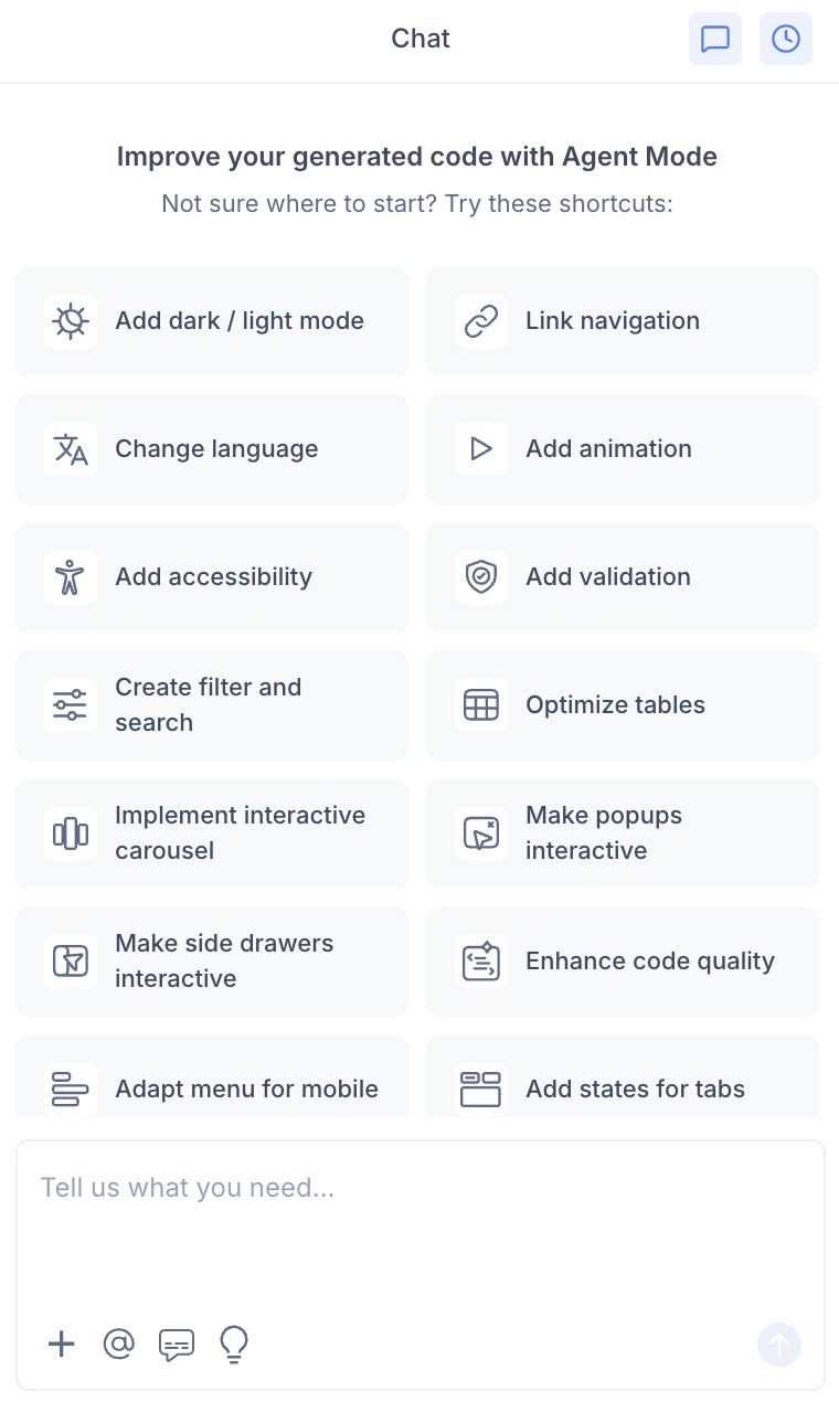
- Select "Make popups interactive" from the list.
- Agent Mode will wire up the popup components on the current screen.
Using a Custom Prompt
Type a prompt to describe the popup behaviour:
"Make the 'Delete confirmation' dialog interactive. Open it when the delete button is clicked and close it on confirm, cancel, or clicking outside."
"Wire up the image lightbox so clicking any product image opens it in a full-screen popup."
"Make the newsletter signup modal open automatically after 5 seconds on page load."
"Add a confirmation popup before the form is submitted. Close it and submit the form when the user confirms."
"Make the popup accessible — trap focus inside it and close on Escape key press."
Targeting a Specific Popup
To wire up one popup on a page with multiple modals:
- Use the selection tool in Agent Mode to highlight the popup component and its trigger.
- Type your prompt.
Agent Mode will scope the interactivity to just the selected popup.
Example Output
For a modal dialog wired to a trigger button:
const [isOpen, setIsOpen] = useState(false);
const triggerRef = useRef(null);

const openModal = () => setIsOpen(true);
const closeModal = () => {
  setIsOpen(false);
  triggerRef.current?.focus();
};

// Close on Escape key
useEffect(() => {
  const handleKey = (e) => { if (e.key === 'Escape') closeModal(); };
  if (isOpen) document.addEventListener('keydown', handleKey);
  return () => document.removeEventListener('keydown', handleKey);
}, [isOpen]);

return (
  <>
    <button ref={triggerRef} onClick={openModal}>Open dialog</button>

    {isOpen && (
      <>
        <div className="overlay" onClick={closeModal} aria-hidden="true" />
        <div
          role="dialog"
          aria-modal="true"
          aria-labelledby="dialog-title"
          className="modal"
        >
          <h2 id="dialog-title">Confirm action</h2>
          <p>Are you sure you want to proceed?</p>
          <button onClick={closeModal}>Cancel</button>
          <button onClick={handleConfirm}>Confirm</button>
        </div>
      </>
    )}
  </>
);
Customising Popup Behaviour
Once the base interactivity is applied, you can extend it:
"Add a slide-down animation when the modal opens."
"Prevent the modal from closing when clicking the overlay — only allow the close button."
"Add a loading spinner inside the modal while an async action is in progress."
"Stack multiple modals so a second confirmation can open on top of the first."
Tips
- Use the selection tool to target a specific popup if the page has multiple modal components.
- Always include focus trapping and Escape key handling in your prompt to ensure the popup meets accessibility standards.
- Combine interactive popups with form validation if the popup contains a form — validation should run before the popup closes on submit.
- For image lightboxes, combine with scale and enhance images to ensure images are optimised for full-screen display.