Interactive Carousel
A carousel (also called a slider) lets users scroll through a series of images, cards, or content panels. Locofy generates the visual layout from your Figma design, but the navigation logic — next/previous buttons, dot indicators, auto-play, and swipe support — needs to be wired up. Agent Mode does this automatically with a single prompt.
What Agent Mode Does
When you apply the interactive carousel prompt, Agent Mode will:
- Add next and previous navigation buttons that advance the carousel by one slide
- Add dot or thumbnail indicators that reflect the current active slide and allow direct navigation
- Implement auto-play with a configurable interval, pausing on hover
- Add keyboard arrow key support for accessibility
- Add touch/swipe support for mobile users
- Handle looping so the carousel wraps from the last slide back to the first
- Apply smooth slide or fade transitions between panels
How to Apply
Using the Shortcut
- Switch to Agent Mode in the plugin or in Locofy Builder.
- In the new chat, you will see a list of prebuilt prompts. You can also click on the light bulb icon to open the shortcuts panel.
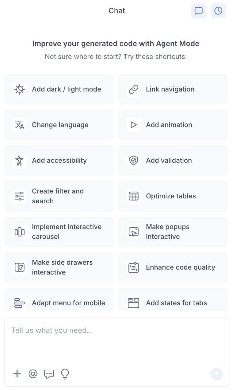
- Select "Make carousels interactive" from the list.
- Agent Mode will wire up interactivity on the carousel component on the current screen.
Using a Custom Prompt
Type a prompt to specify the carousel behaviour:
"Make the hero image slider interactive with next/previous arrows and dot indicators."
"Add auto-play to the testimonials carousel with a 4-second interval. Pause on hover."
"Add swipe support to the product image carousel for mobile users."
"Make the carousel loop infinitely and add a fade transition between slides."
"Use Embla Carousel to make the product slider interactive with drag support."
Targeting a Specific Carousel
To make one carousel interactive on a page with multiple sliders:
- Use the selection tool in Agent Mode to highlight the carousel component.
- Type your prompt.
Agent Mode will scope the interactivity to just the selected component.
Example Output
For a basic carousel with next/previous navigation and dot indicators:
const [current, setCurrent] = useState(0);
const total = slides.length;

const prev = () => setCurrent((c) => (c - 1 + total) % total);
const next = () => setCurrent((c) => (c + 1) % total);

return (
  <div className="carousel">
    <div
      className="carousel-track"
      style={{ transform: `translateX(-${current * 100}%)` }}
    >
      {slides.map((slide, i) => (
        <div key={i} className="carousel-slide">{slide}</div>
      ))}
    </div>

    <button onClick={prev} aria-label="Previous slide">‹</button>
    <button onClick={next} aria-label="Next slide">›</button>

    <div className="carousel-dots">
      {slides.map((_, i) => (
        <button
          key={i}
          className={i === current ? 'dot active' : 'dot'}
          onClick={() => setCurrent(i)}
          aria-label={`Go to slide ${i + 1}`}
        />
      ))}
    </div>
  </div>
);
Customising the Carousel
Once the base interactivity is applied, you can refine it:
"Show two slides at a time on desktop and one on mobile."
"Add a progress bar at the bottom that fills up during auto-play."
"Replace the dot indicators with thumbnail images."
"Add a counter label (e.g. '2 / 5') instead of dot indicators."
Tips
- Use the selection tool to target a specific carousel if the page has multiple slider components.
- If your carousel contains images, combine this with scale and enhance images to ensure images are optimised for the slider.
- Auto-play should always pause on hover and on keyboard focus to meet accessibility standards — mention this in your prompt if you want it explicitly enforced.
- For complex carousels (multi-item, variable-width), specify a library like Embla Carousel or Swiper in your prompt for a more robust implementation.