Hover Effects
Hover effects give users visual feedback when they interact with elements — making buttons, cards, links, and images feel responsive and polished. In Agent Mode, you can add hover effects to a specific selected element or across the entire page using a prompt.
What Agent Mode Does
When you apply the hover effects prompt, Agent Mode will:
- Add CSS
transitionand:hoverstyles to interactive elements such as buttons, links, cards, and icons - Apply colour shifts, background changes, shadow lifts, or scale transforms on hover
- Add underline or highlight effects to navigation links and text links
- Apply image zoom or overlay effects to image cards on hover
- Ensure hover styles are consistent with the existing colour palette and design tokens
How to Apply
Using the Shortcut
- Switch to Agent Mode in the plugin or in Locofy Builder.
- In the new chat, you will see a list of prebuilt prompts. You can also click on the light bulb icon to open the shortcuts panel.
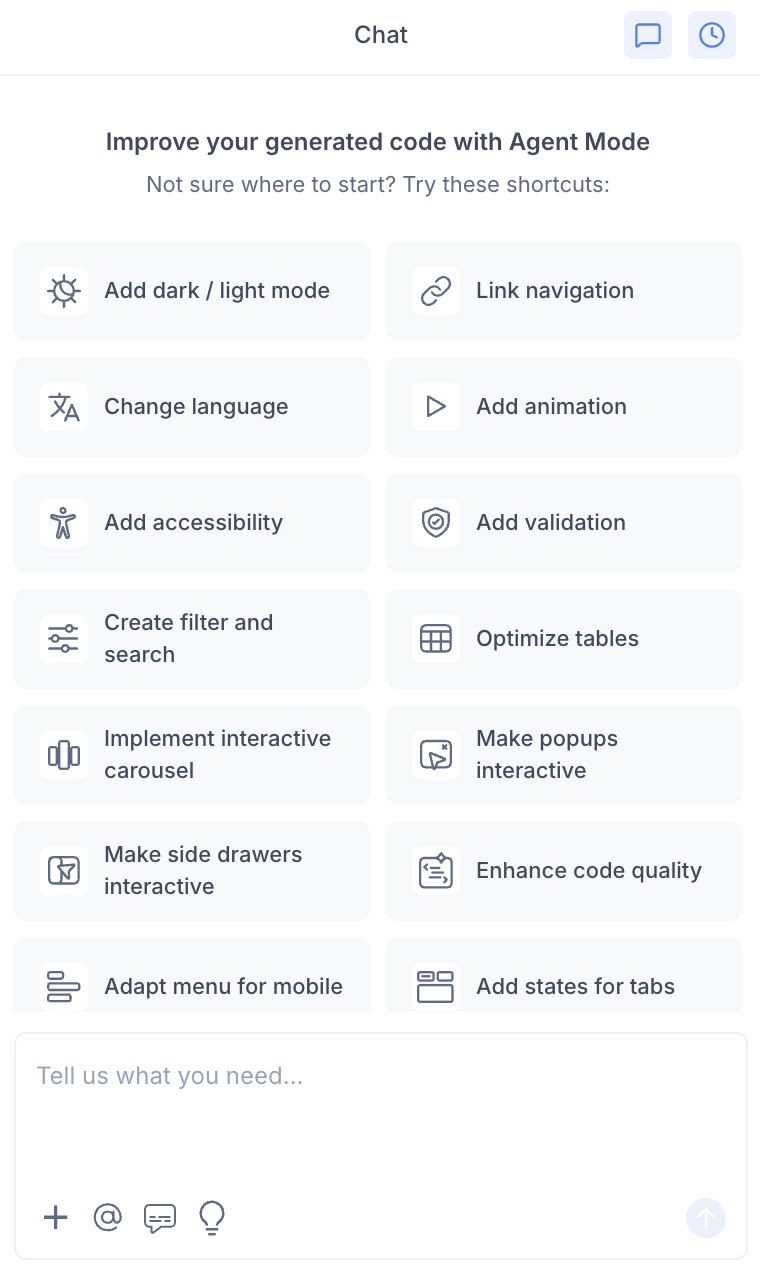
- Select "Create hover effect" from the list.
- Agent Mode will apply hover effects across the current screen.
Using a Custom Prompt
Type a prompt to describe the effect you want:
"Add a subtle shadow lift and slight scale-up effect to all cards on hover."
"Add a background colour change and underline to all navigation links on hover."
"Add an image zoom effect inside the card container on hover, keeping the card size fixed."
"Add a colour transition to all primary buttons on hover using the existing brand colour."
"Add a tooltip that appears on hover for all icon-only buttons."
Targeting a Specific Element
To apply a hover effect to just one component:
- Use the selection tool in Agent Mode to highlight the specific element — a single card, button, or image.
- Type your prompt describing the hover behaviour.
Agent Mode will apply the effect only to the selected element, leaving the rest of the page unchanged.
Applying Across the Entire Page
To apply consistent hover effects to all interactive elements at once:
- Do not make a selection — leave the full screen in view.
- Type a prompt such as:
"Add hover effects to all interactive elements on this page — buttons, cards, links, and icons."
Agent Mode will scan the screen and apply appropriate hover styles to each element type.
Example Output
For a card component, Agent Mode adds:
.card {
  transition: transform 0.2s ease, box-shadow 0.2s ease;
}

.card:hover {
  transform: translateY(-4px);
  box-shadow: 0 8px 24px rgba(0, 0, 0, 0.12);
}
For a primary button:
.btn-primary {
  transition: background-color 0.15s ease, opacity 0.15s ease;
}

.btn-primary:hover {
  background-color: var(--color-primary-dark);
  opacity: 0.92;
}
For an image card with a zoom effect:
.image-card {
  overflow: hidden;
}

.image-card img {
  transition: transform 0.3s ease;
}

.image-card:hover img {
  transform: scale(1.05);
}
Customising Hover Effects
Once hover effects are applied, you can adjust them:
"Make the card hover shadow more pronounced — increase the blur radius."
"Change the button hover colour to a lighter tint instead of a darker shade."
"Add a smooth colour overlay on image cards on hover instead of a zoom effect."
"Remove hover effects from the footer links — only keep them on the main navigation."
Tips
- Use the selection tool when you want a specific effect on one component (e.g. a hero image card) that differs from the rest of the page.
- Leave the selection empty and use a broad prompt when you want a consistent hover style applied site-wide.
- Keep transitions short —
0.15sto0.25s— for hover effects to feel snappy and responsive rather than sluggish. - Hover effects are purely visual and do not affect functionality, so they can be applied at any stage of your workflow.