Filter and Search
Filter and search functionality lets users quickly find relevant items in a list, table, or grid. In Agent Mode, you can add fully wired filter and search behaviour to your generated UI using a prompt — no manual state management required.
What Agent Mode Does
When you apply the filter and search prompt, Agent Mode will:
- Add a search input that filters a list, table, or grid in real time as the user types
- Wire up filter controls (dropdowns, checkboxes, toggle buttons, or tag chips) to narrow results by category, status, date range, or other attributes
- Manage filter state so multiple active filters combine correctly
- Show a "no results" empty state when no items match the current query
- Add a clear or reset button to remove all active filters at once
- Preserve the original data array and filter it reactively without mutating the source
How to Apply
Using the Shortcut
- Switch to Agent Mode in the plugin or in Locofy Builder.
- In the new chat, you will see a list of prebuilt prompts. You can also click on the light bulb icon to open the shortcuts panel.
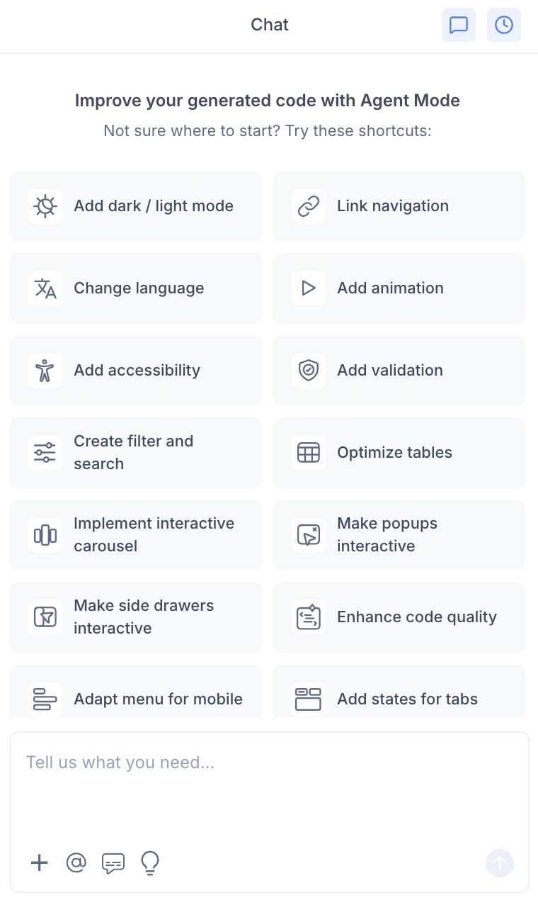
- Select "Add filter and search" from the list.
- Agent Mode will wire up search and filter behaviour on the current screen.
Using a Custom Prompt
Type a prompt to describe the specific filtering behaviour you need:
"Add a search bar that filters the product list by name in real time."
"Add category filter tabs above the grid so users can filter items by type."
"Add a dropdown filter for status (Active, Inactive, Pending) and wire it to the table rows."
"Add a search input and a date range filter to the transactions table."
"Add multi-select tag filters so users can filter by multiple categories at once."
Targeting a Specific Section
To add filter and search to one list or table:
- Use the selection tool in Agent Mode to highlight the component.
- Type your prompt describing the filter behaviour.
Agent Mode will scope the logic to just the selected component.
Example Output
For a product grid, Agent Mode adds a search input wired to a filtered list:
const [query, setQuery] = useState('');

const filteredProducts = products.filter((p) =>
  p.name.toLowerCase().includes(query.toLowerCase())
);

return (
  <>
    <input
      type="search"
      placeholder="Search products..."
      value={query}
      onChange={(e) => setQuery(e.target.value)}
    />
    <div className="product-grid">
      {filteredProducts.length > 0 ? (
        filteredProducts.map((p) => <ProductCard key={p.id} product={p} />)
      ) : (
        <p className="empty-state">No products match your search.</p>
      )}
    </div>
  </>
);
For a status filter with multiple options:
const [activeStatus, setActiveStatus] = useState('All');

const filteredItems = activeStatus === 'All'
  ? items
  : items.filter((item) => item.status === activeStatus);
Customising Filter and Search
Once the base functionality is in place, you can extend it:
"Add a sort dropdown so users can sort results by price, date, or name."
"Debounce the search input so filtering only triggers after the user stops typing for 300ms."
"Persist the active filters in the URL query string so users can share filtered views."
"Add a results count label that updates as filters change (e.g. 'Showing 12 of 48 results')."
Tips
- Use the selection tool to target a specific list or table if the page has multiple filterable components.
- If your data comes from an API, mention this in your prompt so Agent Mode wires the filters to query parameters rather than client-side state.
- Combine filter and search with table responsiveness for a complete data management experience on mobile.
- Add a "clear filters" button prompt after the initial setup to ensure users can always reset to the full view.