Bootstrap
Bootstrap is a popular CSS framework that provides a responsive grid system, utility classes, and pre-styled components for building modern web interfaces. In Agent Mode, you can convert plain HTML elements in your generated code to use Bootstrap classes and components—buttons, cards, forms, navbars, and more—using a single prompt or the built-in shortcut, so your UI gains consistent styling and responsive behaviour from the Bootstrap design system.
What Agent Mode Does
When you apply the Bootstrap prompt, Agent Mode will:
- Replace plain buttons with Bootstrap button classes (
btn,btn-primary,btn-secondary, etc.) - Convert links styled as buttons to use Bootstrap button classes on anchor tags
- Apply Bootstrap form classes (
form-control,form-select,form-label) to inputs, selects, and textareas - Wrap card-like sections in Bootstrap card structure (
card,card-body,card-title) - Add Bootstrap grid classes (
container,row,col-*) for responsive layouts - Replace navigation elements with Bootstrap nav components (
nav,navbar,nav-link) - Apply Bootstrap utility classes for spacing, typography, and alignment where appropriate
- Ensure the Bootstrap CSS is imported or available in your project
The output aligns with Bootstrap's documentation (opens in a new tab), so your components are ready to use in a project that has Bootstrap installed.
How to Apply
Using the Shortcut
- Switch to Agent Mode in the plugin or in Locofy Builder.
- In the new chat, you will see a list of prebuilt prompts. You can also click on the light bulb icon to open the shortcuts panel.
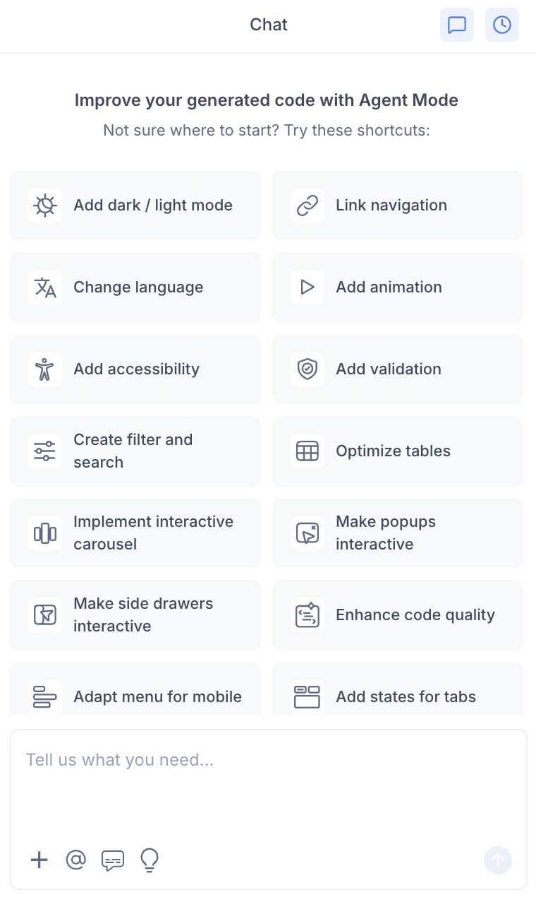
- Select "Add Bootstrap CSS" from the list.
- Agent Mode will apply Bootstrap styling across the current screen or component.
Using a Custom Prompt
You can also type a prompt directly into the chat box for more specific control. For example:
"Convert all buttons and form elements on this screen to use Bootstrap classes. Use btn and btn-primary for buttons, form-control for inputs."
"Apply Bootstrap styling to this component. Use Bootstrap card classes for the card layout and btn classes for buttons."
"Replace the navigation bar with Bootstrap navbar classes. Add Bootstrap button and form styling throughout."
"Use the Bootstrap UI kit for this screen. Convert buttons to btn btn-primary and inputs to form-control."
Targeting a Specific Section
To convert only a portion of your UI to Bootstrap:
- Use the selection tool in Agent Mode to highlight the section or component.
- Type your prompt or select the shortcut.
Agent Mode will scope the changes to the selected area, leaving the rest of the screen unchanged.
Example Output
For a section with plain buttons and a form, Agent Mode might transform:
<div>
  <button>Submit</button>
  <button>Cancel</button>
</div>
<input type="text" placeholder="Enter name" />
into:
<div>
  <button class="btn btn-primary">Submit</button>
  <button class="btn btn-secondary">Cancel</button>
</div>
<input type="text" class="form-control" placeholder="Enter name" />
For cards and grid layouts:
<div class="card">
  <div class="card-body">
    <h5 class="card-title">Card Title</h5>
    <p class="card-text">Card content goes here.</p>
    <button class="btn btn-primary">Action</button>
  </div>
</div>
Extending to More Components
Once the initial conversion is done, you can prompt Agent Mode to convert additional elements:
"Add Bootstrap navbar with nav-link classes to the header."
"Convert all form fields to use Bootstrap form-group and form-control."
"Use Bootstrap grid (container, row, col-md-4) for the three-column layout."
"Replace the modal with Bootstrap modal markup."
Agent Mode will add the appropriate Bootstrap classes and structure.
Tips
- Ensure Bootstrap is installed in your project (
npm install bootstrap) and that the Bootstrap CSS (and optionally JS) is imported in your app entry point or layout. - Bootstrap works with React, Next.js, and Gatsby projects. For Angular, use the Angular Material UI Kit or the Bootstrap UI Code Repo (opens in a new tab) with custom components.
- You can use the shortcut for a quick one-click Bootstrap implementation, or type a custom prompt for more control over which elements to convert.
- Use the selection tool when you want to convert a single form, card, or section without affecting the full page.
- If your project uses the Angular UI Figma Kit (opens in a new tab) with Bootstrap components, Agent Mode conversions will align with that structure.
- After converting, verify that the Bootstrap version and any custom theme variables match your design expectations.