Animations
Animations bring your UI to life — entrance effects, transitions, loading states, and micro-interactions all improve the feel of a product. In Agent Mode, you can add polished animations to your generated UI using a prompt, without manually writing keyframes or animation libraries.
What Agent Mode Does
When you apply the animations prompt, Agent Mode will:
- Add entrance animations (fade in, slide up, scale in) to page sections and cards as they appear in the viewport
- Apply smooth CSS transitions to interactive elements such as buttons, links, and cards on hover or focus
- Add loading skeleton animations to placeholder elements
- Introduce staggered animations for lists and grids so items appear sequentially rather than all at once
- Wire up page or route transition animations if your project uses a router
- Use CSS animations, CSS transitions, or a library such as Framer Motion or GSAP depending on your framework and prompt
How to Apply
Using the Shortcut
- Switch to Agent Mode in the plugin or in Locofy Builder.
- In the new chat, you will see a list of prebuilt prompts. You can also click on the light bulb icon to open the shortcuts panel.
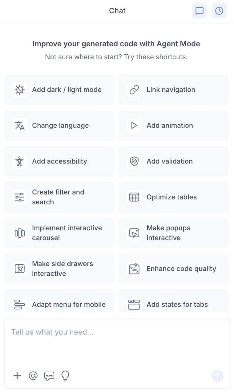
- Select "Add animations" from the list.
- Agent Mode will apply animations across the current screen or component.
Using a Custom Prompt
Type a prompt to specify the animation style and scope:
"Add a fade-in animation to each card as it enters the viewport using Intersection Observer."
"Add a slide-up entrance animation to the hero section with a 0.3s ease-out duration."
"Use Framer Motion to animate the page sections with staggered fade-in effects."
"Add a smooth loading skeleton animation to the product list while data is being fetched."
"Add a pulse animation to the notification badge."
Targeting a Specific Section
To animate one component without affecting the rest of the page:
- Use the selection tool in Agent Mode to highlight the element or section.
- Type your prompt describing the animation.
Agent Mode will apply the animation only to the selected area.
Example Output
For a card grid, Agent Mode adds a staggered fade-in using CSS:
@keyframes fadeInUp {
  from {
    opacity: 0;
    transform: translateY(16px);
  }
  to {
    opacity: 1;
    transform: translateY(0);
  }
}

.card {
  animation: fadeInUp 0.4s ease-out both;
}

.card:nth-child(1) { animation-delay: 0s; }
.card:nth-child(2) { animation-delay: 0.08s; }
.card:nth-child(3) { animation-delay: 0.16s; }
For a Framer Motion entrance animation on a hero section:
import { motion } from 'framer-motion';

<motion.section
  initial={{ opacity: 0, y: 24 }}
  animate={{ opacity: 1, y: 0 }}
  transition={{ duration: 0.5, ease: 'easeOut' }}
>
  {/* hero content */}
</motion.section>
Customising Animations
Once animations are applied, you can refine them further:
"Slow down the card animations to 0.6s and use a spring easing."
"Remove the animation from the footer — only animate the above-the-fold content."
"Add a bounce effect to the CTA button when the page loads."
"Respect the user's reduced motion preference by disabling animations when prefers-reduced-motion is set."
Tips
- Apply animations after layout, theming, and interactivity are finalised so you are animating the final component structure.
- Use the selection tool to animate individual sections (e.g. a hero, a features grid) without touching the rest of the screen.
- Keep animations subtle — short durations (0.2s–0.5s) and simple easing functions feel professional without being distracting.
- Always add a
prefers-reduced-motionmedia query override to respect accessibility preferences for users who are sensitive to motion.