Angular Material UI Kit
Angular Material provides a complete set of Material Design components for Angular applications. In Agent Mode, you can convert plain HTML elements in your generated code to use Angular Material components—buttons, inputs, dividers, and more—so your UI gains consistent styling, accessibility, and behaviour from the Material Design system.
What Agent Mode Does
When you apply the Angular Material prompt, Agent Mode will:
- Replace native
<button>elements with Angular Material buttons using thematButtondirective - Convert links styled as buttons to use
matButtonon anchor tags - Swap plain
<hr>or divider elements for<mat-divider>components - Replace standard form controls (inputs, selects, checkboxes) with their Material equivalents (
mat-form-field,mat-input,mat-select, etc.) - Add the necessary Angular Material module imports to your component
- Apply Material attributes for states such as
disabled,color, andvariantwhere appropriate - Ensure dividers and structural components use the correct Material components
The output aligns with the Angular Material (opens in a new tab) API, so your components are ready to use within an Angular project that has @angular/material installed.
How to Apply
Using a Custom Prompt
- Switch to Agent Mode in the plugin or in Locofy Builder.
- Ensure your project is configured for Angular and that Angular Material is set up in your codebase.
- Type a prompt into the chat box. For example:
"Convert all buttons and dividers on this screen to use Angular Material components. Use matButton for buttons and mat-divider for dividers."
"Replace buttons with Angular Material matButton and add mat-divider between sections."
"Use the Angular Material UI kit for this component. Convert buttons to matButton and add mat-divider where appropriate."
Targeting a Specific Section
To convert only a portion of your UI to Angular Material:
- Use the selection tool in Agent Mode to highlight the section or component.
- Type your prompt describing the conversion.
Agent Mode will scope the changes to the selected area, leaving the rest of the screen unchanged.
Example Output
For a section with plain buttons and a divider, Agent Mode transforms:
<section>
  <div class="example-label">Text</div>
  <div class="example-button-row">
    <button>Basic</button>
    <button disabled>Disabled</button>
    <a href="https://www.google.com/" target="_blank">Link</a>
  </div>
</section>
<hr />
into:
<section>
  <div class="example-label">Text</div>
  <div class="example-button-row">
    <button matButton>Basic</button>
    <button matButton disabled>Disabled</button>
    <a matButton href="https://www.google.com/" target="_blank">Link</a>
  </div>
</section>
<mat-divider />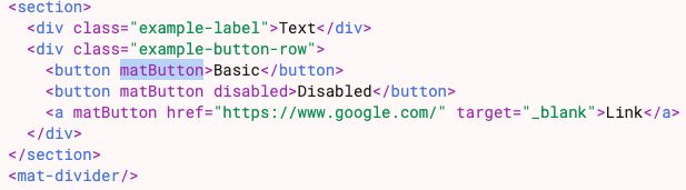
The matButton directive styles native <button> and <a> elements with Material Design, while <mat-divider> provides a consistent separator. Disabled states, links, and structural elements are all handled correctly.
Extending to More Components
Once the initial conversion is done, you can prompt Agent Mode to convert additional elements:
"Convert all input fields to use mat-form-field and mat-input."
"Replace the select dropdown with mat-select inside mat-form-field."
"Add mat-checkbox for all checkbox elements on this form."
Agent Mode will add the appropriate Material components and ensure imports are updated.
Tips
- Ensure Angular Material is installed (
ng add @angular/material) and that your app module or standalone components import the required Material modules before applying the prompt. - Use the selection tool when you want to convert a single form, card, or section without affecting the full page.
- If your project uses the Angular UI Figma Kit (opens in a new tab) and custom components from the Material UI Code Repo (opens in a new tab), Agent Mode conversions will align with that structure.
- After converting, verify that the Material theme and typography are configured so components render correctly.