Accordion
An accordion lets users expand and collapse sections of content, keeping the interface compact while making all information accessible. Locofy generates the visual layout of accordion items from Figma, but Agent Mode wires up the expand/collapse behaviour, animations, and accessibility automatically.
What Agent Mode Does
When you apply the accordion prompt, Agent Mode will:
- Add open/closed state management to each accordion item
- Wire up the header/trigger to toggle the content panel open and closed
- Apply a smooth height or fade transition when panels expand and collapse
- Support both single-open mode (only one panel open at a time) and multi-open mode (multiple panels can be open simultaneously)
- Add the correct ARIA attributes (
aria-expanded,aria-controls,id) for screen reader accessibility - Add keyboard support so users can open and close items with Enter or Space
- Handle the default open state for pre-expanded items
How to Apply
Using the Shortcut
- Switch to Agent Mode in the plugin or in Locofy Builder.
- In the new chat, you will see a list of prebuilt prompts. You can also click on the light bulb icon to open the shortcuts panel.
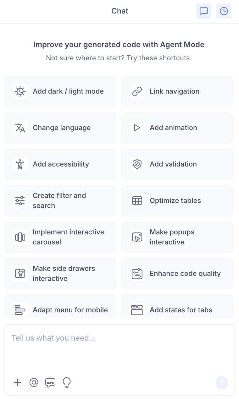
- Select "Implement accordion" from the list.
- Agent Mode will wire up the accordion component on the current screen.
Using a Custom Prompt
Type a prompt to specify the accordion behaviour:
"Make the FAQ accordion interactive. Clicking a question should expand its answer and collapse any other open item."
"Wire up the accordion so multiple panels can be open at the same time."
"Add a smooth slide-down animation when accordion panels expand."
"Make the first accordion item open by default."
"Add a plus/minus icon to each accordion header that rotates when the panel is open."
Targeting a Specific Accordion
To wire up one accordion on a page with multiple collapsible sections:
- Use the selection tool in Agent Mode to highlight the accordion component.
- Type your prompt.
Agent Mode will scope the interactivity to just the selected component.
Example Output
For a single-open FAQ accordion:
const [openIndex, setOpenIndex] = useState(null);

const toggle = (i) => setOpenIndex(openIndex === i ? null : i);

return (
  <div className="accordion">
    {items.map((item, i) => (
      <div key={i} className="accordion-item">
        <button
          className="accordion-trigger"
          onClick={() => toggle(i)}
          aria-expanded={openIndex === i}
          aria-controls={`panel-${i}`}
          id={`trigger-${i}`}
        >
          <span>{item.question}</span>
          <span className={`accordion-icon ${openIndex === i ? 'open' : ''}`}>
            +
          </span>
        </button>

        <div
          id={`panel-${i}`}
          role="region"
          aria-labelledby={`trigger-${i}`}
          className={`accordion-panel ${openIndex === i ? 'accordion-panel-open' : ''}`}
        >
          <div className="accordion-content">{item.answer}</div>
        </div>
      </div>
    ))}
  </div>
);
With a smooth height transition:
.accordion-panel {
  max-height: 0;
  overflow: hidden;
  transition: max-height 0.3s ease;
}

.accordion-panel-open {
  max-height: 500px;
}

.accordion-icon {
  transition: transform 0.2s ease;
  display: inline-block;
}

.accordion-icon.open {
  transform: rotate(45deg);
}
Customising Accordion Behaviour
Once the base interactivity is applied, you can extend it:
"Allow multiple accordion panels to be open at the same time."
"Add a chevron arrow icon that rotates 180 degrees when the panel opens."
"Open all accordion items by default and allow users to collapse them."
"Add a border between accordion items and a highlighted background on the open item."
Tips
- Use the selection tool to target a specific accordion if the page has multiple collapsible sections.
- Combine accordion with tabs with states — on mobile, a tab layout often converts to an accordion for better space usage.
- For FAQ pages, combine accordion with accessibility to ensure the expand/collapse state is correctly announced to screen readers.
- Specify single-open or multi-open behaviour in your prompt — the default depends on the use case (FAQs typically use single-open; settings panels often use multi-open).