Accessibility
Accessibility (a11y) ensures your UI is usable by people relying on screen readers, keyboard navigation, and assistive technologies. In Agent Mode, you can add a comprehensive accessibility layer to your generated UI using a single prompt or the built-in shortcut — without manually auditing every element.
What Agent Mode Does
When you apply the accessibility prompt, Agent Mode will:
- Add
aria-label,aria-labelledby,aria-describedby, androleattributes to interactive and landmark elements - Ensure all images have meaningful
alttext (oralt=""for decorative images) - Add
aria-hidden="true"to purely decorative icons and SVGs - Set correct
tabIndexvalues so keyboard users can navigate in a logical order - Add
aria-expanded,aria-controls, andaria-pressedto toggleable elements like dropdowns, accordions, and buttons - Mark form fields with
htmlFor/idassociations and addaria-requiredandaria-invalidwhere applicable - Add visible focus styles so keyboard focus is always clearly indicated
How to Apply
Using the Shortcut
- Switch to Agent Mode in the plugin or in Locofy Builder.
- In the new chat, you will see a list of prebuilt prompts. You can also click on the light bulb icon to open the shortcuts panel.
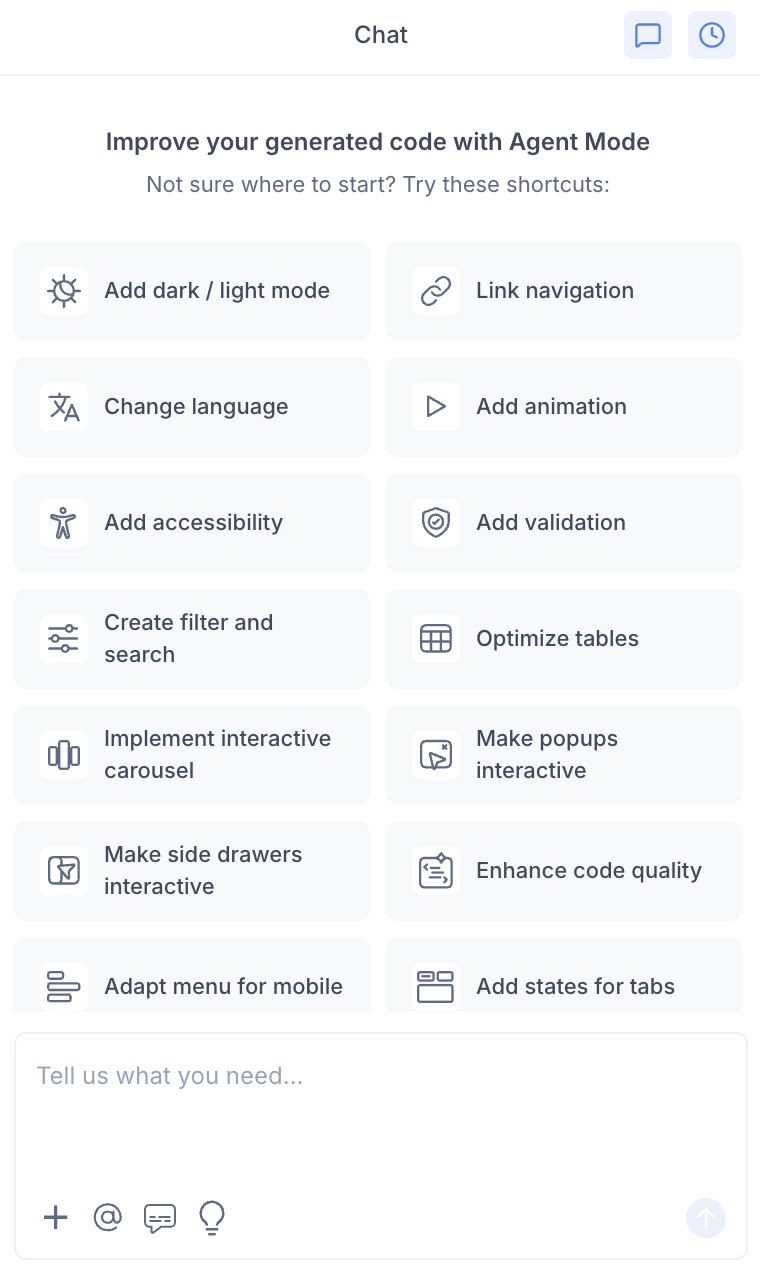
- Select "Add accessibility" from the list.
- Agent Mode will audit and update the current screen or component.
Using a Custom Prompt
You can type a prompt for more targeted control:
"Add ARIA labels and roles to all interactive elements on this page."
"Ensure all images have descriptive alt text. Mark decorative icons with aria-hidden."
"Add keyboard navigation support so users can tab through the form and activate buttons with Enter."
"Add visible focus rings to all focusable elements using a CSS outline style."
"Make the modal accessible — trap focus inside it when open and return focus to the trigger when closed."
Targeting a Specific Section
To apply accessibility improvements to one component:
- Use the selection tool in Agent Mode to highlight the element or section.
- Type your prompt or select the shortcut.
Agent Mode will scope changes to just the selected area, which is useful for auditing a single form, navigation bar, or modal without touching the rest of the page.
Example Output
For a button with only an icon and no visible label, Agent Mode adds:
// Before
<button onClick={handleClose}>
  <CloseIcon />
</button>

// After
<button onClick={handleClose} aria-label="Close dialog">
  <CloseIcon aria-hidden="true" />
</button>
For a form field missing its label association:
// Before
<label>Email</label>
<input type="email" />

// After
<label htmlFor="email">Email</label>
<input type="email" id="email" aria-required="true" />
Customising Accessibility Enhancements
Once the base improvements are applied, you can refine further:
"Add a skip-to-content link at the top of the page for keyboard users."
"Ensure the dropdown menu closes when the Escape key is pressed."
"Add live region announcements so screen readers announce dynamic content updates."
"Improve colour contrast on the secondary button to meet WCAG AA standards."
Tips
- Apply accessibility after finalising your layout and component structure, so ARIA relationships between elements are stable.
- Use the selection tool to focus on high-priority areas first — forms, navigation, and modals are typically the most critical.
- After applying, test keyboard navigation in the preview by pressing Tab through the page to verify focus order is logical.
- Accessibility improvements pair well with validation — both work on form elements and can be applied in sequence.