
 Blogs
BlogsCreating a Custom Theme System With TailwindCSS

TailwindCSS is a utility-first CSS framework popular among developers for its huge number of pre-built classes that make styling web apps a snap. To make the concepts clear, we have been creating tutorials on numerous TailwindCSS topics, including how to set it up and configure TailwindCSS in a React project, how to create a responsive flex layout, a navigation bar, an appealing hero section, and even an entire page with it.
In this tutorial, we will take our exploration of TailwindCSS a step further and delve into creating a custom theme system that is not only dynamic but also highly customizable. This will enable you to create a uniform & unique look and feel for your web application, tailored to your specific needs and preferences.
Setting Up the Development Environment
To begin, we should install and set up TailwindCSS within our React app, as detailed below.
Create a React app by running the command:
Next, install TailwindCSS and other dependencies like postcss and autoprefixer using the command:
Create config files by running the command: npx tailwindcss init -p and open the tailwind.config.css file and replace the content with the provided code snippet.
Lastly, paste the following code snippet inside the src/index.css file:
You can now use TailwindCSS in your React app. Here is the blog article covering the installation process in-depth.
A Deep Dive into the Default Theme System
We know, TailwindCSS is a well-known framework among developers, and it's commonly used in various projects. One of its advantages is the default theme system, which offers a comprehensive collection of pre-defined settings for design-related attributes such as colours, fonts, and spacing.
When using TailwindCSS with React, you can apply these classes directly to your JSX components using the className property. For instance, if you want to set the background colour to grey, you can use the bg-gray class, or if you want to adjust the font size to tiny, you can use the text-sm class.
Here’s a simple example.
In this example, the “div” element has a gray background (bg-gray) and a padding of 16px (p-4). Similar to this, we added some CSS to the paragraph tag.
Although while the default theme system for TailwindCSS offers a lot of useful pre-defined options, there may be times when you want to alter your application's appearance in ways that go beyond what the default system allows. A customized theme system may be employed in such specific situations.
Let's explore that.
The Power of Custom Theming in TailwindCSS
If you wish to use TailwindCSS's custom theme system, you must first create a JavaScript object with the appropriate properties, which you must then pass to the theme configuration option when configuring your TailwindCSS instance.
Thankfully, TailwindCSS already has a ‘tailwind.config.js’ file that can be used to easily add any custom CSS settings. This file can be found in the root directory of your application.
Here is an example of how to implement this in the ‘tailwind.config.js’ file:
In the theme section, we can also define a color palette, fonts, border sizes, breakpoints, or anything else related to the visual design of your site.
Now, let's use those custom CSS properties inside the ‘App.js’ file.
Moreover, if you want a specific file instead of ‘tailwind.config.css’, you may edit the file name as well.
Then afterwards, you only need to specify the file name within the 'postcss.config.js' file located in the root directory.
Indeed, there are other options for configuring your default tailwind css file, but this is the best one.
An In-Depth Look at Dynamic Themes
You can also change the themes dynamically in addition to customizing them.
In short, using Tailwind CSS's dynamic theming, you can effortlessly modify the visual design of your application based on many factors like user preferences or actions.
Let’s make the process a bit more complex by adding CSS variables to dynamically specify custom properties.
Here's an example:
Add CSS variables
Inside App.css, define some global CSS variables.
Here, we are simply defining CSS properties.
Configure TailwindCSS properties
Inside tailwind.config.css, add the following:
Here, we are using the CSS properties that we have defined inside App.css. If you want to deep dive into CSS variables, we even have a tutorial based on that.
Use the theme
You can use the theme inside App.js as shown below:
In this example, we've created a functional React component that displays a toggle button that switches between bright and dark modes. The component stores the current mode (light or dark) in the useState hook and updates it when the button is clicked on.
Finally, the component returns a div with the current mode's class and style, as well as a button with the buttonClass and buttonStyles applied to it.
Unlocking the Full Potential: Customizing Your Screen, Plugins, and Presets for Better Results
Previously, we acquired knowledge on how to customize the theme in a straightforward manner, as well as modify themes dynamically with CSS variables. However, it is also possible to customize the screen size, and color, and expand further to elements such as border-radius and spacing.
Like this:
In addition, third-party plugins can also be integrated.
For example, there is an official TailwindCSS plugin named “@tailwindcss/typography” that you can simply integrate and use the underlying style attributes with.
This plugin lets us apply beautiful typographic defaults to our HTML elements.
First, install the plugin as a dev dependency.
And you have to import it inside your “tailwind.config.css” file inside the plugin section.
And then use it like this:
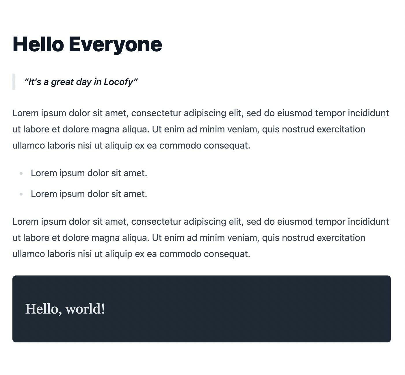
As you can see, just passing a “prose” class provides a better style, similar to markdown or a CMS database.
And here is the output:
Finally, an additional option to customize is using Presets.
In conclusion, Tailwind provides you with a design system that is very easy to manage, and at the same time, it is quite powerful as well. While you can convert your UI designs in Figma & Adobe XD to code faster with Tailwind, it still requires a lot of effort and trial & error to get right.
Creating the pixel-perfect clone of your design files in React is no easy feat and requires several weeks of effort depending upon the complexity of your app. This is where Locofy.ai can help you.
With the Locofy.ai plugin for Figma and Adobe XD, you can convert your designs to production-ready front-end code that works out-of-the-box with TailwindCSS, as well as prominent UI libraries such as Material UI and Bootstrap.
What’s more is that you can even use drag-and-drop components offered by the plugin to quickly build designs & export responsive code in React, React Native, HTML/CSS, Nextjs, and more. To learn more about how to convert your Figma designs to code, check out our docs. Or explore our solution pages for an in-depth look at how Locofy helps you build apps, websites, portfolio pages and responsive prototypes effortlessly using our low-code platform with seamless AI code generation.