
 Blogs
BlogsCreate A Beautiful Hero Section Using React and TailwindCSS


The hero section is the first thing visitors notice when they visit our websites. It introduces the main content or goal of the website whether you are educating your visitors or trying to sell a product or service.
In other words, the hero section is one of the most important areas of a website and requires a significant amount of attention during the design process. It is a key element in engaging users and should be given careful consideration when creating a website.
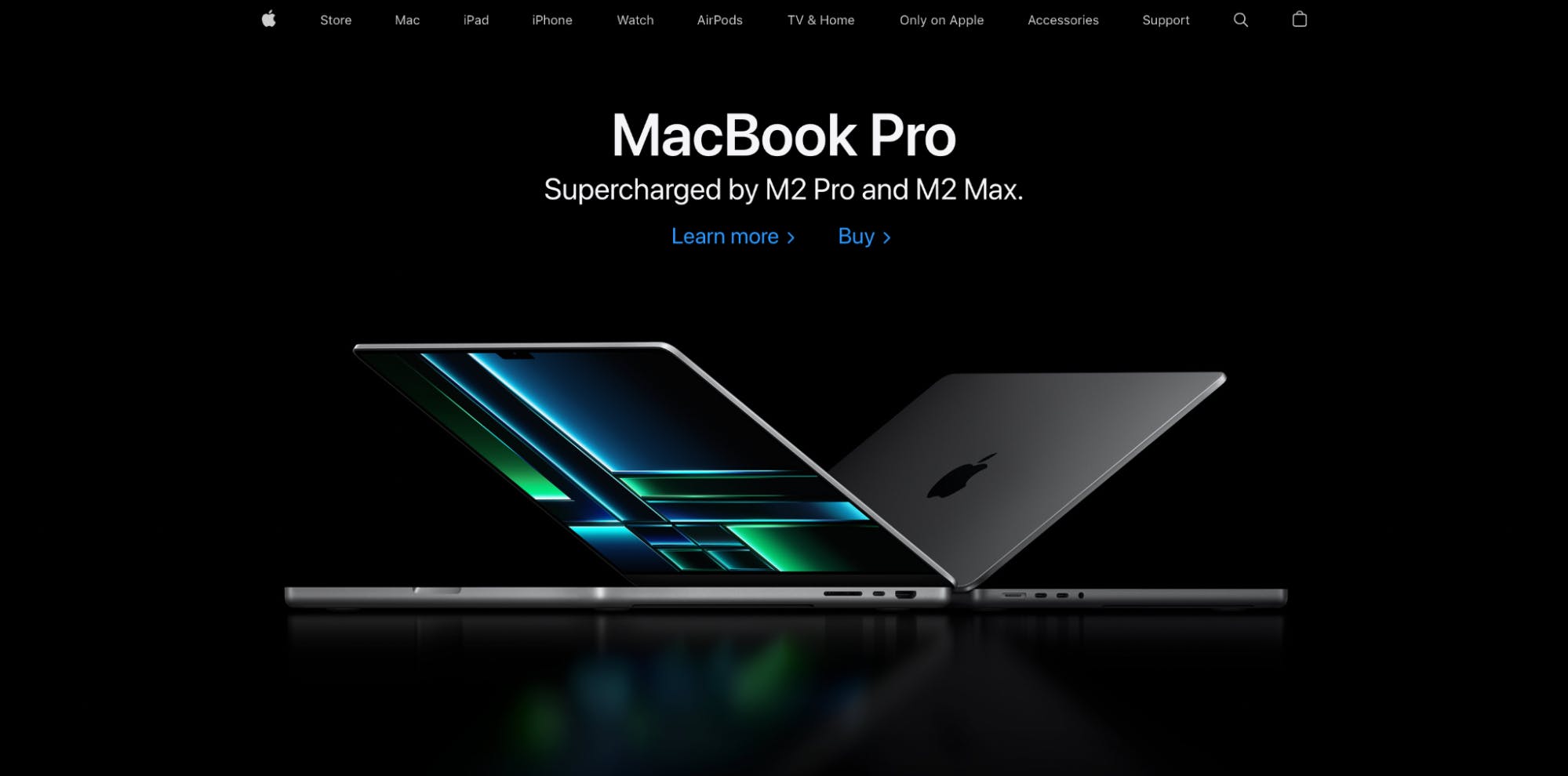
This is the Apple website's hero section.
They listed the most recently released product from the previous year. As a result, whenever a user visits, they can easily find the recently launched product as well as some links that direct them to take action.
In this guide, we’ll be creating a hero section in React with TailwindCSS.
Setting Up the Development Environment
To use TailwindCSS inside a React app, you must first set it up and configure it.
First, create a React app by running the command:
Next, install TailwindCSS and other dependencies like "postcss" and "autoprefixer" using the command:
Create config files by running the command: “npx tailwindcss init -p” and open the tailwind.config.css file and replace the content with the provided code snippet.
Lastly, paste the following code snippet inside the src/index.css file:
You can now use TailwindCSS in your React app. Here is the blog article if you want to learn more about it.
An Overview of the Structure and Layout of the Hero Section
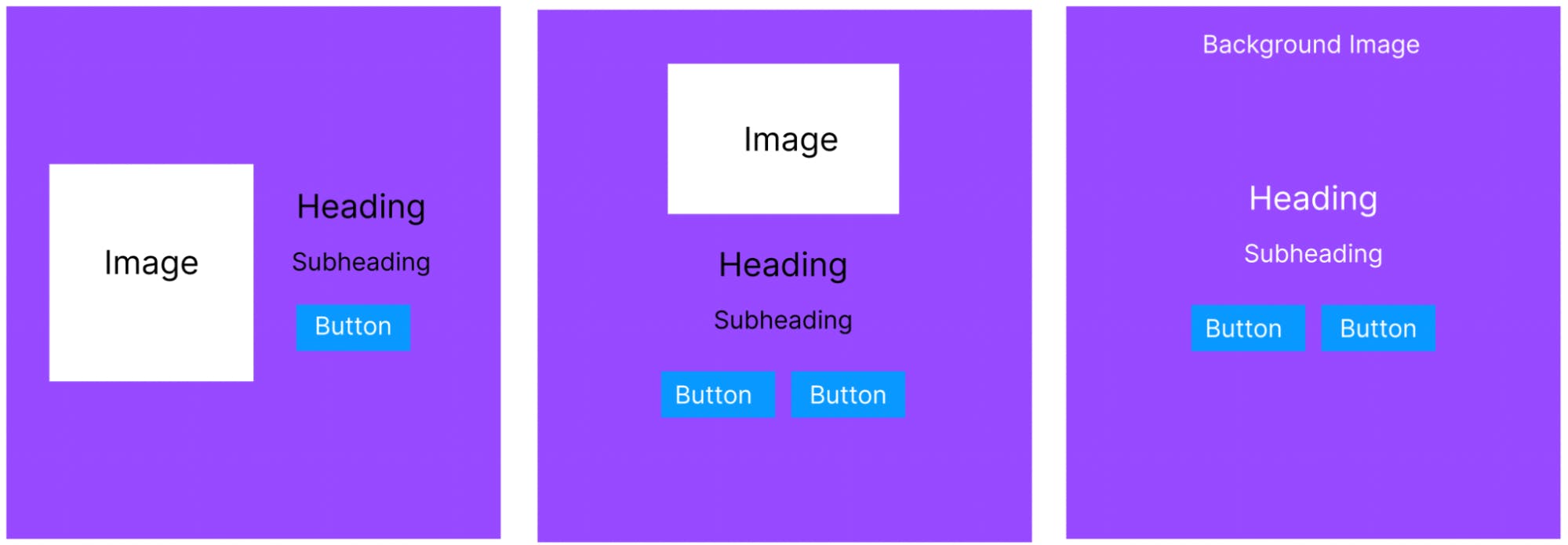
Before we start building the hero section, let’s understand the key elements of any hero section. Most often, the hero section is made up of these elements i.e.
- An eye-catching image or video: This is the main visual element of the hero section and sets the tone for the rest of the website. The image/video can be anywhere, on the left side, right side, or even in the background.
- A heading: This is a short and catchy phrase that conveys the main message of the website. A heading can also be placed anywhere based on where the image is placed.
- A subheading: This provides more information about the website or the main message. It always comes below the heading.
- A call-to-action (CTA) button: This is a button that encourages the user to take a specific action, such as signing up for a newsletter or making a purchase. It always comes below the heading and subheading.
- Overlay: A color or pattern that overlays the background image to increase the visibility of the text and CTA button.
- Additional elements such as icons, animations, or other graphics can be added to the hero section to make it more visually appealing.
In addition to these key elements, it is critical to discover a means to differentiate your brand from the competitors. This may be accomplished by using visually engaging design components such as high-quality images, videos, or animation, as well as unique typography, color schemes, and layouts.
Depending on the aesthetic of your website and the style you choose, you may use a full-screen background image or video, a carousel slider, or a split-screen layout as a hero section design idea.
Let’s look visually at some of the layouts for the hero section.
Creating a Responsive Hero Section
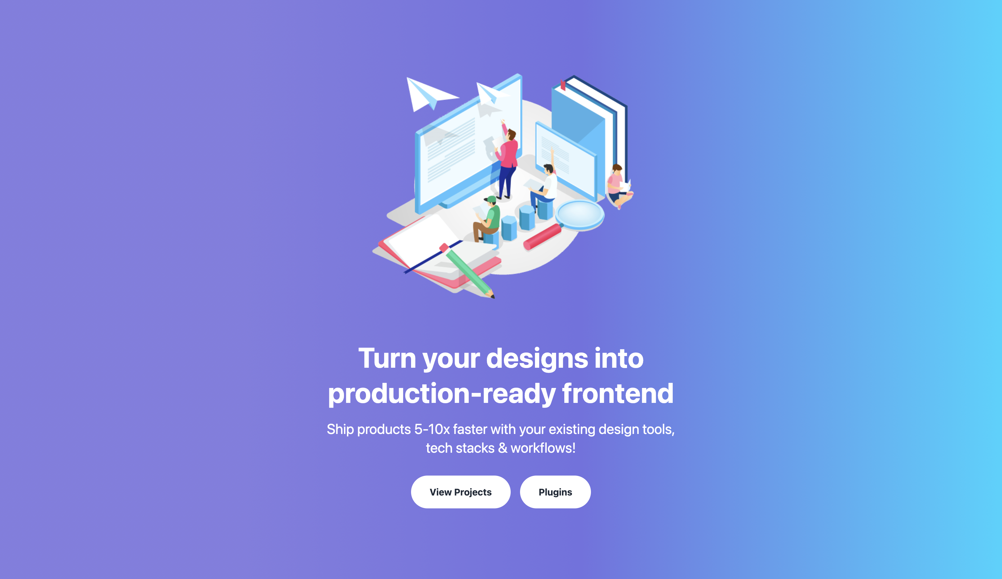
Here, we will design the hero section shown below.
Here is the code for that:
Code Explanation:
- The outer "div" consists of a linear gradient with the width and height of the screen.
- The component consists of an inner "div" that uses a flexbox to center its children horizontally and vertically. The container has an image element that displays the "hero.png" image and sets its size based on the screen size.
- Beside the image is a "div" with text content inside it. The text includes a heading and a description. The title is displayed using an "h1" element and the description is displayed using a "p" element.
- Finally, there are two buttons that are displayed below the text. The buttons have text that reads "View Projects" and "Plugins" and is displayed side by side with some margins.
In terms of responsiveness, it is totally responsive due to the usage of breakpoints like “lg” and “md” to adjust the content for various screen sizes.
Revolutionize Your Website Design With the Help of TailwindCSS
As we learned in our last post, creating personalised navigation bars and designing numerous layouts for your website's hero section becomes intuitive with TailwindCSS.
The conventional difficulties with styling and design are eliminated by using TailwindCSS, which makes modification and execution simple. This should serve as proof of TailwindCSS's skills and the potential it has to revolutionize the look of your website.
TailwindCSS is not just limited to creating visually appealing hero sections and navigation bars. It can also be utilized for a wide range of design elements on your website such as buttons, forms, modals, cards, and much more. With its extensive set of utility classes, it allows for easy manipulation of typography, spacing, colors, and more.
It also has a responsive design built-in, making it easy to create mobile-friendly websites with minimal effort.
Additionally, it can be used along with different JavaScript frameworks such as React, Vue, and Angular, to create dynamic and interactive user interfaces. The possibilities are endless with TailwindCSS and its ability to streamline the design and development process, making it a valuable tool in any web developer's toolkit.
Go from Design to Responsive Code
You can also generate responsive code directly from your design files using the Locofy.ai plugin.
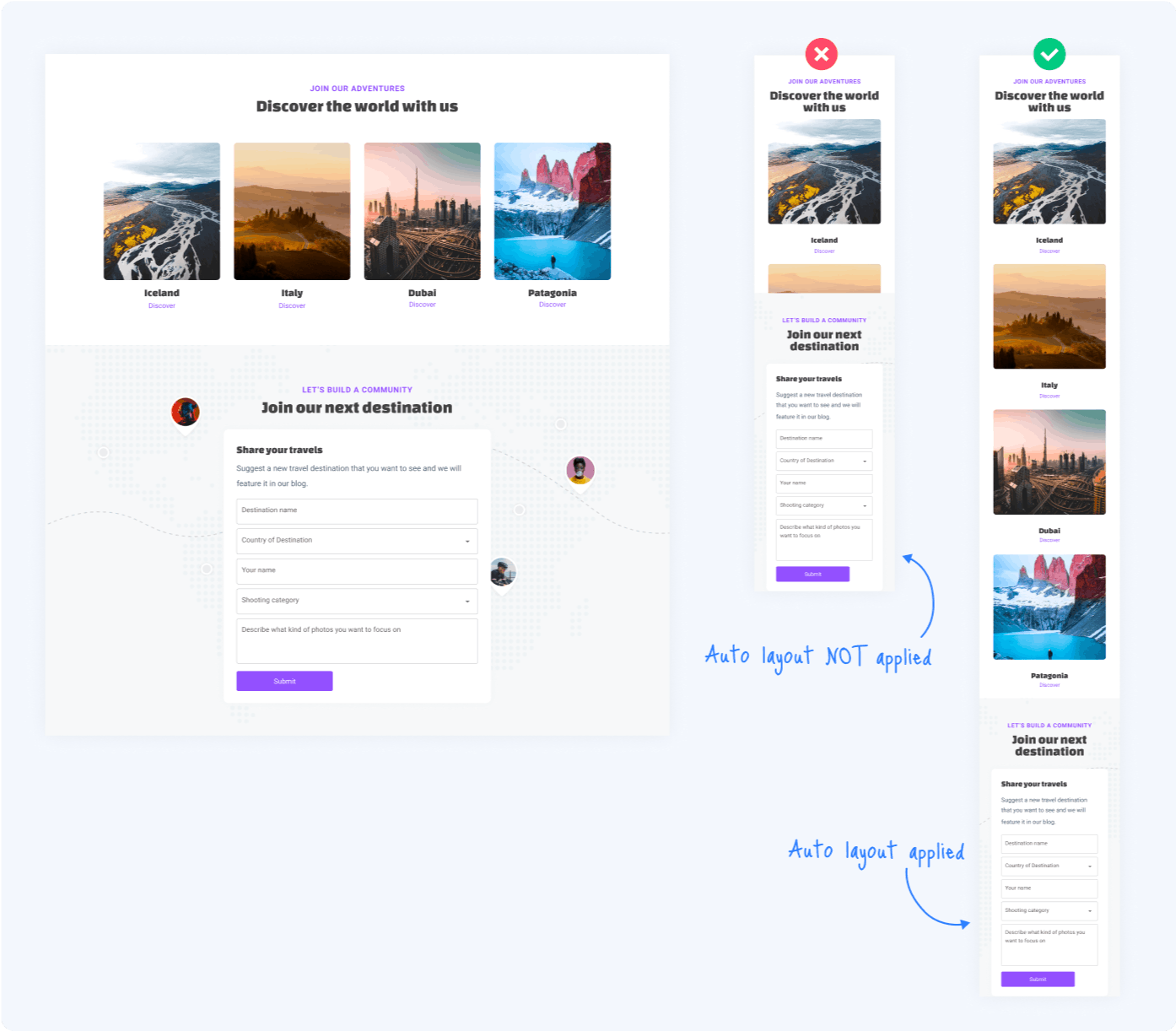
Locofy automatically picks up your Figma auto layout settings and constraints to generate responsive code with flex properties. Additionally, the auto layout facilitates the design process and allows you to create designs faster with cleaner structures, as shown in our recent guide.
What’s more is that you can also configure layout direction for different breakpoints using the plugin, enabling you to directly go from design to pixel-perfect responsive code.
If you want to learn more about how to convert your Figma design to React, React Native, HTML/CSS, Nextjs, Vue, and more, check out our docs. Or explore our solution pages for an in-depth look at how Locofy helps you build apps, websites, portfolio pages and responsive prototypes effortlessly using our low-code platform with seamless AI code generation.