
 Blogs
BlogsHow to Setup and Configure TailwindCSS in React


TailwindCSS is a modern CSS framework that was created to provide developers with a set of utility classes that can be used to quickly style and layout web applications. It differs from traditional CSS frameworks like Bootstrap and Material-UI, which provide a set of predefined styles and layout options.
Instead, Tailwind CSS focuses on providing low-level utility classes that can be combined in various ways to create complex designs. This approach gives developers a great deal of flexibility and control over their design, while still providing them with a set of tools that can help them build responsive, consistent, and maintainable websites. In simple words, TailwindCSS provides them with a customizable design system.
Now let’s start a step-by-step guide to set up and configure TailwindCSS to create UIs in React.
Creating & Configuring React
Create a React App:
First of all, you need to create a React app, and it’s fairly simple using the create-react-app(CRA) CLI.
Note: You need to install Node.js, which should automatically install npm on your system to use the CRA CLI.
That’s it, you have created a React app. Now you need to go inside "my-app" (the name of our React app) and for that, you can use this command.
Before proceeding, it is better to run the app to ensure that there is no problem and that it is working.
Install TailwindCSS
The next step is to install TailwindCSS in your project. It's quite straightforward using the following command:
This will install the necessary dependencies you need along with TailwindCSS.
If you want to see where the dependencies have been installed, just visit the package.json file, scroll down and you will see all the devDependencies that you have installed.
Like this:
Let us now generate and configure the required files.
Create and Configure the Config files
The config files are used to customize the TailwindCSS framework to your requirements. For instance, tailwind.config.js lets you set your own font family, colors, themes, plugins, and much more.
To create the TailwindCSS config files, you have to execute this command.
It will create two configuration files i.e. tailwind.config.js and postcss.config.css
Now, open your tailwind.config.js file and replace the content with this.
It basically states that TailwindCSS must be added to any js, jsx, ts, or tsx files in the "src" folder. If you don’t update the tailwind.config.js file, TailwindCSS will not work.
Configuring Tailwind and Running the app
Include Tailwind in your CSS
The last process you have to follow is to add the @tailwind directives to your index.css files.
So open your `./src/index.css` file and paste the below content into it.
That’s it, you have completed the process to install TailwindCSS with React.
Run the app
Now it’s time to add some TailwindCSS properties in your App.js file and run it.
So open your App.js file present in the src folder and update the content as shown below.
Here, we've changed the background color, increased the size of the text, and added a few more properties.
Run the app with the command: npm run start to see the output.
As you can see from the above example, we can apply CSS styles to our HTML tags without leaving the HTML file. And, using TailwindCSS, you can practically add any CSS property in the simplest way imaginable.
For example, you may use the "bg-red-500" class to change the background color to red & the "text-2xl" class to change the font size to 1.5rem & line height to 2rem.
Similarly, there are tons of TailwindCSS classes that you can easily apply to your HTML elements.
Using TailwindCSS in React
Now that we have integrated TailwindCSS with React and even written a simple program, we can definitely say it is easy to use.
Well, it has some more benefits such as:
- It promotes a consistent design style, as all the utility classes are based on a set of design principles that have been pre-defined. This can make it easier for designers and developers to work together and create a cohesive design.
- It is easy to customize and extend. Tailwind provides a large set of utility classes out of the box, but you can also create your own custom utilities or override the default ones if needed.
- It can improve the performance of your website or application, as it generates minimal and specific CSS, rather than a large, generic stylesheet that may contain styles that are not used on your site.
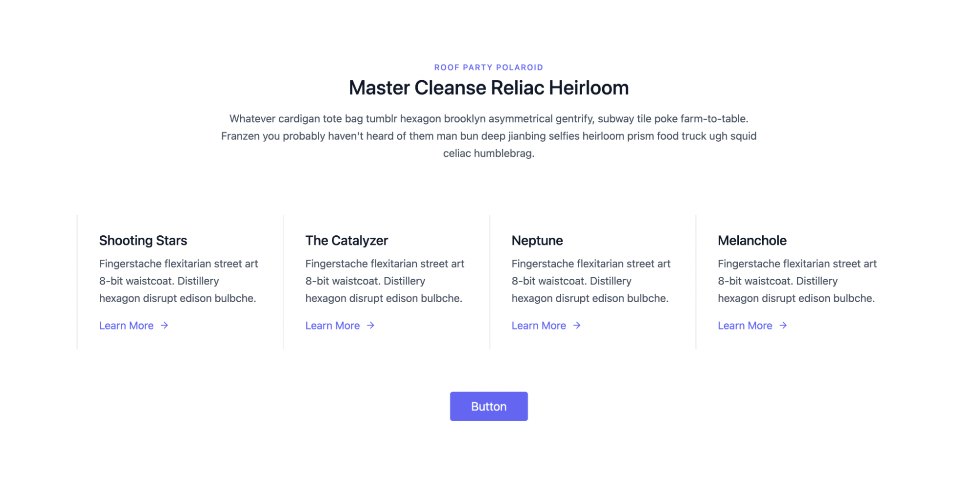
Now, let’s take a more concise example and see how you can build the page given below responsively using TailwindCSS.
For that, open your App.js file and update the code as shown below.
Here, we have used several TailwindCSS properties. If you are familiar with CSS, you can understand most of these properties as they are aptly named.
- border-0: Makes the border width zero.
- flex: Makes the display use the flex property.
- mx-auto: Applies margin along the x-axis as auto.
- text-lg: Makes the text large.
- px-8: Adds 2rem(32 pixels) of padding along the x-axis.
Lastly, you may see some other properties like lg:w-⅔, xl:w-¼, lg:w-½, and many more such properties. These properties are simply useful for making the app responsive.
Is TailwindCSS the Right Choice for Your Next Project?
Overall, while determining whether to utilize TailwindCSS or another CSS framework, it's critical to analyze your project's demands and goals. Suppose you want a full-fledged design system at your disposal with the ability to customize it for your particular project. In that case, TailwindCSS is unquestionably a good pick.
TailwindCSS helps you ship faster by offering low-level utility classes, & doesn’t add unnecessary weight to your CSS file by purging unused CSS. This is especially handy for applications that demand a quick loading time, such as mobile apps or high-traffic websites.
However, if you don't want ingrained flexibility in your designs or want to use a pre-designed UI library, you may prefer Bootstrap, Chakra, or Material UI over TailwindCSS.
Tailwind provides you with a design system that is very easy to manage as well. While you can convert your UI designs in Figma & Adobe XD to code faster with Tailwind, it still requires a lot of effort and trial & error to get right.
Creating the pixel-perfect clone of your design files in React is no easy feat and requires several weeks of effort depending upon the complexity of your app. This is where Locofy.ai can help you.
With the Locofy.ai plugin you can convert your designs to production-ready front-end code that works out-of-the-box with TailwindCSS, as well as prominent UI libraries such as Material UI and Bootstrap.
If you want to learn more about how to convert your Figma design to React, React Native, HTML/CSS, Nextjs, Vue, and more, check out our docs. Or explore our solution pages for an in-depth look at how Locofy helps you build apps, websites, portfolio pages and responsive prototypes effortlessly using our low-code platform with seamless AI code generation.