
 Blogs
BlogsCreating a Responsive Landing Page With TailwindCSS and Locofy.ai

Today, we have something special in store for you. We'll be building a complete landing page using React and TailwindCSS, and also explore how to generate responsive code for the same page in just a few minutes directly from design files.
Let's dive in!
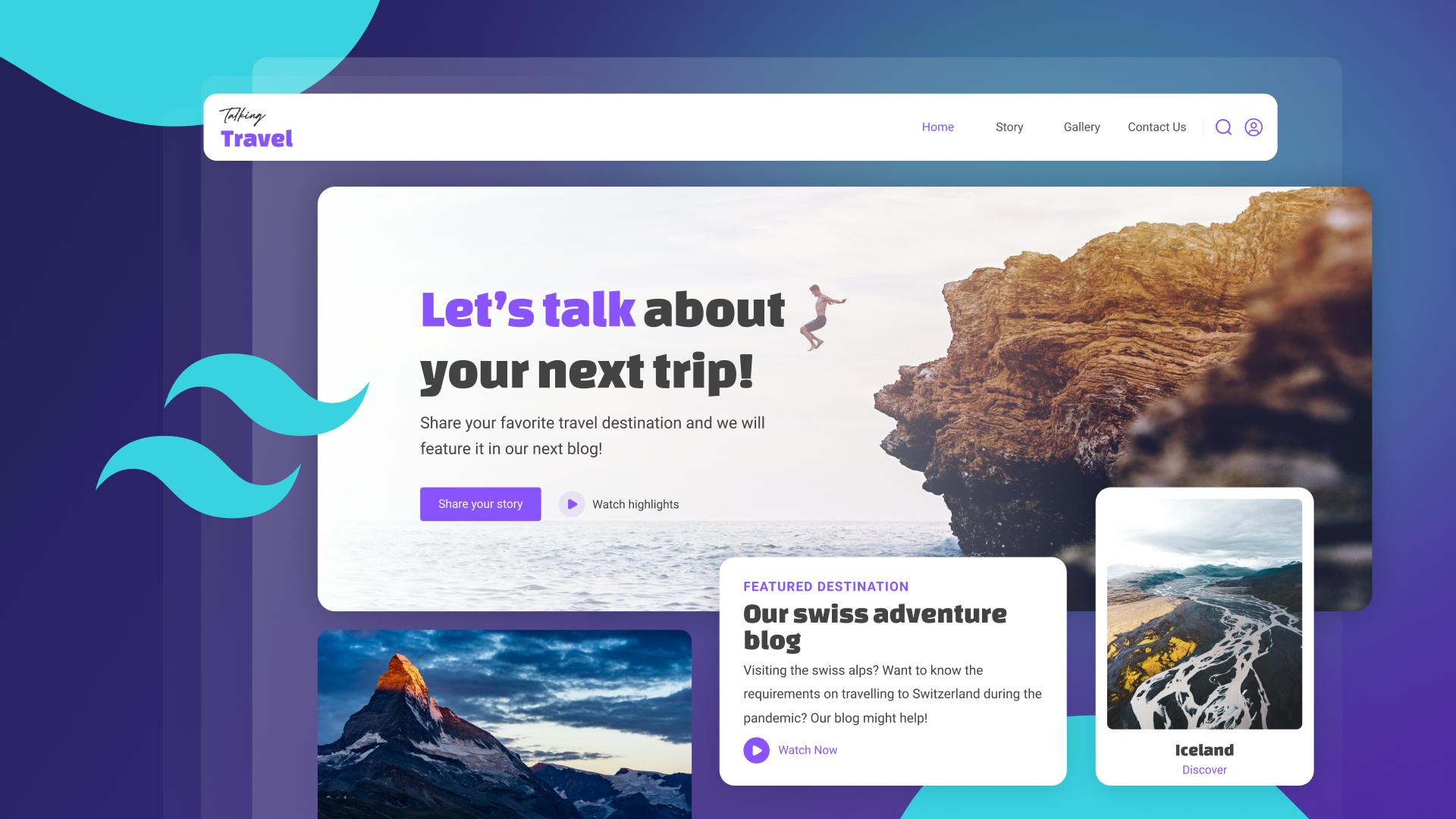
What We’ll Be Building Today
As depicted in the above image, the design presented therein has been generated utilizing Figma.
Given that our objective is to create an entire webpage, we shall develop separate components for each individual section and subsequently integrate them into our primary file. The above design, along with the related resources, can be accessed through this link.
Let’s start.
Setting up the Development Environment
To use TailwindCSS inside a React app, we have to first install and configure it.
Create a React app by running the command:
Next, install TailwindCSS and other dependencies like postcss and autoprefixer using the command:
Create config files by running the command:
Then open the tailwind.config.css file and replace the content with the provided code snippet.
Lastly, paste the following code snippet inside the src/index.css file:
We can now use TailwindCSS in our React app. Here is the blog article covering the installation process in-depth.
Creating Components
As we are going to create a complete landing page, let’s begin with a navigation bar.
Here, the Navbar component consists of a div tag as a container. The container has a logo image and a navigation menu, which includes links for Home, Story, Gallery, and Contact Us. There are also two icons for search and user profile, which are aligned to the right side of the navbar.
Now let’s go ahead and create a Hero section.
Here, the component consists of a div tag with a full-screen width and a specific height. Inside this div tag, there is another div tag with a background image, which is centered and covers the full height and width of the div.
The container inside the background image div is used to align the content in the center of the div and includes the text elements of the hero section.
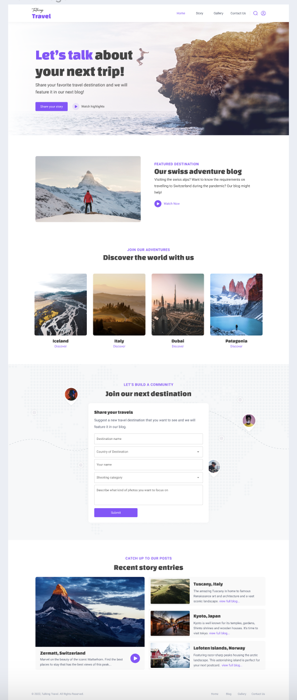
Here is the output:

We have created the rest of the components similarly and you can find the full repo here.
However, this took us quite a lot of time to clone our Figma designs 1:1 in code. We’ll be now seeing the low-code alternative to generate pixel-perfect code directly from your design files.
Creating a Landing Page Directly From Your Design Files With Locofy.ai
Since we already have the design files in Figma, we can directly generate responsive code from it using the Locofy.ai plugin.
However, since our design elements are just rectangles and circles to the machine, we first need to label these designs with the correct HTML tags and also split them into functional React components.
The plugin offers a simple click-to-tag UI where you can click on elements and choose the appropriate tags shown inside the plugin. Moreover, the plugin further facilitates the tagging process by using AI to automatically suggest these tags via a feature called Auto-Tagging.

Locofy.ai plugin actually builds on top of the Figma constraints and properties so if the designs are built with auto layout, the code generated would also be responsive.
For this, we can use the Design Optimiser feature to instantly apply the auto layout to our designs to make them responsive, after which it becomes easy to apply further responsive constraints for different breakpoints via the plugin itself.
For instance, we may want some items to be placed vertically instead of horizontally on smaller devices.

Finally, now we can sync the designs to the Locofy Builder for the final code export. Upon syncing the project for the first time, we get introduced to the Auto Components feature which scans our design files and suggests potential components that we could create, along with value props. This makes it easy to generate code that is modular and highly extendable.
If you want to learn more about how to convert your Figma design to React, React Native, HTML/CSS, Nextjs, Vue, and more, check out our docs. Or explore our solution pages for an in-depth look at how Locofy helps you build apps, websites, portfolio pages and responsive prototypes effortlessly using our low-code platform with seamless AI code generation.