
 Blogs
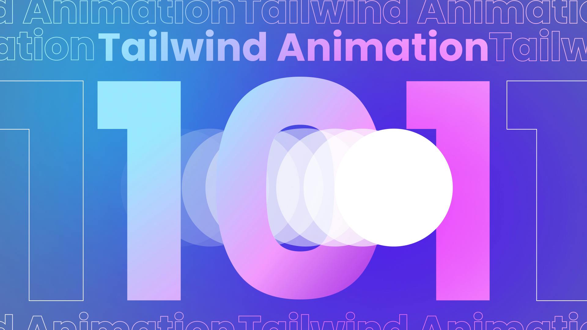
BlogsTailwind Animations 101

Tailwind CSS is a breakthrough CSS framework that has changed the way developers approach front-end development. Because of the low-level nature of it and mobile-first approach, it has become a popular choice for designing unique, responsive, and scalable web designs.
It also features a robust support for animations and enables developers to build engaging user experiences that draw in visitors.
In this detailed article, we'll look at animations using TailwindCSS. We'll go through the different sorts of animations provided by the framework and provide step-by-step instructions for incorporating them into your applications. This post will guide individuals through the process of adding simple hover animations as well as more complicated animations.
By the end of this post, you would have acquired the necessary skills and expertise to create captivating animations for your website.
Setting Up the Development Environment
To begin, we should install and setup TailwindCSS within our React app, as detailed below.
Create a React app by running the command and choosing React as the framework:
Next, install TailwindCSS and other dependencies like postcss and autoprefixer using the command:
Create config files by running the command: `npx tailwindcss init -p` and open the tailwind.config.css file and replace the content with the provided code snippet.
Lastly, paste the following code snippet inside the src/index.css file:
We can now use TailwindCSS in our React app. Here is the blog article covering the installation process in-depth.
A Deep Dive into TailwindCSS Animations for Modern Web Design
Tailwind CSS comes with four animation property by default to add some visual flare to your web pages. These animations are intended to be simply integrated into your project to improve the user experience.
Here, we'll go over each of these animations in depth, with complete examples for incorporating them into our website design.
Animate-spin
Want to add a loading or spinning animation to your website? Simply include the "animate-spin" property and the animation will be automatically applied.
Let’s take an example.
Here is the output:

Animate-pulse
In addition to the "animate-spin" property, TailwindCSS also offers the "animate-pulse" property for fading elements in and out. This property is particularly useful for creating skeleton loaders and other such visual effects.
And here is the output:

Animate-bounce
To make an element bounce up and down, just use the animate-bounce. This is useful if you want to draw attention to an element.
As a result, we get:

Animate-ping
The last Tailwindcss animation property is animate-ping. This property creates a radar ping or water ripple effect, making it perfect for notification badges and other similar design elements.
This is how it appears:

These are the default animations and these can be applied to the hover or active state, as well:
These animations can be applied to the breakpoints.
Create Custom Animations with TailwindCSS
TailwindCSS offers an easy approach to using built-in animations by passing only a single property. Developers can, however, also create customized animations depending on their own requirements.
For instance, one may design a unique animation by modifying the “tailwind.config.css file”. This enables developers to produce animations that are distinctive and specifically suited to the needs of their projects.
Inside tailwind.config.js:
In this case, it builds a custom animation called "button-rotate" with parameters including an infinite repeat rate, an easing function of "ease-in-out," and a duration of two seconds.
Inside App.js file:
And here is the output:

Leveraging Arbitrary Values for TailwindCSS Animations
With TailwindCSS, developers can use unique CSS attributes inside the framework thanks to a feature called "arbitrary values." By adding values in square brackets to TailwindCSS classes, this functionality enables adjustment of design aspects like placement and padding.
For example, we can include properties like padding-[5px], bottom-[17px], and so on.
In short, the arbitrary values feature in TailwindCSS provides versatility and customization choices to swiftly produce aesthetically pleasing web designs.
The same can be used to create custom animation as well.
Here, we used “animate-[wiggle_1s_ease-in-out_infinite]” with specific settings. Let's specify the keyframes immediately.
Inside tailwind.config.css
The outcome will be the same as we specified within the custom animation sections.
Go from Design to Code with TailwindCSS using Locofy.ai
While you can convert your UI designs in Figma & Adobe XD to code faster with Tailwind, it still requires a lot of effort and trial & error to get right.
Creating the pixel-perfect clone of your design files in React is no easy feat and requires several weeks of effort depending upon the complexity of your app. This is where Locofy.ai can help you.
If you want to learn more about how to convert your Figma design to React, React Native, HTML/CSS, Nextjs, Vue, and more, check out our docs. Or explore our solution pages for an in-depth look at how Locofy helps you build apps, websites, portfolio pages and responsive prototypes effortlessly using our low-code platform with seamless AI code generation.