
 Blogs
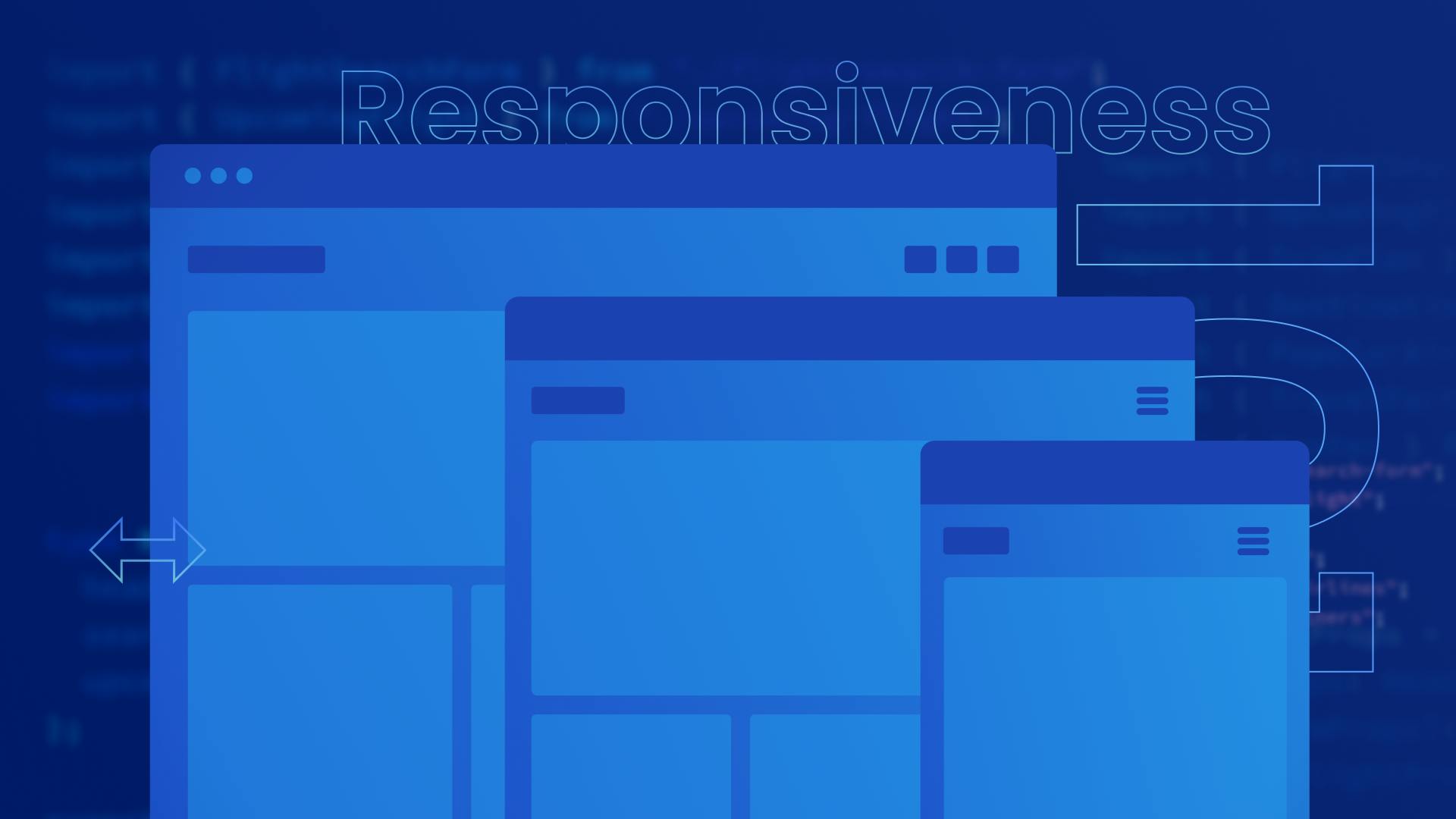
BlogsResponsive Design 101: How to Build a Website That Looks Great on Any Device

A responsive website is designed to provide an optimal viewing experience, with easy navigation and readable content, regardless of the device being used to access it. This means that the website layout, images, and text automatically adjust to fit the screen size, without the need for the user to manually zoom in or out.
In other words, it refers to the ability of a website to adapt to different screen sizes and devices, such as desktop computers, laptops, tablets, and smartphones. In today's world where people use a variety of devices to browse the internet, having a responsive website is essential to provide an inclusive experience to all users.
Responsiveness is important for websites due to the growing use of mobile devices. Websites that don't adapt to different screen sizes can appear distorted and difficult to navigate, leading to a frustrating user experience. Google gives preference to mobile-friendly websites in its search results, making responsive design critical for visibility and traffic. Additionally, responsive websites are more accessible and provide a positive user experience, which is crucial for businesses and individuals looking to engage with a wider audience.
Key Concepts for Responsive Design
Media Queries and Breakpoints

Media queries are used to apply different styles to design elements based on the device or screen size. This means that the same element can appear differently on a desktop computer versus a mobile device, for example. Media queries allow designers to optimize the layout and appearance of the website or app for different screen sizes and resolutions, resulting in a better user experience.
Breakpoints are specific screen widths at which the styles applied to design elements change. Designers can set breakpoints at specific screen sizes to ensure that their designs look good on various devices. For example, a designer might set a breakpoint for a screen width of 768 pixels to optimize the design for tablets.
By using media queries and breakpoints effectively, designers can ensure that their designs are accessible to all users and provide a seamless user experience, regardless of the device being used.
Fluid and Flexible Layouts
Fluid and flexible layouts are two approaches to designing responsive websites that can adapt to different screen sizes and devices.
Fluid layouts use proportional measurements to allow content to expand or contract to fill available screen space. This approach is effective for mobile devices. Flexible layouts use relative measurements and breakpoints to adjust to different screen sizes, providing more precise control over the layout.
Fluid layouts are simpler to implement, while flexible layouts provide more control over the layout. The choice between the two approaches depends on the specific needs of the website or application and builders can also use a combination of both approaches to create a more versatile and adaptive layout.
Mobile-First Designs
Mobile-first design is a web design strategy that prioritizes the mobile user experience above all else. It involves designing the website or application for the smallest screen first and then expanding the design for larger screens.
This approach ensures that the most important content and features are presented in a way that is optimized for mobile devices. It forces designers to prioritize the most important content and features and create a more efficient and user-friendly design because due to the small size of mobile devices, only limited elements can be displayed efficiently.
Challenges of Creating Responsive Designs
Designing for Multiple Screen Sizes and Prototyping
Designing for multiple screen sizes and resolutions is difficult because there are so many different devices with varying screen sizes and resolutions.
It requires designers to create designs that can adapt to a wide range of screen sizes and resolutions, which can be challenging. Designers must also consider the varying aspect ratios of different screens and ensure that the design is optimized for each one.
Moreover, in Figma, designers need to create different screens of similar designs for mobile, desktop, and laptop, among other devices, to showcase the different layouts for each screen size. This can lead to messy Figma files.
Additionally, you have to design and create several prototypes for multiple screen sizes as well. This can be time-consuming, especially for projects with many screens and states. On larger projects, it can lead to absolute craziness.
There's gotta be a better way to prototyping in @figma pic.twitter.com/dIch2NU0Bv
— 🆁🅴🆃 (@tinch) October 19, 2022
Readable, Efficient, and Optimized Code
Similar to how designers need to adapt to different screen sizes, creating responsive designs also requires developers to write code that can adapt to a wide range of screen sizes and resolutions, which can be challenging. This can make the code harder to read and understand, which can lead to mistakes and bugs.
In addition, optimizing the code for performance on different browsers and screens while maintaining readability can be difficult, especially when dealing with complex interactions.
To overcome these challenges, developers must use best practices for writing readable, efficient, and optimized code, such as following established conventions, writing modular code and using comments and documentation to provide context and explanations.
They may also use tools and frameworks designed specifically for responsive design, such as TailwindCSS and CSS modules, which can help simplify and streamline the coding process.
Different Devices Can Affect User Behavior and Needs
Different devices can have a significant impact on user behavior and needs in the context of web development.
For example, users browsing on a mobile device may have different needs and behaviors compared to users on a desktop computer. They may be looking for quick access to specific information, such as store hours or contact information, while desktop users may be browsing for more detailed information such as a full-fledged dashboard.
Users on smaller screens may also have different needs in terms of navigation and layout. They may prefer simpler navigation and larger, more readable text to accommodate smaller screens.
It is important for designers to seamlessly view both the desktop and mobile layout on different screens while building the app to make sure none of the vital information is missed on either screen which is not as straightforward for designers as they need to create different screens altogether.
Generating Responsive Code From Design
Responsive design is challenging but at the same time something that needs to be taken care of by the design team. Keeping this need in mind, many design and prototyping tools have introduced their own implementations and features to make it easier for designers and developers to build responsive products.
Figma’s Approach to Responsiveness
Using the auto layout feature in Figma, you can make your design elements responsive. You can set the width & height as “fill” or “hug” to adjust to the parent frame and their children's size.

However, you still need to create separate frames for mobile, tablet, and desktop because you cannot alter the layout in Figma based on certain breakpoints.
This is where Locofy.ai can help. It is a Figma & Adobe XD plugin that generates production-ready, responsive front-end code.
How is Locofy.ai’s Approach Different?
Locofy.ai builds on top of the native Figma configurations such as auto layout, so builders don’t have to leave their favorite design tools to generate responsive frontend code. In other words, if it's responsive on Figma, it is responsive on Locofy.ai as well.
However, using the plugin, you can change the layout direction and apply other styling properties depending on the breakpoints. This makes designing separate frames for different breakpoints redundant.

The plugin also uses AI to suggest various design fixes and apply the auto layout to your existing designs in Figma without visually changing them. This enables you to convert your design into front-end code rapidly.

Instant Live Prototypes
Figma offers a native solution to create interactive prototypes and flows which allows builders to create a user flow. It is sufficient to lay the first stone but it is very limited because it is based on static images.
However, with the Locofy.ai plugin, you get a robust alternative, which is much more developer-centric when compared to traditional prototypes as the prototype created using the Locofy.ai plugin runs on code and is fully responsive,
Locofy.ai does this by providing a list of comprehensive tags that you can use to tag your design elements as buttons, input fields, containers, etc.
Moreover, the plugin also has an AI-fueled feature called Auto Tagging that scans your design file and suggests relevant tags for different elements present in your design.

Having an instantly generated prototype at your disposal can speed up the design process and can easily be shared with users and other stakeholders to get their feedback.
You can learn more about it in our detailed guide covering this topic.
Highly Extensible Code
The code generated by Locofy.ai can be easily extended by splitting your app into reusable components making your codebase modular and maintainable.
Using the Auto Components feature of the Locofy.ai plugin, you get suggestions to convert your design elements into React components instantly with value and style props. This makes it easy to pass values to these components without worrying about styling.
With the Locofy.ai plugin, you will be able to generate pixel-perfect frontend code that can be broken down into components that can accept props and pages.
If you want to learn more about how to convert your Figma design to React, React Native, HTML/CSS, Nextjs, Vue, and more, check out our docs. Or explore our solution pages for an in-depth look at how Locofy helps you build apps, websites, portfolio pages and responsive prototypes effortlessly using our low-code platform with seamless AI code generation.