
 Blogs
BlogsBuilding a Blog App from a Figma Design with Locofy.ai & Prismic

Goal: Build your front end using Locofy.ai and populate your site with Prismic.
This guide will take you step-by-step through the process of turning your Figma designs into a blog app using Locofy.ai & Prismic.
Prerequisites:
- You will need your design ready in Figma.
- You will need a Locofy.ai account and have the plugin up and running on your Figma file.
- You need a Prismic account.
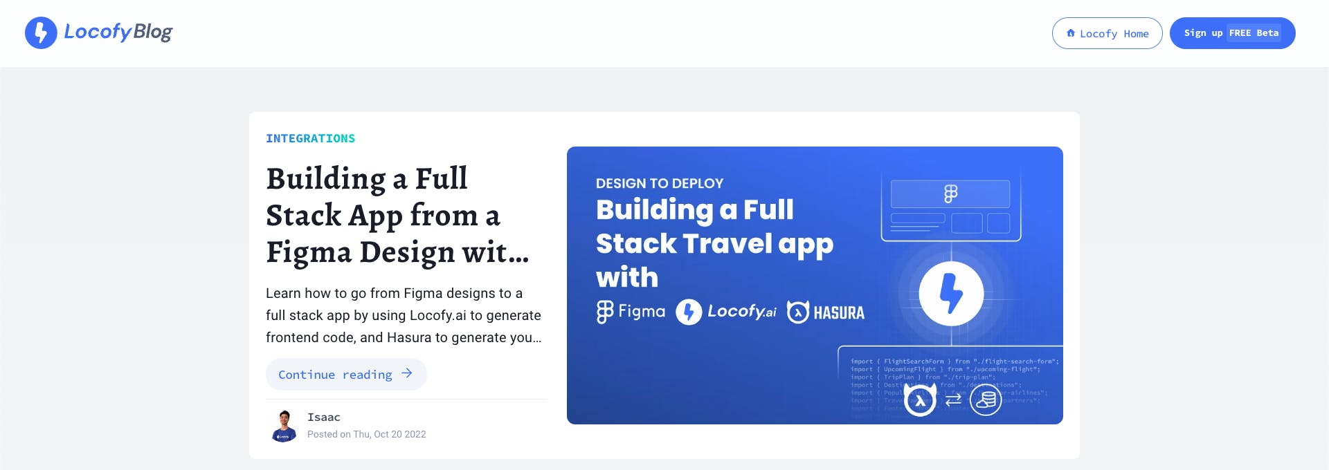
Turn your blog designs into frontend code with Locofy.ai
In this guide, we will be recreating the official Locofy blog page, which was built using the Locofy.ai plugin and Prismic.
This is the design for the blog app that we’ll be building. It consists of 2 pages – a homepage, and an internal blog page. You can find the link to the Figma file here.
The first step is to tag the designs. Tagging allows us to turn the designs into working components, for example, buttons, dropdowns, inputs, and more.
You can also work with popular UI libraries such as Material, Chakra, Ant, and Bootstrap UI by tagging your elements.
For this app, you’ll notice items like:
- Buttons
- Input fields
- Images
Ensure that these elements are tagged for them to become working components in the final app. The Locofy plugin also has LocoAI which uses AI to scan the design and suggest tags, making it easier to quickly tag designs.
Now you can make your designs responsive by configuring the styles in the Styles & Layouts tab.
Select your components that need to be responsive and on the Locofy plugin, under the Styles & Layouts tab, you will find different media queries & states. Select the breakpoint you want to make your design responsive to and then change the styles and layout accordingly.
You can also use auto layout for your designs for responsiveness and use the locofy plugin to take care of layouts on different screen sizes.
You can trigger actions to build fully featured apps and websites. You can head over to the ‘Actions’ tab and assign actions for click events.
You can scroll into view and open popups and URLs amongst other actions.
Now that the designs are tagged correctly and responsive, you can preview them.
To preview your design, select the frame or layer that you want to view, and click the “Preview” button.
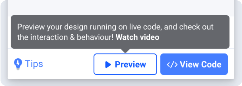
Once you are satisfied with your preview, you can sync your designs to Locofy Builder to add more advanced settings, share your live prototype, and export code.
Click the “View Code” button at the bottom right corner of the plugin & select the frames. In our case, we’ll be syncing both frames.
Once the sync is complete, click on “View code in the Builder”.
You need to turn some of the code generated by Locofy into components inside the Locofy Builder.
In our design, we need to make all our sections into components and every blog card has to be converted into components since we will have multiple blogs and we can reuse the components.
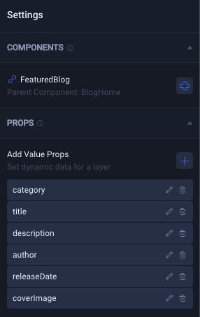
For each blog card, we expect certain props such as blog titles, images, author names, and release dates. You can quickly add these props in the Locofy builder.
Once the prototype matches the product vision, you can view the live responsive prototype that looks and feels like your end product. Then you can export the code.
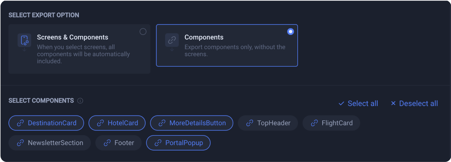
Make sure to select all the screens you need, as well as the correct framework and project settings. Once done, you can download your code in a Zip File by hitting the “Download Zip File button” in the bottom right corner.
Exported Code Overview
After extracting the zip file you downloaded, you can see how the Next.js project is structured.
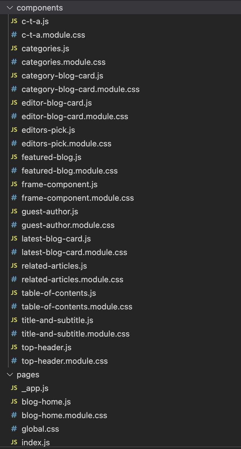
You can see the components you created in the Locofy builder have been placed inside the "components" folder and you have got our screens as pages inside the "pages" folder.
- To run the app, we need to first install the packages running the "npm i" command in your terminal. Once the dependencies are installed, we can run the project in the development environment using "npm run dev" command.
- Now that the application is up and running, we can check the responsiveness as well as the styles we added using the Locofy plugin by visiting https://localhost:3000 URL on your browser.
Getting Started with Prismic
Prismic is more than just a typical CMS. It is essentially a headless website builder that enables its users to create on-demand pages using reusable components.
Let’s see how we can connect our app with Prismic CMS.
Log in to your Prismic account and if you don’t have one, you can quickly sign up by clicking here. Once logged in, create a new repository. We are using the Next.js framework for this project, but feel free to select any of the mentioned frameworks on the Prismic site.
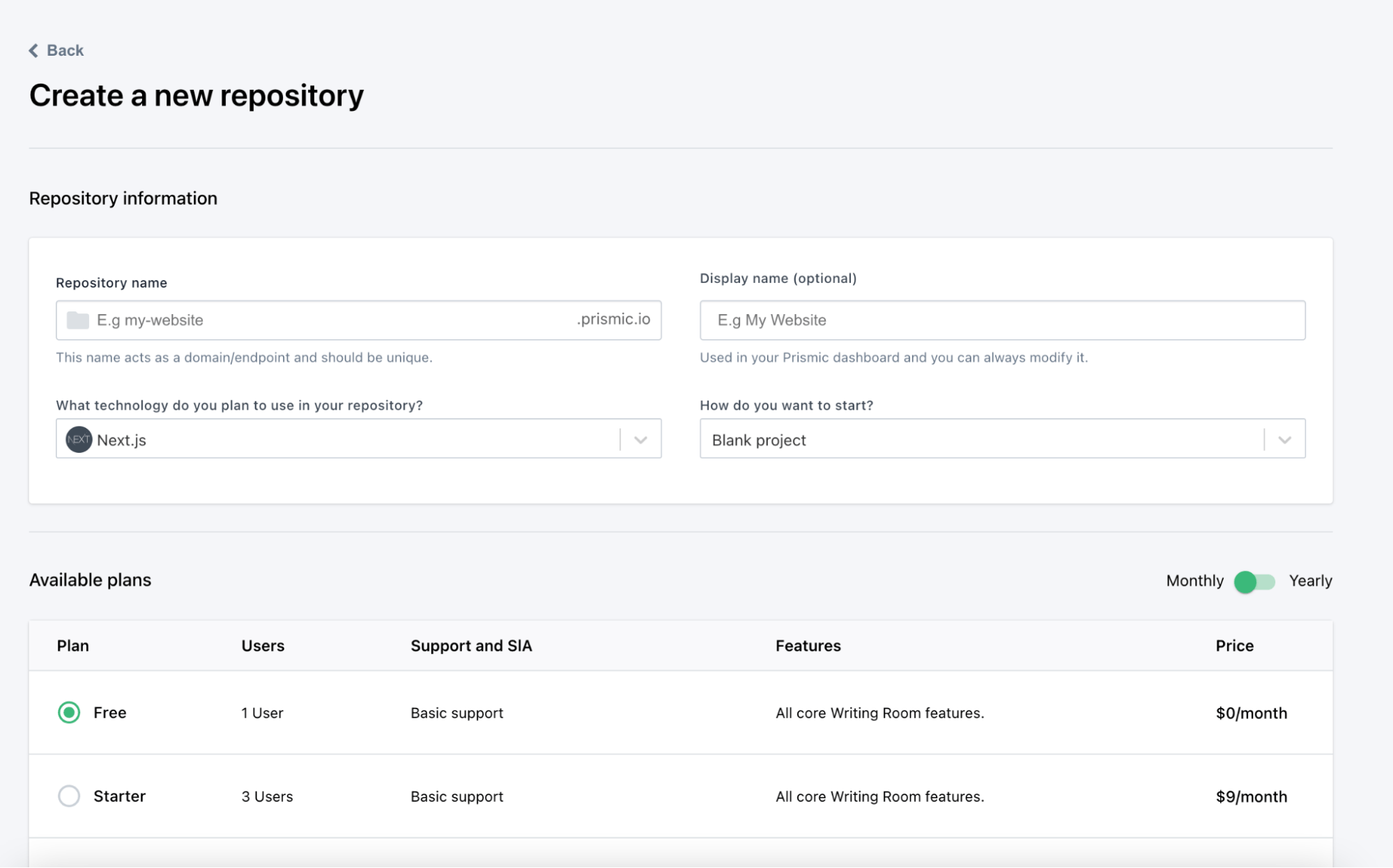
Since you already have the project exported using Locofy.ai, you can select a blank project and move forward.
Give your project an apt name and click on “Create repository” at the bottom of the page.
After creating the project, Prismic will show commands for creating a new Next.js project and then launching the Slice Machine. We’ll discuss Slice Machine later in this guide.
Since you already have the project exported from the Locofy Builder, you can install and run the Slice Machine using the commands provided.
This installs all the packages that you need and also sets up the project for Prismic. However, for Next.js, you need another package that you can install using the following command:
Understanding core Prismic features
Prismic has 3 cornerstone concepts that you need to understand before diving into code:
Slices
Prismic provides more freedom to developers and designers by providing them with reusable website sections, that they can easily interact with. These sections are called Slices. Using these slices, you can create dynamic web pages on demand.
Custom Types
Custom Types enable you to provide a structure and model for documents. You can specify the data fields it should have, the link to other documents, and also the slices it should have access to.
There are two types of custom types you can create: Repeatable and Single.
Repeatable custom types are ideal for documents where you expect to reuse the structure. For example, blog pages should be a repeatable custom type because each site can have multiple blog pages.
Single custom types are documents that you only intend to have one copy of throughout your site. An example of this is the privacy policy page which is present only once on your site.
Slice Machine
To create & edit with custom types and slices, Prismic gives us Slice Machine. It is a local custom type and slice builder that connects your component code with Prismic.
Now that you have these concepts out of the way, you can work on extending the code.
Generating Custom Types & Slices
Run the following command to setup the Slice Machine in your app:
This will install the necessary dependencies, create a new Prismic repository or let you choose an existing one and also create a “sm.json” file, which contains the API endpoint of your project and the location of the slices folder.
Create a new file in your root directory and name it “prismicio.js”. This file will contain all the configurations you need for Prismic to work such as creating a client and specifying the routes.
You can find a copy of the file here.
Now you need to wrap the component inside the “_app.js” file using two React components that you can import from the “@prismicio/react” & “@prismicio/next” packages.
The “PrismicProvider” component provides settings for Prismic's React components, using React context. All “@prismicio/react” components that are children of this one will receive the specified options as defaults.
Whereas the “PrismicPreview” component enables Prismic previewing functionality.
Start the Slice Machine to build custom types and slices. Run the following command to start:
Go to http://localhost:9999 in your browser and you should see the Slice Machine up & running. It will prompt you to create a Custom Type.
You need to create a document to reflect the landing page. Let's go ahead and create a custom type and we can name it ‘homepage’.
Save it to the local file system and then head over to the “Changes” tab present on the left panel and push the changes to Prismic as well.
You have just created the first custom type and synced it with Prismic!
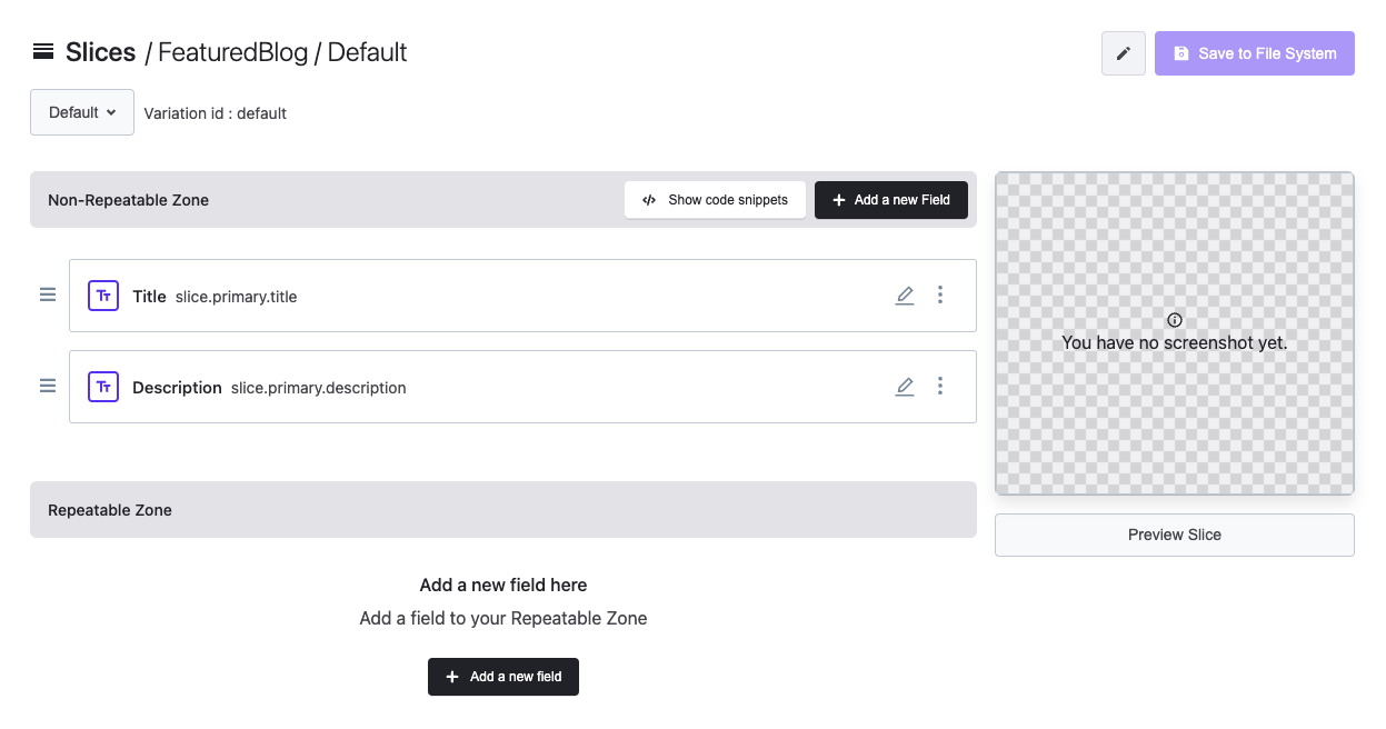
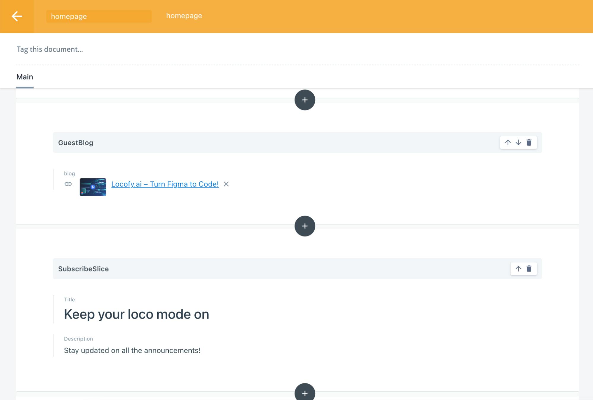
Now you need to create a slice. Go to the “Slices” tab and create a few slices.
In our design file, you can see various sections such as a featured blog section and a subscribe call-to-action section. You want to convert all these sections into slices that can be populated using the Prismic dashboard.
Inside each slice, you can specify the fields it should accept under the ‘Static Zone’. If you have repeatable data, you can specify the fields for that inside the ‘Repeatable Zone’.
Once done with the slices, save them to the file system and then go to the “homepage” Custom Type and click on ‘Update Slice Zone’ and select all the slices.
This will allow you to access and use these slices inside the ‘homepage’.
Head back to the “Changes” tab and push all the changes to the Prismic servers.
Fetching the Data & Rendering Slices
As discussed before, you can specify the arrangement and data of slices inside documents. Go to the Prismic dashboard and click on the ‘Create New’ button on the top right corner to use the ‘homepage’ Custom Type you created earlier.
Click the plus button at the center of the page and choose the slices you want to populate the page with.
You will find that the slices have empty fields for the data you specified earlier inside your Slice Machine.
You can create another custom type for documents like blogs and using a custom relationship field, you can attach them to your slice data fields.
You can populate the fields & these data will be passed on along with the slices when you fetch them inside our app.
Now that you have created & populated the ‘homepage’ document, you can fetch them in our “index.js” file in the pages directory.
You will be fetching the data on the server side using the “getServerSideProps” function.
We are importing the “createClient” function present in the “prismicio.js” file we created earlier.
Using it we are calling a method getSingle() which takes 2 parameters – the first one is the ID of our Custom Type, and the second one is where we can specify additional queries such as ordering, sorting, and additional fields we want to fetch.
To fetch the data of the linked documents we are using “fetchLinks” key as shown above and providing it with an array of the names of the data fields.
Return the fetched data using the props so you can access it inside your component.
To render the data, Prismic provides us with a component called Slice Zone present inside the “@prismicio/react” package.
Import the package by using the following code:
You can use it inside the components to render the data. It needs two props: “slices” and “components”.
In the “slices” props you can pass data that you have received from the Prismic servers whereas “components” accepts a list of all the components present inside the “slices” folder in your project.
You can now go back to your local development site to see the slices in action however they won’t be styled or able to digest the data yet.
Digesting Data & Styling Slices
Our slices are already accepting the data inside the ‘slice’ prop with the help of the Slice Zone component.
You can view the structure of the prop by logging into the console.
Based on this, you can create your styles and digest the data appropriately.
Since you have generated the components using the Locofy Builder and specified the props ahead of time, you can simply import these components into the slices and pass the props to them.
In this slice, we are replicating the featured blog section inside our design file. We are simply passing the data to the component we generated earlier and since these components are already styled, we can return them without any other modifications.
Sometimes you may have data that may not be directly digestible by the generated components, in that case, you may need to write a few lines of code.
Sometimes you may have data that may not be directly digestible by the generated components, in that case, you may need to write a few lines of code.
For example, for the editor’s pick section, our slice has an array of blogs. To map these blogs, you can use the “Array.map()” function and return the Locofy generated component.
Here, you can pass the blogs in the prop named “arrayOfBlogs” and check if that’s null or not. Based on that you can either return a component with the right props or a null.
With that, you've successfully re-created the official Locofy blog page.
By referring to the steps above, you can quickly work with Locofy & Prismic to ship a dynamic website builder.
You can view our blog page here (built using Locofy + Prismic).
With Locofy you will be able to generate production-ready frontend code in a matter of few hours that would have otherwise taken us 3-4 weeks to code manually. Moreover, the code can be easily extended with headless CMS such as Prismic to generate dynamic pages.
If you want to learn more about how to convert your Figma design to React, React Native, HTML/CSS, Nextjs, Vue, and more, check out our docs. Or explore our solution pages for an in-depth look at how Locofy helps you build apps, websites, portfolio pages and responsive prototypes effortlessly using our low-code platform with seamless AI code generation.