Working with Material UI
Learn how to use Material UI inside your design system.
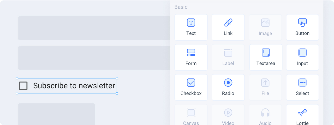
Tagging a Material UI element
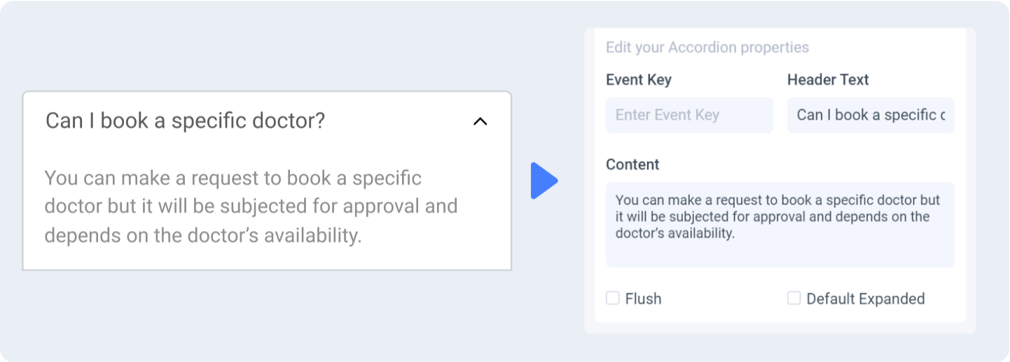
To tag a Material UI element:
-
Select the Material UI element from your Figma file.
-
Choose the tag from the Locofy plugin. Available tags will be highlighted based on your selection.
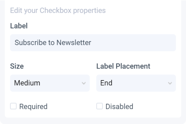
 A Material “Checkbox with Label”
- Select Material UI.
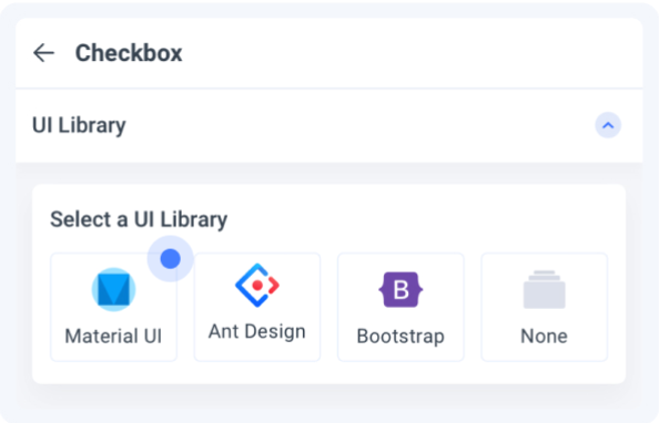

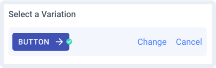
- Select a Variation: Choose the variation of the element you are using
- Select Palette: Choose the palette you want to use for this element.
- Edit Properties: You can further define how this element should work.
-
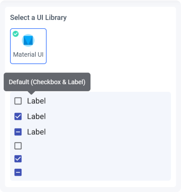
Check the interactive preview: Play with the interactive preview to verify your element is correctly set up
-
Click Done.
Locofy provides an interactive preview for you to visualize your element while tagging.
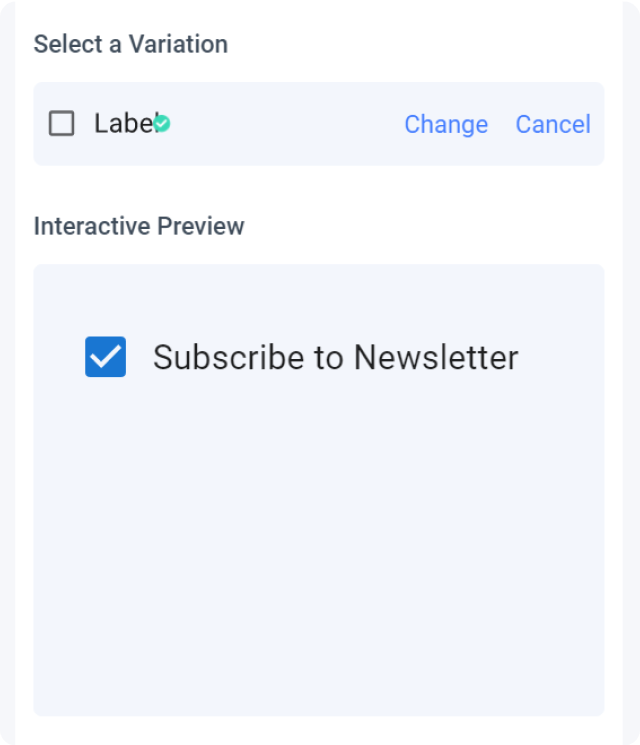
Any changes made to your properties settings will update and refresh the interactive preview.
Properties auto-detection
When tagging your Material UI element, Locofy reads your Figma design to automatically populate properties for you.
Change or cancel Variation
You can switch to a different variation or cancel the variation by clicking the ‘Change’ or ‘Cancel’ button respectively.
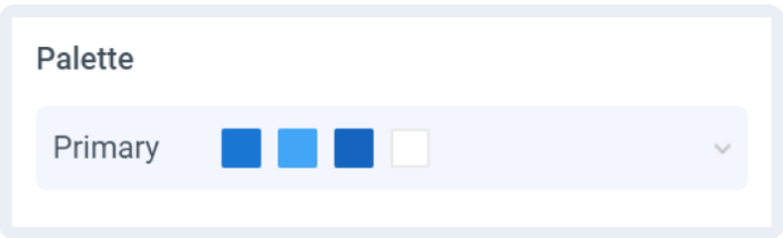
To switch between your palette choice, click on the palette dropdown and choose a different option.
Theming
Theming allows for a customized, consistent look across all your Material UI elements.
Editing your theme
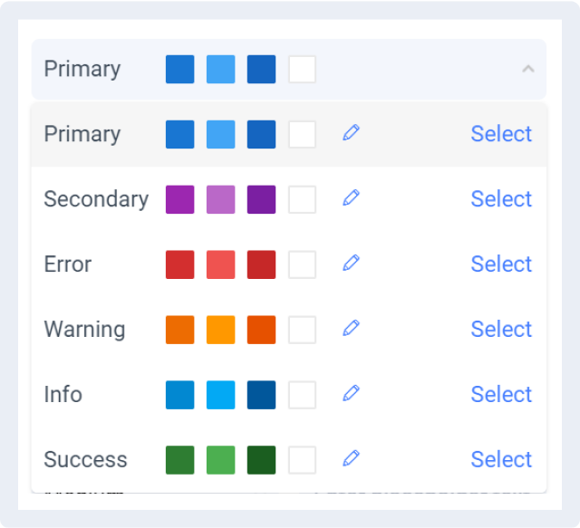
When tagging your Material UI element, you are required to choose the palette to use for the tagged element.
Click the pen icon to edit your theme settings.
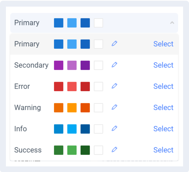
Theme settings
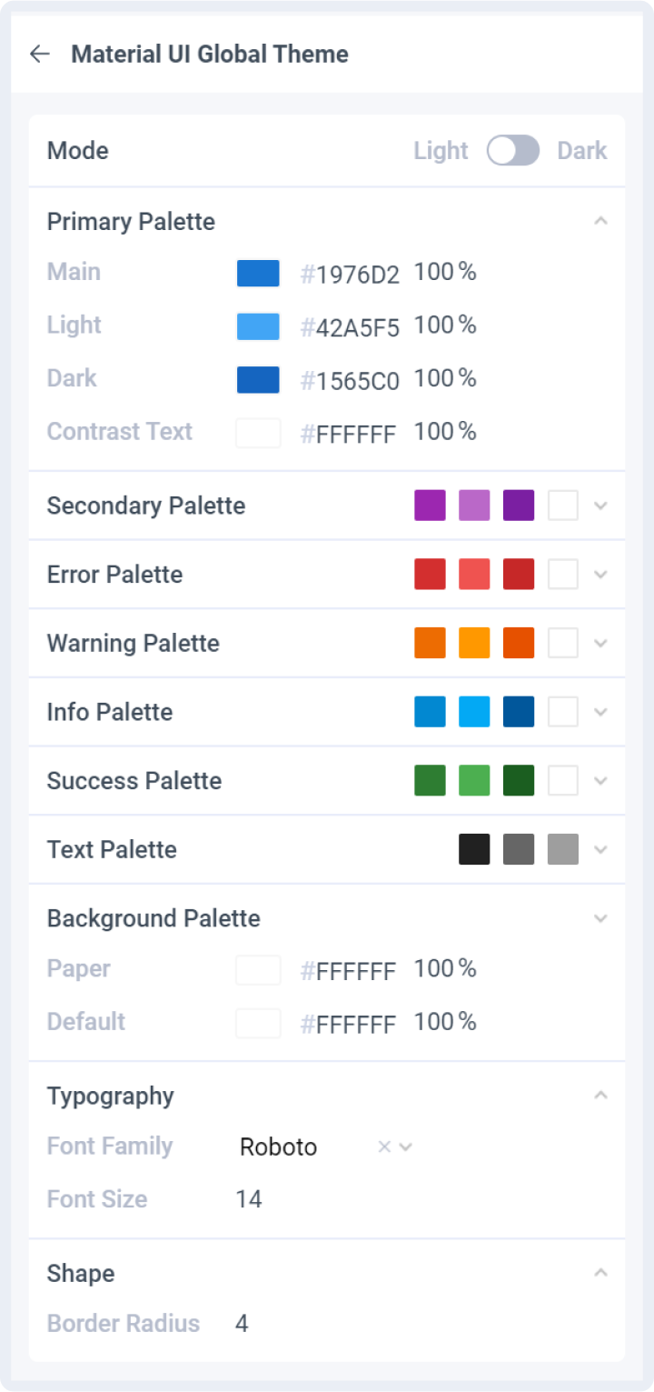
Mode
Toggle easily between light and dark mode.
Palettes
For each palette, you can define the colours and contrast text individually.
Background Palette
Define the colours used for background in elements such as Select and Autocomplete dropdown menus
Typography
Define typography settings that will be used across all Material UI elements
Shape
Define the border radius to use across Material UI elements
MUI Version
Material UI package will be imported as a dependency for the generated code base.
- @mui/material: 5.13.4