Introduction to the Behavior and Responsiveness Widget
Learn the basics of creating responsive designs and creating beautiful interactions
This widget helps you to:
- Make your design responsive
- Create a beautiful interactions using states (Hover, Click, etc)
Creating responsive designs with media queries
What are Media Queries?
Media queries allow you to change the styling of your design based on rules such as screen width.
An example of that would be to change your design from being arranged horizontally to stacking vertically on the <428px Media Query - this means this setting is only applied when the screen width is less than 428px
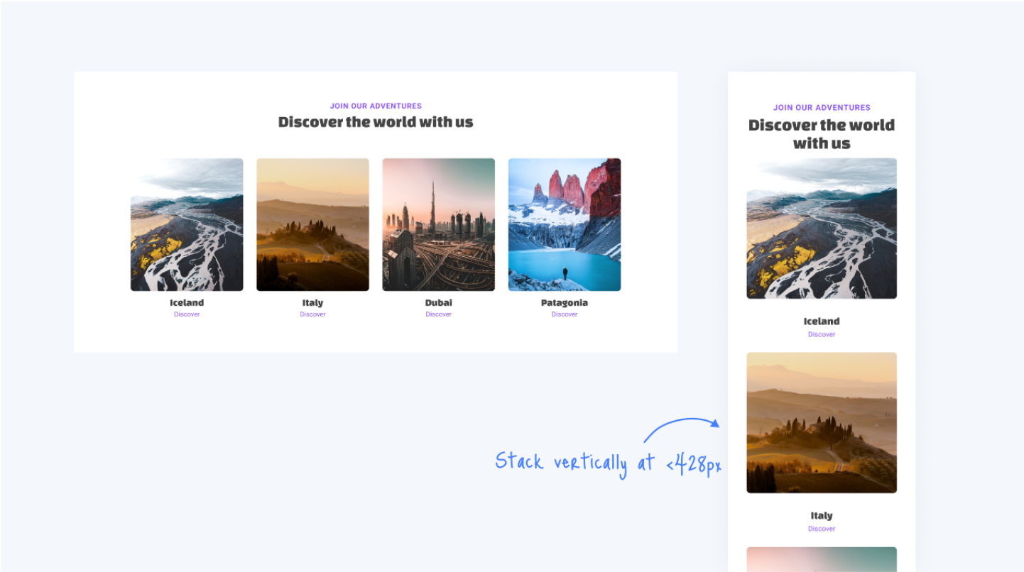
By using Media Queries, you can control your design for various devices such as desktops, tablets, mobile and more.
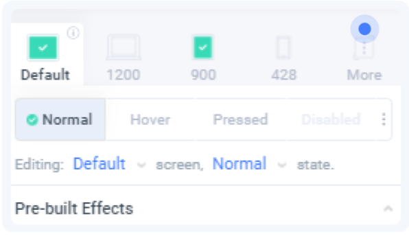
Editing in different Media Queries
Working with media queries in Locofy is easy:
- Click on the desired Media Query tab or select from the dropdown
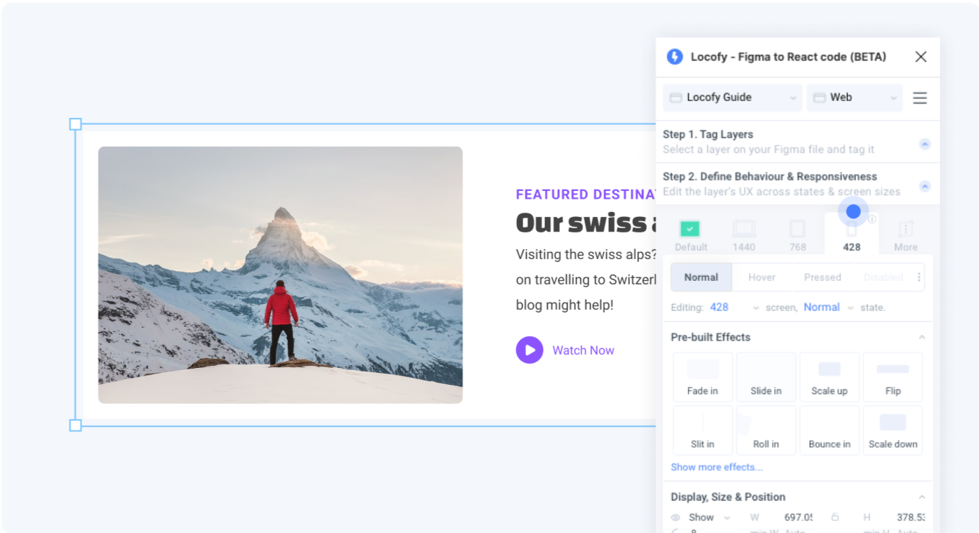
- Edit the styling of the layer in the styling sections below. All the changes made will apply to the selected media query.
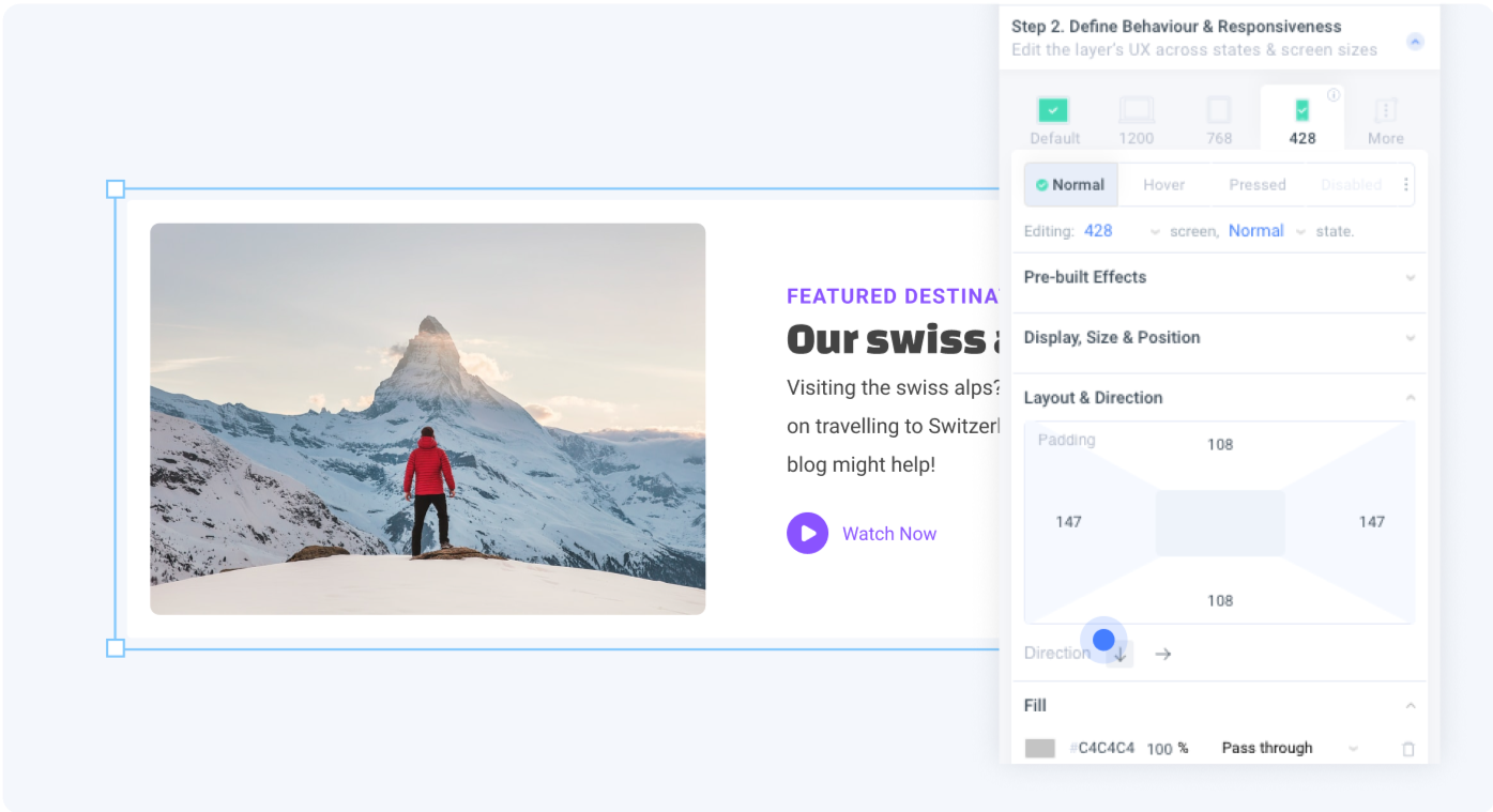 Changing layout direction to vertical stacking when screen is <428px
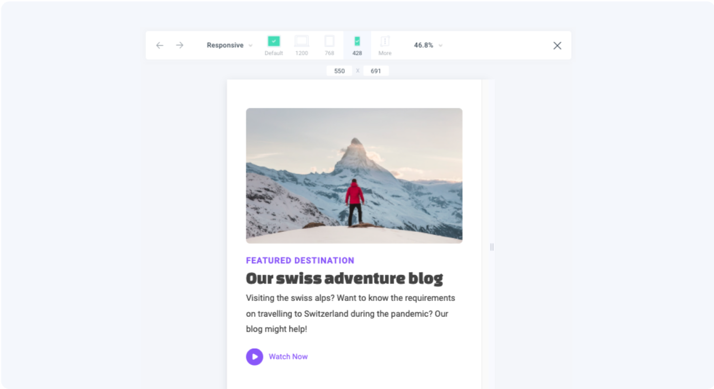
- Preview to see how your element behaves in your selected screen size
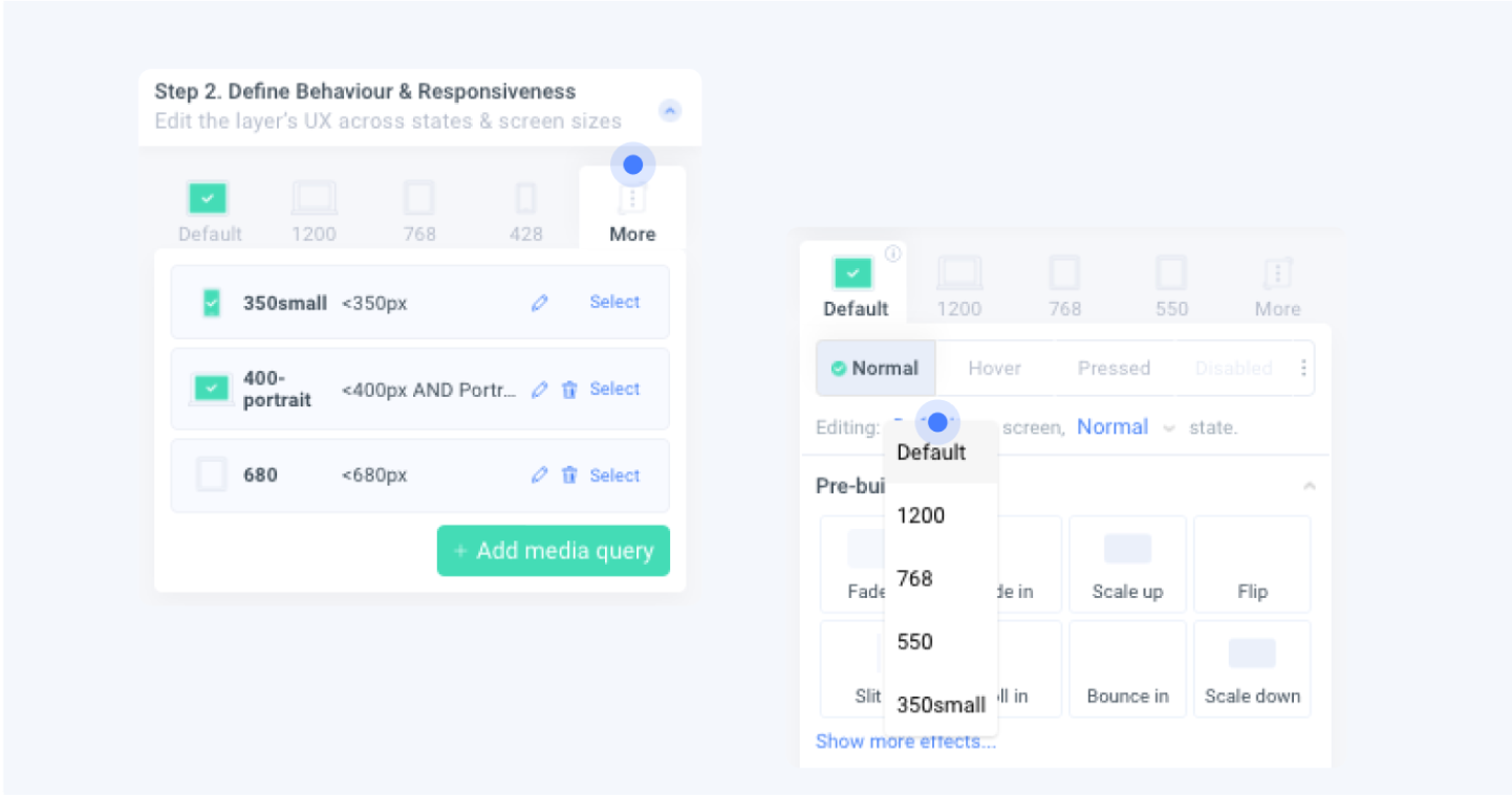
If you have added more custom media queries, you can find all the Media Queries you created in the “More” Tab, or by clicking the dropdown
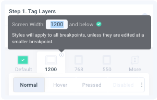
Editing Media Query Widths
To edit Media Query widths:
- Click on the information icon
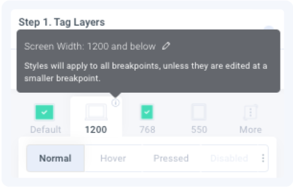
- Click the pencil icon to edit.
 Changing this media query width from ‘1200’ to ‘1024’
- Press enter or click the green checkmark to save
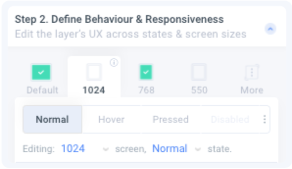 The media query tab now indicates the new width of ‘1024’
Add Custom Media Queries
To add more custom media queries:
- Click on the “More” tab
- Click on Add Media Query
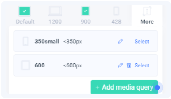
- Define your new media query and assign it a name for easy reference
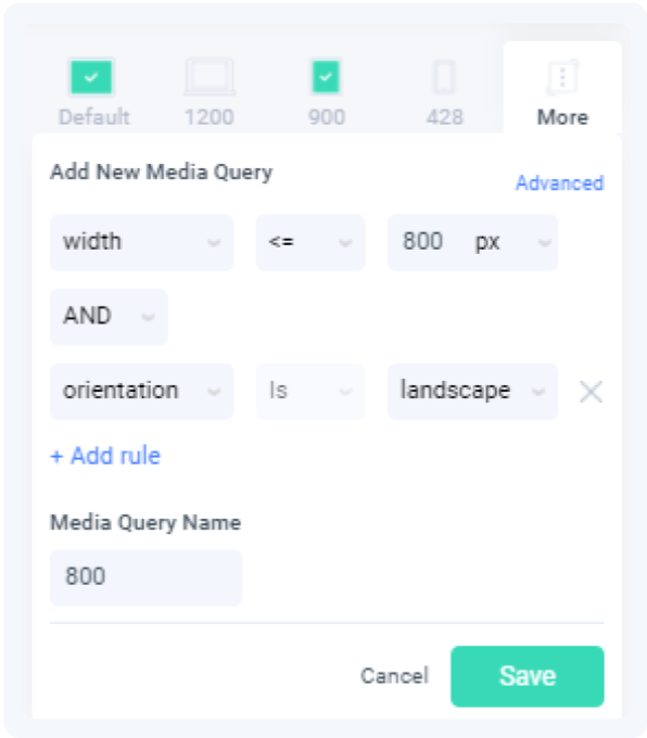
Advanced users can click on the “Advanced” button to enter media query code manually.
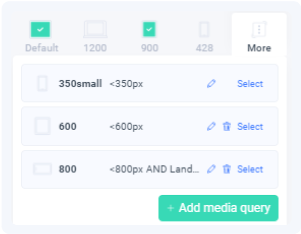 The new ‘800’ media query is added to your list
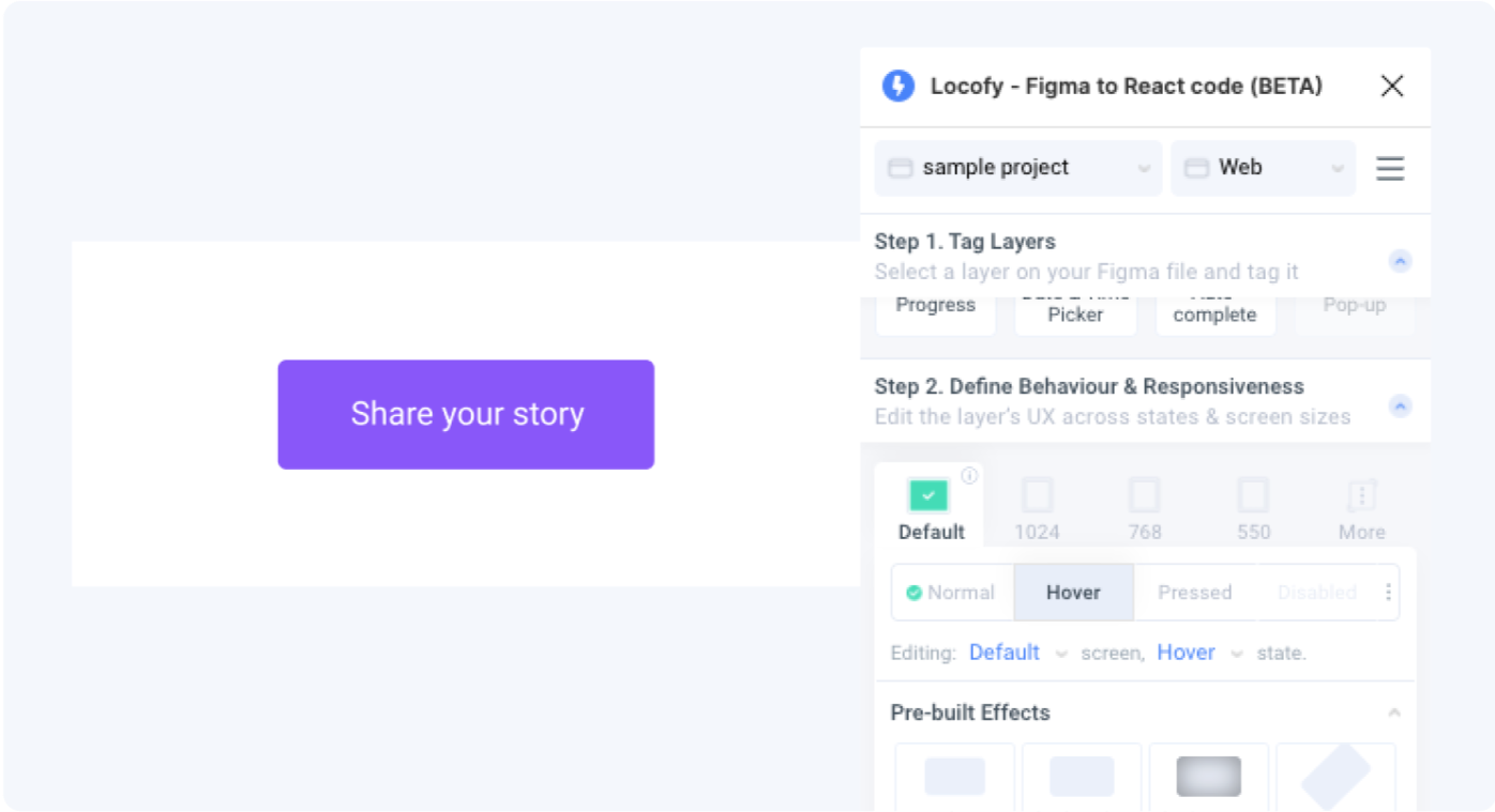
Creating beautiful interactions with states
Elements on your page are not just static. As users interact with the elements, you may want have a different styling for your element based on its state.
You can do so inside Figma with the Locofy plugin. Commonly used states which are supported by Locofy are:
- Normal
- Hover
- Pressed
- Disabled
- Focused
- Checked
- Empty
Editing element style in its different states
To edit the styling for an element in different states:
- Select the state you want to edit for. You can click on the tab or use the dropdown.
 You are now styling this element for ‘Default’ media query and ‘Hover’ state
- Edit the styling of your layer. All changes made will apply only to the selected state.
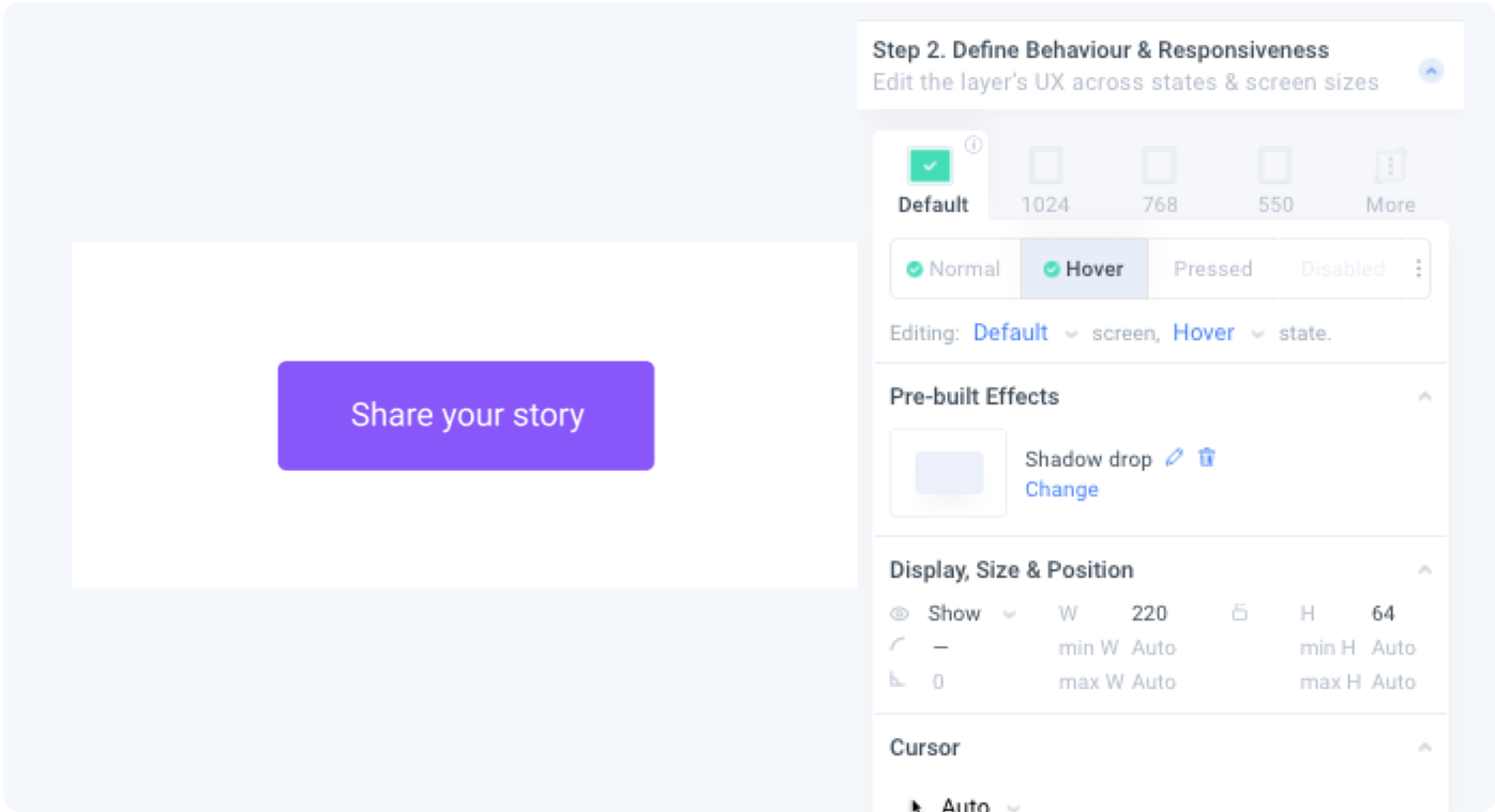 Add a drop shadow for the button.
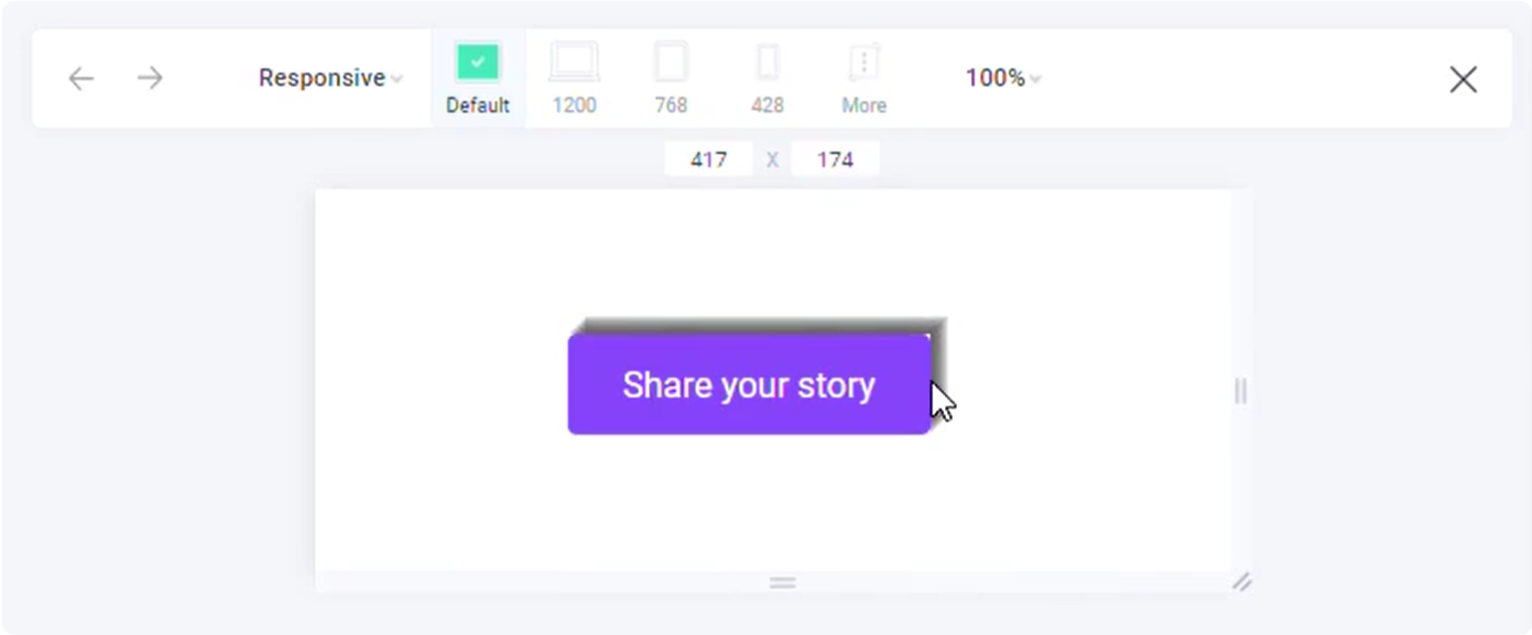
- Preview to see how your layer looks in the newly styled state.
Edit styling properties for your layers
Locofy supports styling options for:
- Prebuilt Effects
- Display, Size & Position
- Spacing
- Fill
- Border
- Shadow
- Typography
- Cursor
- Layout
Advanced CSS properties
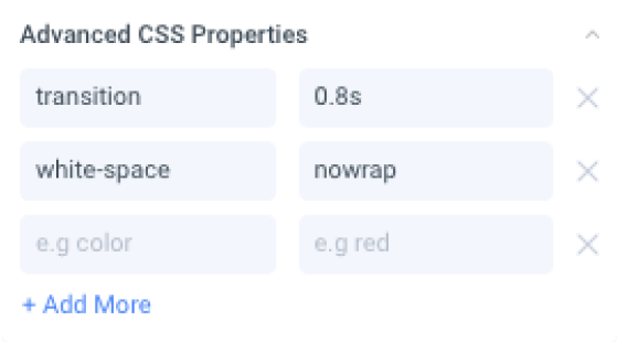
Advanced users can use any CSS property they need by entering key-value pairs in this section.