Building a responsive card
Learn how to build a responsive card that can be used in various layouts and resizes according to its parent container
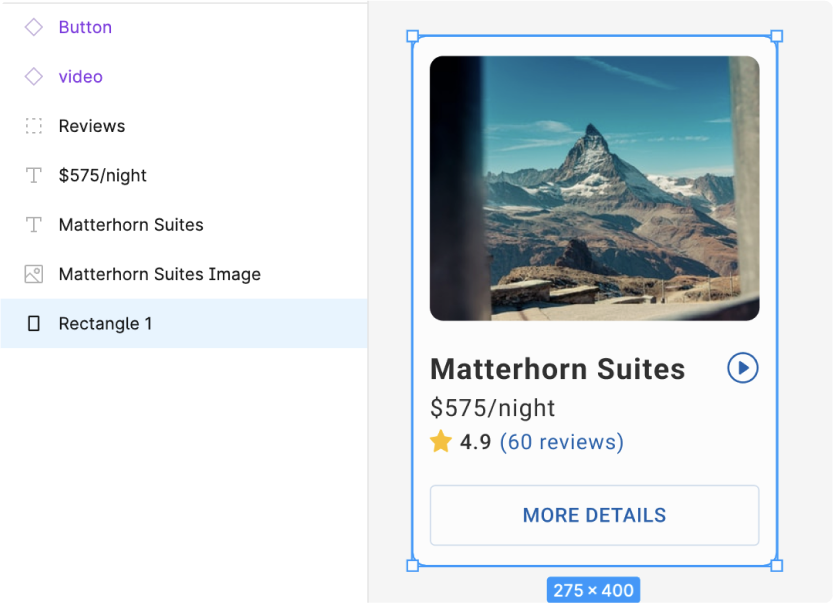
- Examine your card design. Check if you’re using a rectangle or image as the background.
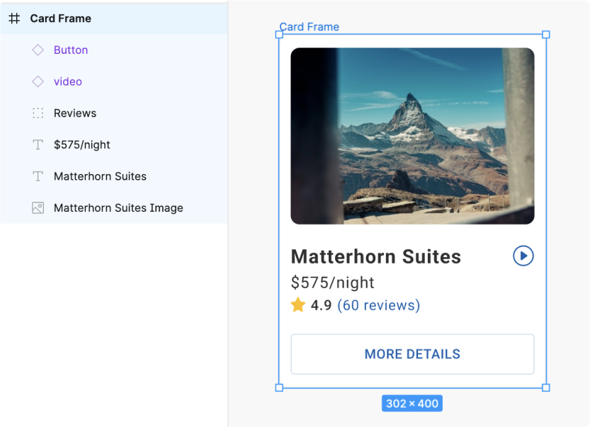
- If you’re using a rectangle or image - you should instead use a frame for the background. You can copy and paste the properties such as Fill, Stroke, Border radius from the rectangle to the frame.
Apply autolayout and constraints
- Ensure that autolayout is applied to the card. You may need to first group up and apply autolayout to inner elements so as to ensure that your design is preserved.
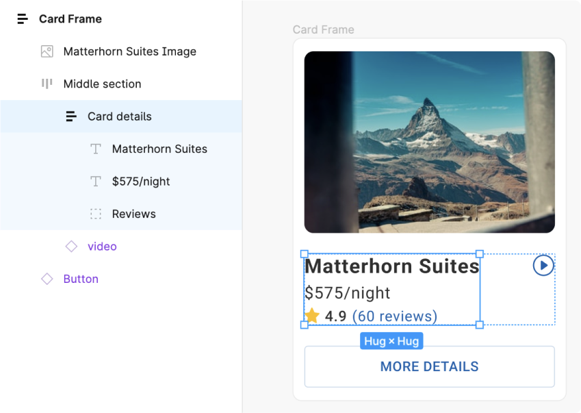
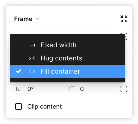
- Apply width constraints such as “Fill container” to ensure the child items resizes along with the card
- You have successfully created a responsive card for use in various layouts